A financial dashboard is a useful data visualization tool that allows businesses to track financial key performance indicators (KPIs) in real-time. Essentially, dashboards display financial data from different departments, such as accounting, marketing, and sales, in the form of charts and graphs. Because of this, these dashboards help businesses understand trends and make critical strategic decisions regarding their financial goals. Simply put, to succeed, every business needs a financial dashboard.
However, creating a good financial dashboard isn’t easy unless you’re using an efficient tool like FusionCharts. FusionCharts is a beautiful data visualization tool that lets you effortlessly create visually appealing and easy-to-understand financial dashboards. Ease of use is one of FusionCharts’ most loved features.
In this article, we’ll show why we love creating financial dashboards with FusionCharts. We will also show you what makes FusionCharts the best tool for building beautiful and informative financial dashboards.
Table of Contents
Which Type of Financial Dashboards Can Be Built With FusionCharts?
FusionCharts offers different ways to display different types of data. It has more than 100 different types of graphs and charts, such as bar, column, line, pie charts, and over 2000 choropleth maps. You can use these charts, graphs, and maps to build any type of financial dashboard. FusionCharts also offers numerous pre-built financial dashboards that you can use to track different KPIs.
Some examples of FusionCharts dashboards include:
Sales Management Dashboard
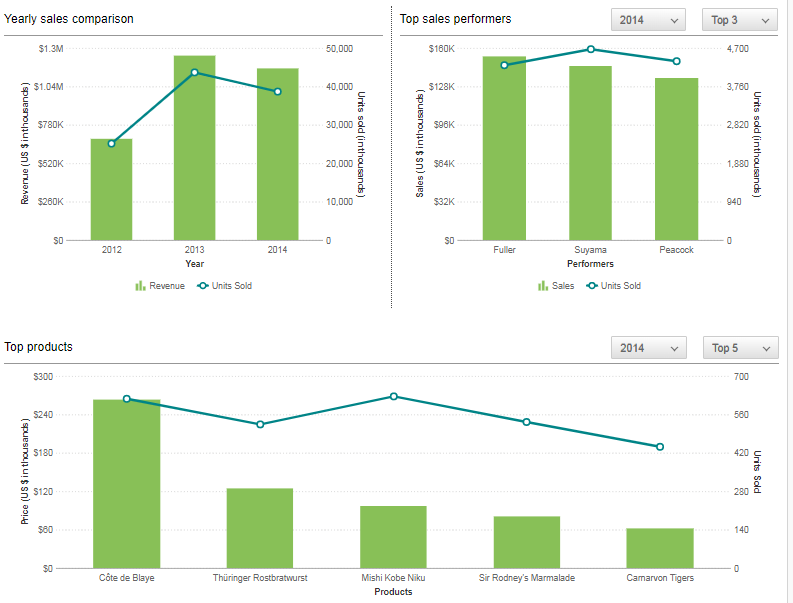
The Sales Management Dashboard allows you to analyze important sales stats. You can use this dashboard to see your organization’s performance over the years, analyze different product categories, track the performance and progress of employees, and individually analyze different sales locations.
Wealth Management Dashboard
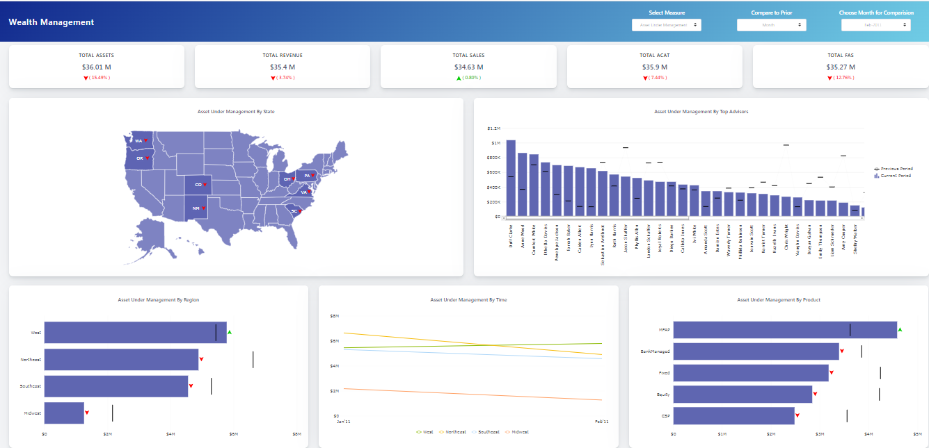
A Wealth Management Dashboard helps businesses better manage their wealth. It provides an easy way for businesses to track the distribution and performance of their financial assets. You can also use this dashboard to track different key metrics, such as revenue, sales, new net money, and more.
Investment Portfolio Dashboard
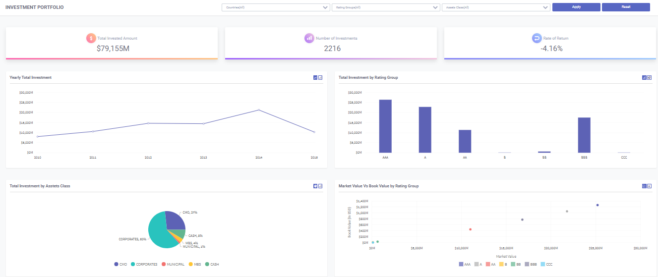
The exploratory Investment Portfolio Dashboard allows you to quickly analyze the rate of return, investment distribution, and portfolio risk associated with your investments. With this dashboard, you can analyze your investments by different countries, asset classes, and rating groups.
Marketing Dashboard
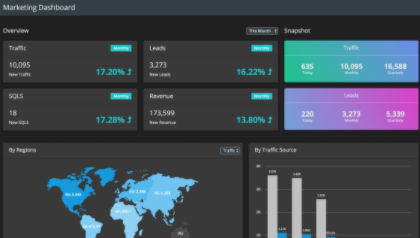
Finally, the Marketing Dashboard is the best way to check if your marketing efforts are paying off. You can use it to see leads, traffic, SQL, and revenue numbers and track the progress made towards each goal.
How Easy Is It to Build Financial Dashboards With FusionCharts?
Building financial dashboards is super easy with FusionCharts. to put it simply, FusionCharts is the main reason why we love financial dashboards, and you should, too!
Our team of experts has built lots of ready-to-use financial dashboards for different use cases to make things easy for you. You can download the source code of any dashboard with a click of a button for free and get started in no time.
For example, to get started with our sales management dashboard, all you need to do is follow these simple steps below:
- First, ensure you have Node JS >= 8.10 and npm >= 5.6
- Make a folder and extract the zip in it
- Go to the extracted folder and install the dependencies “npm install” or “npm I.”
- Start the server with “npm run serve.”
- Finally, open the URL “https://localhost:8081/qa/dashboards/wealth-management-dashboard/” in your browser.
FusionCharts doesn’t have a steep learning curve. As a result, you can create your own first chart in just 15 minutes or so. With its consistent API across different charts, it’s super easy to create any type of chart or dashboard. In addition, FusionCharts comes with detailed documentation and numerous live examples to make things even easier.
Does FusionCharts Support Interactive and Responsive Financial Dashboards?
Interactivity is the key to a good chart or dashboard. This is because interactivity makes your visualizations easy to understand and interpret. Unlike many other data visualization tools, FusionCharts allows different types of user interactions. You can show or hide data series in column charts, zoom in and out, see more data points, build drag-able charts, and more. You can also use the interactive legend to allow viewers to focus on one part of your data. Finally, with FusionCharts’ interactive legends, you can show/hide, fade in/fade, or slice in/slice out the data plots.
With FusionCharts, your users can also switch between numbers and values on your graphs. Another great feature of FusionCharts is that it allows you to add drill-downs to your financial dashboard. With drill-downs, your users can look at the fine details in visualizations for deeper analysis.
Are There Any Customization Options for Financial Dashboards?
Customization is another key feature that allows your users to build easy to understand dashboards. That’s why FusionCharts offers several customization options. You can add labels, titles, different types of annotations, and legends to your financial dashboard. To highlight key landmarks within the data, you can also add trend lines to your charts. In addition, with FusionCharts, you can arrange the visualizations and charts on your financial dashboard column-wise or row-wise for a cleaner, more organized look.
Can I Update Financial Dashboards in Real-Time with FusionCharts?
A financial dashboard should have data visualizations that update in real-time. That’s why FusionCharts offers data streaming or real-time charts. These charts automatically update themselves after a specified number of seconds by fetching data from the server. They don’t need any page refreshes.
What Devices Can My Financial Dashboards Run On?
FusionCharts is specially optimized to display visualizations that adapt to different screen sizes, such as desktops, laptops, and mobile devices. This means any dashboard that you build with FusionCharts can run on any device and any platform. Users can access the financial dashboard from desktops, laptops, mobile phones, and tablets in the most efficient way.


