Here’s what you shouldn’t do to ensure that your data dashboards are engaging and insightful. With this post, you’ll learn about the top ten dashboard design errors and how to avoid them; once you’ve learned everything, you’ll be able to build dashboard creations without making design mistakes.
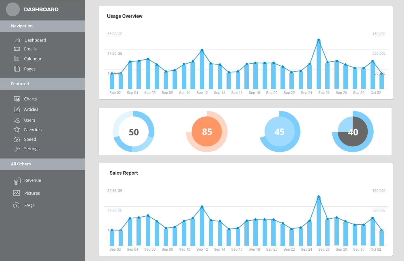
Dashboards are an excellent way to collect information and display it in the form of smart, visually appealing snapshots. It has all of the bells and whistles of an infographic, which are visually rich data representations. (The difference is that infographics already have an insight and a story built around it.) A dashboard also has the power of simple data visualizations – like tables or charts – allowing users to delve into and analyze the numbers.
Most importantly, several visualizations and information snippets are combined in a dashboard, allowing users to quickly identify trends, patterns, parallels, and differences, ultimately leading to the all-important holy grail – actionable insights.
However, ensuring that your dashboard checks all of these boxes isn’t always simple.
A typical dashboard user is unlikely to be a data analyst. Marketing executives, startup CEOs, HR professionals, and government officials make up a sizable portion of your TG, and they all share three major constraints.
First, High volumes
Many factors influence the best decisions, and several metrics together make success (or failure). A good dashboard should collate all the relevant material without omissions or excess additions.
Second, time crunch. Chances are, only half of one meeting of a CEO’s entire working day will be dedicated to looking at the dashboard. Without true ‘at-a-glance’-ability, your visualization runs the risk of being underutilized or even ignored.
Third, knowledge gaps. The onus is on you, as the dashboard creator, to correctly depict the information. For instance, a business user might ignore a slice representing 0.5% in a pie chart – because she doesn’t know what she’s looking for or the many nuances of visualization.
Dashboards have been around for a while now; the 1970s decision support systems first sparked the idea. Since then, it has gone through several transformations – fueled by advancements in IT and data science on the one hand, and the evolution of design on the other.
Today, you only have to look up ‘dashboard’ on Pinterest to be flooded with exciting and valuable data visualization ideas.
If you’re working on a dashboard project that’s also Pinterest-worthy (or nearly there) – here are ten pitfalls to avoid:
Table of Contents
1. Too Much Clutter
White space is among the most critical elements for any design, and dashboards are no exception. Because the interface is data-heavy, full of numbers, texts, shapes, and colors, it’s essential that the user also has some breathing space.
Also, it makes it easier for the user to segment the dashboard into related chunks. Remove clutter and use white space wisely, and you’ve successfully drawn invisible lines that guide the eye across the dashboard.
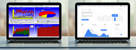
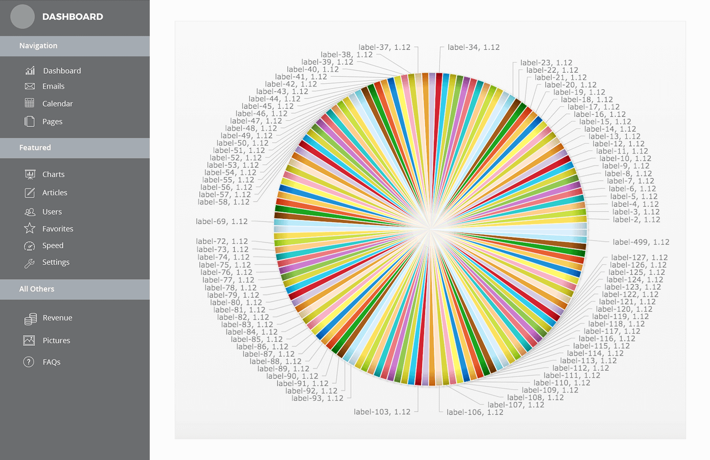
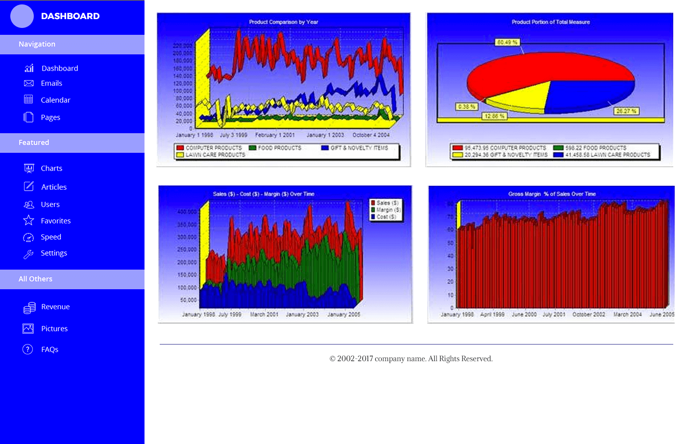
2. Too Many Colors
To the human mind, everything is a visual cue – from the font you choose to the shade of red.
Let’s say the four columns of a bar chart use four different colors. The user will automatically look for the significance of color when the columns already show the various fields. And in a dashboard that’s lit like the Christmas tree, the colors that matter is drowned out.
A good rule of thumb is to try and use no more than three colors and avoid subtle shade changes as much as possible.
3. Lack of Context
Because a dashboard is almost like a data summary, each section should speak for itself and present an accurate story.
For instance, a quarterly sales dashboard including historical data is more beneficial for mapping growth than a department-wise breakdown. A gross revenue statement might suffice, but it could paint a whole new picture when budgeted revenue is also presented.
Remember, what goes on the dashboard is just as important as how you put it up there.
4. Bad Data-to-Visualization Pairing
This pairing is a kind of error plaguing not just dashboards but all sorts of visualizations. Imagine geographical data shown in a large column chart or data with a decimal-level difference shown in a pie chart.
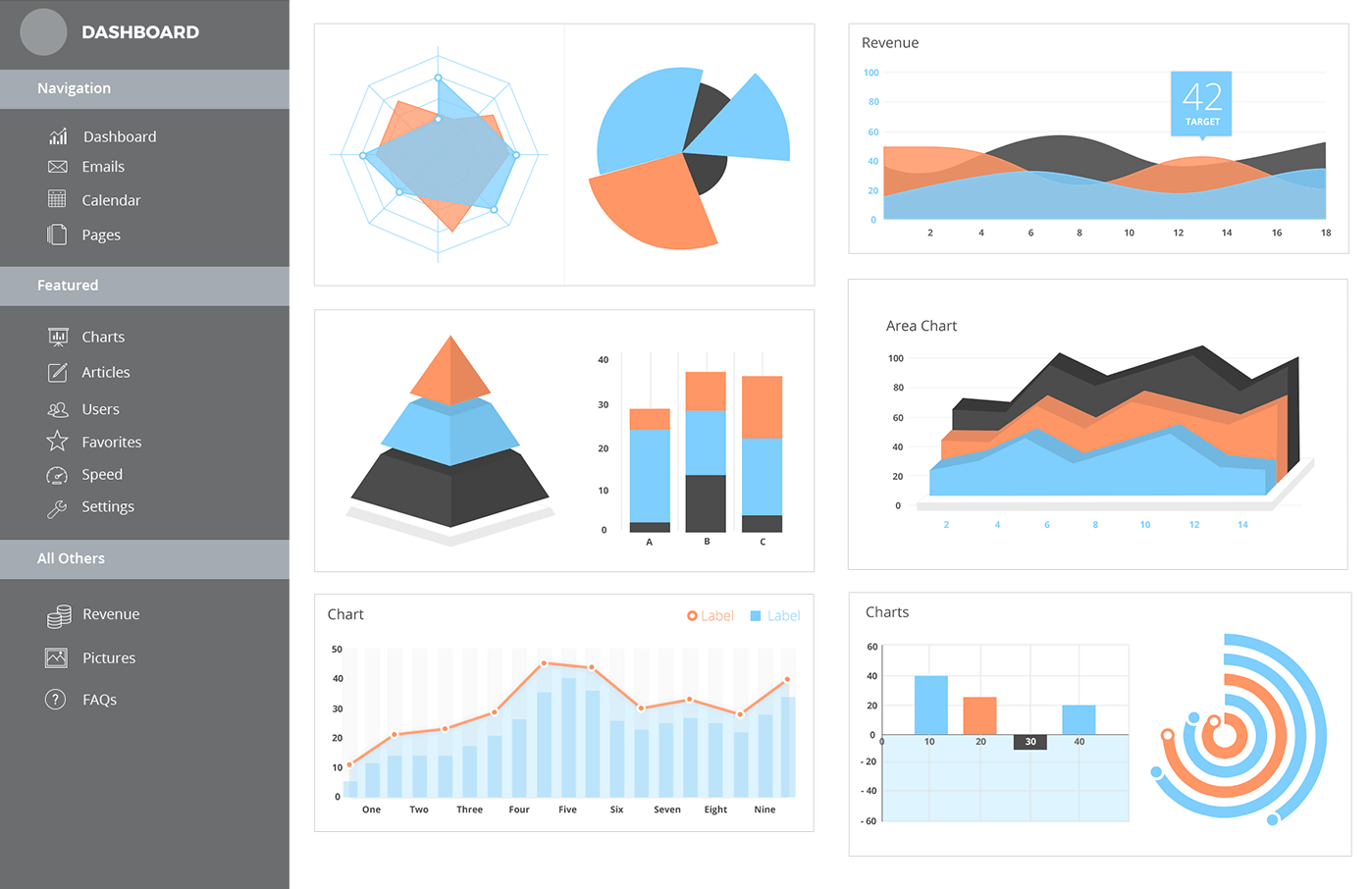
The type of graphic depends on the data and why it’s used. Too many data points to plot? A line chart is a better fit than a bar or column. When analyzing disparate data sets together, go for a combination chart. And the list goes on.
Take a look at readily available resources like this one to make the right call.
5. Careless Arrangement
Like any valuable piece of real estate, the power of your dashboard components lies in location, location, and location.
Typical reading patterns make the top left corner of your dashboard the most critical – the first element to draw the eye. The caption, a company logo, the starting line for your entire dashboard, or the most significant number – what goes here, sets the tone for the remaining visualization.
One efficient model (and there are many) is a cause-and-effect flow. Place impacting factors first and gradually build to the outcome.
6. Incorrect (or No) Focus
A dashboard with perfect symmetry, equally spaced parts, and size uniformity can look chic, sophisticated, and smartly minimalist. But it’s almost entirely useless – the user doesn’t know where to look.
On the other hand, putting a secondary visualization in the spotlight could misdirect your user.
Colors, size, and text elements help a graphic stand out. Utilize these visual cues to ensure that:
a. Each component in your dashboard is distinct from the other.
b. Temper the variety with subtle repetitions, but make your primary visualization unique.
7. Unnecessary Variety
Dashboards often carry several kinds of visualizations just to cut the monotony. For example, we have a dashboard that compares this year’s sales for several products with last year’s numbers. A line chart would be ideal, but a designer may be tempted to use bars, columns, what have you – to avoid an entire dashboard full of lines.
The key is to use other elements – colors or captions – then use every visualization technique in the book to interest your user.
8. Confusing Resemblance
The flip side is that using the same design idea indiscriminately across the dashboard can make your elements almost ‘blend’ into each other. The user spends precious time just zeroing in on the relevant data before she can even analyze it.
When at crossroads, ask the data – for similar depictions and needs, don’t shy away from using the exact visualization (or element) twice.
9. Too Ornate
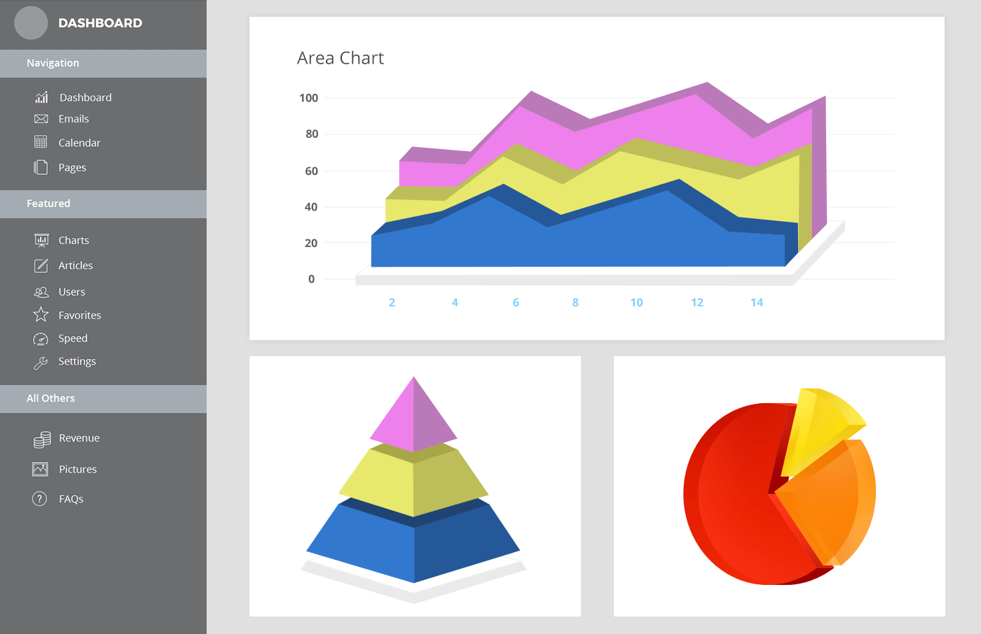
Among the most common (and easily solved) dashboard errors is the use of decorations – elements that add nothing to the data, don’t assist the flow, or fulfill any purpose other than sitting there and looking pretty. 3D charts, for example, or thematic images could distract the user more than aid them. Visual content that doesn’t lend to the data is best avoided in dashboards – and kept in store for infographics.
10. Just Plain Ugly
Dashboards capture the user and help them interact with data – an experience that’s supposed to be more fun and engaging than staring at a spreadsheet.
Poorly designed dashboards defeat this primary purpose – and, well, let’s say pictures speak louder than words.
Conclusion
The data dashboard complexity myth is easy to break. Instead of burning the midnight oil trying to stitch every piece of data at hand into a meaningful visualization, it’s critical to show the correct data. And once that’s identified, select charts that make those values – and their implications – entirely clear.
A little research into ways of fixing bad data visualization will inspire your project and give it direction. Steer clear of these errors and pray:
Grant me the serenity to accept the elements I cannot manipulate, the skillsets to change the ones I can, and the domain understanding to know the difference!


Murtuza Banani
January 25, 2018, 2:27 amNice article.
A dashboard is the only unit that can help the user to measure the performance. It really matters if the dashboard clearly defines the progress. If the user is unable to take away the insights then it’s totally useless.
You have mentioned some good stuff about dashboards. I suggest to also have a piece / article that breakdown steps before creating a dashboard.
I did a dashboard design recently and that took me a lot of time because the client haven’t done his homework. So I got involved with his team and help them to build a better product.
Will appreciate if you consider my article suggestion. 🙂
Thanks.
Shafique
January 30, 2018, 6:34 pmHey Murtuza,
Thank you for your comment. You’re right, sometimes it is very hard to get people to understand the value of planning the dashboard in advance.
It so happens that we are currently working on an ebook on the same topic as you suggested. Once, it gets published I will share the link with you.
Cheers!
Murtuza Banani
March 5, 2018, 7:30 pmHello Shafique,
Thanks a lot for your reply. Glad to hear that. Have seen the book it’s great… Must say you guys have done a great job. I’ll surely share it on my social media so more people can benefit from it.
Cheers!
Shafique
March 5, 2018, 8:09 pmThanks, Murtaza. Means a lot.