
When developing a financial web application, it is critical to display your data in a meaningful way to improve user productivity. Visualizing your data through beautiful charts and graphs is one way to accomplish this. This is due to the fact that compelling data visualizations improve users’ understanding of information. You can use FusionCharts to create a fantastic React Chart for finance that will make your React apps shine.
In this post, we’ll go over fusioncharts and let you learn how to add finance charts to your React applications using fusioncharts to make your apps more powerful and stand out.
Table of Contents
What is FusionCharts?
FusionCharts is a popular JavaScript charting library for the web and mobile applications. It offers over 100 interactive charts to help you visualize the data beautifully and help users quickly uncover critical insights. FusionCharts also provides extensive easy-to-follow documentation to help you add charts to your web application quickly.
How to Add Finance Charts to Your React Application Using FusionCharts
With FusionCharts, you can include a variety of charts in your React web applications. Here is how to quickly implement three finance charts:
How to Add a Line Chart to Your React App
Line charts allow you to represent financial data over a continuous timeline. By adding time navigation, your users can navigate to a specific period easily. Here is an example:
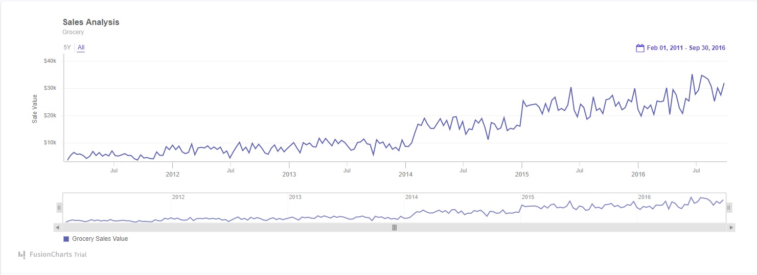
To create this line chart, follow these steps:
1. First, you have to import all the required libraries:
import React from "react";
import FusionCharts from "fusioncharts";
import TimeSeries from "fusioncharts/fusioncharts.timeseries";
import ReactFC from "../lib/ReactFC";
2. Now, you have to call React.fcRoot method with FusionCharts and TimeSeries as parameters:
ReactFC.fcRoot(FusionCharts, TimeSeries);3. Use this line to get your response in JSON format:
const jsonify = res => res.json();4. Next, fetch the data:
const dataFetch = fetch(
  "https://s3.eu-central-1.amazonaws.com/fusion.store/ft/data/line-chart-with-time-axis-data.json"
).then(jsonify);
const schemaFetch = fetch(
  "https://s3.eu-central-1.amazonaws.com/fusion.store/ft/schema/line-chart-with-time-axis-schema.json"
).then(jsonify);
5. Then you have to create a constant called dataSource. It will have chart, caption, subcaption, y-axis plot, and format fields.
const dataSource = {
  chart: {},
  caption: {
    text: "Sales Analysis"
  },
  subcaption: {
    text: "Grocery"
  },
  yaxis: [
    {
      plot: {
        value: "Grocery Sales Value"
      },
      format: {
        prefix: "$"
      },
      title: "Sale Value"
    }
  ]
};
6. After that, create your ChartViewer class to define the state of the time series data.
class ChartViewer extends React.Component {
  constructor(props) {
    super(props);
    this.onFetchData = this.onFetchData.bind(this);
    this.state = {
      timeseriesDs: {
        type: "timeseries",
        renderAt: "container",
        width: "600",
        height: "400",
        dataSource
      }
    };
  }
7. Finished that? the next step is to execute the componentDidMount() method:
componentDidMount() {
    this.onFetchData();
  }
8. Now you have to execute the onFetchData() method:
onFetchData() {
    Promise.all([dataFetch, schemaFetch]).then(res => {
      const data = res[0];
      const schema = res[1];
      const fusionTable = new FusionCharts.DataStore().createDataTable(
        data,
        schema
      );

      const timeseriesDs = Object.assign({}, this.state.timeseriesDs);
      timeseriesDs.dataSource.data = fusionTable;
      this.setState({
        timeseriesDs
      });
    });
  }
9. Finally, its time to display the line chart by executing the render() method :
render() {
    return (
      <div>
        {this.state.timeseriesDs.dataSource.data ? (
          <ReactFC {...this.state.timeseriesDs} />
        ) : (
          "loading"
        )}
      </div>
    );
  }
}
Source Code:
You can find the source code here.
How to Add a Bar Chart to Your React App
A bar chart enables you to provide a simplistic visualization of complex data effectively. Here is an example:
To create this bar chart, follow these steps:
1. Import all the required files:
import FusionCharts from "fusioncharts";
import charts from "fusioncharts/fusioncharts.charts";
import ReactFusioncharts from "react-fusioncharts";
2. Resolve the chart dependency by calling the charts() function. Use FusionCharts as the parameter:
charts(FusionCharts);3. Next, you have to create a constant, called dataSource. It will have theme, label, and value of data captions. You can find everything in the source code.
4. Now, you have to render the bar chart using the following code:
class MyComponent extends React.Component {
  render() {
    return (
      <ReactFusioncharts
        type="bar2d"
        width="100%"
        height="100%"
        dataFormat="JSON"
        dataSource={dataSource}
      />
    );
  }
}
Source Code:
You can view the source codes here.
How to Add Combo Chart to Your React App
As its name suggests, a Combo Chart combines multiple charts into one. Combo Charts are handy if you need to present multiple data visualizations like a bar, area, and line charts in a single view. Here is an example:

To create this chart, follow these steps:
1. Import all the files.
import FusionCharts from "fusioncharts";
import charts from "fusioncharts/fusioncharts.charts";
import ReactFusioncharts from "react-fusioncharts";
2. Then resolve the chart dependency with this code:
charts(FusionCharts);
3. Create a constant called dataSource. It will contain different fields for charts and datasets. To see more, check the source code.
4. Render the Combo Chart with this code:
class MyComponent extends React.Component {
  render() {
    return (
      <ReactFusioncharts
        type="mscombi2d"
        width="100%"
        height="100%"
        dataFormat="JSON"
        dataSource={dataSource}
      />
    );
  }
}
Source Code:
Get the source code here.
Choose FusionCharts for Your React App!
You should consider using FusionCharts. It provides you with more than 100 interactive charts and 2,000 data-driven maps. By using them, you can make your React apps shine.