
Today, data analytics and data visualization are critical components of every business. They also have a significant impact on the enterprise economy. They serve an important purpose in that they provide a visual representation of the large and complex data points that businesses generate on a daily basis. Beautiful data charts and explanatory graphs, in addition to illustrations, are critical components of any data visualization goal, and this is where FusionCharts comes in!
FusionCharts enables developers to implement beautiful and responsive chart components thanks to its large library of robust and beautiful data visualization components.
The best thing about FusionCharts is that developers can access the full source code. All you have to do is download it, plug it into your own projects, and start using them.
Continue reading to learn how to create a simple chart, using FusionCharts in your AngularJS applications to create stunning visualizations, responsive dashboards, business dashboards, and visual information pages.
Table of Contents
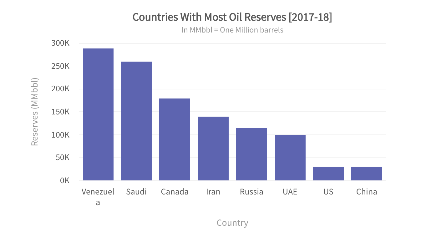
How Can I Create a Simple Chart in AngularJS?
A simple histogram-based chart is an ideal choice in situations where you have to do a comparative analysis of the subjects against specific parameters. Histograms give you a brief overview of your entire data pool. They also allow you to pull valuable insights from it.
FusionCharts has support for AngularJS, which is one of the pioneers in building single-page web applications. Using the FusionCharts library, you can easily create beautiful histogram-based visualizations in your applications.
Component JavaScript
var myApp = angular.module("myApp", ["ng-fusioncharts"]);
myApp.controller("MyController," ["$scope", function($scope){
    $scope.myDataSource = {
        "chart": {
            "caption": "Countries With Most Oil Reserves [2017-18]",
            "subCaption": "In MMbbl = One Million barrels",
            "xAxisName": "Country",
            "yAxisName": "Reserves (MMbbl)",
            "numberSuffix": "K",
            "theme": "fusion",
        },
        "data": [
            { "label": "Venezuela", "value": "290" },
            { "label": "Saudi", "value": "260" },
            { "label": "Canada", "value": "180" },
            { "label": "Iran", "value": "140" },
            { "label": "Russia", "value": "115" },
            { "label": "UAE", "value": "100" },
            { "label": "US", "value": "30" },
            { "label": "China", "value": "30"}
        ]
    };
}]);
Include the following dependencies in index.html.
<script type="text/javascript" src="https://cdnjs.cloudflare.com/ajax/libs/angular.js/1.7.2/angular.min.js"></script>
<script type="text/javascript" src="path/to/fusioncharts/fusioncharts.js"></script>
<script type="text/javascript" src="path/to/fusioncharts/themes/fusioncharts.theme.fusion.js"></script>
<script type="text/javascript" src="path/to/angularjs-fusioncharts.min.js"></script>
<link rel="stylesheet" href="path/to/fusioncharts/themes/fusioncharts.theme.fusion.css"/>
Component HTML
<div ng-app="myApp">
    <div ng-controller="MyController">
        <fusioncharts
            width="600"
            height="400"
            type="column2d"
            datasource="{{myDataSource}}">
        </fusioncharts>
    </div>
</div>
What is an Easy Way to Create a Time-Series Visualization in AngularJS?
Most of the enterprises in today’s agile world are interested in knowing the trends that their data follows over time. This is undoubtedly an important metric to watch out for because data changes rapidly and customer priorities shift frequently. Therefore, it is necessary to keep an eye on time-trending data using visualizations.
FusionCharts allows you to create amazing time-series visualizations that you can integrate into your already built AngularJS applications and monitor your data trends with time.
To build your histogram, just use the following code:
Component JavaScript
var jsonify = res => res.json();
  var dataFetch = fetch(
    'https://s3.eu-central-1.amazonaws.com/fusion.store/ft/data/area-chart-with-time-axis-data.json'
  ).then(jsonify);
  var schemaFetch = fetch(
    'https://s3.eu-central-1.amazonaws.com/fusion.store/ft/schema/area-chart-with-time-axis-schema.json'
  ).then(jsonify);
var myApp = angular.module("myApp", ["ng-fusioncharts"]);
  myApp.controller("MyController", ["$scope", function($scope){
    $scope.myDataSource = {
      data: null,
      chart: {
        showLegend: 0
      },
      caption: {
        text: 'Daily Visitors Count of a Website'
      },
      yAxis: [
        {
          plot: {
            value: 'Daily Visitors',
            type: 'area'
          },
          title: 'Daily Visitors (in thousand)'
        }
      ]
    };
Promise.all([dataFetch, schemaFetch]).then(res => {
      const data = res[0];
      const schema = res[1];
      const fusionTable = new FusionCharts.DataStore().createDataTable(
        data,
        schema
      );
      $scope.$apply(function() {
        $scope.myDataSource.data = fusionTable;
      });
    });
  }]);
Include the following dependencies in index.html.
<script type="text/javascript" src="https://cdnjs.cloudflare.com/ajax/libs/angular.js/1.7.2/angular.min.js"></script>
<script type="text/javascript" src="path/to/fusioncharts/fusioncharts.js"></script>
<script type="text/javascript" src="path/to/fusioncharts/themes/fusioncharts.theme.gammel.js"></script>
<script type="text/javascript" src="path/to/angularjs-fusioncharts.min.js"></script>
Component HTML
<div ng-app="myApp">
  <div ng-controller="MyController">
        <div id="chart-container">
            <!--To get the reference of chart instance listen to initialized event-->
                <fusioncharts
                  type="timeseries"
                  width="100%"
                  id="id1"
                  height=500
                  dataFormat="json"
                  datasource-dt="myDataSource">
                </fusioncharts>
        </div></br>
  </div>
</div>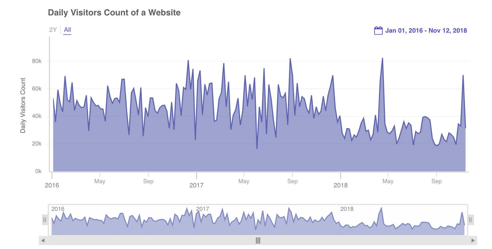
What is a Simple Way to Add a World Map in AngularJS with FusionCharts?
With the introduction of modern technologies, enterprises have started offering digital services worldwide. This allows them to scale and build a clientele from different parts of the world. These services generate a significant amount of data. and it is extremely important to monitor this distributed data to continuously provide top-of-the-line services to your clients.
FusionCharts allows you to create a world map visualization in AngularJS that can help you monitor this widespread data.
Component JavaScript
var myApp = angular.module("myApp", ["ng-fusioncharts"]);
myApp.controller("MyController", ["$scope", function($scope){
  // datasource
  $scope.myDataSource = {
    "chart": {
      "caption": "Average Annual Population Growth",
      "subcaption": " 1955-2015",
      "numbersuffix": "%",
      "includevalueinlabels": "1",
      "labelsepchar": ": ",
      "entityFillHoverColor": "#FFF9C4",
      "theme": "fusion"
    },
    "colorrange": {
      "minvalue": "0",
      "code": "#FFE0B2",
      "gradient": "1",
      "color": [

        {
          "minvalue": "0.5",
          "maxvalue": "1.0",
          "color": "#FFD74D"
        },
        {
          "minvalue": "1.0",
          "maxvalue": "2.0",
          "color": "#FB8C00"
        },
        {
          "minvalue": "2.0",
          "maxvalue": "3.0",
          "color": "#E65100"
        }
      ]
    },
    "data": [{
        "id": "NA",
        "value": ".82",
        "showLabel": "1"

      },
      {
        "id": "SA",
        "value": "2.04",
        "showLabel": "1"
      },
      {
        "id": "AS",
        "value": "1.78",
        "showLabel": "1"

      },
      {
        "id": "EU",
        "value": ".40",
        "showLabel": "1"
      },
      {
        "id": "AF",
        "value": "2.58",
        "showLabel": "1"
      },
      {
        "id": "AU",
        "value": "1.30",
        "showLabel": "1"
      }
    ]
  };
}]);
Include the following dependencies in index.html.
<script type="text/javascript" src="https://cdnjs.cloudflare.com/ajax/libs/angular.js/1.7.2/angular.min.js"></script>
<script type="text/javascript" src="path/to/fusioncharts/fusioncharts.js"></script>
<script type="text/javascript" src="path/to/fusioncharts/themes/fusioncharts.theme.fusion.js"></script>
<script type="text/javascript" src="path/to/angularjs-fusioncharts.min.js"></script>
<link rel="stylesheet" href="path/to/fusioncharts/themes/fusioncharts.theme.fusion.css"/>
Component HTML
<div ng-app="myApp">
  <div ng-controller="MyController">
    <fusioncharts
      type="world"
      width="800"
      height="400"
      dataFormat="json"
      dataSource="{{myDataSource}}">
    </fusioncharts>
  </div>
</div>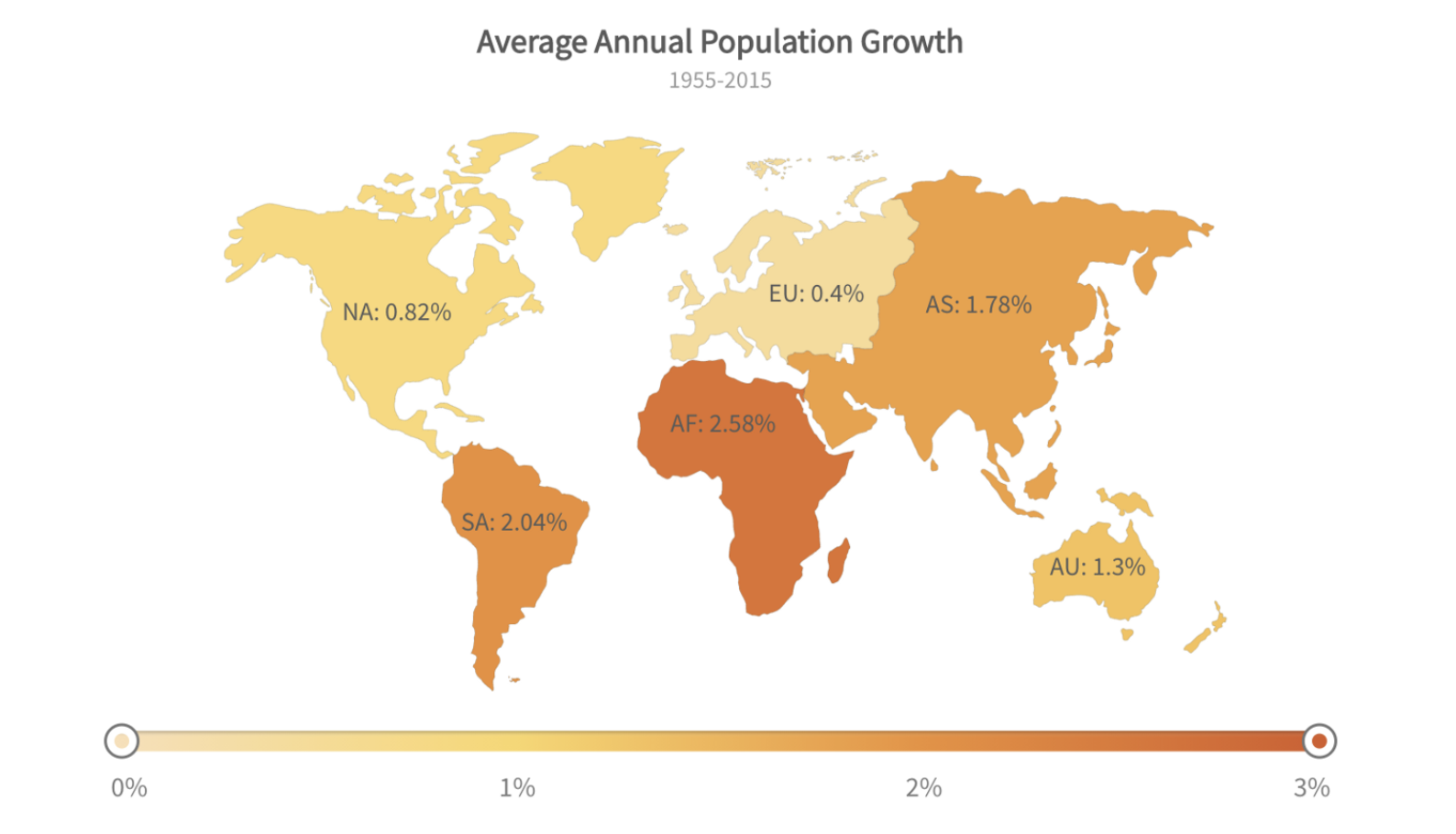
How Can I Create a 2D Pie Chart with FusionCharts?
Pie charts are frequently used in the visualization industry with an aim to facilitate quantifiable analysis. You can create 2D pie charts in your AngularJS applications using FusionCharts components easily and quickly. Take a look!
Component JavaScript
var myApp = angular.module("myApp", ["ng-fusioncharts"]);
myApp.controller("MyController", ["$scope", function($scope){
  var chart,
  clickedPlot;
  // datasource
  $scope.myDataSource = {
    "chart": {
      "caption": "Market Share of Web Servers",
      "plottooltext": "<b>$percentValue</b> of web servers run on $label servers",
      "showLegend": "0",
      "enableMultiSlicing": "0",
      "showPercentValues": "1",
      "legendPosition": "bottom",
      "useDataPlotColorForLabels": "1",
      "theme": "fusion",
    },
    "data": [{
      "label": "Apache",
      "value": "32647479"
    }, {
      "label": "Microsoft",
      "value": "22100932"
    }, {
      "label": "Zeus",
      "value": "14376"
    }, {
      "label": "Other",
      "value": "18674221"
    }]
  };
  // handler for daplotclick event
  $scope.plotClickHandler = function(event){
    $scope.$apply(function(){
      clickedPlot = (event.data.categoryLabel).toLowerCase();
      if ($scope.selectedItem !== clickedPlot) {
        $scope.selectedItem = clickedPlot;
      } else{
        $scope.selectedItem = 'none';
      }
    });
  };
  // handler for initialzed event
  $scope.initialized = function(chartObj){
    // store the reference of chart instance for further usage
    chart = chartObj;
  };
  $scope.selectedItem = "none";
  $scope.noneChecked = function(){
    chart.slicePlotItem(0,false);
    chart.slicePlotItem(1,false);
    chart.slicePlotItem(2,false);
    chart.slicePlotItem(3,false);
  }
  $scope.apacheChecked = function(){
    chart.slicePlotItem(0,true);
  }
  $scope.microsoftChecked = function(){
    chart.slicePlotItem(1,true);
  }
  $scope.zeusChecked = function(){
    chart.slicePlotItem(2,true);
  }
  $scope.otherChecked = function(){
    chart.slicePlotItem(3,true);
  }
}]);
Include the following dependencies in index.html.
<script type="text/javascript" src="https://cdnjs.cloudflare.com/ajax/libs/angular.js/1.7.2/angular.min.js"></script>
<script type="text/javascript" src="path/to/fusioncharts/fusioncharts.js"></script>
<script type="text/javascript" src="path/to/fusioncharts/themes/fusioncharts.theme.gammel.js"></script>
<script type="text/javascript" src="path/to/angularjs-fusioncharts.min.js"></script>
Component HTML
<div ng-app="myApp">
  <div ng-controller="MyController">
    <!--To get the reference of chart instance listen to initialized event-->
      <div>
          <fusioncharts
            type="pie2d"
            width="100%"
            height="500"
            dataFormat="json"
            initialized="initialized(chart)"
            fcevent-dataplotclick="plotClickHandler(event)"
            datasource="{{myDataSource}}">
          </fusioncharts>
      </div>
      <div style='position:relative;bottom:2px;text-align:center'>
          <div>
            <div>
              <input type="radio" value="none" id="none_button" ng-click="noneChecked()" ng-model="selectedItem"/>
              <label for="none_button">None</label>
            </div>
            <div>
                <input type="radio" value="apache" id="apache_button" ng-click="apacheChecked()" ng-model="selectedItem"/>
                <label for="apache_button">Apache</label>
            </div>
            <div>
                <input type="radio" value="microsoft" id="microsoft_button" ng-click="microsoftChecked()" ng-model="selectedItem"/>
                <label for="microsoft_button">Microsoft</label>
            </div>
            <div>
                <input type="radio" value="zeus" id="zeus_button" ng-click="zeusChecked()" ng-model="selectedItem"/>
                <label for="zeus_button">Zeus</label>
            </div>
            <div>
                <input type="radio" value="other" id="other_button" ng-click="otherChecked()" ng-model="selectedItem"/>
                <label for="other_button">Other</label>
            </div>
          </div>
      </div>
  </div>
</div>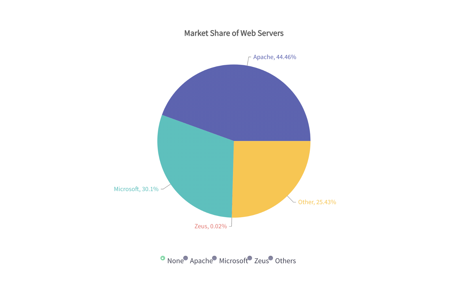
How Can I Add a Simple Gauge with FusionCharts in AngularJS?
Gauge-based visualizations are not frequently used in the visualization industry, however, they are very useful for visualization in selected cases. Undoubtedly, IoT applications and their data visualization modules are good candidates for gauge-based visualizations.
FusionCharts, integrated with AngularJS applications, is one of the easiest ways to implement gauge-based visualizations.
Component JavaScript
var myApp = angular.module("myApp", ["ng-fusioncharts"]);
myApp.controller("MyController", ["$scope", function($scope){
  // datasource
  $scope.myDataSource = {
    "chart": {
      "caption": "Nordstorm's Customer Satisfaction Score for 2017",
      "lowerLimit": "0",
      "upperLimit": "100",
      "showValue": "1",
      "numberSuffix": "%",
      "theme": "fusion",
      "showToolTip": "0"
    },
    "colorRange": {
      "color": [{
        "minValue": "0",
        "maxValue": "50",
        "code": "#F2726F"
      }, {
        "minValue": "50",
        "maxValue": "75",
        "code": "#FFC533"
      }, {
        "minValue": "75",
        "maxValue": "100",
        "code": "#62B58F"
      }]
    },
    "dials": {
      "dial": [{
        "value": "81"
      }]
    }
  };
}]);
Include the following dependencies in index.html.
<script type="text/javascript" src="https://cdnjs.cloudflare.com/ajax/libs/angular.js/1.7.2/angular.min.js"></script>
<script type="text/javascript" src="path/to/fusioncharts/fusioncharts.js"></script>
<script type="text/javascript" src="path/to/fusioncharts/themes/fusioncharts.theme.fusion.js"></script>
<script type="text/javascript" src="path/to/angularjs-fusioncharts.min.js"></script>
<link rel="stylesheet" href="path/to/fusioncharts/themes/fusioncharts.theme.fusion.css"/>
Component HTML
<div ng-app="myApp">
  <div ng-controller="MyController">
    <fusioncharts
      type="angulargauge"
      width="450"
      height="250"
      dataFormat="json"
      dataSource="{{myDataSource}}">
    </fusioncharts>
  </div>
</div>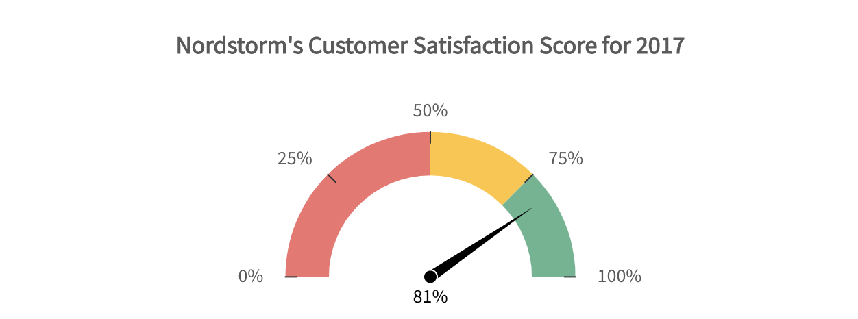
Source Code for FusionCharts in AngularJS and Demo
As you can see, AngularJS, in addition to FusionCharts, is an ideal choice for designing and developing your data visualizations. Apart from AngularJS, FusionCharts also supports a wide variety of bindings out of the box for Javascript, Angular 2+, React, jQuery, Vue.js, Ember, React Native, Svelte, ASP.NET, and PHP, in addition to Java, Ruby on Rails, and Django.
Let us know in the comment section below how you used FusionCharts with AngularJS to build beautiful visualization charts.
Download FusionCharts and get started today!
{
“@context”: “https://schema.org”,
“@type”: “FAQPage”,
“mainEntity”: [{
“@type”: “Question”,
“name”: “How Can I Create a Simple Chart in AngularJS?”,
“acceptedAnswer”: {
“@type”: “Answer”,
“text”: “A simple histogram-based chart is an ideal choice in situations where you have to do a comparative analysis of the subjects against specific parameters. Histograms give you a brief overview of your entire data pool. They also allow you to pull valuable insights from it.
FusionCharts has support for AngularJS, which is one of the pioneers in building single-page web applications. Using the FusionCharts library, you can easily create beautiful histogram-based visualizations in your applications.”
}
},{
“@type”: “Question”,
“name”: “What is an Easy Way to Create a Time-Series Visualization in AngularJS?”,
“acceptedAnswer”: {
“@type”: “Answer”,
“text”: “Most of the enterprises in today’s agile world are interested in knowing the trends that their data follows over time. This is undoubtedly an important metric to watch out for because data changes rapidly and customer priorities shift frequently. Therefore, it is necessary to keep an eye on time-trending data using visualizations.
FusionCharts allows you to create amazing time-series visualizations that you can integrate into your already built AngularJS applications and monitor your data trends with time.”
}
},{
“@type”: “Question”,
“name”: “What is a Simple Way to Add a World Map in AngularJS with FusionCharts?”,
“acceptedAnswer”: {
“@type”: “Answer”,
“text”: “With the introduction of modern technologies, enterprises have started offering digital services worldwide. This allows them to scale and build a clientele from different parts of the world. These services generate a significant amount of data. and it is extremely important to monitor this distributed data to continuously provide top-of-the-line services to your clients.
FusionCharts allows you to create a world map visualization in AngularJS that can help you monitor this widespread data.FusionCharts allows you to create amazing time-series visualizations that you can integrate into your already built AngularJS applications and monitor your data trends with time.”
}
},{
“@type”: “Question”,
“name”: “How Can I Create a 2D Pie Chart with FusionCharts?”,
“acceptedAnswer”: {
“@type”: “Answer”,
“text”: “Pie charts are frequently used in the visualization industry with an aim to facilitate quantifiable analysis. You can create 2D pie charts in your AngularJS applications using FusionCharts components easily and quickly.FusionCharts allows you to create a world map visualization in AngularJS that can help you monitor this widespread data.FusionCharts allows you to create amazing time-series visualizations that you can integrate into your already built AngularJS applications and monitor your data trends with time.”
}
},{
“@type”: “Question”,
“name”: “How Can I Add a Simple Gauge with FusionCharts in AngularJS?”,
“acceptedAnswer”: {
“@type”: “Answer”,
“text”: “Gauge-based visualizations are not frequently used in the visualization industry, however, they are very useful for visualization in selected cases. Undoubtedly, IoT applications and their data visualization modules are good candidates for gauge-based visualizations.
FusionCharts, integrated with AngularJS applications, is one of the easiest ways to implement gauge-based visualizations.”
}
}]
}


