
To present visually and aesthetically appealing data, you need live charts. Live charts are different from regular charts. They self update in real time without the user refreshing the page. In this post, we’ll look at some successful applications of live charts.
If you’re searching for a data visualization library that helps you create beautiful data presentations, the FusionCharts charting library is the way to go. Used by over 800k developers, the library is a popular data visualization tool for creating stunning, self-updating data presentations that self update in real-time.
Table of Contents
What are Live Charts?
Live charts automatically update their data at pre-established intervals. They are also referred to as real-time, or data streaming charts. They work by fetching data directly from your server without the user refreshing their browser.
What are the Types of Live Charts?
There are several types of real-time charts, including:
- Line Charts
- Area Charts
- Column Charts
- Stacked Area Charts
- Stacked Column Charts
- Dual Y-Axis Line Charts
Let’s take a look at each of them.
What are Line Charts?
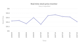
This type of live chart contains dependent and independent variables. Line Charts show how the dependent variable changes with the values of the independent variable.
What are Area Charts?
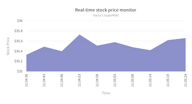
Like line charts, area charts also show changes in the dependent variable over time. An area covers the range.
What are Column Charts?
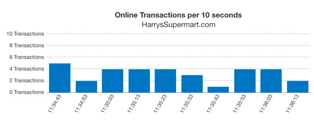
Column charts compare several variables and data values as they change over time. The columns cover the range.
What are Stacked Area Charts?
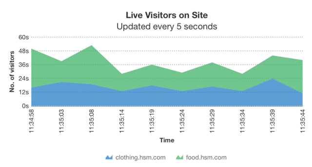
Stacked area charts combine multiple area charts stacked on each other. This type of live chart involves multiple datasets and updates automatically after a set interval.
What are Stacked Column Charts?
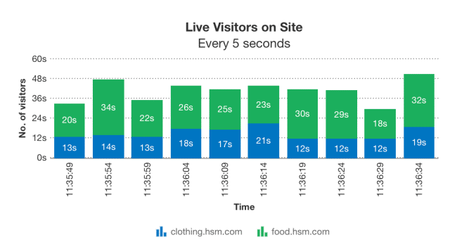
Stacked column charts compare different datasets from various categories. The range of change for each class is stacked and presented in a column.
Also, this chart updates itself automatically after a set interval to reflect real-time data variations.
What are Dual Y-Axis Line Charts?
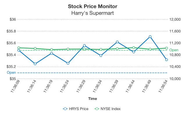
Dual-line charts contain two y-axes to compare how a pair of variables change together as time passes.
Examples of Successful Live Charts are?
Live charts present data in a consumable way. They have use cases in various fields: finance, education, stocks, and more. Here are some examples of successful live charts.
Investing.com (Area chart)
At Investing, you’ll find a real-time chart that shows thousands of instruments: shares, indices, commodities, currencies, ETFs, bonds, and futures.
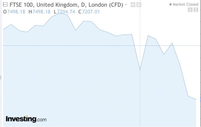
This chart updates and refreshes at intervals.
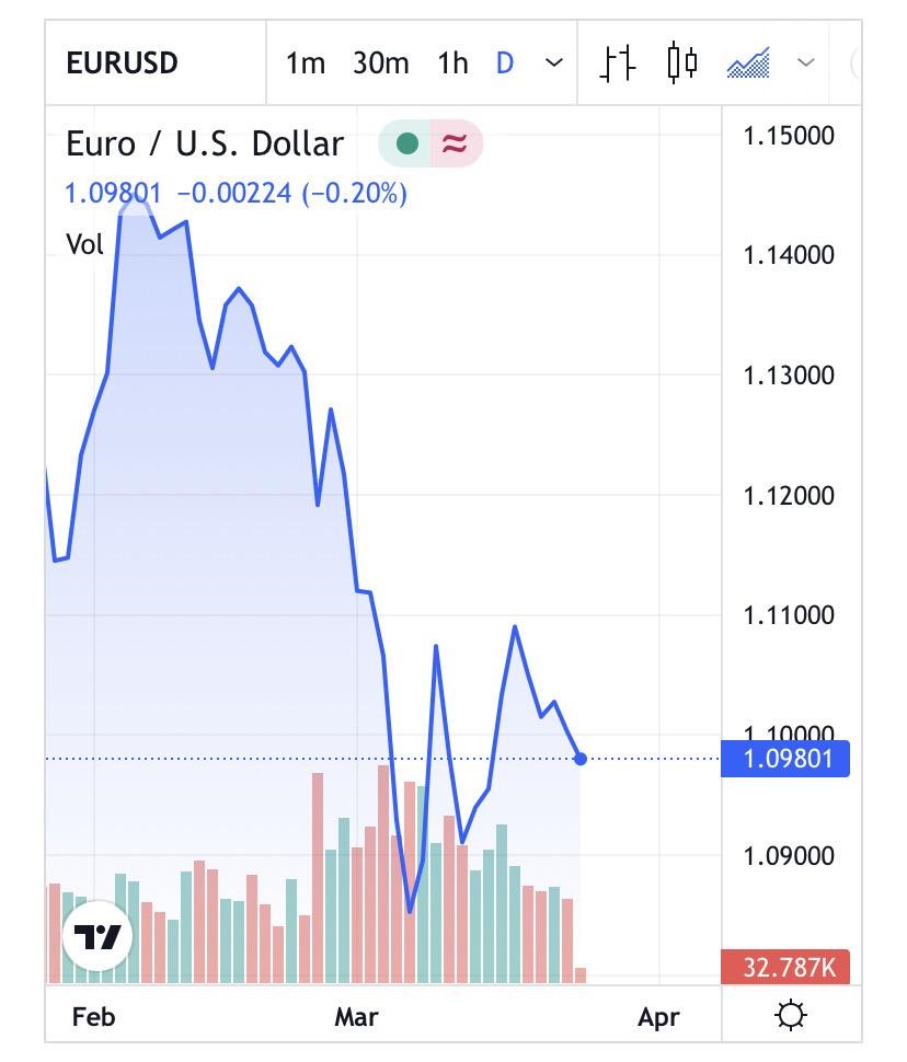
TradingView
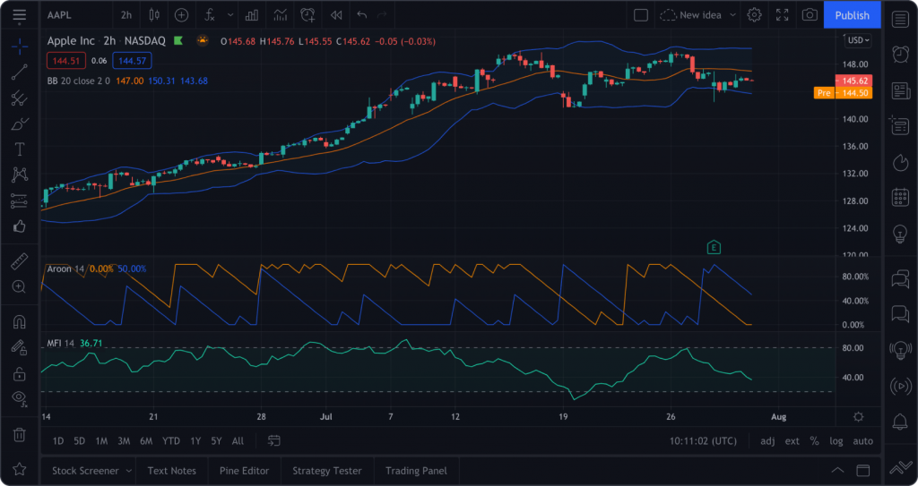
Another excellent example of live charts is TradingView.
The platform connects you to hundreds of real-time data feeds covering stocks, futures, significant indices, forex, Bitcoin, and CFDs. It is trusted by over 30M traders around the world.
Whether you want to predict stock market prices or set alerts for when your favorite crypto reaches an all-time high (ATH), TradingView live charts have you covered.
Yahoo Finance
The next example is the Yahoo Finance website, which boasts a real-time chart that tracks assets over time.
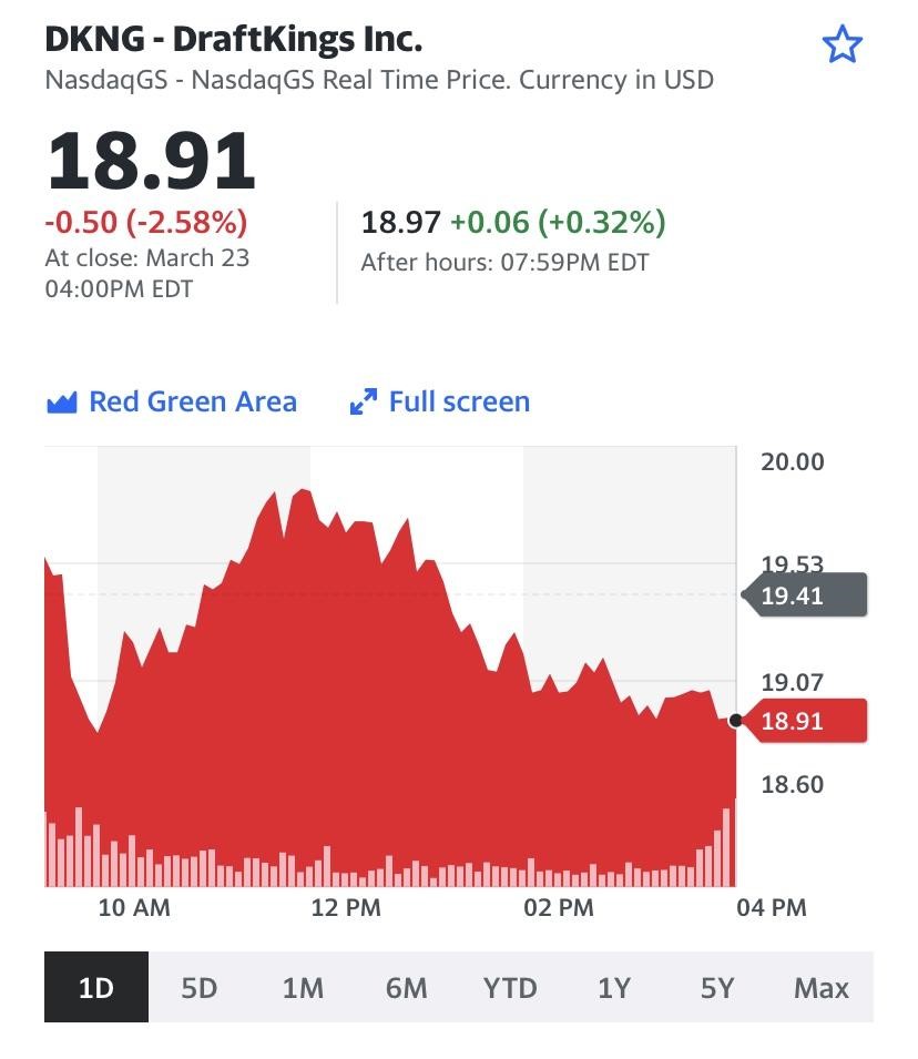
It uses an area and column chart hybrid to show the range over days, weeks, months, and years.
Coinbase
Coinbase is a platform that exists to build the crypto-economy. It enables a fair, accessible, efficient, and transparent financial system to securely invest, spend, save, earn, and use crypto.
They use self-updating, real-time line charts on their website to showcase the change in price of various crypto assets over time.
FXCM
FXCM incorporated live forex charts for various currency pairs and instruments on their website.
This line chart helps technical traders identify trends and analyze price points for market entry and exit.
How to Use Live Charts on FusionCharts?
Live charts are essential to present and visualize data. They offer a way to explain, consume and understand data easily. Whether you’re looking up the latest price for a particular stock asset or you want to monitor price patterns, live charts are handy.
And in this post, you’ve learned about the different types of live charts and seen real-life examples. FusionCharts is a beautiful JavaScript library for visualizing data. The library comes packed with many charts, graphs, and gauges as well as 2000+ choropleth maps.
On the feature side, you get an alert manager, real-time message logger, interactive legends, and context menus. With FusionCharts, you can create interactive, live charts and graphs that update themselves. Plus, it can easily handle millions of data points while updating your charts to give you a sense of exactly how your data varies.
You can sign up to FusionCharts today and join its client base of over 800K developers from 28K+ organizations globally. Start making the most out of your data – download the FusionCharts Suite XT trial for free today to get started.


