
Financial dashboards play a key role in the success of all small and large enterprises and organizations. This is because they provide a unified, holistic view of data related to different departments and areas of a business. As a result, managers can track and monitor key performance indicators. They can also view long-term trends and make strategic decisions to meet and exceed the financial goals of a company.
If you are looking to make the most out of your data visualizations, then read our list of seven most frequently asked questions about financial dashboards. All said, this blog will convince you that FusionCharts is the best JavaScript library for effective financial dashboards.
Table of Contents
1. What are Some Examples of Financial Dashboards?
Here are links to a few financial dashboards. You can click on each link for more details. You can also explore a more comprehensive list of different types of financial dashboards built using FusionCharts.
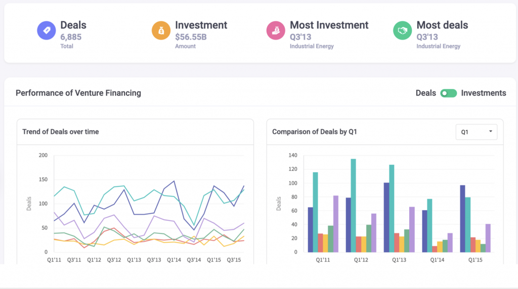
- Venture Financing Dashboard
- Wealth Management Dashboard
- Business Operation Monitoring Dashboard
- Investment Portfolio Dashboard
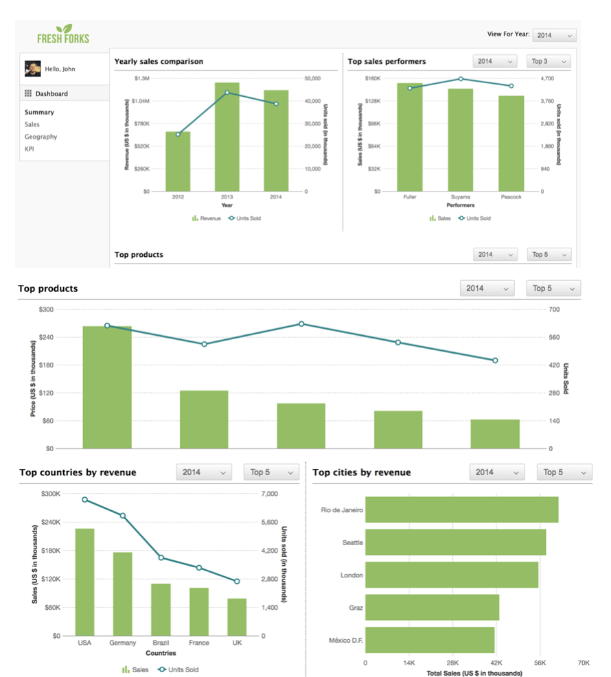
- Sales Opportunity Dashboard
- Marketing Dashboard
2. What Should be Included in a Financial Dashboard?
First, you should include all your key performance indicators (KPI) and metrics on your financial dashboard. It is best to have a separate chart or graph for all the important metrics. In addition, data values that require comparisons can be placed together on the same chart. Similarly, related metrics can be placed next to each other in different charts. Finally, depending upon the application you are building, you can also choose to add specific parameters. These include sales values, net profits, summaries of quarterly or yearly numbers, or cash inflows and outflows, and, finally, investment values.
FusionCharts allows you to define different data sources for the same dashboard. You can also easily set up your dashboard to display whichever metric or indicator you want your end user to see.
3. Which Device and Platform Should the Financial Dashboard Run On?
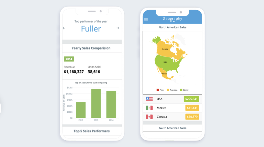
Your financial dashboard should run on all devices and operating systems. Moreover, your users should be able to access their dashboard for either a quick glance or a detailed perusal, anywhere at anytime. With FusionCharts specialized software, your financial dashboards can be viewed anywhere — in the office on a desktop device or at home using a mobile device. All charts and graphs are customized to run on all types of mobile devices. This includes phones and tablets running on iOS as well as Android.
4. Can Multiple Users Interact on a Financial Dashboard?
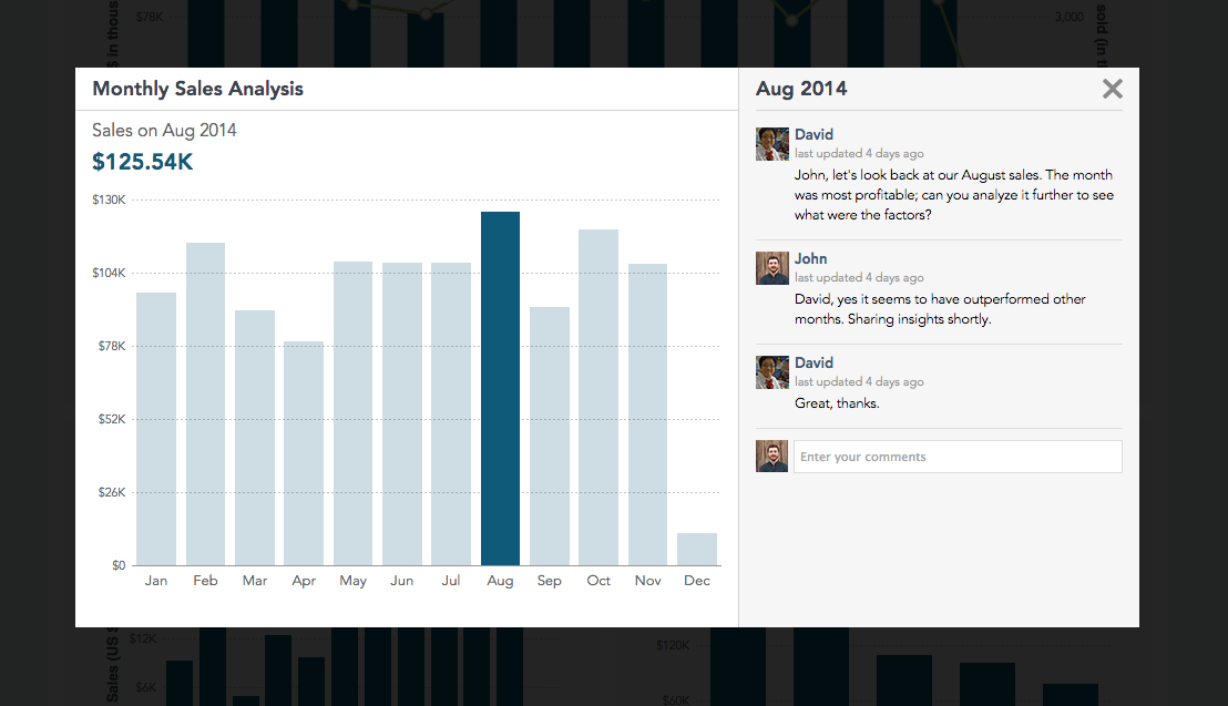
Yes, absolutely. Provided you are using FusionCharts, that is. This is because FusionCharts comes with a special collaborative editing feature that allows your users to review, comment on, and discuss your charts and graphs. This turns your financial dashboard into an interface similar to a social media platform — all your executives and managers can share opinions and views on the same chart and focus on fluctuating values or long-term trends.
5. How Often Should my Financial Dashboard Update Itself?
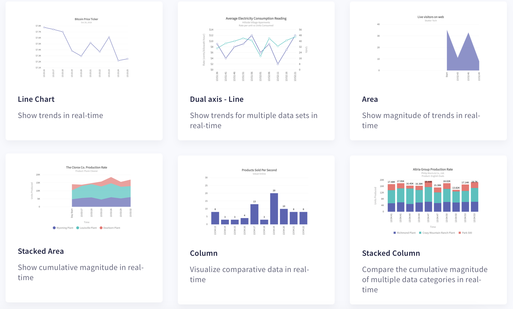
All financial dashboards should be dynamic entities that update in real-time without requiring page refreshes. Depending upon how critical your data is, you can also choose to update your dashboard daily, hourly or even every second. FusionCharts includes self updating charts, which are also called data streaming charts. These allow users to define a time interval after which they refresh themselves.
6. What are Drill-Downs and How Do They Add More Value To A Financial Dashboard?
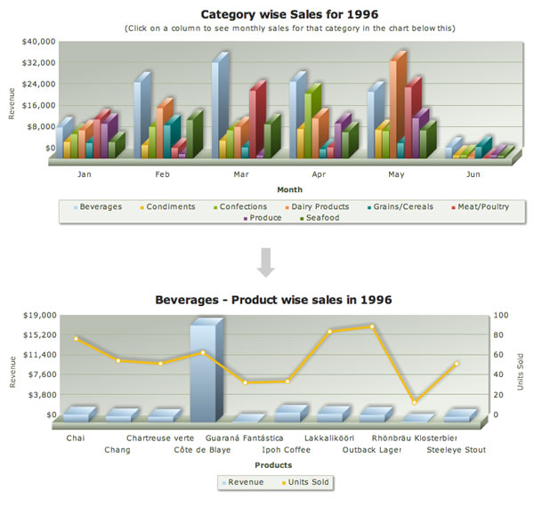
The drill-down feature, as its name suggests, transitions the financial dashboard interface from broader summaries to finer details. FusionCharts fully supports drill-down. It makes each data point a hot spot. This means you can customize the way it responds to user clicks on each hot spot. For example, clicking on a value that represents a weekly summary can open a more detailed chart that depicts your daily numbers. You can define your own drill-downs by adding popups or opening URLs in the same or a new window on a user click.
7. Which is the Best Tool to Create A Financial Dashboard and How Do I Make One?

FusionCharts is the best library for creating financial dashboards. With FusionCharts you can create beautiful and stunning data presentations. There are 100+ charts, gauges and graphs along with 2000+ choropleth maps that enrich your end users experience with engaging and effective data visualizations.
With FusionCharts, creating a financial dashboard is easy. You can browse through a list of business dashboards and select the one that matches closest to your requirements. FusionCharts provides the source code for each dashboard and you can download the code and easily customize it according to your needs.
The best thing is that FusionCharts can be integrated into your financial software developed using your favorite choice of platform. FusionCharts supports Java, JavaScript, React, Django, Svelte, Angular, and more.
How Do I Sign Up For FusionCharts?
Sign up for your free trial here!
FusionCharts is a beautiful data visualization library. It is now the first choice of over 28,000 individuals, organizations, and businesses across 118 countries, thanks to its simple and clean design, wide variety of charts and graphs, event handling capabilities, interactive and responsive interfaces, extensive documentation, cross-browser support, and more.
Make the most of your data. Start exploring FusionCharts today!


