
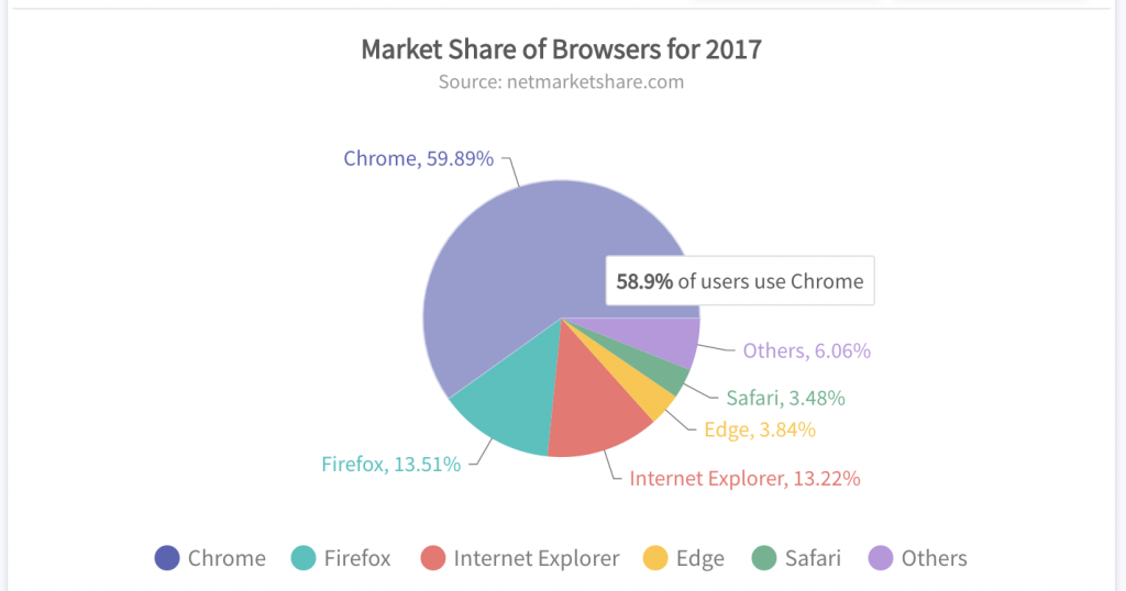
Data is powerful. There is no denying that understanding historical data empowers decision-makers to shape effective, strategic future plans. Unfortunately, massive amounts of data cannot be comprehended simply by glancing at numbers in a spreadsheet. That is where data visualization tools come to the rescue by presenting data in a clear, understandable manner. Data illustrations like charts and graphs give analysts a holistic view of long-term trends. They also illustrate the finer details of shorter trends and fluctuations.
Continue reading to find out how you can make the most of your data and your data visualization tool. This post will convince you why FusionCharts is the best choice for a charting and graphing library.
Table of Contents
Does your Charting Tool Have the Right Chart For your Data Visualizations?
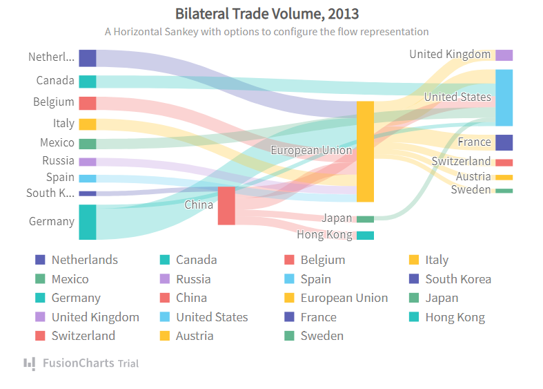
When it comes to designing a data visualization interface, choosing the right chart is one of the most important factors to consider. While all data visualization tools support common graphs like bar charts, line charts, and area graphs, FusionCharts provides specialized charts that most others don’t. These include Marimekko charts, spider charts, Sankey charts, waterfall charts, and, finally, chord charts.
Does your Data Visualization Tool Support Real-Time Updates?
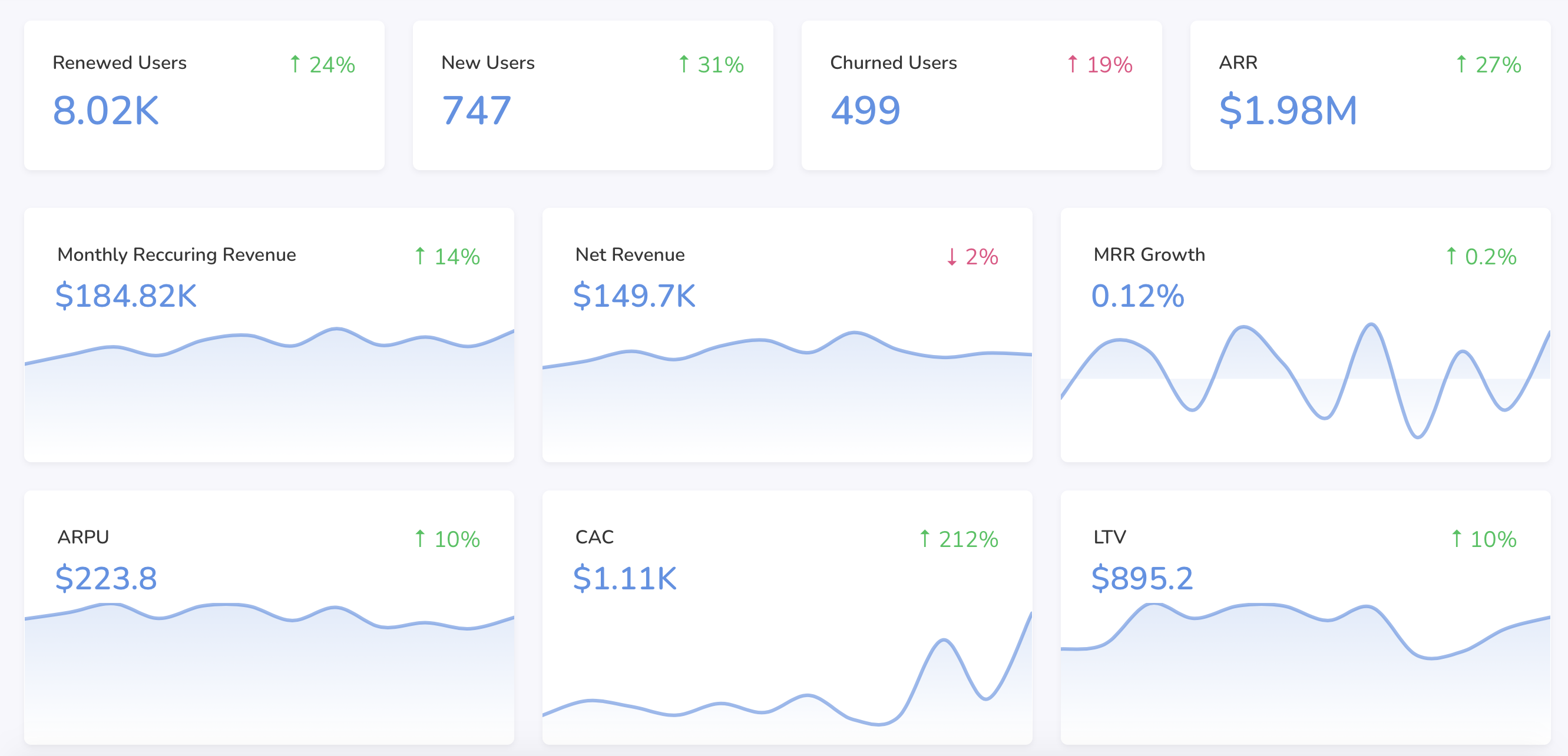
Data visualizations should not be static or fixed. All charts and graphs should be dynamic. This means they should update as their data updates. FusionCharts supports data streaming charts that refresh automatically after fixed intervals without requiring any web page refreshes. This way your users stay updated through any fluctuations or irregularities in usual trends.
Can You Add Drill-Downs To Your Charts?
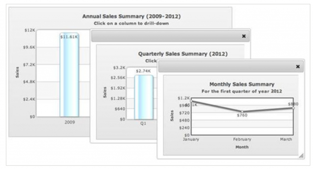
Drill-downs show users the finer details in charts. In FusionCharts, each data point can act as a hot spot. This means that clicking a data point opens up descendent charts to as many levels of data as your hierarchy requires. You can also customize your drill-down to either open a pop-up window or open a URL in the same or even a new window.
Can You Customize Your Charts Completely?
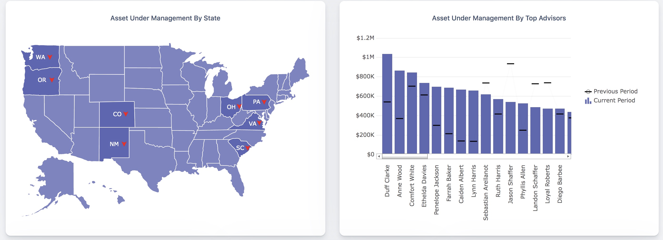
Adding more value to your data visualization interface, FusionCharts lets you customize everything, starting from your chart colors to text styles. You can also add your own axis labels, tick labels, legends, titles, and more. It all depends on your requirements.
Does your Data Visualization Tool Allow You to Handle User Interactions?
While many data visualization tools allow you to create different visualizations of data, very few allow developers to capture user events and write their own handlers. With FusionCharts all types of handlers for keyboard and mouse events can be defined and customized. You can also configure the actions related to data events like in-chart data loading or data fetching from the source. The ability to handle all types of events makes FusionCharts’ graphs and charts truly interactive and responsive.
Can You Access Data Visualization Anytime, Anywhere?
While many data visualization tools work on desktops or laptops, FusionCharts works on multiple devices. These include mobiles and also tablets. FusionCharts also supports all platforms like iOS and Android. You can easily create charts your users can view anytime on either a desktop computer in the office or on a mobile device at home.
Can You Export Your Charts and Graphs to Other Formats?
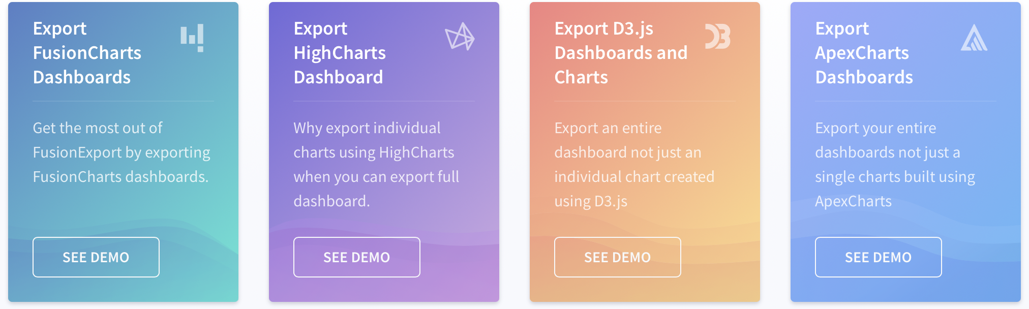
When you choose a data visualization tool, consider whether you can export your chart or graph to an image or pdf file. With FusionExport, you can save your chart or a snapshot of your business dashboard as jpg, png, or pdf. This allows you to share information through emails or other social media channels for viewing and discussion.
Does your Data Visualization Tool Support Collaborative Editing?
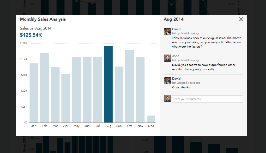
Collaborative editing lets multiple users comment on a chart or graph. With FusionCharts, executives and managers can comment on a data dashboard as the data and chart update in real-time. This gives your data visualization interface the look and feel of a social media platform. It will also keep your users engaged and focused on tracking and monitoring your indicators and metrics.
Where Can I Sign Up For FusionCharts
Interested in learning more? Sign up for a free trial here.
FusionCharts is the best data visualization tool out there. With superior data plotting capabilities, event handling, beautiful interfaces, and customizability as well as cross-platform support, and multiple device capabilities, FusionCharts is trusted by over 800,000 developers across 28,000 companies.
So think no more. Make the most of your data and start building effective, engaging and awesome data presentations. Begin exploring FusionCharts’ awesome features today.


