
Businesses today are producing data at previously unimaginable rates. Almost every step of the product life cycle generates information. From production to sales, businesses create data that they can later analyze to improve their bottom line.
Sounds great, right? It should, however, with all this data is a unique problem – the data is often unstructured. This means, at worst, it is almost useless. That it is challenging to make sense of manually, especially in real-time. That is why data analytics researchers are always on the lookout for solutions that can automate the process of data visualization like a powerful data visualization tool. In other words, their goal is to make real-time analytics accessible to everyone. By doing this, they can increase the usability of the data lakes most companies generate.
Table of Contents
What is Real-Time Data Visualization?
According to data visualization expert Edward Tufte, “Graphical excellence is that which gives to the viewer the greatest number of ideas in the shortest time with the least ink in the smallest space.” This is especially true when it applies to real-time data visualization. Also, it highlights the impact and importance of robust and constructive visualizations in the business domain.
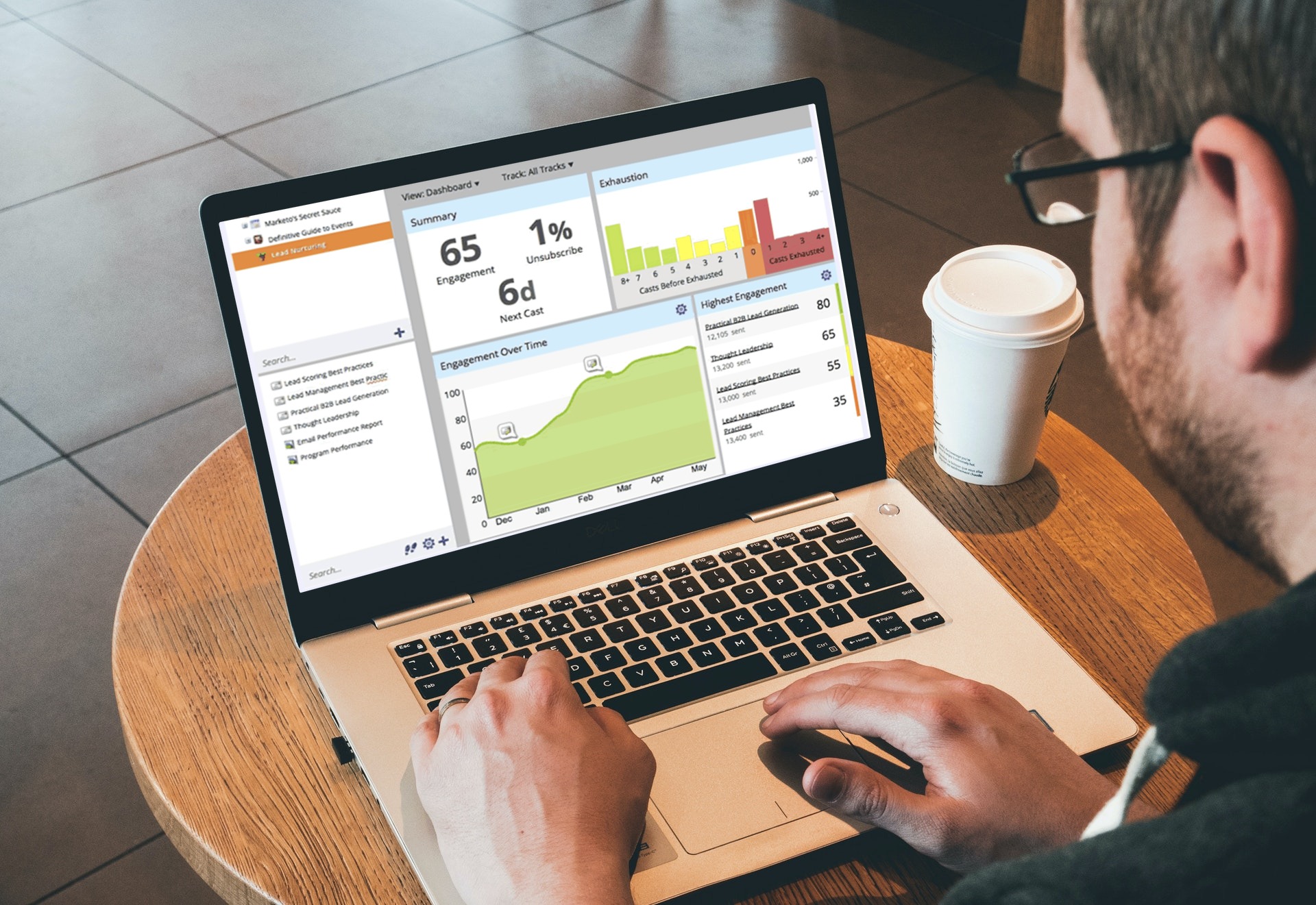
This blog post will look at the benefits of real-time data visualization and explore some elegant data analysis solutions that work best with real-time data. You can find out more of these ideas in “The Ultimate Guide to Real-time Data Visualization” whitepaper.
Why is Real-Time Data Visualization Important?

In the current data-driven world, real-time data visualization is an essential part of the business intelligence ecosystem. Emerging technological concepts include the internet of things (IoT), GPS navigation, automated marketing, social media monitoring, healthcare, and fintech demand real-time, analytical setups. These setups have the potential to serve as the catalysts to improved sales marketing efforts.
According to Gartner, three significant characteristics differentiate conventional data and real-time big data today. These characteristics are volume, velocity, and variety. Organizations must gear up to handle the big data revolution these concepts are driving. More specifically, organizations need to harness real-time business intelligence in a way that empowers their decisions.
How Can I Choose the Right Real-Time Charting Solution?
Real-time analytics is significantly different from conventional data analytics. With real-time analysis, data is primarily unstructured and continuous. Because of this, it demands special attention. To take advantage of real-time analytics, you must choose the right charting solution for your data.
Here are four factors to take into account while you design your real-time data charting solutions.
Update and Refresh Intervals
A real-time visualization component should be capable of extremely low update and refresh intervals. If the speed of your streaming data is faster than your visualization component can handle, your chart may not load or behave weirdly. The ideal solution is to have a visualization component that can handle extremely high volumes of streaming data with update and refresh intervals as short as one second.
Persistent Storing of Historical Data
It is a given that with real-time data visualization, you want to access your information instantly. But another critical requirement is how you view and analyze historical information. Efficient charting solutions should address this using a history buffer based on a particular number of historical data points or a historical time range. As a result, your historical data will facilitate richer analysis and contribute to more informed decisions.
A Large Number of Datasets
The volume of data social media monitoring apps capture is enormous. It takes tremendous processing power for a visualization component to keep up with the pace of social media updates. The ability to handle a large number of data datasets ensures that your heavy-data dashboard does not crash.
Timestamps for More Control
To avoid too much bandwidth consumption and network clogging, you should use a timestamp against the retrieved data. This allows the visualization component to receive updates and refresh at an appropriate rate. The result is more control over the performance of your application.
How Does Real-Time Analytics Work?

There are specific activities you should perform in a particular order to capture effective real-time analytics from continuous data. Here are the four steps critical to every real-time analytics pipeline:
- They will help you capture your live streaming data adequately. You can use various sources and methods such as scrapers, collectors, agents, listeners, and databases to collect high volumes of data.
- Also, you can process and refine your captured data before passing it on to the analytics phase. You can do various data processing using fault-tolerant, distributed database systems like Hadoop, HBase, Cassandra, and Storm.
- Create a structured data file using the correct format (JSON/XML)
- Pass the structured data to your visualization component to read and render a chart, gauge, or other visualization in your reporting interface.
What is the Future of Real-Time Data Visualization?

As mobile devices become even more pervasive, the amount of passively shared real-time data is going to change the way we live. Digital applications generate continuously rising volumes and velocities of data. With this in mind, companies that recognize the importance of capturing real-time insights will win the business intelligence race.
Companies like Fitbit and Sensaris lead the real-time data charge with wearable devices that track fitness and health. That said, we are just getting started with the potential of real-time data. There are plenty more cutting-edge advancements to come.
Click the link below if you are interested in real-time analytics and how it can take your data visualization to the next level.
Download FusionCharts’ “Ultimate Guide to Real-time Data Visualization” whitepaper to learn more.


