
Data visualization is one of the most important and effective mediums of communication in business today. Good visualizations explain complex and complicated stories with simple graphics, charts, and visuals. More importantly, they help organizations clarify and pinpoint business issues they need to resolve. This is because a well-designed visual has the capability to efficiently and economically communicate more information than a table or a raw piece of text. Simply put, visuals are more effective than tables at presenting data.
According to data visualization expert Edward Tufte, “Graphical excellence is that which gives to the viewer the greatest number of ideas in the shortest time with the least ink in the smallest space.” It is an excellent summary of the impact and importance of powerful and constructive visualizations in the business domain.
In this blog post, we’ll look at some data visualization principles that make your charting procedures more easily understood. For a more in-depth view, you can also check out our “Principles of Data Visualization — What We See in a Visual” whitepaper.
Table of Contents
Why is it Important to Create Impact by Solving Specific Problems?

Properly presenting data insights using visualizations is no small task. To be effective, your visualizations need to be simple yet comprehensive. Above all else, you need to be sure that you are telling the right data story to your audience. At their best, visuals are explanatory in nature — they direct their audience progressively along a defined path. Above all else, they need to provide valuable insights along the way.
One reason for this is that business-oriented visualizations have a significant impact on the way organizations communicate. Quality visualizations can help you with the following goals:
- Answer a question
- Support a decision
- Information communication
- Increase efficiency
How Can I Easily Explore and Better Understand Large Datasets?

While solving complex, real-world problems, you will most likely come across large, difficult to interpret, datasets. In this scenario, choosing the right visual exploration techniques to explore large datasets is critical. Exploratory visuals offer decision-makers new perspectives to visually explore and interrogate information — especially when comparing multiple datasets.
Modern exploratory data analysis techniques allow us to look at data with fresh eyes and:
- come up with new questions you should be asking.
- approach your data from a fresh perspective.
- discovering meaningful insights you might have missed.
How Do Long-Term and Working Memories Affect Visual Information?

An impactful visualization is one that correctly aligns with the way we process visual information. Correctly designed, visualizations affect our:
- Long-term memory
- Working memory
Long-term memory, or expectation, is what makes us expect the units to be marked off on the X and Y axes of a chart, or to find the date range selector at the top of a dashboard. We develop these long-term, memory-driven expectations due to our past experiences and interactions with user interfaces. In order to create impactful visualizations, your thought process must be inspired by how people think based on their long-term memory.
On the other hand, working memory is used to store temporary information. This is information that is relevant to us in the moment. This type of memory allows us to break large visuals into smaller chunks we can process more easily. To be effective a powerful and effective visualization must stimulate our working as well as long-term memory centers.
How Do Analytical Patterns Impact the Preattentive Attributes in Visualizations?

Generally speaking, we tend to prefer analytical patterns that intuitively help us make appropriate decisions for our businesses. This type of visualization plays upon our preattentive tendencies to seek out analytical patterns in what we are seeing.
For example, here are some familiar patterns and trends that most people instantly recognize and understand.
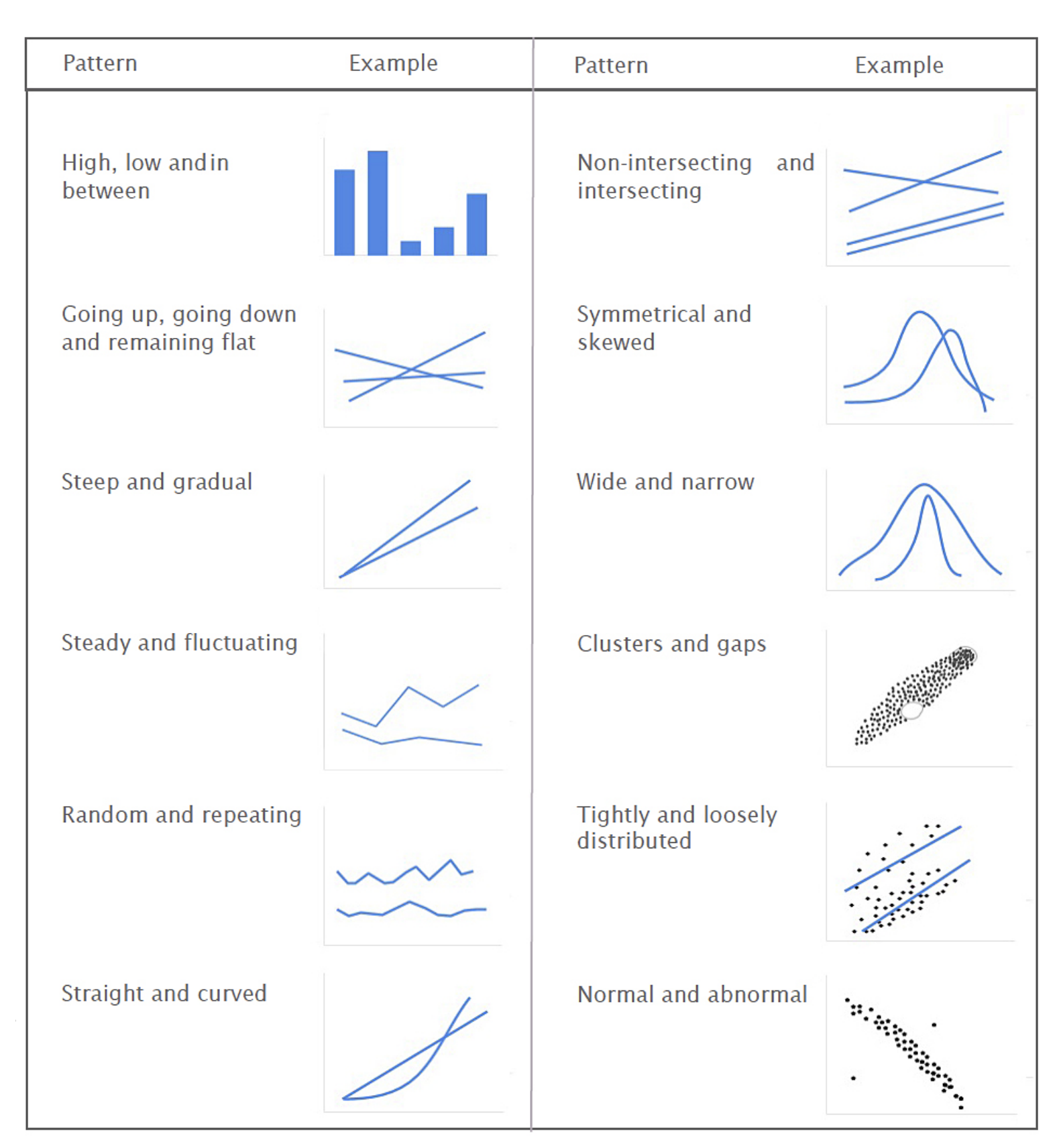
How Do Gestalt Principles Highlight Patterns in Visualizations?

Gestalt principles set the standard for creating visualizations that expose meaningful patterns. They describe how our minds organize individual visual elements into groups. We can also use these principles to highlight patterns that are important and downplay other patterns. Following are some of the key Gestalt principles for analytical patterns.
- Proximity
- Similarity
- Going up, going down, remaining flat
- Wide, narrow
- Tightly, loosely distributed
- Normal, abnormal
If you are interested in learning more about Gestalt principles and how they can take your data visualization to the next level, click the link below to get access to our recent white paper.
Download FusionCharts’ “Principles of Data Visualization” whitepaper for more insights.


