
A depth chart illustrates the supply and demand sides to show how much of an asset you can sell at a particular market price. It is a graphical representation of orders for a specific asset at various prices. A depth chart helps traders understand a trading pair’s overall supply and demand. Its graphical format offers easily recognizable cues as to the condition of the market. However, depth charts are useful in other fields, such as sports. This article will serve as a detailed guide on how to read depth charts, as we will go over their detailed definition, importance, components, and much more, which will help you get started with JavaScript charts.
Table of Contents
What Is A Depth Chart?
All the buy and sell orders on the platform are graphically represented in the depth chart. The X-Axis measures the price, while the Y-Axis measures the number of orders.
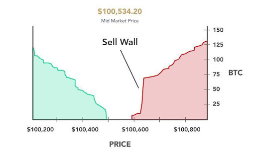
The green area on the left represents the lowest prices that customers are looking for. The red area on the right represents the highest prices sellers desire. The split represents the price levels from the most recent trade in the middle.
If you know about bubble charts, then it might be evident that, unlike them, in a depth chart, the combined value of the sell orders is distorted to match the left-axis dollar values. As a result, the x-axis values do not always display equal values despite being in the same currency. As a result, an investor or trader can perform technical analysis to learn more about the asset’s liquidity and volatility by comparing the values on the x-axis.
The x-axis should have values closely aligned with each other if demand and supply for the asset are roughly equal. The volume will be skewed to the right, forming a noticeable sell wall if the asset is highly liquid—more market participants are looking to sell it than buy it. The chart will be skewed to the left, forming a buy wall, if the asset is illiquid, meaning there is a greater demand than participants are willing to supply.
Why Understanding A Depth Chart Is Important?

It is a graphic representation of an order book or active buy and sell orders for an asset at various prices. For those interested in trading, understanding the market requires being able to read a Bitcoin depth chart.
Components Of A Depth Chart
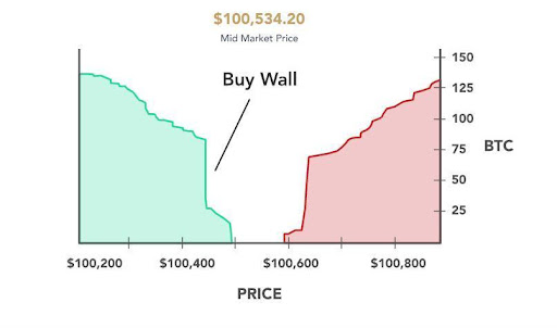
The “wall” is one of the Depth Chart’s distinguishing features. Walls, which denote price levels where the cumulative bid or ask value dramatically rises, can form on the buy or sell sides of the chart. This information is not visible on a typical price chart, but viewing the depth chart shows how other market participants respond to constantly shifting market conditions. On the price chart, walls formed throughout the trading session may later act as support or resistance.
Buy Wall
The left vertical axis (green) shows the cumulative value of the buy orders placed on Bullish at a given price point for a particular asset pair below its current market price.
Sell Wall
The right (red) side of the chart shows the cumulative value of the sell orders placed on Bullish at a given price point above the asset pair’s current market price.
Horizontal Axis
This axis represents the price points at which a buy and sell order is placed for a particular asset pair.
Vertical Axis
The vertical axes on both sides of the chart represent the total volume of an asset pair being bought and sold.
Price Range
With the “+” and “-” buttons at the top of the chart, you can narrow or widen the displayed price range. In addition, you can use the scrolling capabilities of your mouse or trackpad to zoom in and out of the chart.
Market Depth Indicator
This indicator provides visibility into order sizes expressed in the base currency of the asset pair, executed prices, and notional values across buys (in green) and sells (in red) when hovering over either side of the chart.
Market Depth Chart

Market depth in trading is the capacity of a market to withstand large orders without significantly affecting price. A security order book is typically used to determine market depth. Order books contain pending sell orders at various price points.
Market depth charts show data for a specific asset at various prices for the bid (buy) and ask (sell). This supply and demand visualization transforms order book data into a quick-to-read chart.
Anatomy of the Depth Chart
The Anatomy of the Depth Chart can be divided into three main sections: quotes, graph, and tooltip.
Quotes
The Quotes section at the top of the window presents various market data items. Dynamic values such as ask, last prices, bid, and the session’s open, high, low, and volume values are available here. By selecting “Show Quotes” from the context menu when you right-click on the Depth Chart, you can choose not to display the Quotes section.
Graph
The Depth Chart’s main display is the Graph. The vertical value at any point is the result of adding all active orders in the order book to the price value on the horizontal axis because it shows the cumulative buy and sell orders through the entire available book. To adjust the zoom level, focus on more recent prices, or zoom out to see the bigger picture, use the + and – buttons at the top of the chart.
Tooltip
The price level under the cursor, the cumulative order volume value associated with it, and the current cost of that cumulative volume are all displayed in the tooltip.
Knowing how much market participation is taking place in the markets you watch can be useful.
How To Read A Market Depth Chart
As you can see, there are many components of a Depth Chart. Each chart has several walls formed that make them difficult to read. Here are a few examples of market depth charts.
Buy Walls
“but walls” represent large numbers of buy orders and are typically placed below the current price point. More pending buy orders are at a given price when the buy wall is higher. High buy walls signify that market participants think an asset won’t drop below a specific price.
Sell Walls
Conversely, sell walls represent many sell orders set above the current price. High-sell walls may indicate that traders do not believe an asset will surpass a certain price, while low-sell walls indicate the opposite.
Bitcoin Depth Chart

If you know how to create a pie chart and how helpful it can be, you might even know that the Depth Chart can be used to understand the supply and demand for bitcoin at different prices. The demand and supply for bitcoin are measured in dollars and bitcoins, respectively.
How To Read A Bitcoin Depth Chart
You can read the bitcoin depth chart in the following manner:
The buy wall increases in proportion to the number of unfulfilled buy orders at a given price. Traders may believe the price will not fall below a particular level if there is a high buy wall. A significant buy wall keeps bitcoin prices from falling sharply by generating many buy orders at a single price.
Traders may be persuaded to sell an asset and make a profit right away, or to buy an asset and make more money over the long term if they see a large or expanding buy wall.
Buy Walls
The purchase wall increases proportionately to the number of unfulfilled buy orders at a given price. Traders may feel that the price will not fall below a particular level if there is a high buy wall. A significant purchase wall keeps bitcoin prices from falling sharply by generating many buy orders at a single price.
Traders may be persuaded to sell an asset and make a profit right away or to buy an asset and make more money over the long term if they notice a huge or expanding buy wall.
Sell Walls
The sell wall rises in proportion to the number of unfulfilled sell orders at a given price. A high sell wall might mean that many traders don’t think an asset will rise above a certain price, whereas a low sell wall might mean the asset’s price is anticipated to rise.
Because it generates numerous sell orders at a single price, a large sell wall prevents bitcoin prices from rising quickly. Traders may decide to sell and limit their losses if they notice a large or expanding sell wall because they may think the asset price will drop.
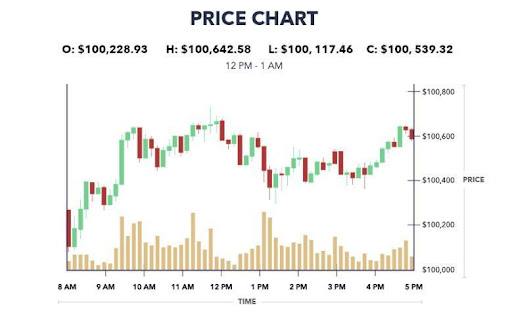
Candlestick Charts
With a depth chart, cryptocurrency exchanges frequently offer a second chart, a candlestick chart. A candlestick chart displays an asset’s price changes over a predetermined period.
The price changes between the open, close, high, and low are shown using candlestick figures on a candlestick chart, also referred to as a price chart.
The candlestick body, which represents the price movement over the predetermined period, is the primary element of a candlestick chart. The “real body,” or the widest portion of the candlestick, represents the dollar difference between the opening and closing prices. The thin, upper end of the candle’s “wick” represents the period’s high price, and the thin, lower end represents its low price.
Candlesticks are frequently colored green or red; a green candlestick indicates a price rise during that period, while a red candlestick denotes a decline.
Final Thoughts

Market depth in trading is the capacity of a market to withstand large orders without significantly affecting price. A security order book is typically used to determine market depth.
A depth chart is a graphic representation of an order book or the active buy and sell orders for an asset at various prices. Understanding the market and how to read a Bitcoin depth chart is crucial for those looking to trade.
Thinking about the impact of hidden liquidity when interpreting a market depth chart is crucial. For example, pending buy or sell offers that the depth chart hasn’t considered are hidden liquidity. This may impact the depth chart’s accuracy.
When working with depth charts, you should know about FusionCharts. Over 27,000 businesses and 750,000+ developers globally use FusionCharts, a JavaScript charting library for your web and enterprise applications. It turns all of your data into interactive dashboards that are meaningful. You can do so by using over 90 charts and more than 1000 maps. FusionCharts helps in the use of Google chart in JavaScript along with several other options. Moreover, depth charts can even be made using this platform. Furthermore, you can use FusionCharts more efficiently if you know about Fusion Exports.


