
Businesses today leverage data visualization tools, such as a JavaScript chart library, to enable users and stakeholders to analyze and gain insights into large data sets easily. These tools allow you to translate raw data into different visual contexts. One such context is a bubble chart. But what is a bubble chart? In a nutshell, it is a great charting method for analyzing three or more quantitative variables.
This article provides a complete guide to bubble charts. You’ll learn what bubble charts are, when to use them, and the best JavaScript chart library for producing these charts.
Table of Contents
What Is A Bubble Chart?
To help you create a mental image of what a bubble chart is, let’s create one with a small data sample. Below is a table containing three numeric parameters: Equities, Age of Investment, and Return on Investment (ROI),
| EQUITY | AGE OF INVESTMENT (YEARS) | RETURN ON INVESTMENT (%) |
| A | 6 | 100 |
| B | 1.5 | 20 |
| C | 4.5 | 75 |
| D | 7 | 70 |
| E | 8 | 20 |
If the objective is to determine the relationship between all three parameters, how can we do that effectively and quickly? A visual representation of the above data using a bubble chart in one of the best JavaScript chart libraries is shown below.
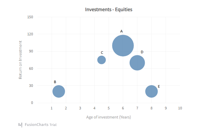
The X and Y axes denote Age of Investment and Return on Investment, respectively. The investment size is the third variable, represented by the bubble plot’s area. From the chart above, A has the largest ROI and the largest investment size as well.
Representing these variables in a bubble chart lets you infer not only for one equity, but also analyze relative to another using their distinct positions. This insight is only easily obtainable by visually examining the data through a bubble. It doesn’t end there; the bubble chart also allows for deeper analysis. Below is the same chart divided into four quadrants.
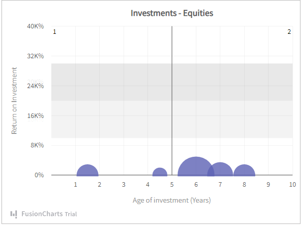
Quadrants
Depending on the parameters, each quadrant can represent different readings for you. For example:
- Quadrant 1 – Lucrative investments: High ROI in a short investment period. Depending on the type of equity, these quadrants are sometimes unsustainable.
- Quadrant 2 – Good investments: High ROI in a long investment period. Widely acceptable mode of investment. Making further investments in the equities in this quadrant wouldn’t be a bad idea.
- Quadrant 3 – Below average investments: Long investment period, yet low ROI. You wouldn’t want further investments in equities in this quadrant.
- Quadrant 4 – Average investments: Average ROI in a short investment period. Equities in this quadrant could be great for low short-term yields.
While this example uses only five equities, in reality, investments could be in the hundreds or thousands. In this case, mental divisions like this are very helpful in making informed business decisions.
You can access other bubble charts’ live examples in our chart gallery.
When Should You Use A Bubble Chart?
Scatter plots and bubble graphs are quite similar in that you can depict relationships between numeric variables using both. However, the addition of a bubble area allows for comparing the third variable. A bubble chart is best when the goal is to determine the relationship between three numeric variables.
It would require multiple scatter plots to gain the kind of insights possible with a bubble chart. Even then, gathering insights from multiple charts can result in a disjointed analysis.
Below are some bubble chart use cases:
- To determine the relationship between promotional expenses, footfall, and revenue for retail stores over time. You can represent the daily footfall and promotional expenses on the X-Axis and Y-Axis, respectively. At the same time, the plot area would denote a retail store’s revenue generated over a period of time. This chart can help determine the success or failure of store promotions.
- To determine the relationship between CPC, clicks, and conversions in PPC campaigns. A bubble chart represents a perfect way to check if increasing your ad spend on CPC leads to higher clicks and, ultimately, more conversions.
- Word Graphs. Businesses and marketing agencies could use Word Bubble Charts to identify the best keywords, tags, or hashtags. Examples include: identifying the most searched queries in a particular industry for 2022, or the most used hashtags in fashion and cosmetics on Instagram.
Which JavaScript Chart Library is Best For Creating Bubble Charts?
Now that you know what a bubble chart is, how can you create one, and what is the best solution for drawing bubble charts?
Firstly, you need to choose the right JavaScript chart library. There are numerous chart libraries, and selecting the right one for your project can get overwhelming. However, we’ve made this process by comparing FusionCharts, a leading JavaScript chart library, with other top libraries in the market. According to our research, FusionCharts comes out on top every time.
In this case, below is an example showing how you can create bubble charts using FusionCharts.
Here are the steps used in creating this chart:
- In the JSON data, set the attributes and their corresponding values in “<attributeName>”: “<value>” format.
- Specify the chart type using the type attribute. To render a bubble chart, set bubble.
- Set the container object using renderAt attribute.
- Specify the dimension of the chart using width and height attributes.
- Set the type of data (JSON/XML) you want to pass to the chart object using dataFormat attribute.
You can access this chart’s JSON format here.
Ready To Create Your Own Bubble Charts?
When it comes to data visualization, FusionCharts is ahead of the curve. Its unique combination of advanced features and ease of use makes it superior to other JavaScript chart libraries. With extensive customization capabilities, you can easily add your brand theme and feel to your charts.
Moreover, you can always turn to FusionCharts’ excellent support system and substantial documentation if you have any questions or have technical issues that need resolved.
Now that you know everything about bubble charts, download the FusionCharts XT Suite to get started.


