
Data visualization techniques aid in the comprehension of data. Graphs, charts, and dashboards not only help to illustrate current trends but also help to create data narratives. They also enable decision-makers to make critical future decisions. In this context, a graph maker is critical to how data is visualized, presented, and, most importantly, comprehended.
In this post, we will look at the vital role of the graph maker. Continue reading to learn more about the FusionCharts graph maker and the types of data presentations it creates. We’ll also demonstrate how to make simple line graphs, column, bar, area, bubble, and scatter graphs with FusionCharts.
If you’re specifically interested in scatter graphs, you might want to explore the FusionCharts Scatter Graph Maker or a powerful AI presentation maker for data presentations.
Table of Contents
What is a Graph Maker?
A graph maker is an automated tool for visualizing and plotting data. From tens of points to millions of numbers, a graph maker pictorially represents data to communicate an idea or message. Graph makers also help users understand current trends and make future decisions using charts and plots.
Is FusionCharts a Graph Maker?
Absolutely! FusionCharts is a Javascript library for creating charts, graphs, and dashboards. There are over 100+ charts, graphs, and gauges to choose from. It also ships with 2000+ choropleth maps, that you can use to visualize location-based data. FusionCharts can be a graph maker, allowing you to create various graphs, including scatter plot graphs. Additionally, you can use FusionCharts as an online scatter plot graph maker, enabling you to visualize data points in a scatter plot format.
Do I Need to Learn Coding to Use FusionCharts Graph Maker?
FusionCharts requires no special coding skills. All you need to do is put your data and chart configuration in a JSON object and you are good to go. There is almost no learning curve to the FusionCharts scatter graph maker.
What Chart Options are Present in the FusionCharts Graph Maker?
FusionCharts has a wide variety of charts and graphs to choose from depending upon your data.
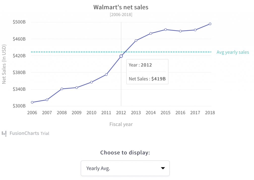
What are Line Charts?
Line charts, also known as line graphs or curve charts, are a fundamental type of data visualization used to show trends over time or another continuous variable. They excel at revealing changes and patterns in data points connected by straight-line segments. Line graph makers can be incredibly useful tools for creating these visualizations quickly and easily.
What are Area Charts?
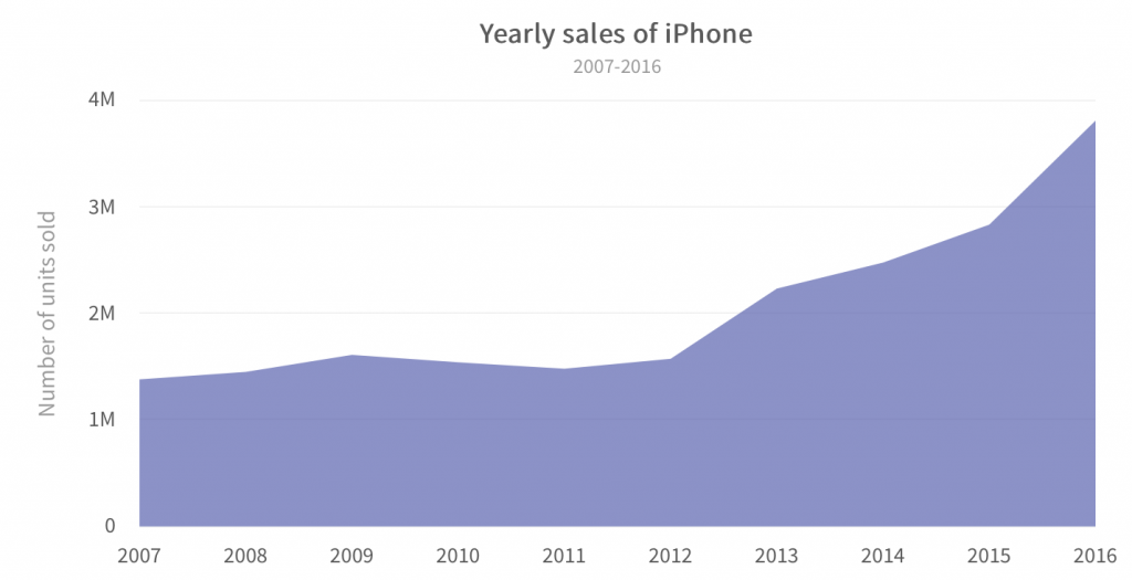
Area charts, sometimes referred to as area graphs, visually represent how volumes of data change over time. They create a shaded area beneath a line graph, highlighting the cumulative totals across different categories. This makes them ideal for showcasing how parts contribute to a whole over time. There are two main types of area charts: basic area charts and stacked area charts. These charts depict how volumes of data vary over time. They present a summation of data as it changes over time.
What are Bar Charts?
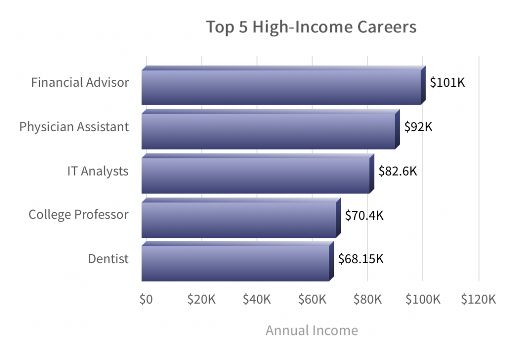
Bar charts, sometimes referred to as bar graphs, are another staple of data visualization. They’re ideal for comparing different categories of data that are not continuous. Bar charts compare different variables, including stacked bar charts.
What are Column Charts?
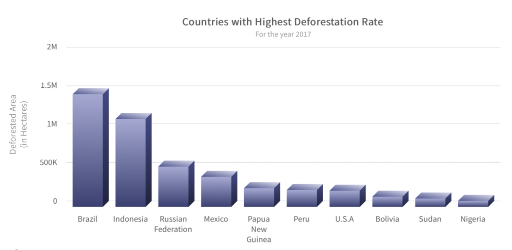
Column charts, sometimes referred to as vertical bar charts, are versatile tools for comparing data values across different categories. Each category is represented by a vertical rectangle or column, with the height of the column corresponding to the value it represents. This visual format makes it easy to see how data points within each category stack up against each other.
What are Bubble and Scatter Charts?
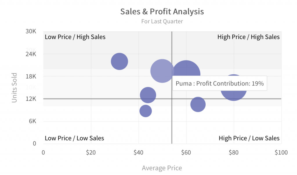
Bubble charts effectively demonstrate 3D data. You can analyze relationships between data values as well as gain insights over patterns and trends in your data. A scatter chart shows the relationship between two variables and how they vary with respect to each other. So, if you’re looking to create scatter graphs, you might consider using a scatter graph maker to easily plot and analyze your data.
Are There More Specialized Charts?
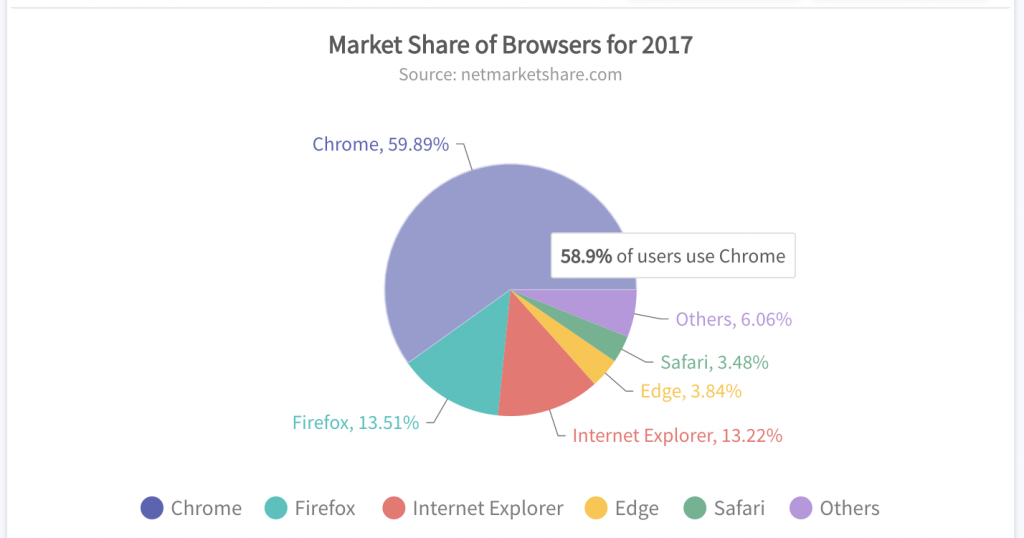
There is a comprehensive set of options for specialized charts that include pie and doughnut charts, stacked charts, combination charts, Pareto charts, Sankey charts, chord charts, market share charts, and more.
How Do I Make a Simple Line Chart?
Just to illustrate how simple and easy it is to create graphs and charts in FusionCharts, here is a simple example. The following is a line chart created using FusionCharts:
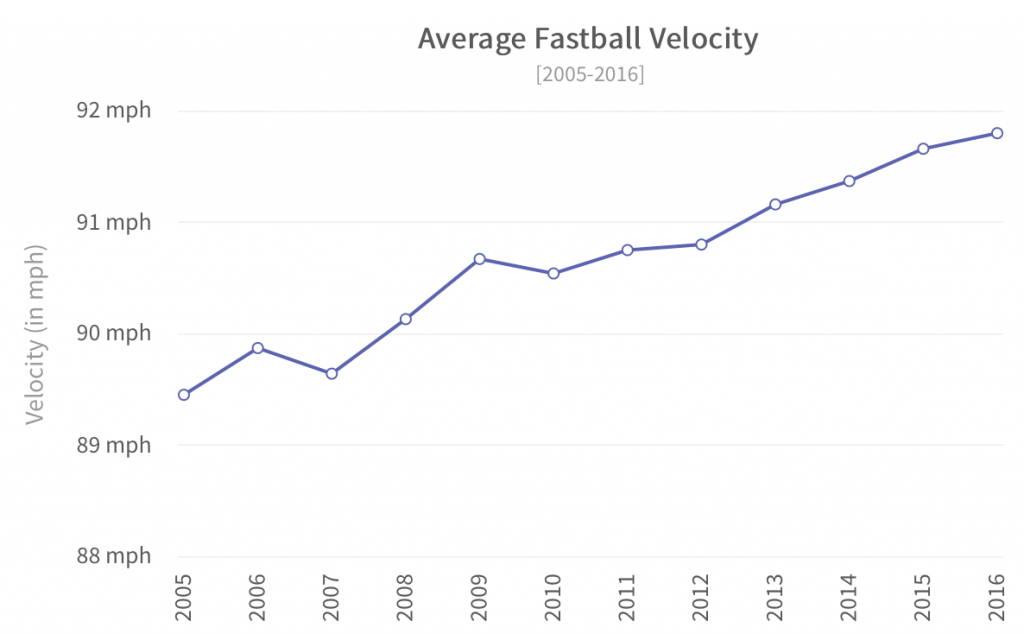
You can copy the code given below in a .html file and open it in your browser. All that you need in this HTML file is your data points and the graph configuration as JSON objects.
<html>
<head>
<title>FusionCharts</title>
<h1>My first Line Chart</h1>
<h2>With Awesome FusionCharts Library</h2>

<!-- Include fusioncharts core library -->
<script type="text/javascript" src="https://cdn.fusioncharts.com/fusioncharts/latest/fusioncharts.js"></script>
<!-- Include fusion theme -->
<script type="text/javascript" src="https://cdn.fusioncharts.com/fusioncharts/latest/themes/fusioncharts.theme.fusion.js"></script>
<script type="text/javascript">


const dataSource = {
  chart: {
    caption: "Average Fastball Velocity",
    yaxisname: "Velocity (in mph)",
    subcaption: "[2005-2016]",
    numbersuffix: " mph",
    rotatelabels: "1",
    setadaptiveymin: "1",
    theme: "fusion"
  },
  data: [
    {
      label: "2005",
      value: "89.45"
    },
    {
      label: "2006",
      value: "89.87"
    },
    {
      label: "2007",
      value: "89.64"
    },
    {
      label: "2008",
      value: "90.13"
    },
    {
      label: "2009",
      value: "90.67"
    },
    {
      label: "2010",
      value: "90.54"
    },
    {
      label: "2011",
      value: "90.75"
    },
    {
      label: "2012",
      value: "90.8"
    },
    {
      label: "2013",
      value: "91.16"
    },
    {
      label: "2014",
      value: "91.37"
    },
    {
      label: "2015",
      value: "91.66"
    },
    {
      label: "2016",
      value: "91.8"
    }
  ]
};

FusionCharts.ready(function() {
  var myChart = new FusionCharts({
    type: "line",
    renderAt: "chart-container",
    width: "100%",
    height: "100%",
    dataFormat: "json",
    dataSource
  }).render();
});

</script>
</head>
<body>
<div id="chart-container"></div>
</body>
</html>
Can The Graph Maker Facilitate Chart Updating In Real Time?
With FusionCharts you can create real-time or data streaming charts that can update themselves after user-specified intervals of time.
What Other FusionCharts Graph Maker Features Are There?
FusionCharts offers a wide variety of features listed below (this is not an exhaustive list). For more details, explore FusionCharts Suite XT.
What are Drill-Down Charts?
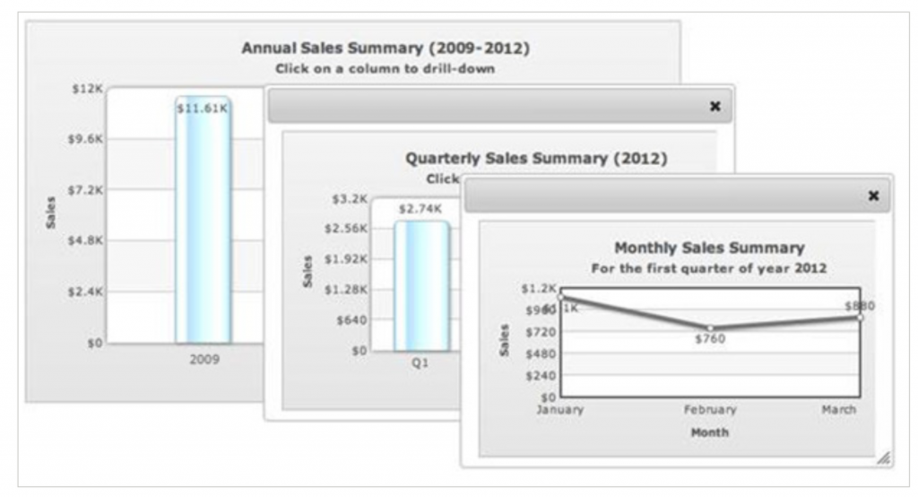
These charts let each data point act as a hot spot. You can choose to open a descendent chart with finer details in a new window or use pop-up windows on top of the parent window.
Can I Fully Customize Charts and Plots?
You can customize everything from titles, sub-titles, colors, labels, and more
What is FusionExport?
With FusionExport, you can export your dashboard, chart, or graph into an image file or pdf.
Can I Make All Charts Interactive and Responsive?
The FusionCharts graph maker creates graphs and plots that respond to all types of user interactions. You also have an option to customize this behavior by writing your own handler. If you need to create scatter graphs, you might consider using an online scatter graph maker.
Conclusion
So you’ve explored the world of graph makers and discovered FusionCharts! This powerful tool empowers anyone to create stunning data visualizations – from simple line charts to interactive dashboards. With a vast library of chart options, including scatter graph maker, real-time data updates, and extensive customization features, FusionCharts uncloses the hidden stories within your data. Sign up for your free trial today and see the difference clear, compelling data visualization can make!
How Can I Get Started With FusionCharts Graph Maker?
It’s time to switch over to FusionCharts graph maker! With a customer base of over 800,000 developers over 28,000 organizations, FusionCharts offers the most beautiful data visualizations consisting of interactive, responsive, dynamic, and data-driven graphs, charts, and maps. The best thing is that you can add FusionCharts visuals to any software developed in your choice of framework. Frameworks like JavaScript, Svelte, Angular, Java, React, Django and more.
Sign up for your free FusionCharts trial today!
FAQs
What is a Graph Maker?
A graph maker is a tool, website, or software program that helps you create visual data representations. These tools can range from simple chart generators to sophisticated software with various chart types, customization options, and data analysis features.
What are the 5 requirements for making an accurate graph?
- Clearly labeled axes
- Appropriate scale
- Accurate data points
- A clear distinction between data and design elements
- Proper data source citation
What is the website to create a scatter graph?
There are several scatter graph makers’ websites available online. One of them is FusionCharts, which offers a powerful and versatile solution for creating scatter graphs.
What are the rules we should follow when making a graph?
While making a graph, you should follow several rules mentioned below:
- The first one is to keep the graph simple. Focus on conveying the data clearly, avoiding unnecessary complexity or visual clutter.
- The second one is to choose the chart type (scatter plot, line graph, bar chart, etc.) that best represents the relationship between your variables.
- The third one is to use the same scale units for both axes whenever possible.
- Use clear and concise titles and labels.
- Last but not least, consider color and design thoughtfully.


