
As more and more developers turn to Svelte for creating web-based applications, building dashboards and interactive charts and maps are also increasing in popularity. Of the many different tools out there, one of the most popular is FusionCharts.
FusionCharts is a one-of-a-kind charting and graphing library that stands out for its efficiency, presentation, and usability. It is also compatible with a variety of development frameworks, including Svelte.
If you’re looking for the best platform for your business dashboards, data visualization, and presentations, keep reading to learn why the Svelte FusionCharts library is the best option for 2021.
In this post, you’ll learn more about the key features of the Svelte component, various Data Visualization Options, Adding Charts, and Getting Started on Svelte with FusionCharts Components.
Table of Contents
What Are The Key Features Of Svelte Component For FusionCharts?
The Svelte Component for FusionCharts creates stunning data presentations. Here are some of the key features of charts and graphs supported by the FusionCharts library:
Interactive and responsive
All charts are interactive and responsive. You can write event handlers for different events generated by the mouse and keyboard.
Panning, zooming, scrolling, and scaling
FusionCharts supports panning, zooming, and scaling. Your users can either zoom in on minor details or look at long-term data trends.
Real-time updates
Build charts that update in real-time. Your graphs and charts will give you a true picture of the current data at any time.
Add drill down to charts:
With FusionCharts your developers can add drill down to charts. Turn each data point into a hotspot. Your users can open a new descendant chart by simply clicking on a single data point to see more data and information related to it.
Annotations
All of our charts can be annotated. As the user slides their mouse pointer over a graph or chart, information about that part of the chart provides them with a more detailed, comprehensive view of the chart.
Customization options
You can customize FusionCharts’ Svelte charts for all types of devices including mobile phones and tablets. Every component of the chart like data point labels, axis labels, and captions can also be tailored to your application.
Efficiency
FusionCharts is efficient. Even if you have millions of points, you won’t have performance issues.
Export options
You can export FusionCharts graphs, maps, and charts to different formats including excel spreadsheets, png images, jpeg format, and PDF as well as many more.
What Are The Various Data Visualization Options With Svelte FusionCharts?
FusionCharts lets developers choose from over 100+ charts, graphs and gauges, and 2000+ choropleth maps. Depending upon the nature of data, you can create different visualizations using different charting methods like area charts, bar charts, and line charts as well as donut, Marimekko, radar, and stock charts. You can also integrate fully customizable, responsive, and interactive dashboards into your app. To top it all off, they can update in real-time.
How Do I Add Charts Using Svelte?
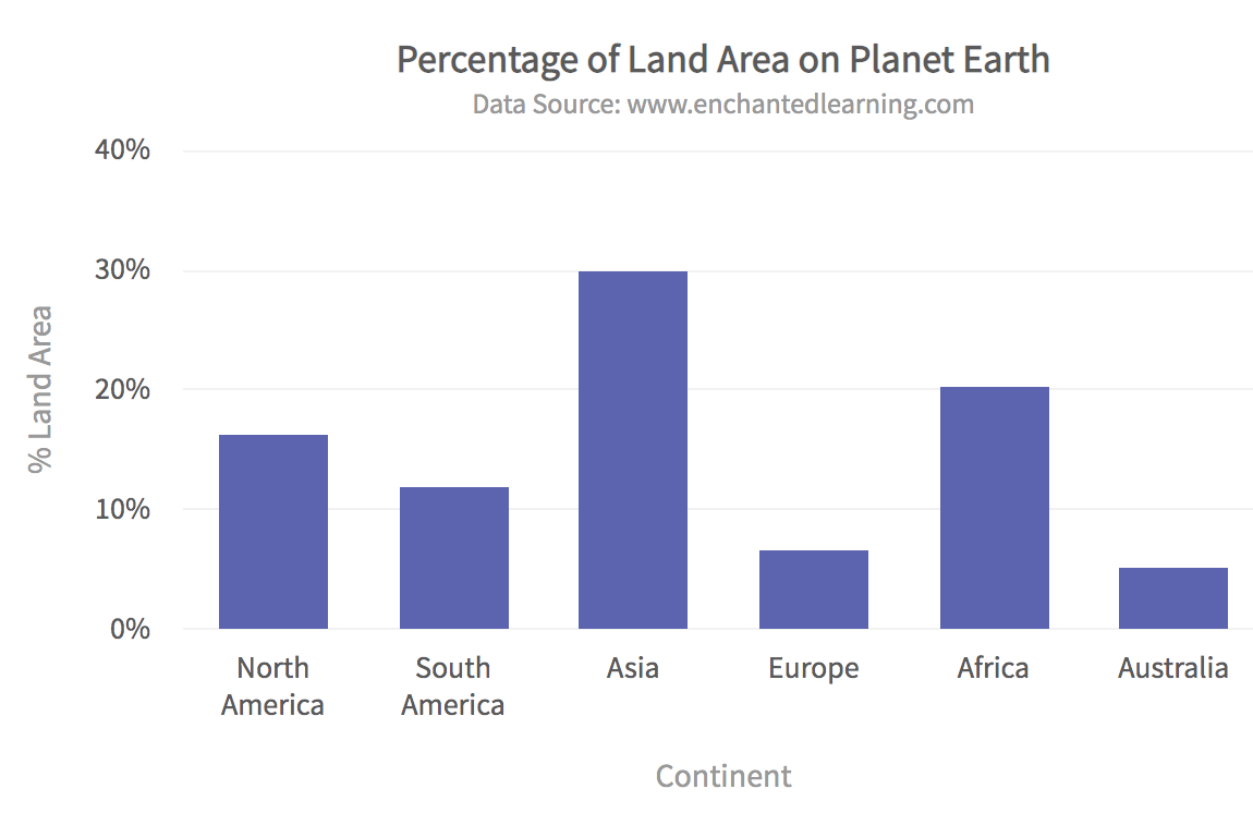
Adding charts, graphs, or maps using Svelte is easy. FusionCharts has consistent APIs for creating different types of charts and graphs. The code below shows how to add the following 2D column chart to Svelte using FusionCharts:
<script>
  import FusionCharts from 'fusioncharts';
  import Charts from 'fusioncharts/fusioncharts.charts';
  import FusionTheme from 'fusioncharts/themes/fusioncharts.theme.fusion';
  import SvelteFC, {fcRoot} from 'svelte-fusioncharts';
  import dataSource from './data.js';

  fcRoot(FusionCharts, Charts, FusionTheme);

  const chartConfigs = {
    type: 'column2d',
    width: '600',
    height: '400',
    dataFormat: 'json',
    dataSource
  };
</script>

<div id="container">
  <SvelteFC {...chartConfigs} />
</div>
The corresponding data.js file holds the data for rendering the chart:
export default {
    "chart": {
      "caption": "Percentage of Land Area on Planet Earth",
      "subCaption": "Data Source: www.enchantedlearning.com",
      "xAxisName": "Continent",
      "yAxisName": "% Land Area",
      "numberSuffix": "%",
      "theme": "fusion"
    },
    "data": [
    {
      id: "NA",
      label: "North America",
      value: "16.3",
      showLabel: "1"

    },
    {
      id: "SA",
      label: "South America",
      value: "12.0",
      showLabel: "1"
    },
    {
      id: "AS",
      label: "Asia",
      value: "30.0",
      showLabel: "1"
    },
    {
      id: "EU",
      label: "Europe",
      value: "6.7",
      showLabel: "1"
    },
    {
      id: "AF",
      label: "Africa",
      value: "20.3",
      showLabel: "1"
    },
    {
      id: "AU",
      label: "Australia",
      value: "5.2",
      showLabel: "1"
    }
  ]
  }
How Do I Get Started On Using Svelte FusionCharts Component?
Don’t miss out on the best charting library of 2021. With easy-to-use integration features, excellent documentation, plenty of tutorials, stunning visualizations, customizable components, and much more, the FusionCharts library is ready to use in Svelteand other popular frameworks. These include including Java, React, Javascript, and Python as well as Ruby on Rails, to name a few.
Why wait? Try the most popular charting library today!
Download the free trial today and make the most of your data now.


