
Pie charts are a very common element in mathematics. It has a lot of applications in programming and data science as well. Various programming languages have different methods for creating them. If you want to learn how to create a pie chart in JavaScript, this is the right article for you. Creating a JavaScript d3 pie chart is not a difficult process, and we will show you how to do it.
Table of Contents
What Are Pie Charts?
As we just mentioned, Pie charts can be thought of like a Pizza. They are a circular format visual representation of data. The data, for instance, can be your food expense for the month of January.
The pie chart is divided into multiple slices or sections that represent a fraction of the total sum of the data. And by just looking at the Pie Chart, you can relate the size of each section to the fraction of the total data it represents.
Take a look at the following values and the pie chart, which shows my food expenses for the year 2023:
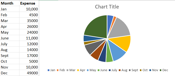
Let’s set aside judging my spending habits and take a look at how you are able to easily understand how much of the data points fall into each month. In addition to that, you can also quickly compare and get a basic understanding of the relative sizes of each month with the pie chart than just a table.
You might also find it useful to know that Pie charts are only one of the many data visualization forms in the line of line charts, bar charts, and donut charts. Check out this Step By Step Guide On What Are Charts to learn more.
Why Are Pie Charts Important?

A developer is creating a pie chart in JS. Let’s break down how Pie charts are useful with several benefits it offers for visualizing data:
Easy To Understand
Pie charts are an easy-to-understand method of displaying data since they are clear and basic. Without the need for intricate calculations, readers can quickly observe the relative proportions of various groups in a dataset.
Good For Comparing Proportions
Pie charts are very useful when comparing the relative sizes of several categories. It is simple to identify which categories are the largest and smallest as well as how they compare to one another by utilizing various colors or shading for each group.
Can Highlight Trends
You can use pie charts to show patterns and trends in data that have developed over time. Comparing pie charts from several time periods makes it simple to spot areas that are expanding or contracting. Therefore, it helps to decide where you should pay attention to.
Widely Used
Pie charts are a popular and widely used format for data visualization. This makes them an excellent option for reports and presentations. They can also be used to display a variety of facts and are easily recognized and readable.
Provide Context
Above all, pie charts are excellent for giving data context. They can demonstrate how several categories relate to one another and to the whole, enabling viewers to comprehend the importance of each category and its function within the larger dataset.
Creating Pie Charts With JavaScript
When we create Pie Charts with JavaScript, it’s much less hassle if we use a library or framework. This could provide us with the necessary tools and functions for generating pie charts. For example, FusionCharts, D3.js, Chart.js, and Highcharts are a few of the most popular JavaScript d3 pie chart.
In this section, you will get an idea of the general procedures for making a pie chart with JavaScript.
Choose a JavaScript Library or Framework
As we mentioned, choosing a JavaScript chart library would be great work off your shoulders. This is especially since libraries like such deliver the capabilities and functionality you need to generate the desired pie chart. It’s good news that you also have several options available, so make sure to look into each one to see which one best suits your requirements.
Load The Library or Framework
Once you know which library you need, you’ll need to include all the necessary files or scripts in your HTML file to load the library. You can find this information in the library’s documentation easily.
Prepare The Data
Not all data would be in the format you’re expecting – and if you do have such data, you are one lucky person. To format the data into something more appropriate, one thing you could try is creating an array or an object that represents the data you want to display in the chart.
Initialize The Chart
Once you know your chart data values are appropriate, you need to revisit the library’s documentation to use the right function or method to initialize the pie chart. You should also specify other parameters such as which data the function should use.
Configure The Chart
Now it’s time to customize. You can customize the chart’s appearance or behavior with various options such as colors, labels, and annotations. You can also go with the default values if you’re looking to generate a quick chart. This will help you to create a chart that looks and functions exactly the way you want it to.
Render The Chart
Finally, you need to render the chart in your HTML file. This will make sure your chart will generate and display in the place you wanted on your webpage.
Example Of Creating a Basic Pie Chart With The Chart.js Library
The Chart.js package is a well-liked choice if you want to make a pie chart with JavaScript. You can quickly create dynamic, interactive pie charts using Chart.js that will help you present your data in a visually appealing manner.
Here is an example of a simple pie chart made with Chart.js:
<canvas id="pie-chart"></canvas>
<script>
  // Load the Chart.js library
  var chart = document.createElement('script');
  chart.src = 'https://cdn.jsdelivr.net/npm/[email protected]/dist/Chart.min.js';
  chart.async = true;
  document.head.appendChild(chart);

  // Prepare the data
  var data = {
    labels: ['Apples', 'Bananas', 'Oranges'],
    datasets: [{
      data: [10, 20, 30],
      backgroundColor: ['#ff6384', '#36a2eb', '#cc65fe']
    }]
  };

  // Initialize the chart
  var ctx = document.getElementById('pie-chart').getContext('2d');
  var pieChart = new Chart(ctx, {
    type: 'pie',
    data: data
  });
</script>
Benefits Of Using JavaScript FusionCharts For Creating Pie Charts
The most important step in creating a pie chart is the first step – choosing a library. FusionCharts is a graphing and charting library. With FusionCharts, you can create meaningful, effective, and powerful data presentations.
As for creating pie charts with the JavaScript FusionChart, the following properties can help you decide if FusionCharts is a fit for you:
User-Friendly
JavaScript Fusion Charts provides a user-friendly interface that makes it easy to create pie charts, even for users with limited programming experience.
Customizable
JavaScript Fusion Charts provides a wide range of customization options, allowing you to create charts that match the look and feel of your website or application.
Interactive Charts
JavaScript Fusion Charts allows you to create interactive charts that can be interacted with by users. You can add features such as drill-downs, zooming, panning, and hover effects to charts to provide a more engaging user experience.
Cross-Platform Compatibility
JavaScript Fusion Charts is compatible with a wide range of platforms, such as web browsers, mobile devices, and server-side environments, making it a good choice for creating charts for websites and web applications.
Large Community
JavaScript Fusion Charts has a large and active community of developers and users, providing support, tutorials, and other resources to help you get the most out of the library.
High-Performance
JavaScript Fusion Charts is optimized for performance, providing fast and smooth chart rendering even for large datasets.
Common Use Cases For Pie Charts In Business And Data Analysis

If you are someone who works in business or data-oriented fields, the following are some common use cases of a pie chart in those contexts:
Distribution Of Data
Pie charts are useful for displaying the distribution of data in terms of relative proportions. You can often see them for showing the distribution of sales across different regions, product categories, or time periods.
Comparison Of Data
Pie charts are also effective for comparing data across different categories or groups. For example, you can use them to compare the sales of different products or the market share of different companies.
Budgeting And Financial Analysis
Pie charts can be used to represent the allocation of budget or expenses across different categories, such as operating expenses, marketing expenses, and capital expenditures.
Customer Demographics
Pie charts can be used to show the distribution of customer demographics, such as age, gender, or income. One can use this kind of information to target marketing campaigns and improve customer experience.
Market Research
Pie charts can be used to display the distribution of market research data, such as the results of a survey, the preferences of customers, or the opinions of stakeholders.
Sales Analysis
Pie charts can be used to analyze sales data, such as the distribution of sales across different regions, channels, or product categories. You can use this information to make informed business decisions, such as adjusting pricing, product offerings, or marketing strategies.
Explore More About Javascript Pie Chart With FusionCharts
To conclude this post, creating a pie chart with JavaScript is a simple and effective way to visually represent data in your web applications or websites. FusionCharts is a powerful JavaScript library that allows you to create customized, interactive, and high-performing pie charts with ease. With its user-friendly interface and extensive documentation, JavaScript FusionCharts is a great tool for both beginners and experienced developers alike.
Create Stunning Pie Charts in JavaScript with FusionCharts
Easily visualize your data with FusionCharts’ user-friendly interface and extensive customization options. Impress your audience with dynamic and interactive pie charts that make your data come alive. Try it now!
FAQs
What is a pie chart in JavaScript?
A JavaScript pie chart is a circular image with numerous slices. It’s useful to compare the proportional values of various categories.
Is JavaScript good for visualization?
JavaScript is excellent for visualizing information, especially when combined with libraries like FusionCharts, javascript pie chart, and Chart. js, and Plotly.
What are the types of pie charts?
There are 7 common types of pie charts. These include the Exploded pie diagram, Polar area diagram, Ring diagram, Spie diagram, Square diagram, 3D pie, and Doughnut charts.
How to make a chart in JavaScript?
You can create charts with FusionCharts JavaScript library in no time.


