
Apart from the common pie charts you are used to, there are different types of pie chart you should know. They’re similar in readability and functionality but mostly differ in aesthetics. Depending on your visual preference, they have similar use cases as normal pie charts. In this post, I’ll take you through the various types of a pie charts, when you should use them, and the best practices to follow.
Table of Contents
What Is A Pie Chart?
A pie chart is a circular chart divided into sections to visualize the part-whole relationship of data variables.
They are easy to create and used to show the distribution of a total quantity between various categorical variables.
The entire circle represents 100% of the total quantity. While each slice represents a categorical variable measured in angles of the full 360 degrees (central angle). The arc size and arc length of a pie chart shows how much of the total quantity that category occupies.
Pie charts are popular and widely used as an essential element in data-driven business analysis. But they are not suitable for every type of business and data presentation.
When Should Pie Charts Be Used Or Appropriate?
Pie charts have a limited use case and are unsuitable for every kind of data.
Here are some situations when you should strongly consider using a pie chart.
Unique Categories
When your data contains distinct numeric variables, it is best to create a pie chart.
In this case, each unique category would be represented by an arc of the circle graph.
And you can compare the contribution of each category to the entire quantity.
No Time Dimension
Unlike other data visualization types, a pie chart lacks the element to showcase the change in data over time.
An example is if you’re visualizing sales data for each department in a store and you also want to show sales by month.
It would be practically impossible to illustrate the proportions of the sales by month along with each category using a pie chart.
So if your data has a time dimension, a pie chart will not be appropriate for that situation.
Few Categories
A pie chart works best when your data set has a few components. The more variables in your data, the more slices you’ll have to create.
No one would find it easy to interpret what a pie chart displays if it has a ton of slices. So a pie chart would not be appropriate if you have plenty of categories. For example, if you are using a feedback form to collect data on your website and want to visualize customer satisfaction across different regions, you can use a pie chart.
Easy Visualization
A pie chart is suitable when you want to quickly show the amount each unique category contributes to the overall data.
A use case is when you want to show the total amount of energy generated from various energy sources; coal,
In this case, you can easily visualize the amount coal contributes to the total generation or which energy source contributes the least. Nne
Budget And Financial Planning
A pie chart is perfect for budgeting and planning your financial decisions.
You can visualize your income as a total and show each expenditure category as a section of the circle.
Through this, you’ll be able to make better financial decisions, track spending and maximize income.
Types of Pie Chart
There are several popular charts and graphs based on visual aesthetics and the dimension of the graph. Let’s take a look!
Donut Chart
Donut charts are pie chart variations, but the only difference is that the center is eliminated, making the chart literally resemble a donut.
Think of it as “a pie chart with a hole in the center.” The blank center of the donut chart is left empty or used to add labels and annotations.
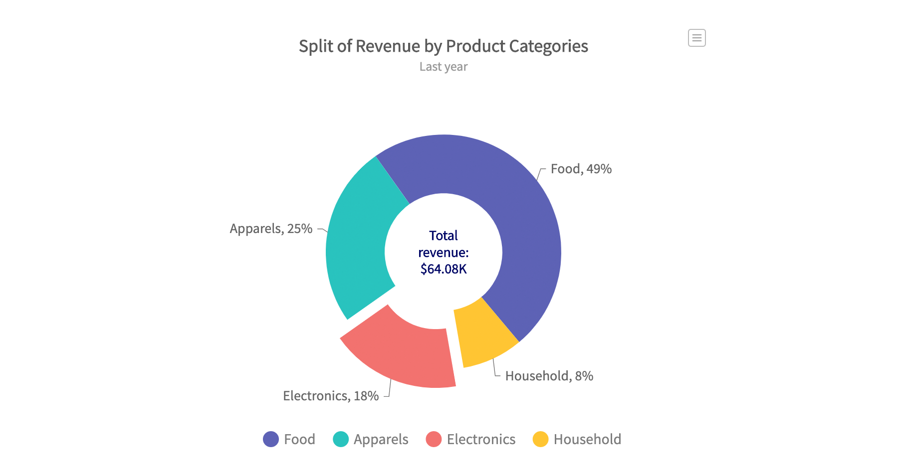
A donut chart has the same readability and practical use cases as a normal pie chart. They are mainly used based on aesthetic preferences.
However, donut charts could be cumbersome to read when interpreting different groups of data.
3D Pie Chart
A 3D pie chart is a 3-dimensional representation of a pie chart that visualizes data on the x, y, and z-axis.
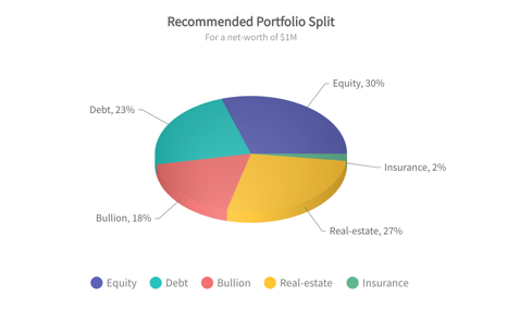
They are mostly used for aesthetic reasons and to make business presentations look cool. Its distorted form makes it challenging to interpret. 3D pie charts are of two types, namely, the simple 3D chart and the exploded 3D chart.
Exploded Pie Chart
This is one of the more common types of pie chart. An exploded pie chart forms when the different divisions are pulled apart from the center.
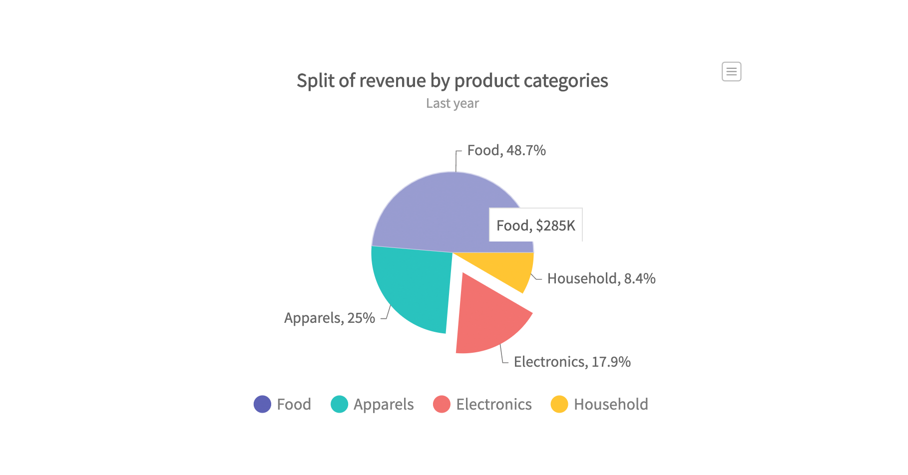
This is usually done to place emphasis on any or all variables in the pie chart. While this feature is great for aesthetics, it affects the overall readability of the graph.
Best Practices For Using A Pie Chart
Here are some best practices to follow when you want to create a readable, visually appealing pie and simple pie chart.
Add Annotations
Small fractions such as 1/2 (50%), 1/3 (33%), and 1/4 (25%) are usually easy to interpret on the main pie chart.
But when the percentage gets smaller, it becomes difficult to estimate proportions from pie charts.
This is where annotations and data labels come in. They are a best practice when creating a pie chart and serve as a guide to chart interpretation.
Data slices on your pie chart should be appropriately labeled with values, and you could also include an icon legend where possible.
Whether it’s a pie chart in Excel or a React pie chart, Annotations are a great inclusion and enable your audience to understand exact proportions.
Order Slices By Size
Ordering a circle chart by size is a surefire way to make it readable and visually better.
Typically, you should arrange the sections according to their contribution to the whole. A common order is to go anticlockwise from the largest slice at the right-top area to the smallest one.
To do this, add the largest slice at the top-right corner of the chart as a starting point. And from right to left, arrange each section in descending order according to size.
A good slice arrangement would make it easy for readers to visually interpret the pie graph.
Combine The Smaller Categories
A pie chart with hundreds of slices will be congested, and nobody wants to interpret that.
In cases where you have plenty of categorical variables, you should consider lumping small sections into one. The new parent category would be called ‘others’ and accurately labeled in the icon legend.
If you must visualize in a pie chart, merging slices is a best practice when you have many categories.
Common Pie Chart Alternatives
Here are some options to consider in cases where a regular pie chart doesn’t fit.
Absolute Frequency Vs. Relative Frequency
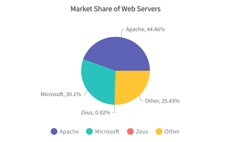
A pie chart is usually labeled with absolute values of the variable or relative numerical proportion in percentages.
But you could go a step further by adding the percentage proportions on each arc and labeling each category with the absolute value.
It is important to consider your visualization goals to decide which annotation style is best for your pie chart.
Bar Chart
Bar charts are considered the closest competitor to pie charts. They are used to visualize categorical variables as bars of varying lengths and compare them.
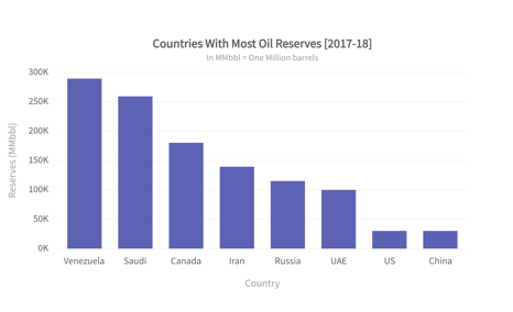
Bar charts are suitable for precise comparison between multiple categories and can be used as an alternative to a pie chart.
Stacked Bar Chart
Stacked bar charts illustrate a part-to-whole relationship between different categories of a total value.
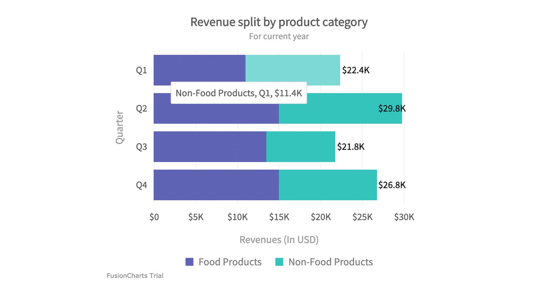
You can liken it to having slices of a pie chart forged into rectangular bars.
A stacked bar chart makes a close alternative to a pie chart and can fit into most use cases. However, they are not widely used.
Waffle Chart
Also known as square charts or square pies, Waffle charts are rendered as a 10 x 10 grid containing 100 little icons. Each icon in the grid represents 1% of the whole quantity and is colored based on the category they represent.
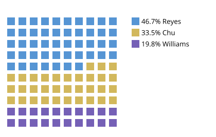
As an alternative to pie charts, waffle charts make it easy for relative categorical proportions to be read.
Conclusion
Pie charts are undoubtedly great for visualization. They are perfect for illustrating the part-to-whole relationship. While the types of pie chart discussed in this article may be new to you, they represent the same data type similarly. For example, donut charts, 3D pie charts, and exploded pie charts.
Depending on your use case or aesthetic preference, you could explore any of these chart types to visually tell the story behind your data on your next visualization assignment.
Ready to include pie chart variation in your project? With over 200 chart examples and templates, Fusioncharts can help you get started. Download a trial today


