
If you are having a hard time trying to make sense of the data you have at your disposal, let me tell you something. You are not alone! In this time and age, the overabundance of data can be daunting. And, creating data charts is a great way to make such raw data into a digestible graphical representation. This can be data as small as just profit values within a year or as large as a list of customer information on e-commerce. So, if you are looking to make sense of data, this post about what are charts and how you can do them yourself is for you!
Table of Contents
What Are Charts?
It’s most likely you have heard what a chart is. It can be as simple as a pie chart with all your household expenses for the last month or as complex as those in trading forecasts. Either way, a chart is simply a way of looking at your data in a way that makes it easier to understand, remember and interpret.
Let’s say, you revolve around the world of trading. A chart in that context would visualize the prices of stocks, currencies, and other financial instruments. This way, you can get a clear picture of the insights on a daily, weekly, or intraday basis. By looking at all this, you can predict a price movement, perhaps. This can help you make very important trading decisions such as investing your money in a Facebook stock or not! (tip: you probably should if that’s what the chart says!)
It is quite fascinating, isn’t it? Well, it only gets better from here.
Why Are Charts Important?
As we already mentioned, charts make your life easier because they only make sense out of a bunch of complex data. This can, for example, be a lifesaver if you are a business person and you need the numbers your manager just yelled at you into beautiful and human-understandable charts. Now, your manager and yourself can make more informed decisions quickly.
We just spoke about forecasting in trades. And, the charts in forecasting typically help people show changes over time. This can reveal what we call a “trend”. A trend is a fancy word for a pattern in data. Trend lines on a chart can indicate whether the Facebook stock you are about to invest in is going to be a good idea or not.
Okay, now you just hit a great profit in stocks and you want to share it with your friends. Assuming your friend is not from a background in trading, how do you explain it to them? The charts speak on behalf of you! They can help your friend remember the information and convey a great deal of the data quickly.
How Are Charts Used?
Charts are particularly useful when you want your audience to remember the correlation between two or more pieces of data and you need to effectively explain it.
We previously spoke about how charts would be useful in a variety of contexts like trading and business presentations. But, the limits of chart usage are basically limitless! Here are some fields and industries you can find the usage of charts:
- The healthcare industry revolves around patients and what’s an organization without proper patient tracking? Charts, here, mean patient data, lab results, vital signs, treatment effectiveness, and much more.
- Apart from the healthcare industry, science itself requires the need to present and analyze data in important areas like geology or biology.
- A football match without a scoreboard is a like a party without snacks. And charts make the match as fun as a party using scoreboards, team standings, and player statistics!
These are only a few of the many examples where charts are useful because they are a highly-versatile tool. Let’s take a look at the different forms of charts.
Types of charts
This section will run down 16 types of charts starting off from a simple line chart to more complex ones.
Line Chart
This is known as the most basic type of chart. You might see a line chart to often express a progression of something over time or with some continuous data, eg. the price of an egg over a 10-year period. Might I add – it could probably be the steepest line chart you would have seen?
A line chart is constructed using a series of data points with a line connecting all of them. This can reveal any potential trends in the data. Moreover, when there are data with only closing data and little to no opening data, line charts can be useful. For example, when you track trading data on an intraday basis.
Bar chart
A bar or a column chart shares a lot in common with line charts but unlike line charts, they can display open data points. Bar charts have data on display in rectangular bars. Each bar represents each data point. These bar graphs are appropriate in business or finance contexts because of the use of visually appealing colors that can be used on them.
Candlestick chart

In the financial markets, especially the stock and commodity markets, candlestick charts are a common style of chart. Similar to bar charts, they also display data on the open, close, high, and low prices for the period being tracked as well as the asset being displayed. The “true body” of each “candlestick” represents the open and closed prices, while the “shadows” stand in for the high and low prices for a specific time period, such as a day or a week. If the price closes higher or lower than the opening price, it can be determined by the color of the real body.
Point-and-figure charts
These are the kind of charts you can use to track the price change of a product. They do not typically take into account the time like how other charts do. Instead, regardless of how long it took for a price movement to occur, each point, bar, or candlestick reflects a specific amount of price movement. Traders frequently use these charts to spot trends and prospective buy or sell signals.
Dual axis chart
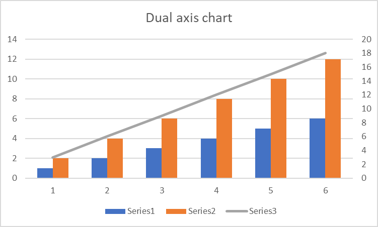
Dual axis charts are an excellent tool for contrasting two separate data sets. Even though the scales of the two data sets are different, they let you see trends and patterns in the data. When comparing data that spans a wide range, such as sales numbers across time, this is especially helpful. You can view the data in relation to one another thanks to the chart’s two axes, one on each side. There will be two y axis and a single x axis. This is a fantastic method to quickly see how your data is evolving over time and may be very helpful for financial and business research.
Flow chart

Flow charts are ideally in use for visualizing processes. You can see them in engineering fields often. Here, they can illustrate how different components of a process are interconnected. Every shape in a flow chart is a visual representation of a stage while the lines show how they are connected.
Spline chart
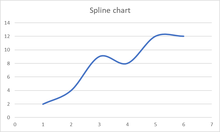
Spline charts are a kind of line graph that joins data points using curved lines. They are especially helpful for showing trends that call for curved lines, like data that changes over time. The curved lines smooth out data volatility and make it simpler to understand the overall trend.
Gantt chart

This is a great tool, especially when we talk about project managers. They can plan, schedule, and track the progress of tasks with the aid of a Gantt chart. Construction, software development, and other industries where projects are broken down into a number of tasks that must be finished in a precise order frequently utilize Gantt charts as well. They can be used to display the beginning and ending dates of tasks, their durations, and their interdependencies.
Scatter plot
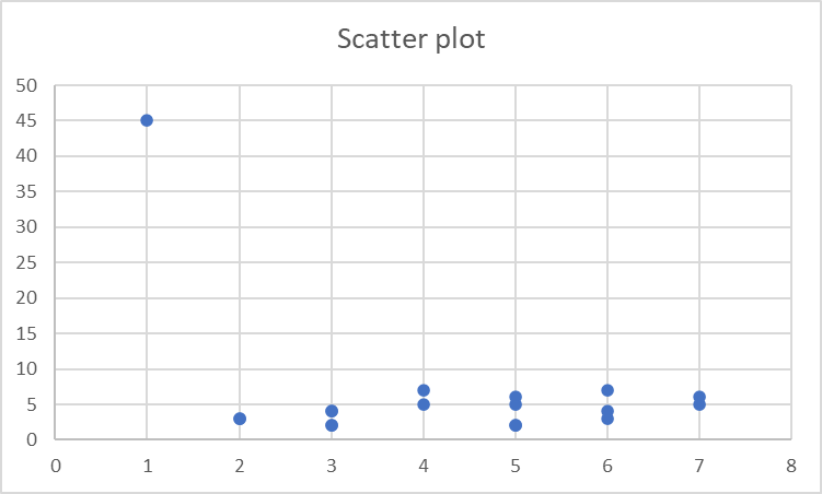
A scatter plot, as the name suggests, is a kind of chart where the individual data points are represented by dots as distinct data points. This is ideal to understand the link between two variables. You can often find this in data analysis and scientific research to spot trends.
Bubble chart
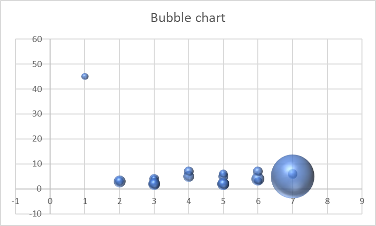
This is very similar to scatter plots in its looks but it has a third variable. When you analyze this chart, you should focus more on the size of the bubble. Because it represents the third variable. This is particularly ideal for business and economic-related fields. You can often see data that deals with three factors, such as sales volume, price, and profit margin. And, a bubble chart is a great way to visualize it.
Box and whisker chart
A box plot, commonly referred to as a box and whisker chart, is a form of graphic that shows the distribution of a dataset. It displays the data’s lowest, maximum, median, upper and lower quartiles, and other values as well. This chart gives you an idea of the distribution of the data and locating outliers or extreme values in a dataset. This comparison of various sets of data is frequently done in statistics and data analysis.
Mekko chart
A Mekko Chart also called a Marimekko chart, is a stacked chart that presents data using different column widths and heights. It is helpful for displaying how big certain categories or groups are in relation to one another within a dataset. Multiple data sets can be compared using this style of chart. Moreover, patterns and trends can be found, and the distribution of data can be understood. It is an excellent tool for visualizing data and can be applied to a variety of industries, including business, finance, marketing, and more.
Bridge chart
A bridge chart, commonly referred to as a waterfall chart, displays the combined impact of positive and negative numbers. For example, it demonstrates how cash flows in and out over time. This graph is very helpful for illustrating changes in certain data collection and pinpointing their causes. It is frequently used in accounting and finance to illustrate how a company’s financial condition has changed over time. Monitoring development and pointing out problem areas are both helpful in project management as well.
Gauge chart
A gauge chart shows a single value. They are helpful for presenting key performance indicators (KPIs) or other significant metrics and are frequently useful in information dashboards and other data visualization tools. A dial or needle that points to a given value on a scale often makes up a gauge chart, which makes it simple to see how a measure is doing fast.
Radar chart
Radar charts are useful when you are trying to contrast between a lot of variables. They are useful to compare several products, or groups of products, such as smartphones, or automobiles. Each axis of the chart represents a separate variable or dimension. The axis itself has several axes and radiates out from its center. The information on the chart represents how one data point relates to the others in terms of that data point.
Funnel chart
You can see the steps of a process, such as a sales process or a customer journey, using funnel charts. They are usually applied in sales and marketing to monitor a lead’s or customer’s progress through various phases, including awareness, interest, consideration, and conversion. The funnel-shaped chart’s widest portion at the top represents the total number of leads or customers, while its narrowest portion at the bottom represents the number of conversions or process completions. Most importantly, you can process bottlenecks or places where changes might be made using this chart.
How To Create Charts?
Well, it seems like we saw some of the most popular options in chart types. Now let’s get into business. How do we create those charts? You can create some of the charts from popular sources like Excel. However, most of the chart options will not be available. Therefore, in this post, we will be discussing how to create charts using a library called FusionCharts.
FusionCharts is a graphing and charting library. It helps you create meaningful, effective, and powerful data presentations. To get you started, we put together a step-by-step guide to show how to generate your first set of data charts using the FusionCharts library.
Create An HTML File
When using FusionCharts to create charts, creating an HTML file is really important. This HTML file acts as the chart’s container that carries its properties and data.
Here’s an example to get you started:
<title>FusionCharts</title>
<style>
.container {
    width: 70%;
    float:  left;
    padding: 10px;
    border: 3px solid green;
}
</style>

<center><h1>Here's an example of a Bar Chart:</h1></center>
Import Libraries
Alright, HTML? Check. Now onto the Javascript or more specifically the library FusionChart. Here’s how you can import them into your code:
<script type="text/javascript" src="https://cdn.fusioncharts.com/fusioncharts/latest/fusioncharts.js"></script>

<script type="text/javascript" src="https://cdn.fusioncharts.com/fusioncharts/latest/themes/fusioncharts.theme.fusion.js"></script>
Put Together Your Data
Here, we are going to put together some random dataset so our chart would have some meaning to it. Let’s say we want to look at the income of 5 employees at your office. Here’s an example of how to represent data:
const incomeData = [
      {
         "name": "Alicia",
         "income": 5000
      },
      {
         "name": "Patricia",
         "income": 7000
      },
      {
         "name": "Robert",
         "income": 9000
      },
      {
         "name": "Joana",
         "income": 6000
      }
 ];
Specify The Chart Configuration
To start small but be meaningful, we are going to create a bar chart. Here’s how you can specify that:
<script>
FusionCharts.ready(function () {
  var chart = new FusionCharts({
      type: 'column2d',
      renderAt: 'container',
      width: '600',
      height: '400',
      dataFormat: 'json',
      dataSource: {
          "chart": {
              "caption": "Employee Salary",
              "xAxisName": "Employee",
              "yAxisName": "Salary (in USD)",
              "theme": "fusion"
          }
      }
  }).render();
});
</script>
In the above code, we have specified type of chart as column2d to generate a bar chart. Next, we have specified where to render all of this (in our case, the HTML container name was container). Further down we have the specification of the graph’s looks and horizontal axis and vertical axis labels. (If you are feeling ambitious and want to know how to customize the colors of charts, nobody is stopping you!)
Consolidated Code
Here’s a full wrap up of all the code:
<title>FusionCharts</title>
<style>
.container {
    width: 70%;
    float:  left;
    padding: 10px;
    border: 3px solid green;
}
</style>

<script type="text/javascript" src="https://cdn.fusioncharts.com/fusioncharts/latest/fusioncharts.js"></script>

<script type="text/javascript" src="https://cdn.fusioncharts.com/fusioncharts/latest/themes/fusioncharts.theme.fusion.js"></script>

<script type="text/javascript">
	const incomeData = [
      {
         "name": "Alicia",
         "income": 5000
      },
      {
         "name": "Patricia",
         "income": 7000
      },
      {
         "name": "Robert",
         "income": 9000
      },
      {
         "name": "Joana",
         "income": 6000
      }
    ];
	FusionCharts.ready(function () {
  var chart = new FusionCharts({
      type: 'column2d',
      renderAt: 'container',
      width: '600',
      height: '400',
      dataFormat: 'json',
      dataSource: {
          "chart": {
              "caption": "Employee Salary",
              "xAxisName": "Employee",
              "yAxisName": "Salary (in USD)",
              "theme": "fusion"
          },
	  "data": incomeData
      }
  }).render();
});
</script>

<center><h1>Here's an example of a Bar Graph:</h1></center>
Conclusion
In conclusion, using FusionCharts to create charts is a quick and effective approach to see your data. You can choose the ideal chart to display your data from a variety of chart kinds, such as bar charts, line charts, and pie charts. With the simple and intuitive chart configuration, you can easily alter the appearance and feel of your chart. FusionCharts is a flexible tool for data visualization since it can import data from a wide range of sources, including JSON and CSV. Look no further than FusionCharts for a robust and user-friendly charting library.
FAQs
What are charts used for?
A chart’s primary purposes are to present data and encourage deeper study of a subject. When a straightforward table cannot clearly show crucial connections or patterns between data points, charts are utilized.
Why do we use charts for our data?
Graphs and charts condense a lot of information into simple formats that communicate key ideas clearly and effectively.
What’s the most popular chart?
Line graphs
How many types of charts are available in Excel?
20


