
Google Docs is a free productivity software collection that can perform many of the same tasks as much more expensive software programs. Using Google Docs, you can display your collected data in a graph using the spreadsheet program, making it much easier to visualize the information. Charts are the most common way to express data, which is why they can be found in programs such as Google Docs.
A bar chart is one of the most fundamental and frequently used visuals in business presentations. Unfortunately, many people don’t know what a bar graph is or how it works on Google Docs. Therefore, this article will cover how to make a bar graph on Google Docs.
Table of Contents
What is a Bar Graph? A Brief Overview
<!– –>
–>

Bar charts display categorical or grouped data using bars on a common baseline. Each bar represents a category, with its length showing the corresponding value. The x-axis shows categories, and the y-axis shows values. Bars can be vertical or horizontal and are ideal for comparing values or visualizing distributions.
The React chart framework is a popular visualization tool that supports bar charts and other chart types. It offers capabilities for bar, pie, and flow chart creation and interactive, customizable tools, making it a powerful option for building bar graphs and business visualizations.
What are the Types of a Bar Graph?

There are different types of bar graphs, but the commonly used bar graphs at present include:
- Vertical Bar Graphs: Also known as column graphs, vertical bar charts use upright bars to display values based on categorical data along the x-axis. You can create a bar graph on Google Docs using the “Chart” option under the “Insert” menu.
- Horizontal Bar Graphs: They display values with side-to-side bars, ideal for long category labels. The vertical axis holds categories, while the horizontal axis shows numerical values.
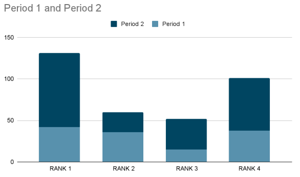
- Stacked Bar Graph: Stacked bar charts (vertical or horizontal) break bars into colored segments, showing subcategory contributions. They’re useful for comparing both individual parts and total values across categories.
- Grouped Bar Graphs: Grouped (or clustered) bar graphs show multiple bars per category to compare subgroups. Colors indicate secondary categories, helping visualize comparisons across multiple datasets.
- Simple Bar Graph: These use evenly spaced bars, vertical or horizontal, to represent category values. They’re widely used for easy visual comparisons in business, education, and research.
What are the Uses of a Bar Graph?

Math and statistics commonly use bar graphs. Some uses of a bar graph are:
- Comparisons between various variables are simple and practical.
- It is the simplest diagram to create and takes little work.
- It is the most popular technique for representing data. Various industries use it.
- Compare data sets with it. There is no interdependence between data sets.
- Therefore, long-term patterns can be studied with its aid.(Suggest)
Read in depth: What is a Bar Chart Used For?
What are the Steps for making a Bar Graph on Google Docs?

Making a bar graph in Google Docs is an effective way to organize your data. Log in to your Google Drive account before we walk you through the steps. You can then create a bar graph in Google Doc in 4 easy steps:
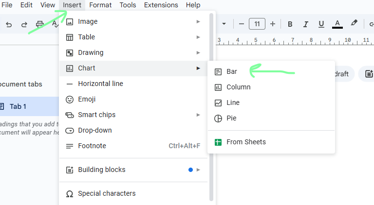
- Step 1: Open the Google Doc where you want to make a graph.
- Step 2: Next, navigate to the menu bar, and tap on ‘Insert.’
- Step 3: Now, hover over ‘Chart’ on your Google Doc, and various options appear.
- Step 4: Select ‘Bar’.
These basic steps of creating a Bar Graph on Google Docs become simple with this basic method, which makes the visualization of data easy and accessible for you.
Editing The Bar Graph
After you’ve finished these steps, you’ll have a customizable bar graph. Follow these steps to customize your chart style and add the necessary data:
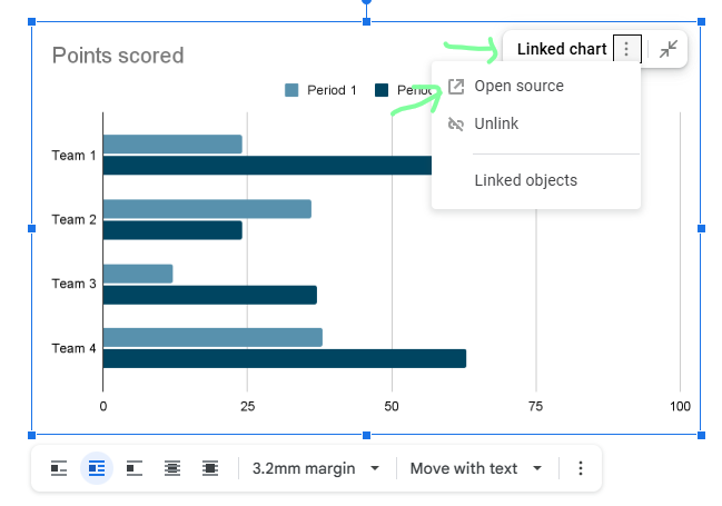
- Step 1: Once you insert a graph, tap on the arrow pointing down in the upper right corner.
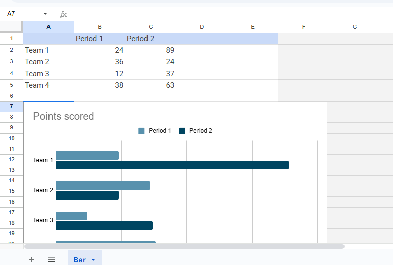
- Step 2: Click on ‘Open Source,’ which will take you to a Google Sheet document and display the chart with the data in individual columns.
Editing The Bar Graph step2 - Step 3: You can change the data in each column.
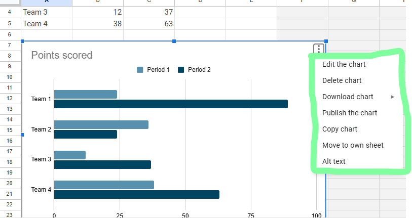
Editing The Bar Graph step10 - Step 4: You can also use the ‘Edit Chart’ option to create a stacked bar chart and change colors, fonts, chart titles, grid lines, and more.
Editing The Bar Graph step4 - Step 5: Once you’re done with the changes, go back to your Google Docs file.
- Step 6: You’ll see ‘Update’ on the graph. Tap on it.
Editing The Bar Graph step6
Additionally, using a bar graph maker can help you edit and design your graphs more efficiently.
How to Label a Bar Graph in Google Docs
To ensure the clarity and grasp the basic knowledge of your data visualization, it is necessary to label a bar graph. Here are the various factors through which user can effectively label your bar graph on Google Docs:
Adding a Chart Title
- Firstly, click on the graph and to edit the Google Docs, select the “Open Source”.
- Open Google Docs, click on the selected chart and then press the three-dot menu situated on the top-right corner.
- Open the panel, select the “Edit Chart” option, and then explore the “Customize” tab.
- Once you open the tab, click on the “Chart & Axis Titles” option and then enter your title so that the graph can easily.
Using a bar graph maker ensures that your titles are formatted properly for easy readability.
Label the Axes
- To label the Axes, open the “Customize” tab and then select the option “Chart & Axis Titles”.
- For labelling the x-axis, select the “Horizontal axis title” and similarly if you want to label the y-axis, select the “Vertical axis title”.
- Now, to clearly define the accuracy of the data, enter the appropriate label.
Customize Fonts and Colors
To modify the font style, color and size user can use the text formatting option which helps in enhancing the visibility of your labels. This will make sure that the labels can easily read and interpret the data. Bar Graph on Google Docs provides customization features to enhance the appearance and readability of your graphs.
Add a Legend
A bar graph maker allows you to adjust the legend settings to fit your data presentation needs.
- To add a legend, access the “Customize” tab.
- After adding, adjust the legend’s position and colors to make in data representation and enhance its visual appeal.
How to Add Error Bars in Google Docs
Putting error bars on your graph is a must if you wanna show data’s ups and downs. To add the error bars in Google Docs:
- Click on the “Open Source” to open the chart in Google Sheets.
- Then, in Google Sheets, click that chart and hit “Customize” in the Chart Editor sidebar.
- Now, you’re going to drop down the “Series” menu, scroll a bit and make sure to select the box for “Error bars”.
- You’ll see options like “Constant,” “Percentage,” and “Standard Deviation” for your error bars – pick one and type in what you need.
- After doing this, error bars will pop up on your chart. They give you the real representation of accurate visibility of data.
How to Change a Data Visualization in Google Docs
Switching from one chart style to another can make your data look way clearer and hit harder. Changing the chart type in Google Docs:
- Choose the bar graph and pick “Open Source” to edit that chart in Google Sheets.
- Once you’re entering in Google Sheets, tap on the chart and click on the three-dot menu in the top-right.
- Select the “Edit Chart” and head over to the “Setup” tab.
- Click on that “Chart Type” button and choose the type that shows off your data the best, like line chart, pie chart, or a stacked bar chart.
- Once all the process is completed save the changes and update the charts in Google Docs to reflect the new visualization.
Using a bar graph maker can help you easily switch between different data visualization types.
Practical Examples of Bar Graphs
Here are some of the practical examples of where we use Bar Graphs on Google Docs:<.p>
- Business Analytics: Track monthly sales performance across different regions.
- Education: Compare student performance in different subjects.
- Healthcare: Analyze the frequency of diseases in various age groups.
- Finance: For analyzing the budget expenses visually in different categories
Troubleshooting Common Errors
If your previous chart is not updating in Google Docs, click on the chart and select “Update.” For missing labels, ensure axis titles are added in the “Chart & Axis Titles” section. If data is represented incorrectly, open Google Sheets and verify the selected data range. Moreover, if error bars are not showing, check that they are enabled under “Series.” By following these steps, you can create, customize, and troubleshoot bar graphs efficiently in Google Docs.
Conclusion

Create shareable documents that you can constantly update with Google Docs. It allows you to create documents and access them from any internet-connected device. In addition, you can create graphs in Google Docs to enhance your document and tailor them to your objectives.
Bar or column charts can represent quantitative values across various subcategories. This article covered all the essential information you will need to create meaningful bar chats in Google Docs.FusionCharts is an incredible platform that allows you to create responsive, sleek, and visually appealing visualizations.
Google Docs provides various tools to make a Bar Graph on Google Docs seamlessly, ensuring efficient and accurate data representation.
FAQs
1. Can I create a Bar Graph on Google Docs without using Google Sheets?
While Google Docs uses Sheets as the source for chart data, you don’t need to create a separate file. The chart inserts automatically with linked data you can edit within the connected Sheet.
2. Is it possible to make a 3D bar graph in Google Docs?
Google Docs’ built-in chart tools do not support 3D bar graphs directly. For advanced styles like 3D, use Google Sheets with Add-ons or third-party bar graph makers, then import the chart into Docs.
3. How do I resize a Bar Graph in Google Docs?
Click on the chart in your Doc to reveal blue handles around it. Drag these handles to resize the graph proportionally within your document.


