The Line and Area charts appear to be very similar. They even facilitate the same type of analysis, but their functions are not interchangeable.
In this post, you’ll learn how to choose the right chart type for your chart type, and how a graph maker made by fusioncharts can help you create the chart you need.
Table of Contents
When to Use Line Chart vs. Area Chart
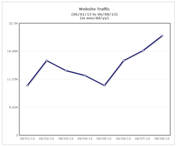
Line charts are usually for observing trends over a certain period. The Y-axis shows numeric values, and the X-axis represents the essential measurements. Line charts are clear and easy to understand since you can see the specific trend for the individual data group.
Area charts have a pattern similar to line charts. However, the space between each line and the X-axis is filled with a specific color. Area charts are ideal for indicating a change among different data sets.
A line chart connects discrete but continuous data points by using straight line segments. It is effective in facilitating trend analysis. An example of applying line charts in real life is by financial managers to check trends for profits and other business factors.

An area chart does the same except that the area below the plotted line is filled with color.

Let’s understand the scenarios where these charts shine through in their own right.
When There are Multiple Data Sets
Line charts can easily display multiple data sets.

However, we cannot clearly show multiple data sets in area charts as the upper layer hides the layers below (occlusion). This issue becomes especially bad when you have more than two data categories.
")
You can minimize occlusion by increasing the transparency of the different layers, but it persists.

Increasing the transparency works best for up to two data sets.

When the Area Under the Plotted Line Represents a Summation
Let’s say you visualize your Revenue vs. Expenses data using an area chart.

From this chart, we can get an approximate idea of the profits for the period by visually subtracting the expenses from the revenue.

There is no visual element (a colored area) in a line chart to support such cognitive relationships.
When You Want to Establish a Part-to-Whole Relationship
Similar to a stacked column chart, a stacked area chart displays part-to-whole relations by showing the constituent parts of a whole one over the other.
Let’s say you want to visualize your sales per region.

Using a stacked area chart, you can get an idea of the total sales for a month and the contribution of each region. It is, however, difficult to interpret the area of each region precisely. This issue is because the height of each region is affected by the pattern below it.
On the other hand, a line chart is more effective in facilitating an understanding of your monthly region-wise sales trend.

However, the trend for the total sales has to be obtained manually (by adding the monthly region-wise values and then plotting it as a separate line).

If the user does not refer to the chart legend, there is room for misinterpretation of the total sales line as another regional sales line. To avoid this, make your total sales line visually distinct from the regional sales lines.

While both the line and the area charts facilitate trend analysis, it is better to use the area chart when there is a summation relationship between the data sets or when you want to show a part-to-whole relationship (along with trend).
For more insights on charting best practices, check out this space.
{
“@context”: “https://schema.org”,
“@type”: “FAQPage”,
“mainEntity”: [{
“@type”: “Question”,
“name”: “When to Use Line Chart vs. Area Chart”,
“acceptedAnswer”: {
“@type”: “Answer”,
“text”: “Line charts are usually for observing trends over a certain period. The Y-axis shows numeric values, and the X-axis represents the essential measurements. Line charts are clear and easy to understand since you can see the specific trend for the individual data group.
Area charts have a pattern similar to line charts. However, the space between each line and the X-axis is filled with a specific color. Area charts are ideal for indicating a change among different data sets.
A line chart connects discrete but continuous data points by using straight line segments. It is effective in facilitating trend analysis. An example of applying line charts in real life is by financial managers to check trends for profits and other business factors.An area chart does the same except that the area below the plotted line is filled with color.”
}
},{
“@type”: “Question”,
“name”: “When There are Multiple Data Sets”,
“acceptedAnswer”: {
“@type”: “Answer”,
“text”: “Line charts can easily display multiple data sets.However, we cannot clearly show multiple data sets in area charts as the upper layer hides the layers below (occlusion). This issue becomes especially bad when you have more than two data categories.You can minimize occlusion by increasing the transparency of the different layers, but it persists.Increasing the transparency works best for up to two data sets.”
}
},{
“@type”: “Question”,
“name”: “When the Area Under the Plotted Line Represents a Summation”,
“acceptedAnswer”: {
“@type”: “Answer”,
“text”: “Let’s say you visualize your Revenue vs. Expenses data using an area chart.From this chart, we can get an approximate idea of the profits for the period by visually subtracting the expenses from the revenue.There is no visual element (a colored area) in a line chart to support such cognitive relationships.”
}
},{
“@type”: “Question”,
“name”: “When You Want to Establish a Part-to-Whole Relationship”,
“acceptedAnswer”: {
“@type”: “Answer”,
“text”: “similar to a stacked column chart, a stacked area chart displays part-to-whole relations by showing the constituent parts of a whole one over the other.Let’s say you want to visualize your sales per region.Using a stacked area chart, you can get an idea of the total sales for a month and the contribution of each region. It is, however, difficult to interpret the area of each region precisely. This issue is because the height of each region is affected by the pattern below it.
On the other hand, a line chart is more effective in facilitating an understanding of your monthly region-wise sales trend.However, the trend for the total sales has to be obtained manually (by adding the monthly region-wise values and then plotting it as a separate line).If the user does not refer to the chart legend, there is room for misinterpretation of the total sales line as another regional sales line. To avoid this, make your total sales line visually distinct from the regional sales lines.While both the line and the area charts facilitate trend analysis, it is better to use the area chart when there is a summation relationship between the data sets or when you want to show a part-to-whole relationship (along with trend).”
}
}]
}


T
November 28, 2017, 10:16 amThis is a pretty good write!Thanks for this.
Shafique
November 30, 2017, 4:58 pmGlad that you found it helpful.