
Stakeholders and decision-makers today can’t afford to pore through pages and pages of spreadsheet data in this fast-paced economy. Particularly when a few button clicks can turn those almost unending rows and columns into visually appealing and easy-to-understand versions. Data charts are great visualization tools that allow for quick access, analysis, and understanding of complex data. However, it’s no news that most people cringe at the thought of maneuvering through rows and columns in Microsoft Excel. That’s why we’ve created this easy-to-follow guide on how to make a graph in Excel.
But before diving in, let’s go over the Excel graph and the different data charts you have access to in Excel.
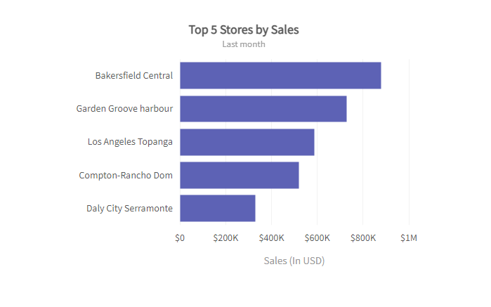 Bar charts or graphs are great visualization tools for data sets with values divided into categories. Businesses use bar graphs to determine the relationship between categories—for example, the relationship between product sales in different store locations.
Check out bar chart guidelines here.
Bar charts or graphs are great visualization tools for data sets with values divided into categories. Businesses use bar graphs to determine the relationship between categories—for example, the relationship between product sales in different store locations.
Check out bar chart guidelines here.
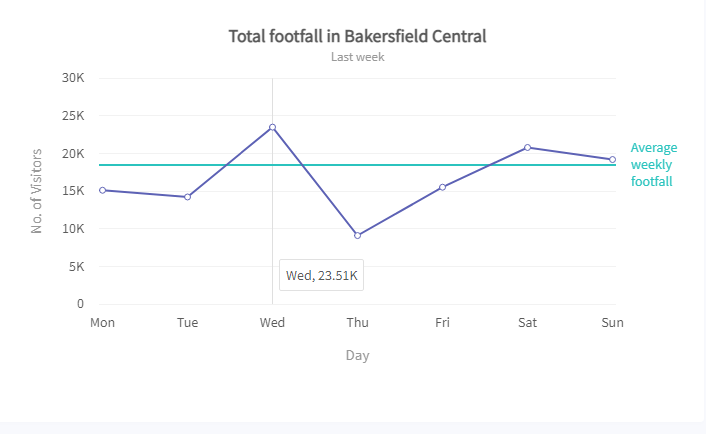 Excel offers both two-dimensional and three-dimensional line graphs. They’re typically used to display data values that change over time. This way, users can quickly identify trends, patterns, and outliers. Line charts or graphs can also contain more than one data parameter. In this case, Excel automatically distinguishes each line using different color codes. Examples of data types you can represent using the line graph include:
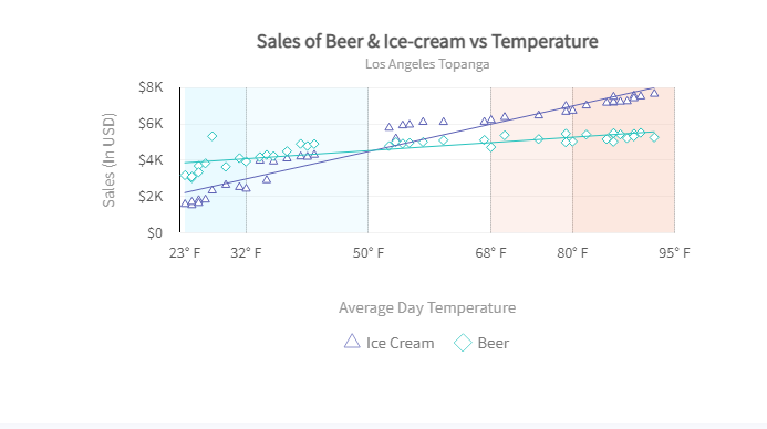 The scatter graph is useful for comparing or determining the relationship between two numerical data variables. Data values are plotted using dots on a two-dimensional or Cartesian plane. The dot positions, relative to the horizontal axis and vertical axis, denote the value of the data points they represent. Examples of the data type that best suits the scatter graph includes:
Table of Contents
Excel Graph
Excel graphs are visual representations of the row and columns in an Excel worksheet. They make it easier to understand and analyze large data sets quickly. The human brain comprehends visuals faster than numbers and texts. For this reason, interpreting data using an Excel graph is more efficient than scrolling through rows and columns. Excel provides a wide range of charting options for different data types and goals. And, with a few button clicks, you can quickly tell your data’s story in a visually compelling manner.Types Of Graphs
Excel offers numerous graph types for representing data. That said, the key to choosing the right graph is understanding your data and the uses of each Excel graph. Once you clearly understand your visualization goals, you can easily match your data to the chart that best suits these goals. Below are the most popular graph types in Excel.Bar Graph
Bar charts or graphs are great visualization tools for data sets with values divided into categories. Businesses use bar graphs to determine the relationship between categories—for example, the relationship between product sales in different store locations.
Check out bar chart guidelines here.
Line Graph
Excel offers both two-dimensional and three-dimensional line graphs. They’re typically used to display data values that change over time. This way, users can quickly identify trends, patterns, and outliers. Line charts or graphs can also contain more than one data parameter. In this case, Excel automatically distinguishes each line using different color codes. Examples of data types you can represent using the line graph include:
- Employee compensation
- The average number of hours worked in a week
- Average number of annual leaves
The Scatter Graph
The scatter graph is useful for comparing or determining the relationship between two numerical data variables. Data values are plotted using dots on a two-dimensional or Cartesian plane. The dot positions, relative to the horizontal axis and vertical axis, denote the value of the data points they represent. Examples of the data type that best suits the scatter graph includes:
- Outside temperature versus ice cream sales
- Monthly store sales versus the number of monthly visitors
- Pie charts
- Area graphs
- Column charts