Today, especially in the business world, we are obsessed with data, but not without a good reason. Data lets us explore and understand hidden trends. Because of this enterprises, governments, researchers, and even individuals use volumes of data every day.
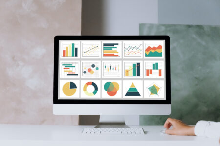
With so much data to go around, we need to be able to share it easily and intuitively. Thankfully, there are powerful data visualization tools to help you understand it better. Because most data is shared over the web, many popular front-end frameworks like Angular have powerful data visualization frameworks. FusionCharts is one of the best data visualization tool options out there.
Let’s take a look at data visualization in Angular and see how FusionCharts makes the complex simple.
Table of Contents
What should effective data visualization in Angular look like?
Many people don’t think data visualization is as important as other data analysis processes. What they fail to realize, however, is that the only insights that matter are the ones you can share and understand. Successful data visualization involves taking your data and presenting it strategically. The goal of data visualization is to share the story behind your data.
To do this, you need to present your data efficiently. You need to put it where it is most effective and use the right data binding and visualization libraries. Because the data is often enormous, you also need an efficient library so your visualizations are robust and dependable.
FusionCharts provides all the methods you need for effective visualizations. You only have to learn a single library.
What qualities should an ideal Angular chart library have?
One of the benefits of popular frameworks like Angular is that they have a wide variety of libraries visualization and charting libraries you can choose from. The difference in these libraries, however, lies in their functionality and the level of interactivity they provide.
You need to look for the following qualities when you choose your Angular data visualization library:
Efficient data binding and handling
Your library should be proficient at handling large volumes of data of any type. It should connect to any data source effortlessly.
Overarching control
Use cases vary greatly in the real world. Your library should give you firm control over every aspect of your visualization to meet them.
Robust interactivity
Make sure your users can satisfy their curiosity with an interactive chart. An interactive chart is much better than a static JPG image.
Visual appeal
Visualization is all about choosing the right charts, color schemes, and sizes. Your library should have sleek and clear visuals with few distractions.
Not all libraries nail this criteria. Some frameworks, however, like FusionCharts provide this functionality without sacrificing performance.
How is FusionCharts helpful for data visualization in Angular?
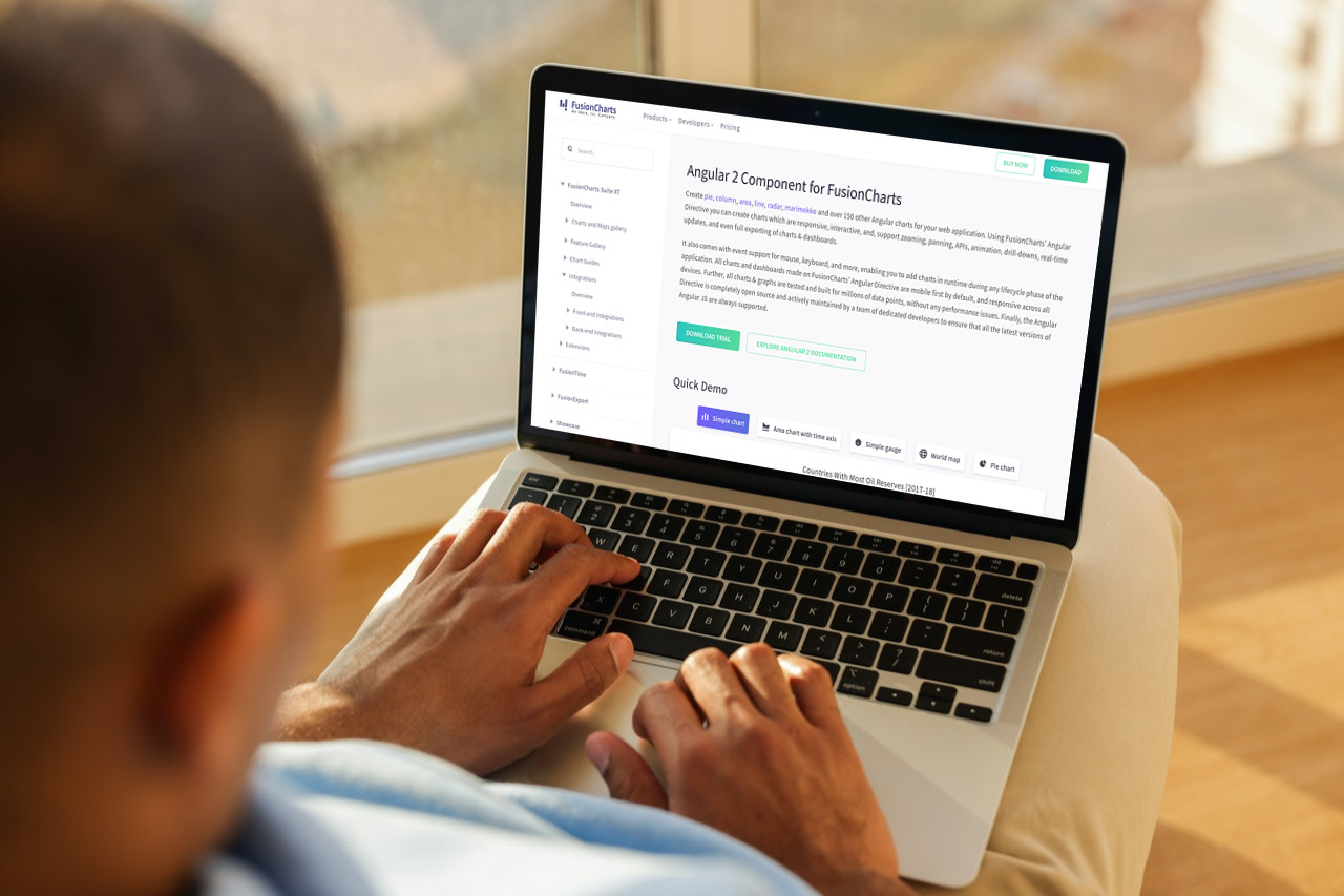
FusionCharts is one of the leading open-source Angular chart libraries available. This is because it fulfills your data visualization needs and seamlessly integrates into your web applications. It also makes it easy to build your visualizations.
Take a look at how you can bring FusionCharts to your Angular application:
import { NgModule, enableProdMode } from '@angular/core'
import { AppComponent } from './app.component';
import { BrowserModule } from '@angular/platform-browser';
import { FusionChartsModule } from 'angular-fusioncharts';

import * as FusionCharts from 'fusioncharts';
import * as Charts from 'fusioncharts/fusioncharts.charts';
import * as FusionTheme from 'fusioncharts/themes/fusioncharts.theme.fusion';


FusionChartsModule.fcRoot(FusionCharts, Charts, FusionTheme)

@NgModule({
  declarations: [
 AppComponent
  ],
  imports: [
 BrowserModule,
 FusionChartsModule
  ],
  providers: [
  ],
  bootstrap: [ AppComponent ]
})
export class AppModule {
}
FusionCharts gives you responsive charts that you can generate at runtime. It lets you tie interactive features to different user events. Because of this, your users can better understand the data you are presenting. For example, your users can hover over data points on a chart or plot for more granularity.
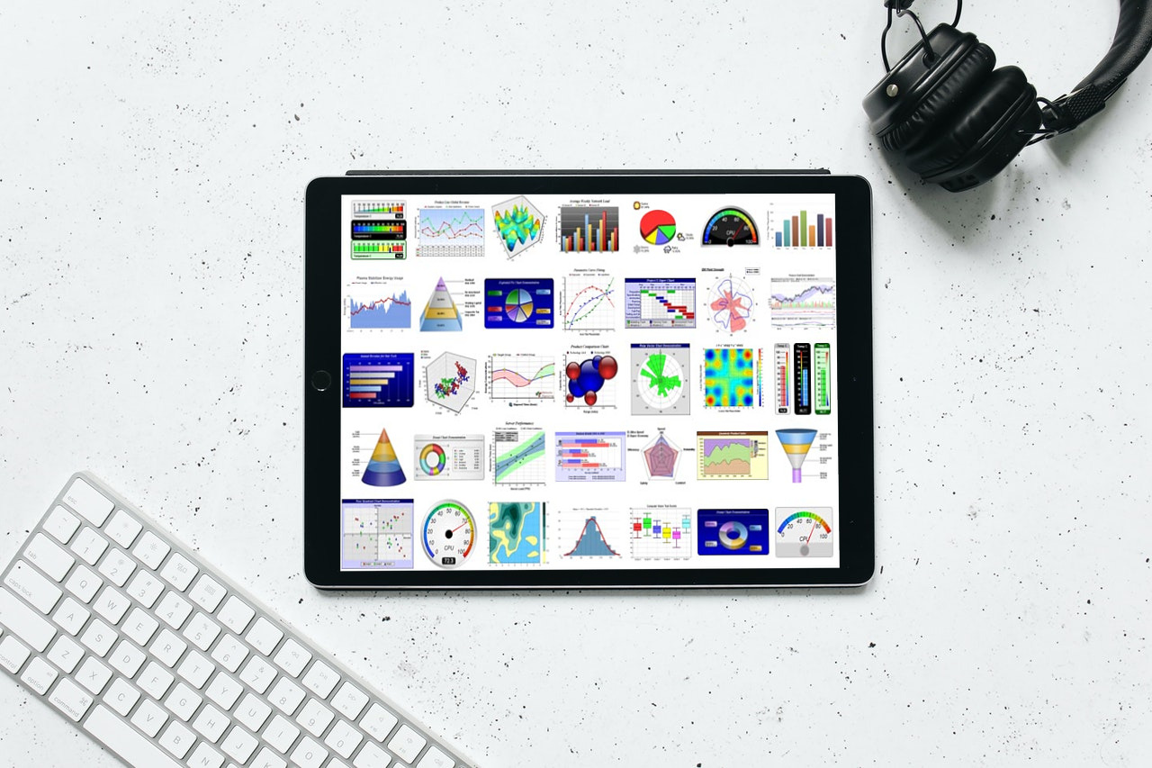
If you want plenty of visualizations to choose from, or you want to create dashboards to keep track of your real-time incoming data, FusionCharts is for you. You can also choose different color schemes, add headings and descriptions, and control chart sizing.
Excited to start your data visualization journey in Angular?
{
“@context”: “https://schema.org”,
“@type”: “FAQPage”,
“mainEntity”: [{
“@type”: “Question”,
“name”: “What should effective data visualization in Angular look like?”,
“acceptedAnswer”: {
“@type”: “Answer”,
“text”: “Many people don’t think data visualization is as important as other data analysis processes. What they fail to realize, however, is that the only insights that matter are the ones you can share and understand. Successful data visualization involves taking your data and presenting it strategically. The goal of data visualization is to share the story behind your data.
To do this, you need to present your data efficiently. You need to put it where it is most effective and use the right data binding and visualization libraries. Because the data is often enormous, you also need an efficient library so your visualizations are robust and dependable.FusionCharts provides all the methods you need for effective visualizations. You only have to learn a single library”
}
},{
“@type”: “Question”,
“name”: “What qualities should an ideal Angular chart library have?”,
“acceptedAnswer”: {
“@type”: “Answer”,
“text”: “One of the benefits of popular frameworks like Angular is that they have a wide variety of libraries visualization and charting libraries you can choose from. The difference in these libraries, however, lies in their functionality and the level of interactivity they provide.
You need to look for the following qualities when you choose your Angular data visualization library:
Efficient data binding and handling
Robust interactivity
Visual appeal”
}
},{
“@type”: “Question”,
“name”: “How is FusionCharts helpful for data visualization in Angular?”,
“acceptedAnswer”: {
“@type”: “Answer”,
“text”: “FusionCharts is one of the leading open-source Angular chart libraries available. This is because it fulfills your data visualization needs and seamlessly integrates into your web applications. It also makes it easy to build your visualizations.FusionCharts gives you responsive charts that you can generate at runtime. It lets you tie interactive features to different user events. Because of this, your users can better understand the data you are presenting. For example, your users can hover over data points on a chart or plot for more granularity.
If you want plenty of visualizations to choose from, or you want to create dashboards to keep track of your real-time incoming data, FusionCharts is for you. You can also choose different color schemes, add headings and descriptions, and control chart sizing.”
}
}]
}


