
Data is an important asset of every business. With the right information, companies can make critical strategic decisions and improve performance. However, the data businesses collect is usually in raw form, and it’s essential to transform it into actionable insights. One way to make sense of your business data is to create dashboards, such as performance dashboards, operational dashboards, etc. Dashboards allow businesses to identify trends, track key performance indicators (KPIs), understand customer needs, inspect business performance and make data-driven decisions. As a result, dashboards and reports have become essential tools for all types of companies, small or big.
In this article, we’ll discuss why businesses need performance dashboards and the elements of a great performance dashboard. We’ll also show you some performance dashboard examples that you can quickly create with FusionCharts, the leading JavaScript charting library.
Table of Contents
What Does a Performance Dashboard Mean in the Workplace?

A performance dashboard is a powerful analytical tool that helps monitor how the business is performing. It consists of real-time data visualizations, such as bar charts and pie charts, that provide insights into different company processes. The visualizations in data dashboards represent key performance indicators (KPIs,) helping businesses analyze the performance of various operations more comprehensively and devise data-driven strategic plans for growth. For example, financial performance dashboards can include the most critical KPIs and performance metrics like net profit, gross profit margin, operational costs, average revenue, etc. Similarly, event analytics dashboards can track attendee engagement and ticket activity to measure event success.
Anchor: track attendee engagement
With performance dashboards, companies can track several data sources and understand patterns, trends, and potential problems at a glance. A good performance dashboard represents data in a single view and is interactive.
Why Should You Utilize a Performance Dashboard?
Research has shown that humans can understand the meaning of an image even if they view it for just 13 milliseconds. In other words, it’s easier for humans to process visuals compared to text. Since performance dashboards consist of meaningful visual representations created from raw numerical data, they make it easy for users to analyze the data and immediately understand what it means. Good dashboards are visually appealing and easy to interpret.
What Are The Benefits Of Performance Dashboards?
Quick Realizations
These dashboards enable quick access to valuable data insights, thus eliminating the need to wait days, weeks, or months for reports. To make these insights easier to communicate across teams and stakeholders, businesses can use an executive summary generator to quickly turn complex dashboard data into clear, concise reports. Additionally, such dashboards provide an overview of real-time, up-to-date data, which empowers decision-makers to take quick action.
Progress Evaluation
With these analytics tools, companies can effectively track progress and determine whether they’re hitting significant milestones. However, choosing KPIs that align with the company’s objectives and goals is critical.
Future Predictions
A business performance management dashboard can bring cutting-edge capabilities like predictive analytics to ensure a successful outcome for your business. On the other hand, when statistical analysis is a manual process, which could take a lot of time to finish and provide future recommendations.
Improved Effectiveness
You can make better decisions quickly when you have easy access to reliable visual information that can be understood easily from a single central location. This will eventually lead to an increase in your company’s overall efficiency in crucial areas.
Improved Collaboration
Analytical tools facilitate a greater understanding of organizational insights, making them much more accessible to all through a corporate performance dashboard. This encourages cross-departmental collaboration.
What Elements Should Every Performance Dashboard Contain?
Succession Of Data Throughout Time
A performance dashboard should include data time series that display trends over time at monthly intervals, going back at least two years. This helps businesses identify emerging problems, instantly evaluate seasonal factors, and analyze whether operational adjustments provide the desired improvements.
Effective KPIs
The purpose of a performance management dashboard is to provide actionable insights and improve performance. Hence, it’s essential to add KPIs that are relevant to business goals and easy to measure. Some examples of company metrics and relevant KPIs to include in your performance dashboards include customer turnover rate, net profit margin, cost per lead, cost per click, conversion rate, and click-through rate, customer acquisition cost, depending on the type of dashboard you are creating.
Real-Time Data Analytics
A performance dashboard must include real-time data so that executives can analyze what’s happening in the organization at the moment and what needs to be improved.
Interactive Elements
A dashboard should include interactive features, such as zoom in/out, drill-downs, view and hide data series, etc., so that it’s easier for users to interpret it. Additionally, a dashboard should be customizable so that different departments can modify it based on their objectives.
The Performance Dashboard: How To Create One?
Creating an effective performance dashboard requires careful planning and consideration of the data that will be used.
Think About The Eventual Result
It’s essential to understand the aim of creating the dashboard and what you want to achieve before you start designing your dashboard. You should first decide what sort of data you need to study because a company performance dashboard often aids in decision-making while highlighting patterns or problems.
Curate And Compile Your Data
Next, you need to begin collecting the data you will need to monitor, track, and illustrate key trends and insights. For example, if you’re creating financial performance dashboard templates, you need to ensure that profit, revenue, and loss data and metrics are included.
Establish Your Critical Performance Indicators
Once you’ve curated the data, it’s time to set the appropriate KPIs. A good dashboard combines data from multiple sources and consists of interactive data visualizations that represent KPIs.
Create a Dashboard
Whether you’re making a sales team performance dashboard, marketing performance dashboard, or employee performance dashboard, designing your dashboard correctly is very important.. Your graphics will be unclear and ineffective if they lack a unified design.
Stay Receptive
Modern data dashboards are interactive and dynamic, so it’s crucial that you stay flexible while making them.
What Are Some Examples Of Performance Dashboards Offered By Fusioncharts?
FusionCharts is a powerful tool for creating beautiful, interactive, and customizable JavaScript charts and dashboards. FusionCharts offers a wide range of pre-built dashboards, allowing users to create attractive, interactive, and real-time dashboards in a matter of minutes. In addition to several business dashboards, FusionCharts also offers a collaboration dashboard that enables multiple users to add comments on the visualizations without the need to leave the dashboard.
Here are some example performance dashboards that you can create with FusionCharts:
SaaS Dashboard
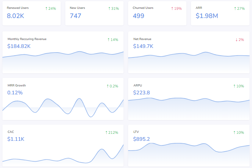
FusionCharts’ SaaS dashboard assists SaaS businesses in keeping track of key organizational KPIs. The viewers have access to full visibility of the parameters related to users, revenue, cost, and growth. Anyone can easily understand the dashboard and metrics thanks to the straightforward usage of KPIs and visualizations.
Wealth Management Dashboard
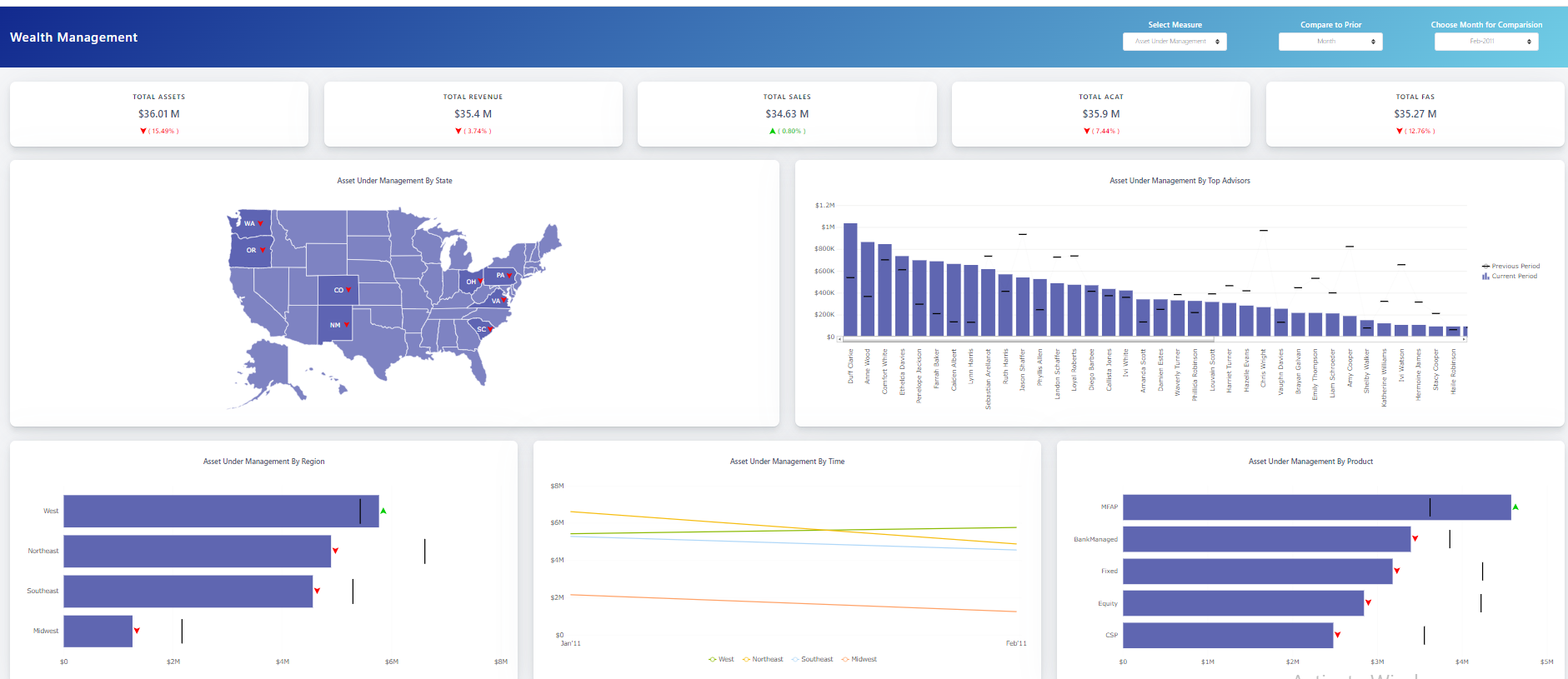
This dashboard allows users to monitor the performance of financial assets and manage them effectively. You can monitor the distribution of assets by state, area, leading advisers, time, and product using our wealth management dashboard. Sales, income, new net money, and many more indicators can also be monitored based on the data.
Marketing Dashboard
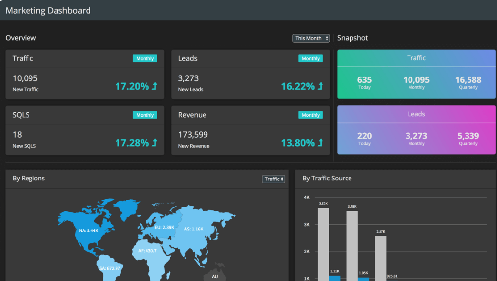
With our Marketing Dashboard, you can track the results of your marketing efforts and make your marketing campaigns more effective. You can follow how the business is progressing towards each goal.
Business Operation Monitoring Dashboard
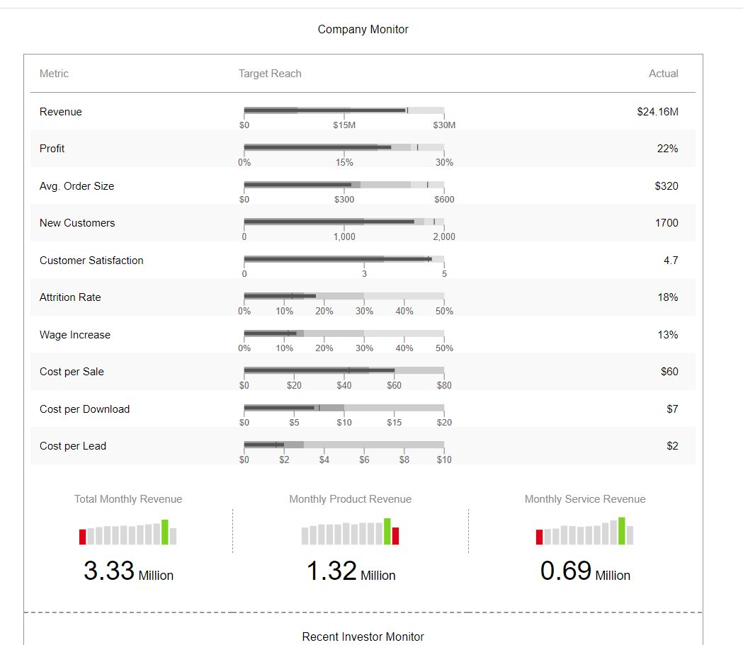
Utilize our efficient Company Monitor to monitor operational indicators across the organization for various departments, such as sales, HR, etc. To increase earnings and control operating costs, use data on topline and bottom-line indicators.
Frequently Asked Questions (FAQs)
What is the purpose of a performance dashboard?
The primary purpose of a performance dashboard is to enable companies to monitor critical business processes. They provide relevant and timely information regarding the performance of the business in different areas, helping executives with the decision-making process.
What are the advantages of business performance management dashboards?
These dashboards help create an effective business strategy and make improved decisions. They provide a deeper understanding of how the business is performing.
What are some performance dashboard examples?
Examples include sales dashboards, business operation monitoring dashboards, marketing dashboards, and financial dashboards.
Download FusionCharts and integrate interactive dashboards into your process today!


