
Data visualizations are a powerful way to bring meaning to data. After all, static charts are great and can do that too, but interactive charts are a step up. FusionCharts provides a wide variety of ways to bring interactivity to your Javascript charts. FusionCharts really bring your data visualizations to the next level. In this article we are going to look into how FusionCharts Suite allows you to configure your chart the way you want them, either functionally or visually.
You can configure the charts through attributes, add layers through annotations or build complex visualizations by using our events and API. In this article, we are going to cover a number of ways you can add interactivity. These include data plots, titles and labels, number formatting, legends, tooltips, trendlines, as well as axes, and gridlines.
Table of Contents
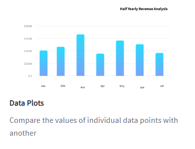
How Can I Customize Data Plots in Charts?
Data plots refer to the graphical representation of data values, such as columns/lines/areas/pie slices in data charts. With data plots, you can easily derive an outcome from the data instead of wasting time on complex tabular formats. FusionCharts offers a lot of customization options on data plots, to make them more insightful. For further details, click here.
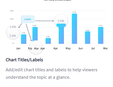
What are the Ways to Specify Chart Titles and Labels?
Any form of text appearing on the chart canvas area adds more details to the data visualization. Your Text can be in the form of chart captions, sub captions, axis titles, as well as data values, and data labels. Find out more.
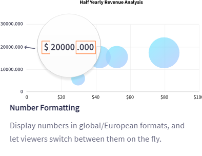
How Can I Set Up Number Formatting in Charts?
FusionCharts allows you to format any numeric values displayed on your chart. You can configure the following:
- Number Prefix
- Number Sufix
- Dual Y-axis
- Number Format
- Decimal and Thousand Separator
- Recursive Number Scaling
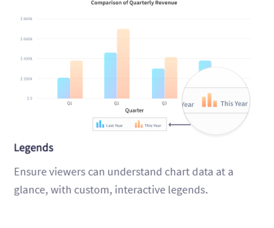
What Are Some Ways to Customize Legends in Charts?
In multi-series charts, you have interactive legends assigned to each set of data. This helps you to relate each and every dataset to its corresponding category. Legends in FusionCharts are interactive in nature. You can click on the legend icon representing a particular data series to either hide or show the data plot and focus on specific data sets on the fly.
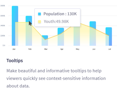
Can I Configure Tooltips in Charts?
A tooltip is a small, floating text box that displays when you hover your mouse cursor over a particular data plot. Depending on the type of chart is belongs to, a tooltip can also display different types of contextual information about data plots. For instance, in a single series chart, a tooltip can show the name and also the data value of a particular plot.
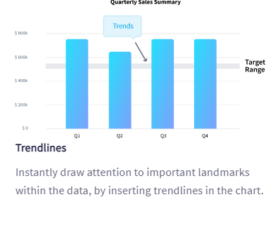
How Do I Add Trendlines in Charts?
Trendlines are horizontal or vertical reference lines, which help viewers easily interpret data. You can use them to set the context for data (with tooltips) as well as define limits and targets.
There are various ways to customize trendlines in your charts and widgets:
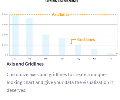
Is it Possible to Configure Axis and Gridlines in Charts?
The axes of a chart are certainly essential for understanding the data values. After all, without a scale of reference, it would be not feasible to build a chart in the first place.
FusionCharts offers you many possible configurations to customize the axis and the gridlines:
- Configure X-axis/Y-axis
- Axis Placement
- Y-axis on the Right
- Secondary Axis
- Axis Customization
- Divisional Lines
- Vertical Lines
- Zero Plane
- Dynamic Re-scaling of Axis
Are You Ready to Turbocharge Your Data with Interactive Data Visualizations?
Whether you are building a dashboard for desktop or mobile, with simple or complex data, FusionCharts has you covered. We have talked about 7 ways you can add interactivity to your charts in this article but there are even more ways that you can read about as well. FusionCharts offers 100+ Interactive Charts & 2,000+ Data-driven Maps. FusionCharts also includes all the variations of popular charts like Bar, Column, Line, Area, and Pie; or domain-specific charts like Treemaps, Heatmaps, Gantt Charts, Marimekko Charts, Gauges, Spider Charts, Waterfall Charts, and many more!
Head over to FusionCharts and get started with our interactive JavaScript charting solutions today!


