
Data visualization occupies a critical role in the world of data science and analytics, two disciplines that are promising to change the world. It helps analysts investigate data trends that aren’t readily apparent, discover new opportunities, and identify future prospects. Raw data doesn’t have much to say on its own, however. That is why the development of innovative technologies for data collection, pre-processing and archiving, has increased the need for effective data presentation tools. While there are many charting and graphing libraries available in the market today, FusionCharts is one unique library that is superior to the rest in terms of its beautiful presentations, stunning visualizations, efficiency, and ease of use.
If you are looking for a data visualization tool, take a minute to look over our ultimate checklist for buying a charts library. We have put together a list of 8 items you will definitely need. It will also show you why FusionCharts is the right option for you — both now and in the future!
So as you consider which charting tool is right for you, stop and take a moment to answer these simple questions.
Table of Contents
1. Does the Charting Library Have a Variety of Charts?
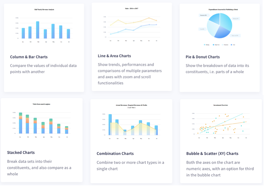
Variety means flexibility, so the first item on our checklist is whether or not a charting library ships with a selection of charts that allows you to pick the right one for your data. While many libraries contain basic graphs and charts, more sophisticated alternatives are often missing. FusionCharts has 100+ charts, graphs and gauges, and 2000+ choropleth maps. In addition to bar, column, line, and area charts it also supports the more domain-specific graphs, These include elegant Sankey charts, chord diagrams, treemaps, heatmaps, Gantt charts, Marimekko charts, gauges, spider charts, and more.
2. Are the Charts Fully Customizable?
The second thing to check is whether or not the charts in a library are fully customizable. Many charting libraries may plot your data correctly but components such as labels, axis labels, font colors, and tick labels may be fixed. FusionCharts allows you to customize everything. You control everything from your data point and axis labels to your label fonts and colors. You can also customize your point colors, point sizes, and line styles using FusionCharts easy APIs.
3. Are the Dashboards and Charts Interactive?
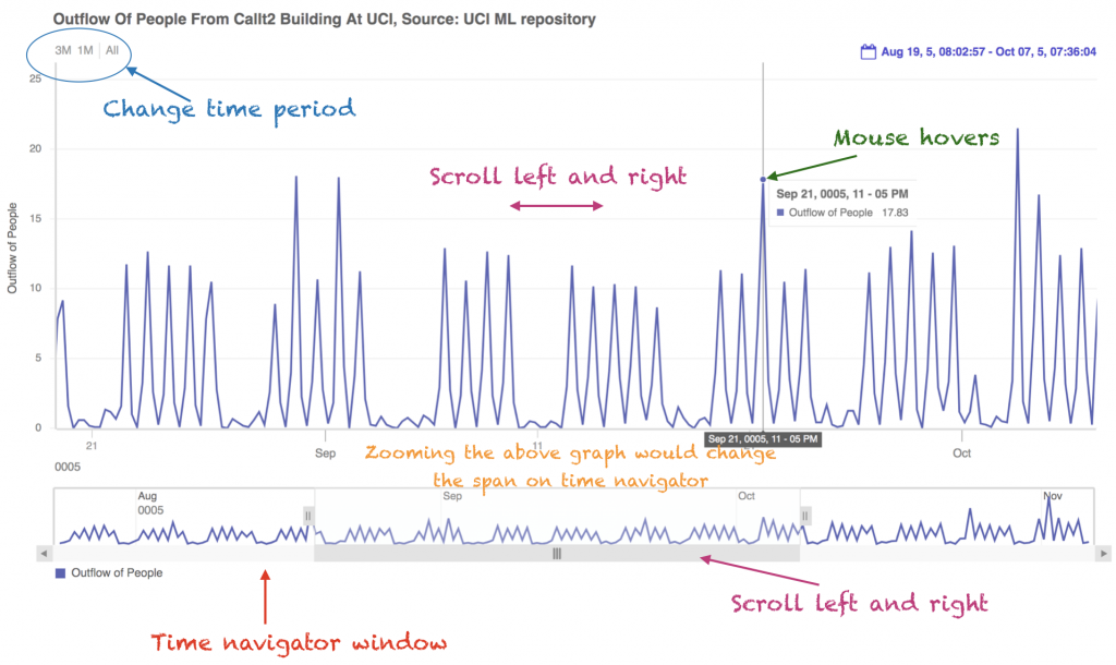
Another important item on our list is whether or not the charts are interactive. Most charting libraries create plots and graphs that are static and do not allow any user interaction. With FusionCharts you can create highly responsive beautiful charts and dashboards. You can implement a variety of interactions such as panning, zooming, and scaling. With FusionCharts your users can zoom in to visualize very minute detail or zoom out to observe overall long-term data trends. For example, look at this example of time series data with a time navigator window:
4. Are there Routines For Generating Maps?
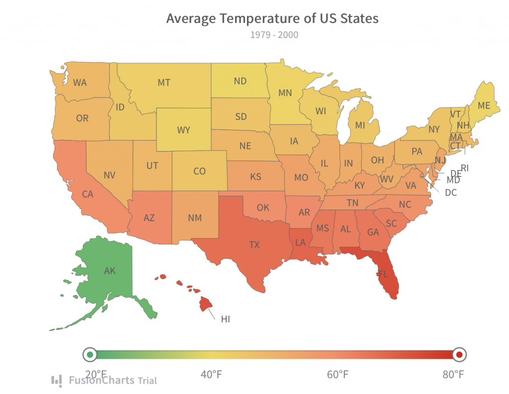
Many modern data visualization techniques involve adding points directly to a map. This type of chart depicts data trends in relation to location. For example, you can use different colors to show demographic information. Bubbles of various sizes on different parts of a map can show differences in agricultural production. Finally, a map can simply show you large international airports. FusionCharts library fully supports maps. There are over 2000+ geographical maps with a large database of all countries, US states, and various European regions. As a result, you can easily visualize business data like revenue by region, employment levels by state, or even your office locations.
5. Can the Charts Update in Real-Time?
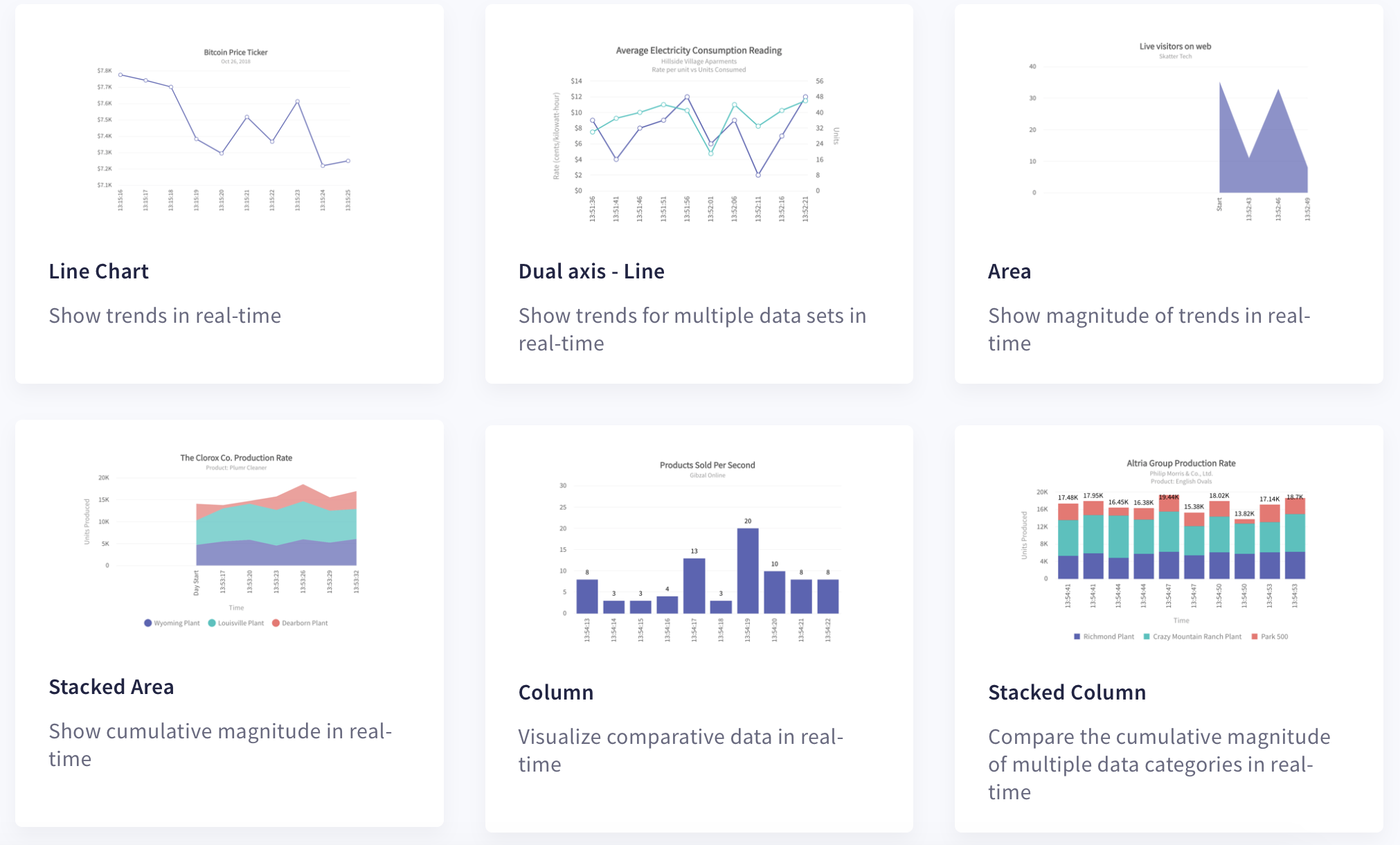
Many charting libraries only support static charts. Updating your graph or chart simply may not be an option. The FusionCharts library, however, comes with a complete set of real-time, self-updating charts. These charts are also called data streaming charts. They automatically get data from the server and update themselves after a time period you specify. Most importantly, these charts update without the need for any page refreshes.
6. Can the Charts be Exported?
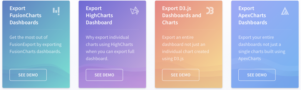
When investing in a charting library, another important consideration is whether or not you can export its charts to other formats. Some libraries do provide limited support but restrict you to downloading only individual charts. With FusionCharts, the FusionExport component allows users to not only download or export individual graphs, plots, and charts but also to download entire live dashboards. It is easy to export dashboards in multiple image formats. These include the .png, .jpg, .svg and also .pdf formats. You can also automatically save your dashboard on the server for sharing and exchanging in emails.
7. Are there APIs and SDKs for Different Frameworks?
Many charting libraries support only one or two programming languages. With FusionCharts, its APIs are consistent across a large variety of charts. You can easily integrate your charts and dashboards with any Javascript framework or server-side programming language. Developers can add charts to their favorite framework including Django, Ruby on Rails, Angular, React, jQuery, and Ember, just to name a few.
8. Is the Charting Library Accompanied by Documentation?
Many charting libraries available today have sparse documentation and limited or no demos and tutorials. With FusionCharts there are loads of online demos, tutorials, code samples, and examples for every chart, graph, map, and gauge. This makes it easy for your developers to use FusionCharts to its full potential.
How Do I Sign Up For a Free FusionCharts Trial?
FusionCharts is a charting library that enables users to create beautiful and stunning representations of data. 800,000 developers across 28,000 companies prefer FusionCharts over any other charting library. Impress your clients and colleagues with awesome, powerful, and effective data visualizations and interactive dashboards.
Wait no more. Make the most of your data and sign up for a free FusionCharts trial today.


