
A comprehensive enterprise dashboard is by far the most popular way to express or visualize results or insights, with an increasing number of companies adopting data analytics as a business tool. Dashboard designers hope to provide an accurate, all-encompassing view of a company’s current state. A well-designed analytics dashboard should be able to present timely, accurate information in an easy-to-understand format. Similarly, dashboard viewers should be able to quickly identify and analyze trends in their data. It stands to reason that as data analytics gains traction, so will the demand for effective business dashboards. Companies are looking for quick ways to improve the effectiveness and viewer-friendliness of dashboard visualizations.
As Edward Tufte, data visualization expert, puts it, “Graphical excellence is that which gives to the viewer the greatest number of ideas in the shortest time with the least ink in the smallest space.” It is a simple but compelling argument – to be effective, dashboards need to be comprehensive, clear, and, above all else, concise.
In this blog post, we’ll take a look at some recent and emerging data visualization trends that will make your dashboard design more responsive, effective, and appealing to your users with the use of the Data Visualization Tool, to keep:
- Keep track of visitor counts within particular intervals of time.
- Stay informed about visitor demographics.
- Find out the success rate of search engine optimization by tracking major factors influenced by SEO.
- Discover major traffic sources at a glance.
Please see our “10 Emerging Trends in Dashboard Design” whitepaper for more information on the trends we discuss here.
Table of Contents
Why is a responsive dashboard layout important for a better viewing experience?
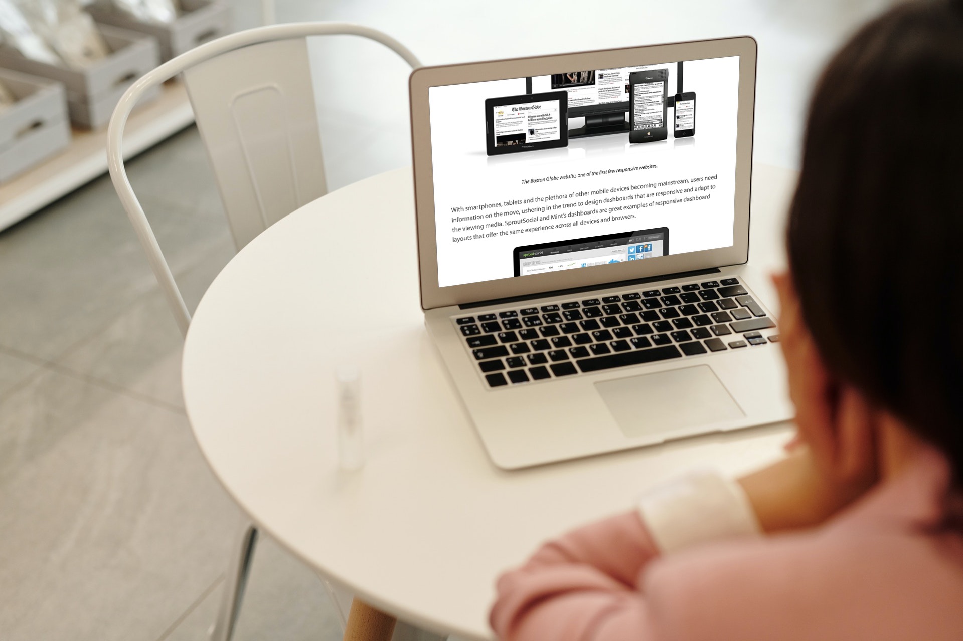
With the increased capabilities of modern devices, design responsiveness has become a key challenge. This is because it directly impacts the user experience. With the average person accessing their information from several devices, it is crucially important to design interfaces that react and adapt to user behavior. In this case, that means enabling a smooth transitional display on a PC, phone, iPad, or tablet.
Graphic designer Ethan Marcotte perfectly summarizes this idea when he suggests that “rather than tailoring disconnected designs to each of an ever-increasing number of web devices, we can treat them as facets of the same experience.”
With the mainstream adoption of smartphones, tablets, and plenty of other mobile devices, your users want information on the move. The result is an increased responsibility for designers to create responsive dashboards that adapt to any viewing medium. SproutSocial and Mint’s dashboards are great examples of responsive dashboard layouts. They offer the same experience across all devices and browsers.
How does interactivity help engage the dashboard viewers?
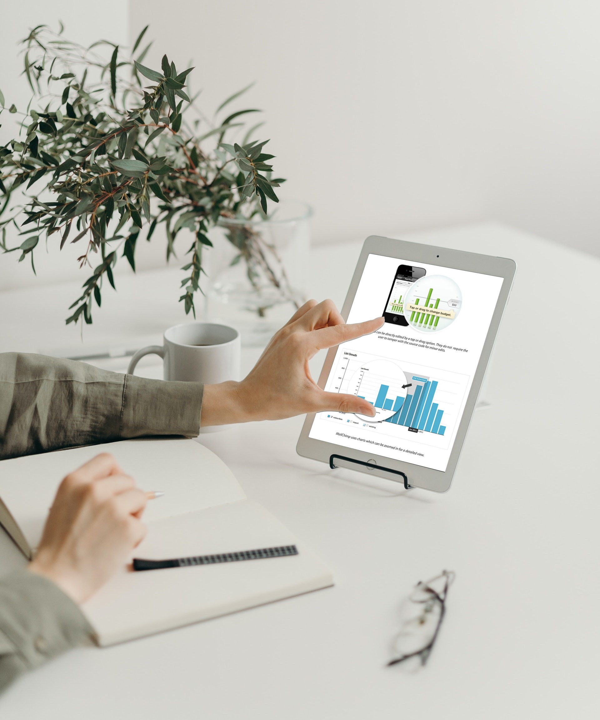
There was a time when we were pretty satisfied with the static dashboard design. We also considered the fixed selection of information from our apps. As technology has advanced, however, so have our expectations. Now, we demand that dashboards and other visualization components are interactive and respond directly to our needs.
For instance, zooming in and zooming out is an essential interactive experience that we expect. It makes accessing our information quick and easy without changing views. Furthermore, slice and dice interactivities allow us to take our data analysis to a whole new level.
What is the role of trendlines and progress bars in adding context to data?
According to the 10 Emerging Trends in Dashboard Design whitepaper, data put in the proper context helps users answer questions. Questions like ‘How far are we from achieving our target?’ or, ‘How do our sales today compare to last month?’
As a sales manager, if your dashboard tells you that the overall sales for this quarter are $25K, it is valuable information. If, however, your dashboard also told you that it was up 25 percent on your last quarter, the data instantly becomes more meaningful. This is where features like trendlines and progress bars provide depth and context to otherwise one-dimensional information.
Today’s dashboards employ multiple methods, like Spark Charts, to provide their users with increased data context and relevance.
What is the importance of real-time updates and alerts in dashboard visualizations?
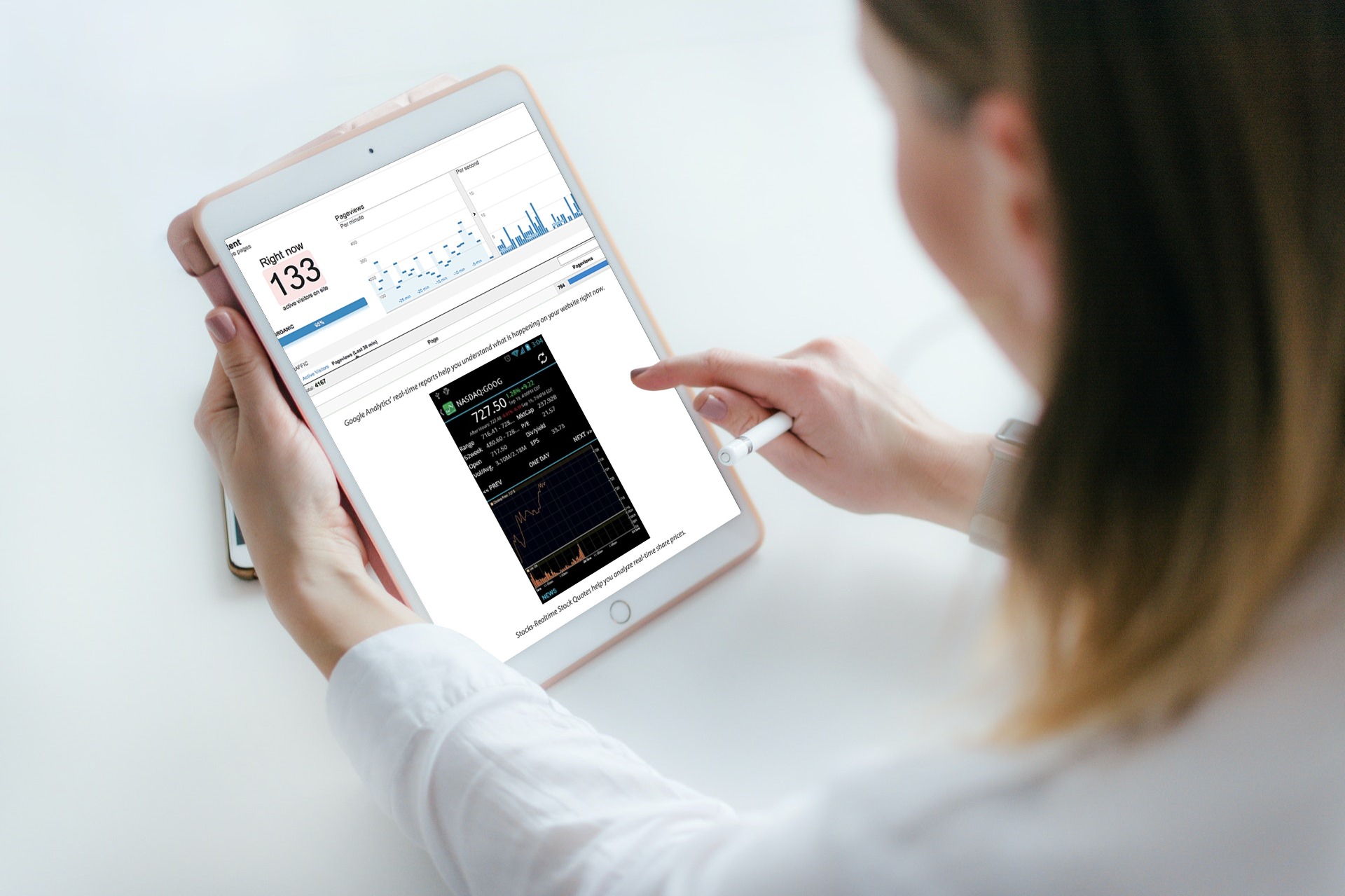 Technological developments in both in-stream and ad-hoc processing have made it easier to get real-time updates on your dashboard directly. However, real-time information is not essential for many tasks. For tasks like Web Traffic Monitoring using A/B tests or Stock Ticker updates, however, real-time data can go a long way toward helping you back the right horse.
Is there an impact to choosing a broader color palette on visualizations?
Traditionally, designers recommended using a maximum of two to three colors for dashboard visualizations. With the advent of modern design concepts like blending and opacity, that, however, has changed. Now designers focus on creating a combination of colors that promote a more pleasant user experience.
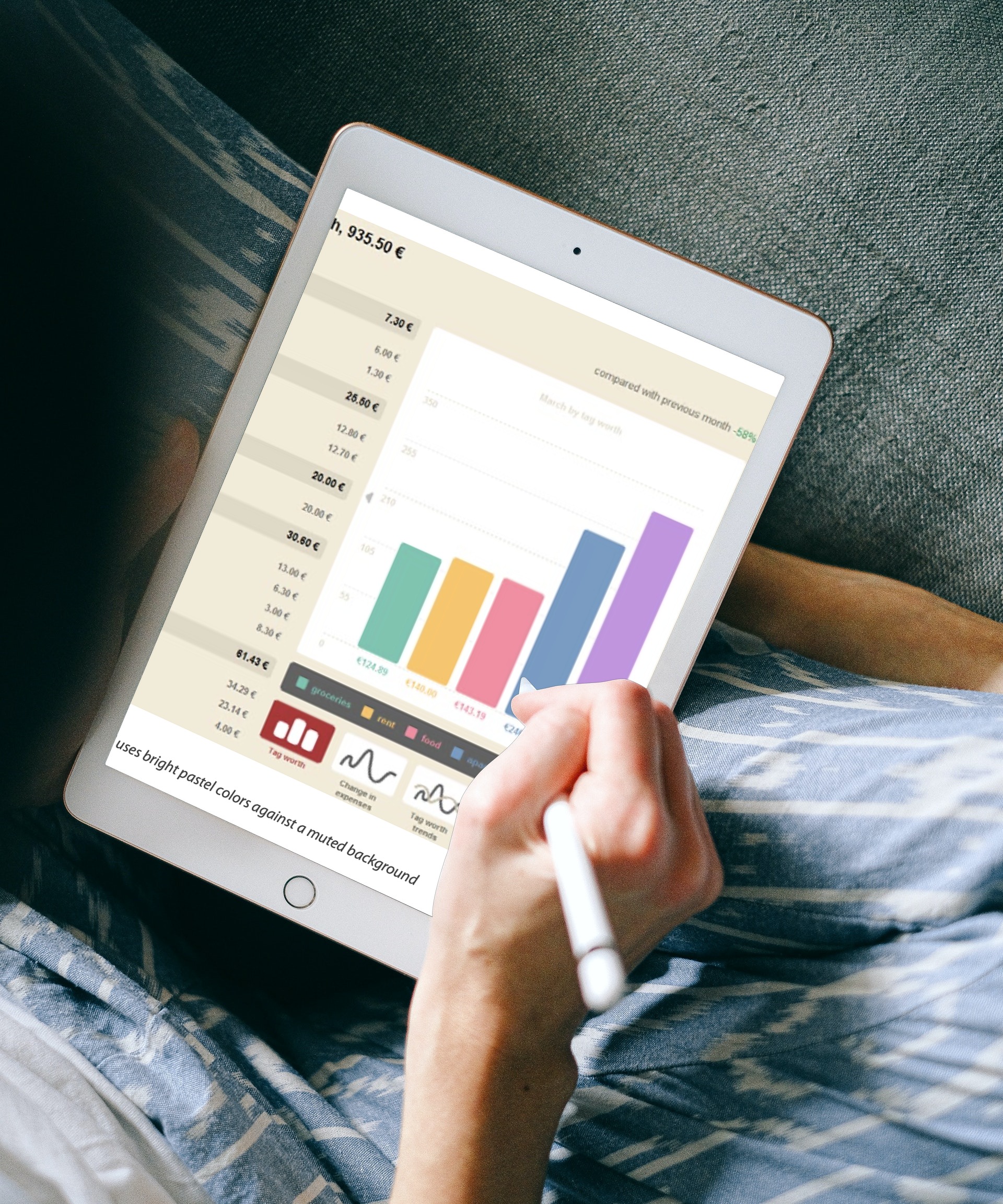
Today’s dashboards involve the skillful use of a broader color palette. On the one hand, we have dashboards that use shades of gray as their core color. On the other hand, there are dashboards with bold and uncommon color combinations. Somewhere in between are dashboards that use bright pastel colors against a muted background.
Click below to discover how emerging trends in dashboard design can take your dashboard visualizations to the next level.
Download FusionCharts’ “10 Emerging Trends in Dashboard Design” whitepaper and know more.


