In today’s competitive world, businesses need to transform raw data into actionable insights. One of the ways to understand your data is to use data visualizations, such as charts, graphs, and maps. Charts and graphs allow businesses to track key performance indicators, compare and contrast different data sets, and identify trends and patterns. As a result, visualizing business data help companies make strategic decisions and future plans. There are several different chart types, and every chart has specific use cases. For instance, a line chart can be used when you want to represent continuous data over time. Similarly, you can use bar graphs to visualize non-time-series data. Bar charts are, in fact, one of the most used and helpful chart types. So, in this article, we’ll show you a bar graph example to help you understand what a bar graph is and when to use it.
Table of Contents
What Is A Bar Graph?
A bar graph is a way of visualizing data, numeric values, or quantities using bars. These graphs are usually used when you have categorical data.
Bar charts help compare different categories or variables of your data set. For instance, you can use a bar chart to see how a variable compares against the others or identify the items in your data with the highest frequency. A bar chart is also a good option when you want to analyze changes in your data over time.
Some of the benefits of bar graphs include:
- Simple and easy to interpret
- Allow users to summarize large data sets in an easy-to-understand visual form
- Help identify and understand patterns and trends in a data set
Are you looking for a powerful data visualization tool to create bar graphs for your web apps? FusionCharts is what you need. FusionCharts is a leading JavaScript charting library that comes with over 100 different types of charts and graphs. These include different types of bar charts, column charts, area charts, pie charts, and many more. It also offers 2,000+ choropleth maps covering countries and cities. Not to mention, FusionCharts has several pre-built business dashboards that you can use to meet your business intelligence needs.
What Are The Elements Of A Bar Graph?
The following are the key elements of a bar graph:
Bars
Bars on a bar graph are essentially rectangles of different heights. The number of bars is equal to the number of data categories. For example, the bar graph will have five bars if there are five different categories. The length or height of each bar represents the numeric value of the category.
Axes
A bar graph has two axes, the x-axis, and the y-axis. One axis consists of bars representing different variables or categories, whereas the other axis represents discrete values.
What Are The Properties Of A Bar Chart?
- A bar graph consists of rectangles or bars. The width of each bar is the same, whereas the height of each bar varies depending on the numeric value of the category.
- Bars can either be vertical or horizontal, depending on your preference.
- The gap between all the bars should be uniform throughout the chart
- Bar graphs are great for comparing different categories of numerical data or understanding changes in data over time
What Are Different Types Of Bar Charts?
Below are the different types of bar charts:
Horizontal Bar Graph
In a horizontal bar chart, the bars are drawn along the y-axis/horizontally. The vertical axis consists of the data categories, and the horizontal axis of the bar represents the numeric values.
Vertical Bar Graph
In a vertical bar graph, the bars are drawn along the x-axis (vertically from down to top.) The horizontal axis consists of the data categories, whereas the vertical axis represents the numerical values.
A vertical bar graph is more common than a horizontal bar graph, and it is also sometimes called a column graph or chart.
Grouped Bar Graph
A grouped bar graph is used when you want to visualize data that consists of various categories, and each category further has several items or sub-groups. For instance, if there are five categories and each category has three sub-groups, the grouped bar chart will have five groups representing the main categories, and each group will have three bars. Grouped bar charts can be drawn vertically or horizontally, depending on your preference.
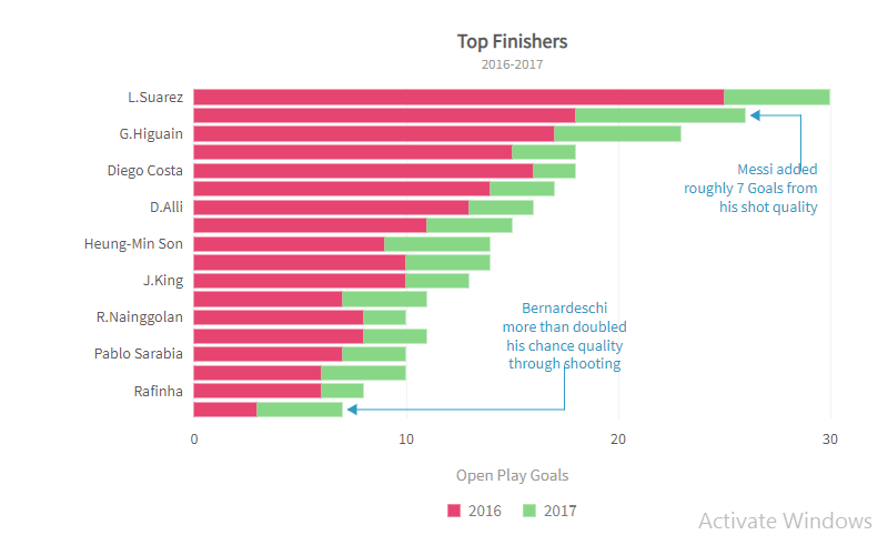
Stacked Bar Chart
A stacked bar chart is also helpful in representing information about sub-groups of different categories. However, the sub-groups are stacked on top of each other. In other words, in a stacked bar graph, each bar is divided into several parts. Hence, we can also use a stacked bar graph to compare parts of a whole.
Here is a stacked bar graph example:
How To Make A Bar Graph?
Below are the general steps you should follow while making a bar graph:
Step 1
First, examine your data and decide on the scale and interval. The scale is essentially the counting sequence on the axis.
Step 2
Next, decide whether you want to make a vertical or horizontal bar graph. Then label the axis accordingly.
Step 3
Draw the bars for each data category, depending on the numeric value of the category.
Step 4
Finally, give the graph a title and mention the scale. This step is essential as it helps viewers understand the chart.
Are you looking to create a bar chart in Excel? Check out this article.
Bar Graph Examples
Bar Graph Example 1
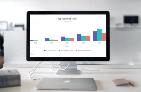
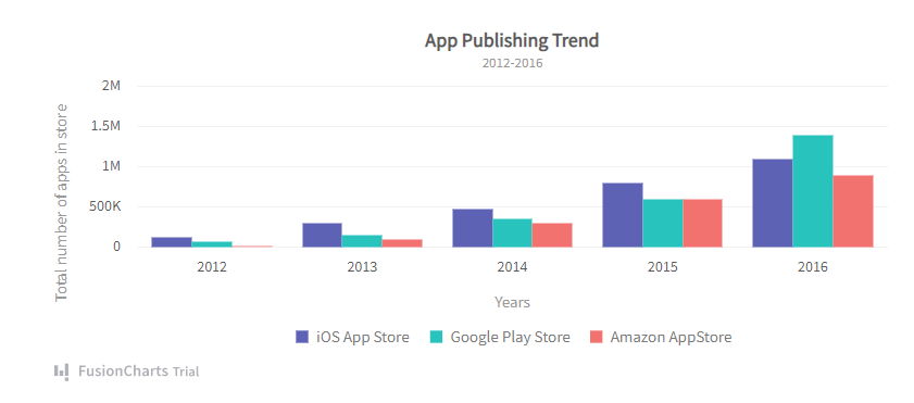
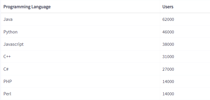
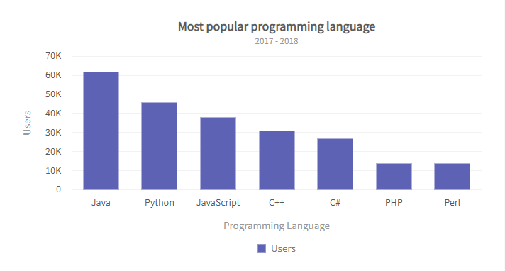
In this example, we’ll create a simple 2D vertical bar chart using FusionCharts. The graph shows the most popular programming languages. The bars on the horizontal axis represent different programming languages, and their heights correspond to the number of users.
Here is the data set we’ll use for this example:
The bar graph will look as follows:
Here is how you can create this chart using FusionCharts:
using System;
using System.Collections.Generic;
using System.Data;
using System.Linq;
using System.Web;
using System.Web.UI;
using System.Web.UI.WebControls;
using FusionCharts.DataEngine;
using FusionCharts.Visualization;

namespace FusionChartsVisualisationWebFormsSamples.Samples
{
    public partial class FirstChart: System.Web.UI.Page
    {
        protected void Page_Load(object sender, EventArgs e)
        {            {            DataTable ChartData = new DataTable();
            ChartData.Columns.Add("Programming Language", typeof(System.String));
            ChartData.Columns.Add("Users", typeof(System.Double));
            ChartData.Rows.Add("Java",62000);
            ChartData.Rows.Add("Python",46000);
            ChartData.Rows.Add("Javascript",38000);
            ChartData.Rows.Add("C++",31000);
            ChartData.Rows.Add("C#",27000);
            ChartData.Rows.Add("PHP",14000);
            ChartData.Rows.Add("Perl",14000);

            // Create static source with this data table
            StaticSource source = new StaticSource(ChartData);
            // Create instance of DataModel class
            DataModel model = new DataModel();
            // Add DataSource to the DataModel
            model.DataSources.Add(source);
            // Instantiate Column Chart
            Charts.ColumnChart column = new Charts.ColumnChart("first_chart");
            // Set Chart's width and height
            column.Width.Pixel(700);
            column.Height.Pixel(400);
            // Set DataModel instance as the data source of the chart
            column.Data.Source = model;
            // Set Chart Title
            column.Caption.Text = "Most popular programming language";
            // Sset chart sub title
            column.SubCaption.Text = "2017-2018";
            // hide chart Legend
            column.Legend.Show = false;
            // set XAxis Text
            column.XAxis.Text = "Programming Language";
            // Set YAxis title
            column.YAxis.Text = "User";
            column.ThemeName = FusionChartsTheme.ThemeName.FUSION;
            // Render the chart to 'Literal1' literal control
            Literal1.Text = column.Render();
        }
    }
}
Bar Graph Example 2
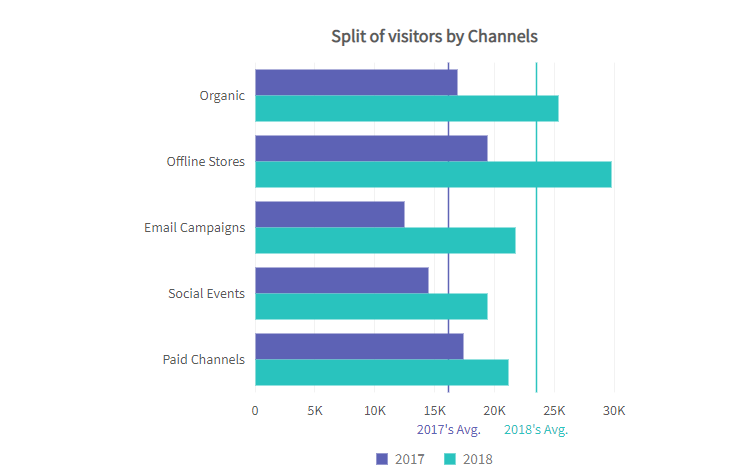
In this example, we’ll create a grouped bar chart using Fusioncharts:
Code:
const dataSource = {
  chart: {
    caption: "Split of visitors by Channels",
    placevaluesinside: "1",
    showvalues: "0",
    plottooltext: "<b>$dataValue</b> visitors from $label in $seriesName",
    theme: "fusion"
  },
  categories: [
    {
      category: [
        {
          label: "Organic"
        },
        {
          label: "Offline Stores"
        },
        {
          label: "Email Campaigns"
        },
        {
          label: "Social Events"
        },
        {
          label: "Paid Channels"
        }
      ]
    }
  ],
  dataset: [
    {
      seriesname: "2017",
      data: [
        {
          value: "17000"
        },
        {
          value: "19500"
        },
        {
          value: "12500"
        },
        {
          value: "14500"
        },
        {
          value: "17500"
        }
      ]
    },
    {
      seriesname: "2018",
      data: [
        {
          value: "25400"
        },
        {
          value: "29800"
        },
        {
          value: "21800"
        },
        {
          value: "19500"
        },
        {
          value: "21200"
        }
      ]
    }
  ],
  trendlines: [
    {
      line: [
        {
          startvalue: "16200",
          color: "#5D62B5",
          thickness: "1.5",
          displayvalue: "2017's Avg."
        },
        {
          startvalue: "23500",
          color: "#29C3BE",
          thickness: "1.5",
          displayvalue: "2018's Avg."
        }
      ]
    }
  ]
};

FusionCharts.ready(function() {
  var myChart = new FusionCharts({
    type: "msbar2d",
    renderAt: "chart-container",
    width: "100%",
    height: "100%",
    dataFormat: "json",
    dataSource
  }).render();
});
The above code will render the following chart:
Start using FusionCharts and try its exciting features today!


