Google Charts is a web service that generates graphical charts from data provided by users. The user enters data, a formatting command in JavaScript is integrated into a web page, and the service responds with a chart image. There are also some amazing Google Charts alternatives on the market that are strong, easy to use, and completely free.
Embedding basic JavaScript into a website page is the most frequent technique to use Google Charts. However, there is a new alternative in town, and it is making waves for being a much better dynamic charts solution than Google Charts [1].
Let’s check out why FusionCharts should be seen as the superior Google Charts alternative.
Table of Contents
Why FusionCharts is the Best Google Charts Alternative?
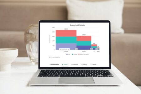
Developed in 2012, FusionCharts gives you the ability to create a real-time dashboard for a laptop or computer that can handle all kinds of data, no matter how complex. The React Native application required to implement the graphs is also easy to handle, making it a user-friendly option for everyone.
But that’s not all, let’s explore why FusionCharts is a fantastic Google Charts alternative:
Does FusionCharts Offer a Wide Range of Chart Types?
FusionCharts offers over 100 charts, gauges, and graphs to choose from. It also allows you to create over 2000 choropleth maps.
In comparison, Google Charts does not have domain-specialized charts like Marimekko for financial applications. It doesn’t support Sunburst, Chord, and 3D charts either.
Is FusionCharts Fully Customizable?
One of the numerous benefits of FusionCharts is that you can customize practically everything. Everything from subtitles to axis labels and point color is configurable and adaptable to your needs.
In addition to many other capabilities, FusionCharts allows users to add more graphic tools to charts, all of which are 100 percent compatible with iOS devices (3.0+) and all Android devices.
Does FusionCharts Help Facilitate User Interactions?
Google Charts does not feature panning, zooming, resizing, or dragging, which are also relatively uncommon on other systems. This is why FusionCharts is a much better option when you looking for a charting program that gives you choices and fine control.
FusionCharts lets you visualize a large amount of data while also providing interactive scaling, panning, and scrolling options. You can simply zoom into any subset of data, pin a specific data point, and pan to compare it to the entire data set when using FusionCharts.
Does FusionCharts Allow You to Define Event Monitors for Almost Any Event Type?
FusionCharts Suite XT features a comprehensive collection of events that allow you to interact with the product’s numerous charts, gauges, and maps at various phases of their lifespan, such as when a chart finishes rendering, when chart information updates, or when you select a data plot.
Unlike Google Charts, FusionCharts provides event handlers for practically all types of events. This means developers can create highly interactive visualizations that meet the needs of their users.
Does FusionCharts Come with a Lot of Documentation to Help Users?
The FusionCharts documentation includes not just API references but also tutorials for each chart and setting. These courses now support ES6 conventions, which you can confidently integrate into your project right away.
Even better, there are tutorials available for more than ten frameworks and languages, including React, Vue, Svelte, Ruby on Rails, Django, etc.
Can FusionCharts Support All Popular Frameworks?
FusionCharts is a simple-to-use library that can be used with practically any major framework, including Svelte, Ruby on Rails, Django, React, and Vue, to mention a few.
Need to Know About Its Great Compatibility?
FusionCharts has always been a developer-first solution, with excellent backward compatibility, authorized plugins, and a solid roadmap. As a result, it supports all of the prominent frameworks, from the classic jQuery to the cutting-edge Svelte and .NET and Ruby on Rails.
Does FusionCharts Offer Trendlines?
Trendlines are horizontal or vertical reference lines that aid in the interpretation of data. With FusionCharts, you can use trendlines to specify limits and targets that serve as a framework for data (including tooltips).
You can use a trendline in a chart to draw users’ attention to a specific segment of data values on any of the axes. You can also customize the trendline’s color, thickness, and transparency.
Does It Help You Customize Legends?
FusionCharts provides interactive legends for every data set in multi-series charts, making linking each to its associated category easier. FusionCharts legends are highly interactive. You can conceal or show a data plot by clicking on the legend icon representing a particular data series, allowing you to focus on relevant data sets on the fly.
Does FusionCharts Allow You to Set up a Chart’s Branding?
From an end-user perspective, it’s important to incorporate your company’s branding on the charts you create.
With FusionCharts, you can place your corporate logo/text and a link to your firm’s homepage in a prominent location. You can also save logos as pictures and use them in newsletters as static images.
Does FusionCharts Offer Annotations?
You can draw bespoke shapes (annotations) on a chart in FusionCharts to display extra information to readers or improve your charts’ appearance. Depending on your needs, you can use a variety of forms, photos, and text annotations in your charts.
Does FusionCharts Provide You the Option to Use Drill-Down Charts?
You can create drill-down charts with FusionCharts XT, and all charts support drill-down interactivity for data items. This means that the data plots in a chart can behave as hot spots for each chart type.
You can create an infinite number of levels of drill-down so that you can rapidly launch another chart with more information about a data plot by clicking on it.
Can You Manage Your Space Better with FusionCharts than with Google Charts?
FusionCharts offers several clever space management tools that can help you organize charts on pages in a logical and space-saving manner.
Vertical charts, for example, can dynamically align so that their axes, columns, and overall space all align evenly, giving your entire page an organized appearance.
Unlike Google Charts, Does FusionCharts Offer Configuration for Chart Loading?
With FusionCharts you can show a message to the viewer before a chart loads to let them know everything is working properly.
You can also notify viewers if there is a problem loading the chart data, a discrepancy between the data and the chart type, or a problem with the data itself. To express this information to the viewer, you can use text or a picture.
Can You Easily Export Charts with FusionCharts?
You can export charts, gauges, and maps from FusionCharts in a variety of formats, including pictures, Excel spreadsheets, and PDF files.
You can also configure several parts of the export process, such as the name that appears in the export menu, the filename, and whether or not a batch of charts exports.
Are You Ready to Change to the Best Google Charts Alternative?
So, there you go! FusionCharts is the best chart-design tool out there. And we have shown you plenty of reasons why it’s one of the best Google charts alternatives —excited yet? Give it a try and step into a world of options you never knew existed!
[1] https://developers.google.com/chart


