Data visualization helps you easily capture valuable information about your business. It’s also useful for effectively communicating your message to the target audience. One of the best ways of visualizing your data is through bar graphs. It allows you to effortlessly compare two or more items. You can use the comparison bar chart to compare your best-selling products. Thus you can boost your conversion rate. In this post, you will find different ways to compare data using the bar graph. Let’s dive in.
Table of Contents
What Is A Bar Graph?
A bar graph is a form of data visualization. It enables you to create a graphical representation of data using bars or strips. It allows you to easily compare distinct categories. Also, you can conveniently contrast different types of data and frequencies.
A bar graph can be horizontal or vertical. Each bar on the chart represents a specific value, such as sales, revenue, growth, etc. Comparing two bars side by side facilitates the visualization and comparison of data.
Bar Graph Comparison Example
Bar charts allow you to easily visualize large amounts of information. Hence, you can easily compare categories. Let’s take a look at an example bar chart.
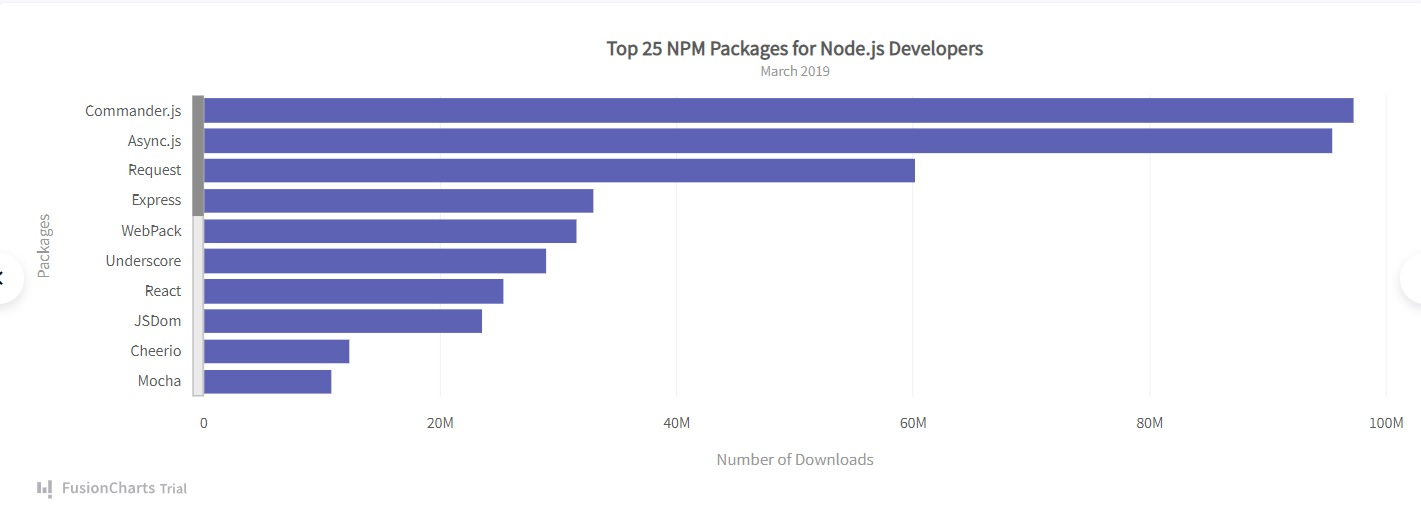
The bar graph displayed above shows the top 25 NPM packages for Node.js developers. The x-axis represents the number of downloads. On the other hand, the y-axis shows different categories of NPM packages. By using the graphical comparison, you can easily compare different groups.
Comparison Bar Chart – Elements
Let’s have a look at the elements of comparison bar chart:
Bar
Bars are the rectangles drawn on the chart. They show the number of items under specific categories.
Axes
The bar graph has two axes. One axis represents the numerical values. The other one represents the categorical data.
Comparison Bar Chart – Types Of Bar Graphs
There are different types of bar graphs. Let’s find them out.
Horizontal Bar Graph
As the name suggests, it horizontally represents data from left to right. Here, you put the data categories on the vertical axis. On the other hand, you place the numerical values are placed on the horizontal axis.
Read: Bar Graphs on Excel
Vertical Bar Graph
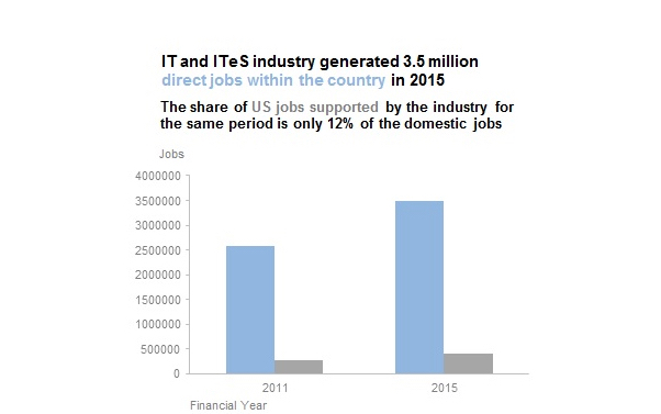
A vertical bar graph is the most common type of bar chart. It is also known as the column graph and these are the best charts for comparing and contrasting. Here, the bars are drawn vertically from down to top. The horizontal axis represents the data categories. On the other hand, the vertical axis represents the numerical values.
Grouped Bar Graph
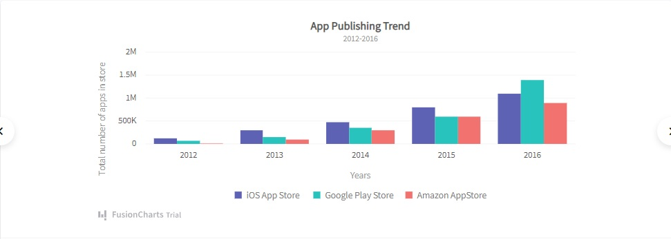
Grouped bar charts are visualizations that compare multiple sets of data items. Each set of data is separately graphed. However, they are placed on the same graph. You use it to display two or more data sets side-by-side. They are grouped under categories on the same axis.
Stacked Bar Chart
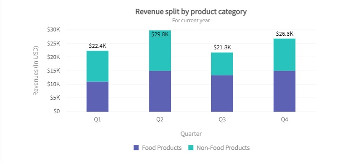
A stacked bar chart is another form of the bar graph. It displays the composition and comparison bar chart of relative or absolute variables over time. Also, it shows sub-groups. However, they are stacked on the same bar.
Read: A Fresh Look At Stacked Bar Graphs
Segmented Bar Graph
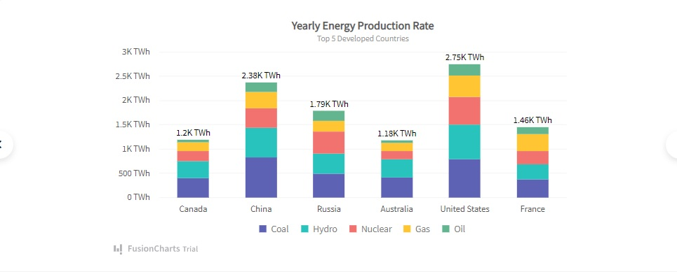
It’s a type of stacked bar chart where each bar shows 100% of the discrete value. Here, the bars are divided into segments of different colors, sizes, or shapes. It allows you to easily compare data between other groups.
Comparison Bar Chart – How To Make A Bar Graph?
In this section, you’ll learn steps for making comparison graphs for bar charts:
Step 1: Establishing Numerical Scale and Intervals
The very first step is to determine the scale and interval for your numerical values. The scale refers to the counting sequence of the axis. If you have smaller values, you can go with a counting sequence like 1, 2, 3… However, for larger values, you have to utilize some interval of numbers between each value. For instance, you can use this sequence: 5, 10, 15…
If you need to use a scale of 1 where your values start at a value higher than 1, such as 25, 28, 38, etc., you can skip the initial values and create the scale from a higher value like 20. To accomplish this, you need to add a “break” on the y-axis.
Step 2: Axis Labeling for Clarity
The second step is to label both the horizontal and vertical axes. It will provide the viewer with a clear description of information.
- The Y-axis is generally used to represent the different categories of the values that have to be represented on the graph.
- On the other hand, the X-axis represents the intensity or quantity of the values.
Step 3: Drawing Category-Associated Bars
The third step is to draw bars corresponding to each category. For example, you are creating a bar chart for the top-selling item of the day. The no. 1 item is a shirt. 10 customers have made the purchase. Therefore, you need to draw a rectangle over the “shirt category.” Its length will be 10 units. Similarly, you have to draw other bars corresponding to each category.
Step 4: Graph Finalization with Contextual Title
The fourth and final step is to label the graph with a title. It will provide a context of what the bar chart is about.
Read: Line Charts Vs. Area Charts
Ways To Use Comparison Bar Charts
There are different ways of comparing data with bar charts. Let’s take a look at them.
Side-by-Side Bar

In a side-by-side bar chart, the bars are split into bar segments. The segments are placed next to each other. You can split the bars into colored segments.
Clustered Bar
A clustered bar chart utilizes clustered horizontal columns to display multiple data series. Each data series shares the same axis labels. Hence, horizontal bars are grouped by category. Clustered bars enable you to make the direct comparison bar chart of multiple series in a given category.
Stacked Bar

A stacked bar chart is a graph that represents the proportional contribution of individual data points in comparison to a total. You use it to break down and compare parts of a whole. Each bar in the chart represents a whole. On the other hand, segments in the bar represent different parts or categories.
The stacked Bar graph can have one category axis. Also, it can have up to two numerical axes. The category axis describes the types of categories being compared. On the other hand, the numerical axes represent the values of the data.
Read: Linear vs. Logarithmic Scales
Bar Graph Comparison – How Can I Easily Create A Comparison Chart?
You can easily create a comparison bar chart by using FusionCharts. It’s the most comprehensive JavaScript charting library on the planet. It allows you to effortlessly build different types of visualizations, including bar charts, line graphs, scatter plots, etc.
Let’s take a look at an example of a horizontal bar chart created using FusionCharts:
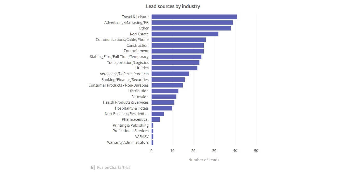
As you can see in the graphical comparison, the horizontal bar chart allows you to easily compare categories. Also, it lets you effortlessly compare data.
To create the horizontal bar chart shown above, you have to follow these steps:
1. First, go to your JavaScript file. Create a constant, called dataSource.
const dataSource = {
  chart: {
    caption: “Lead sources by industry”,
    yaxisname: “Number of Leads”,
    aligncaptionwithcanvas: “0”,
    plottooltext: “$dataValue leads received”,
    theme: “fusion”
  },
2. Then you have to add the data labels and values.
data: [
    {
      label: "Travel & Leisure",
      value: "41"
    },
    {
      label: "Advertising/Marketing/PR",
      value: "39"
    },
    {
      label: "Other",
      value: "38"
    },
    {
      label: "Real Estate",
      value: "32"
    },
    {
      label: "Communications/Cable/Phone",
      value: "26"
    },
    {
      label: "Construction",
      value: "25"
    },
    {
      label: "Entertainment",
      value: "25"
    },
    {
      label: "Staffing Firm/Full Time/Temporary",
      value: "24"
    },
    {
      label: "Transportation/Logistics",
      value: "23"
    },
    {
      label: "Utilities",
      value: "22"
    },
    {
      label: "Aerospace/Defense Products",
      value: "18"
    },
    {
      label: "Banking/Finance/Securities",
      value: "16"
    },
    {
      label: "Consumer Products - Non-Durables",
      value: "15"
    },
    {
      label: "Distribution",
      value: "13"
    },
    {
      label: "Education",
      value: "12"
    },
    {
      label: "Health Products & Services",
      value: "11"
    },
    {
      label: "Hospitality & Hotels",
      value: "10"
    },
    {
      label: "Non-Business/Residential",
      value: "6"
    },
    {
      label: "Pharmaceutical",
      value: "4"
    },
    {
      label: "Printing & Publishing",
      value: "1"
    },
    {
      label: "Professional Services",
      value: "1"
    },
    {
      label: "VAR/ISV",
      value: "1"
    },
    {
      label: "Warranty Administrators",
      value: "1"
    }
  ]
};
3. Finally, you can render the horizontal bar chart with this code:
FusionCharts.ready(function() {
  var myChart = new FusionCharts({
    type: "bar2d",
    renderAt: "chart-container",
    width: "100%",
    height: "100%",
    dataFormat: "json",
    dataSource
  }).render();
});
Overall, the code will look like this:
const dataSource = {
  chart: {
    caption: "Lead sources by industry",
    yaxisname: "Number of Leads",
    aligncaptionwithcanvas: "0",
    plottooltext: "<b>$dataValue</b> leads received",
    theme: "fusion"
  },
  data: [
    {
      label: "Travel & Leisure",
      value: "41"
    },
    {
      label: "Advertising/Marketing/PR",
      value: "39"
    },
    {
      label: "Other",
      value: "38"
    },
    {
      label: "Real Estate",
      value: "32"
    },
    {
      label: "Communications/Cable/Phone",
      value: "26"
    },
    {
      label: "Construction",
      value: "25"
    },
    {
      label: "Entertainment",
      value: "25"
    },
    {
      label: "Staffing Firm/Full Time/Temporary",
      value: "24"
    },
    {
      label: "Transportation/Logistics",
      value: "23"
    },
    {
      label: "Utilities",
      value: "22"
    },
    {
      label: "Aerospace/Defense Products",
      value: "18"
    },
    {
      label: "Banking/Finance/Securities",
      value: "16"
    },
    {
      label: "Consumer Products - Non-Durables",
      value: "15"
    },
    {
      label: "Distribution",
      value: "13"
    },
    {
      label: "Education",
      value: "12"
    },
    {
      label: "Health Products & Services",
      value: "11"
    },
    {
      label: "Hospitality & Hotels",
      value: "10"
    },
    {
      label: "Non-Business/Residential",
      value: "6"
    },
    {
      label: "Pharmaceutical",
      value: "4"
    },
    {
      label: "Printing & Publishing",
      value: "1"
    },
    {
      label: "Professional Services",
      value: "1"
    },
    {
      label: "VAR/ISV",
      value: "1"
    },
    {
      label: "Warranty Administrators",
      value: "1"
    }
  ]
};

FusionCharts.ready(function() {
  var myChart = new FusionCharts({
    type: "bar2d",
    renderAt: "chart-container",
    width: "100%",
    height: "100%",
    dataFormat: "json",
    dataSource
  }).render();
});
That’s it! You have created a beautiful horizontal bar chart with FusionCharts. As you can see, the process is very simple. It doesn’t require you to write a lot of code. Hence, you can quickly create a bar chart. It helps you to boost your development workflow.
Conclusion
Making the best business decisions is crucial for achieving success. To make the best strategy, you need to utilize the information at your disposal. To get quality insights, you’ve to transform the raw data into an easily digestible format. That’s where bar graph comparison comes into play. It allows you to effortlessly compare different categories. Hence, you can quickly find key insights and make effective business decisions.
There are plenty of tools for creating bar graphs. For example, you can create comparison bar charts in Excel or Google Sheets. However, if you are working on developing web apps, the best option is to use a powerful JavaScript library, like FusionCharts.
Now, you have a solid understanding of comparison bar charts. Also, you have seen numerous comparison bar chart examples. Therefore, you can start visualizing the data to uncover valuable insights into the current market. FusionCharts is a comprehensive JavaScript library for building interactive charts and dashboards. It is fast, powerful, and very easy to use. Try it now for free.
FAQ
How can I create a bar chart in Excel and Google Sheets?
If you are using Excel, head to Insert > Insert Column or Bar Chart icon. Then select a column chart option of your choice. If you are using Google Sheets, go to Insert > Chart. Then, in the pop-up chart menu, click the dropdown under Chart Type. Now, choose Bar Graph.
Why is it important to visualize data?
Data visualization utilizes graphs or maps to visually represent complex data. It offers clear meaning to the information displayed. Hence, the data becomes more natural to the viewers. The audience can easily understand complex information, like patterns and trends.
Why charts and graphs are useful?
Graphs and charts transform a large amount of data into an easily digestible format. It enables you to effectively convey your message to the audience. For instance, pie charts, bar graphs, and line graphs allow you to showcase categorical data.


