
In a fast-paced economy, gaining actionable insights from business data is a prerequisite for survival. Consequently, data visualization tools (charts, graphs, and maps) are becoming rampant. With so many tools to choose from, identifying what’s best for interpreting and representing your data can get overwhelming. Every chart type has specific use cases.
For example, a stacked bar chart is great for comparing numeric values between levels of a categorical variable. However, if you apply the wrong chart type to your data, you risk confusing your users or leading them to make bad decisions.
This article discusses the stacked bar chart, as there’s a lot of debate regarding its viability.
Table of Contents
Are Stacked Bar Charts The Worst?
Robert Kosera, in his article, Stacked Bar Charts Are The Worse [1],
“Stacked bar charts are deceiving because we think they work just like regular bars when they’re really pretty terrible.”
Robert Kosera, 2016
Deceiving? And terrible? Tell that to the numerous real-world stacked bar chart use cases.
It’s fair to say that Mr. Kosera’s assessment of this chart type was harsh. Nevertheless, you must be certain about a chart type’s real purpose before applying it to your data. Stacked bar charts are great for comparing total values per series. At the same time, you can easily identify which variable in the series is responsible for making a total bigger or smaller.
However, he also came to that conclusion because he believes people use stacked bar charts like regular bar charts. In this case, we agree with Mr. Kosera. Regular bar charts are great for comparing series magnitude. And that’s not where a stacked bar chart would thrive. In fact, using a stacked bar chart in such scenarios would defeat the purpose of data visualization. So, where do stacked bar charts thrive? Let’s find out!!
When Should You Use A Stacked Bar Chart?
To understand where stacked bar charts are the best, let’s take a step back to analyze regular bar charts. Generally, bar charts suit use cases that require comparing individual data points. Here’s an example:
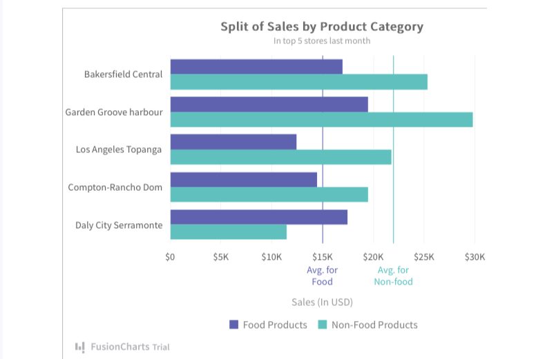
The bar chart above compares the performance of two product categories (food products and non-food products) across 5 stores — Bakersfield Central, Garden Grove Harbour, Los Angeles Topanga, Compton-Rancho Dom, and Daly City Serramonte. This type of visualization is especially useful, where the goal is to infer which store is best for each product. In this case, we need to compare individual values (products) against each other within a category.
We can infer the following answers from the above chart.
- Non-food products produce the highest sales in Garden Grove Harbour, and the worst sales in Daly City Serramonte.
- Food products also have the highest sales in Garden Grove Harbour, and the worst in Los Angeles Topanga.
With this example, we can also infer the biggest and lowest sales within each store, if that’s our goal.
But, what if we our goal is to compare the total sales in each store? Regardless of individual product performance, which store produced the highest sales? To answer this question, a single series bar chart will suffice.
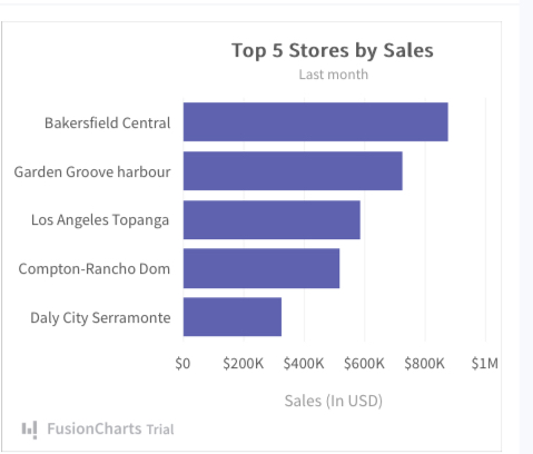
From the example above, we can clearly see that Garden Grove Harbour is the most successful store. But these are just surface readings. What if we could go deeper to understand the relationship between each store? In other words, what products are responsible for a low or high sales store? While it’s possible to infer the answer to this question using the combination of the examples above, it isn’t practical and can lead to inaccurate results.
In fact, it is one of the most common charting mistakes — using multiple charts instead of a single chart for a holistic view.
What’s accurate, however, is plotting the total sales and individual product sales on a single platform. A stacked bar chart can play a key role here.
A stacked bar chart enables the simultaneous comparison of totals and the item level relationship directly influencing the totals.
How To Create A Stacked Bar Chart?
The first step to creating a stacked bar chart is choosing the right charting library. However, there are numerous chart libraries out there, and selecting the best fit for your project can get overwhelming. That said, we’ve done the hard work for you — comparing the top chart libraries in the market. And, FusionCharts comes out on top. In this case, we’ll use FusionCharts as the case study for this example.
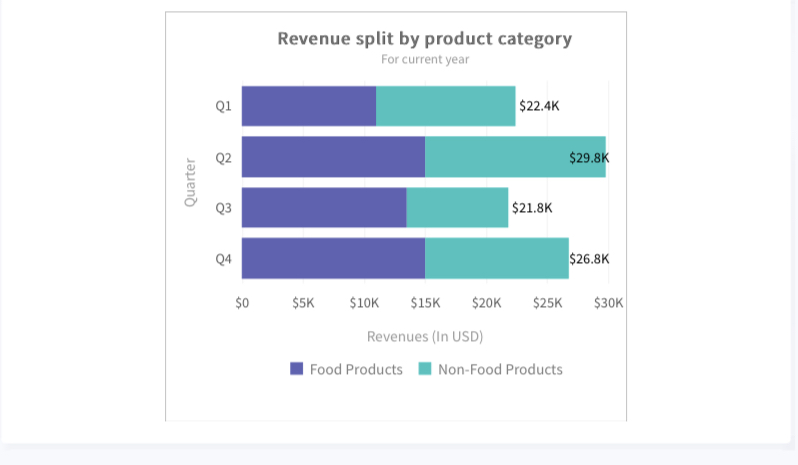
Below’s an example of how you create a stacked bar chart above using FusionCharts.
We’ll plot the quarterly revenue for an imaginary company’s product category — food and non-food products. Each product category will have distinct colors for easy interpretation. FusionCharts offers both 2D and 3D stacked bar charts. Here’s how to create our example in 2D:
- In the JSON data, set the attributes and their corresponding values in “<attributeName>”: “<value>” format.
- Specify the chart type using the type attribute. To render a stacked bar 2D chart, set stackedbar2d.
- Set the container object using renderAt attribute.
- Specify the dimension of the chart using width and height attributes.
- Set the type of data (JSON/XML) you want to pass to the chart object using dataFormat attribute.
The above steps will produce the chart below:
Here’s the code:
{
    "chart": {
        "theme": "fusion",
        "caption": "Revenue split by product category",
        "subCaption": "For current year",
        "xAxisname": "Quarter",
        "yAxisName": "Revenues (In USD)",
        "showSum": "1",
        "numberPrefix": "$"
    },
    "categories": [
        {
            "category": [
                {
                    "label": "Q1"
                },
                {
                    "label": "Q2"
                },
                {
                    "label": "Q3"
                },
                {
                    "label": "Q4"
                }
            ]
        }
    ],
    "dataset": [
        {
            "seriesname": "Food Products",
            "data": [
                {
                    "value": "11000"
                },
                {
                    "value": "15000"
                },
                {
                    "value": "13500"
                },
                {
                    "value": "15000"
                }
            ]
        },
        {
            "seriesname": "Non-Food Products",
            "data": [
                {
                    "value": "11400"
                },
                {
                    "value": "14800"
                },
                {
                    "value": "8300"
                },
                {
                    "value": "11800"
                }
            ]
        }
    ]
}
What Chart Types Are The Best?
Depending on the purpose of your data visualization, a stacked bar chart can be the best. So, the real question should be— “what are your goals?” If you intend to compare categories to determine the relationship between each item across all categories, then a stacked bar chart is the best.
FusionCharts offers different stacked chart types. You can find out which suits your project here.
Click here to start your free trial with FusionCharts today.
References [1] https://eagereyes.org/techniques/stacked-bars-are-the-worst


