Bar Charts : An easy guide for beginners
What is a bar chart?
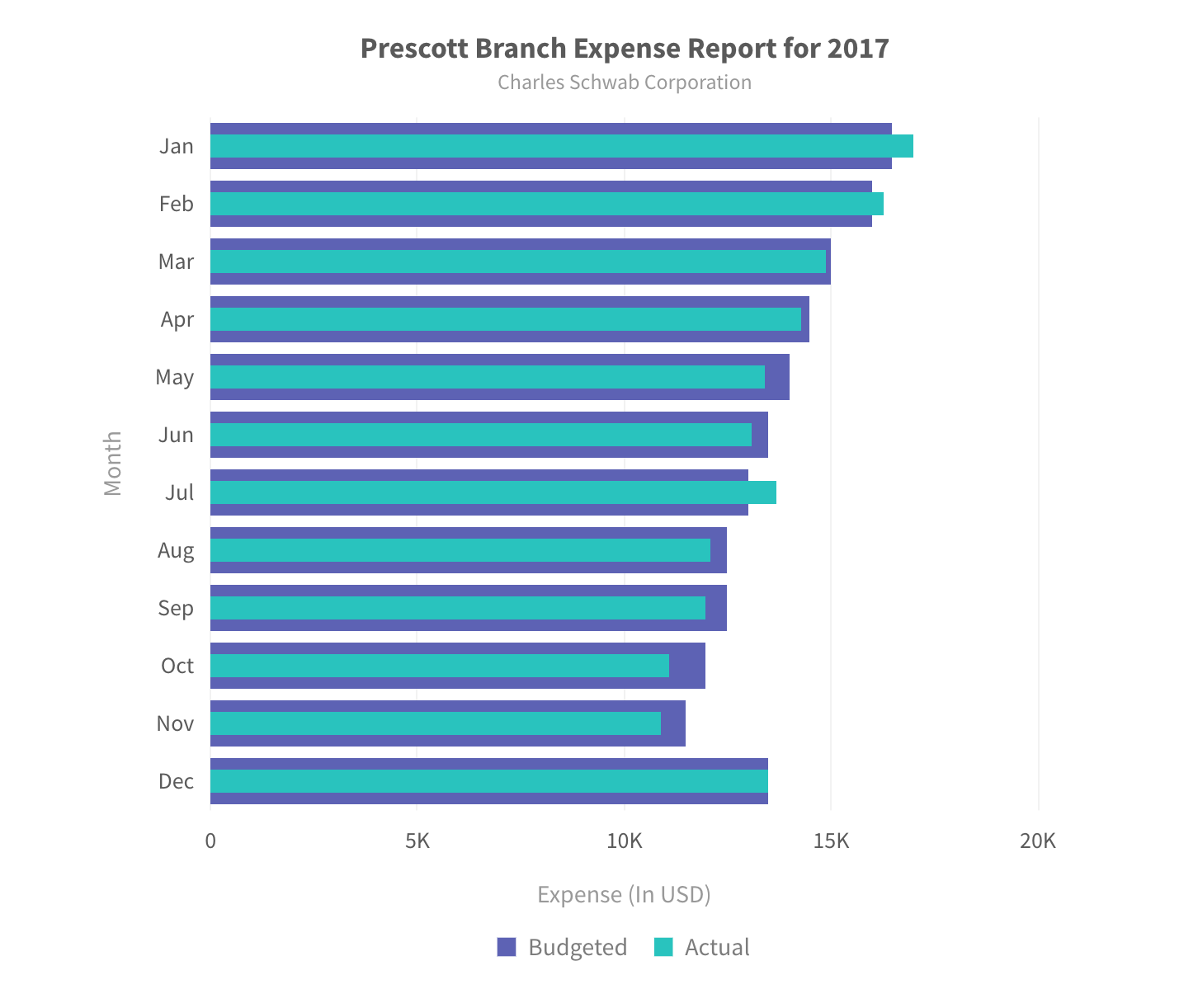
A bar chart represents quantitative information. The chart consists of horizontal bars of equal width with lengths proportional to the values they represent, something that aids in instant comparison of data. One axis of the chart plots categories and the other axis represents the value scale
 Bar Charts are used for comparing data like the GDP growth of various countries, performance of athletes in a sport, and so on.
Why do you need a Bar Chart?
1. Good at comparing a large number of entities
 Bar charts can show a large number of entities very easily in a single view. The above bar chart is a list of the top 50 best-selling video games .
Bar charts are a better alternative than column charts for showing a larger set of data . The vertical alignment of labels give more space for text(name) of each category. Even for large number of plots, labels of each plot can be easily read.Moreover, its inherent UX is similar to vertical scrolling of mobile devices which makes it a great fit for smaller screens like smartphones and smartwatches.
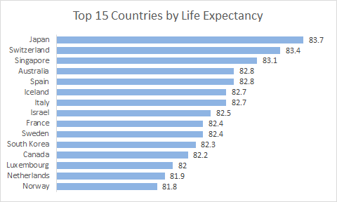
2. Looking at a large set and identifying best-to-worst performers
Simple bar charts, when sorted, help in identifying the max/min categories in one view. They also give a sense of how much each category is smaller than the max. This is especially helpful if the number of individual entities is high (like members of a sales team,
3. Looking at relative numbers/proportions of multiple categories or sub-categories
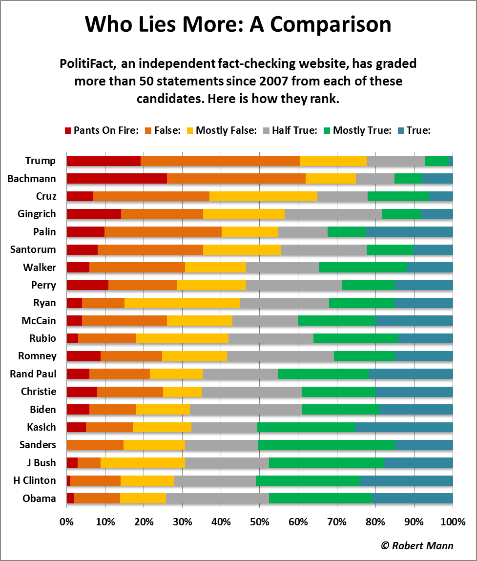
100% Stacked Bar charts work really well with a large number of categories and sub-categories. It can be used to how each of the entities are performing against each other and how much did each of the sub-groups contribute to the whole.
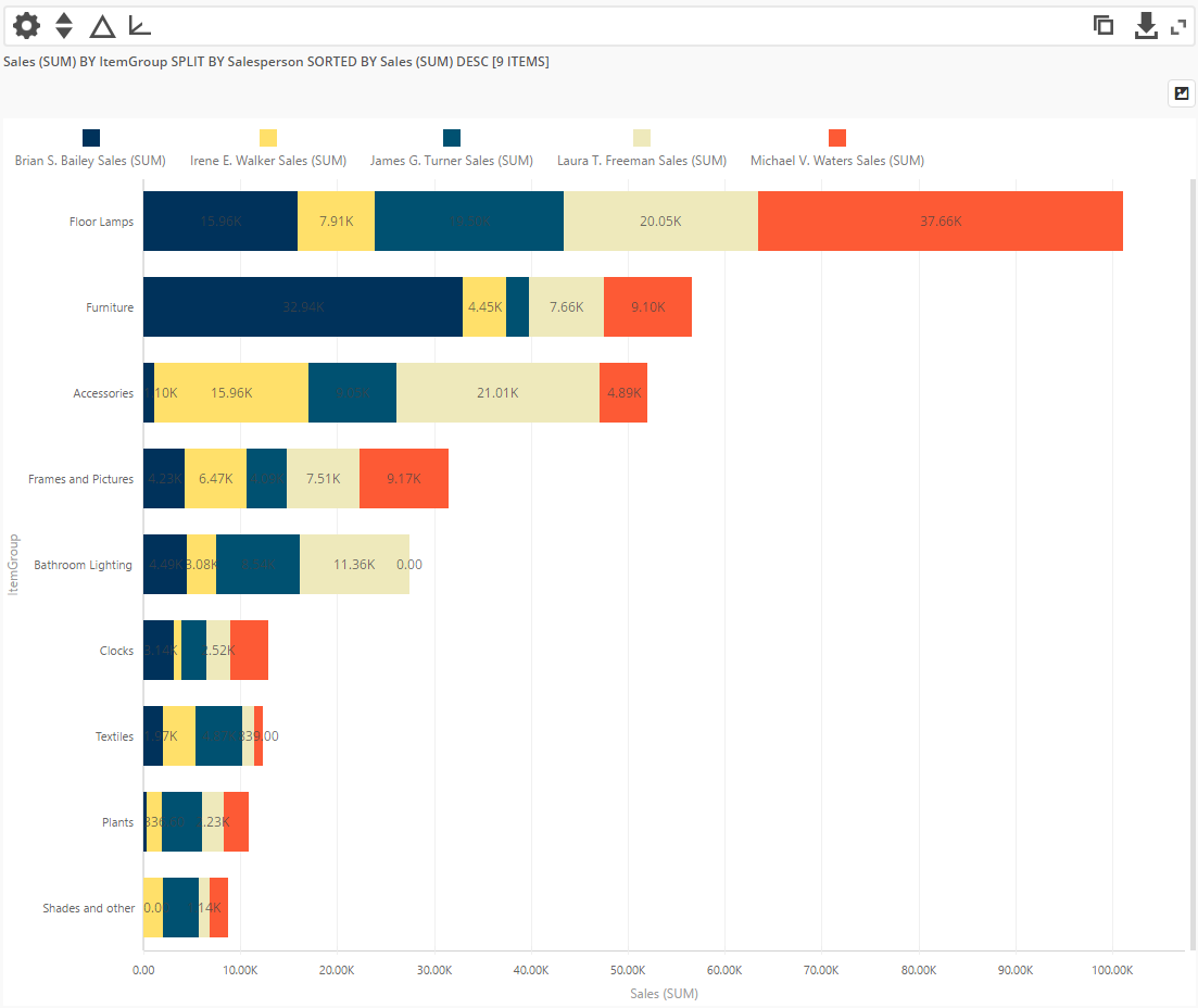
4. Looking at absolute numbers/proportions of multiple categories or sub-categories
Stacked bar charts are used at looking at exactly how much each sub-group contributed to it’s category’s total. This also helps in comparing sub-groups with similar sub-groups of other categories which a % 100 stacked chart can’t tell.
Popular Business Use cases of Bar Charts
- Showcasing public data
 Bar charts are one of the easiest charts to understand, and as such, are very helpful in showcasing information to the general public
- Comparing performance of different business units
 Bar charts can help in comparing a large number of categories fairly easily. This makes them excellent for comparing business units
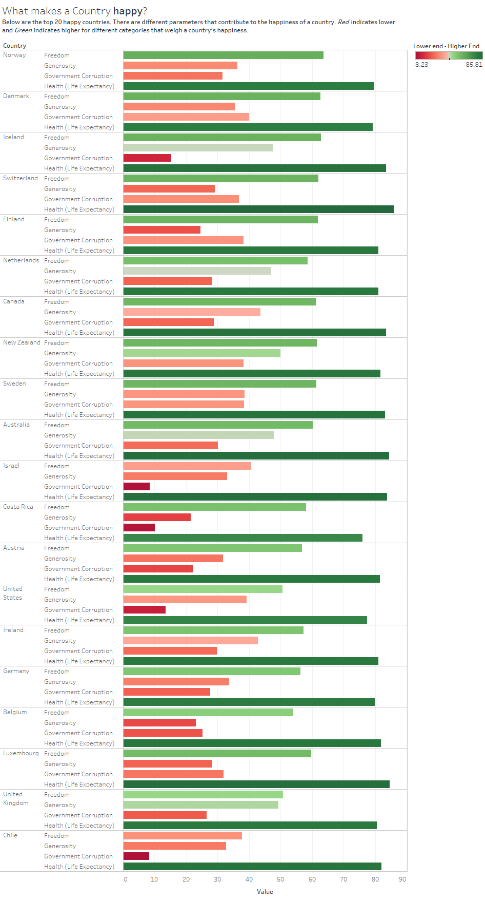
- Looking at different data for various entities
 Lea Pica built this excellent table lens to see how the different customer facing touchpoints contributed to unsuccessful visits
 Bar charts are one of the easiest charts to understand, and as such, are very helpful in showcasing information to the general public
 Bar charts can help in comparing a large number of categories fairly easily. This makes them excellent for comparing business units
 Lea Pica built this excellent table lens to see how the different customer facing touchpoints contributed to unsuccessful visits
Best practices of using Bar charts
- Use consistent colors. Select accent colors to highlight meaningful changes.
- Use horizontal labels to improve readability.
- Start the x-axis at 0 to accurately reflect the proportionate difference in data.
- The space between the columns should be roughly half of the width of each bar.
- When the data is not time based, it is recommended to arrange data in the descending or ascending order.
- For unsorted simple bar charts - different colour for max/min bar helps in easy comparisons.
Variants of Bar Charts
Grouped/Nested Bar Chart
The grouped bar chart is used to compare data for multiple datasets. It is also used to analyze data grouped in sub-categories. It has horizontally aligned rectangular bars on one axis with discrete values shown on the other. The length of the bar is proportionate to the value it represents.
Where to use grouped bar chart?
- To compare revenue for each month for the last couple of years
- To compare product sales across categories for multiple divisions
Overlapping Bar Charts
Overlapping bars can be used to visualize two data sets on a single chart. Similar to a simple bar chart, this chart uses horizontally aligned rectangular bars on one axis as data plots plotted against the discrete values shown on the other. On one axis, bars compare categories, while on the other they represent a discrete value. The width of the bars for the data series differs which makes the chart easy to compare. Both data sets need to be of the same data type like revenue or cost. Selecting or deselecting legend labels allows a single data set view or comparison of two data sets simultaneously.
Where to use Overlapping Bar Charts?
- Measuring Target vs Acquired Sales deals for multiple quarters.
- Comparing income vs expenses of different stores in a city
Want to see how Bar Charts will look on your web or mobile app?
Fusionchart’s expansive library lets you build and use insightful & intuitive charts in minutes.
Other related Charts
- Pie Charts
 When we want to see the part-to-whole contributions and if the members are not more than 3-4, then a pie chart can be used. The pie chart comprises of a circle that is divided into sectors, each representing a proportion of the summation of all values in a dataset
- Tree Maps
 In situations where the number of categories is high enough, and we want to easily identify the categories with majority contribution we can use a treemap. A treemap chart is used for analysis of hierarchical data. The chart is visualized using nested 2D rectangles that represent the nodes and leaves of the tree data structure
- Line Charts
 If time is used as a category on the x-axis, one could try a line chart. A line chart is used to represent continuous data over a continuous time span. It is generally used to show trends and relationships in data. Data values are plotted as data points that are connected using line segments.
- Scatter Plots
 The scatter chart shows the relationship between two variables by plotting them using cartesian coordinates. It displays a variable on each axis, marking the intersection of their values on the chart. When there are two numeric parameters, this chart type is the ideal one to determine how one variable impacts the other
- Bubble Charts
 The bubble chart is used to visualize data that is defined by three numeric variables (Both Bar and column charts on the otherhand, are limited to 2 variables only). Typically, this chart is used to compare and depict relationships between variables by means of positioning and proportions of the size of the bubbles/circles. It is also used to analyze patterns and trends in data
- Maps
 When the categories to be compared are geographical regions, maps can also be used to instead of bar or column charts to show and compare data. Check out the live interactive version of this map
 When we want to see the part-to-whole contributions and if the members are not more than 3-4, then a pie chart can be used. The pie chart comprises of a circle that is divided into sectors, each representing a proportion of the summation of all values in a dataset
 In situations where the number of categories is high enough, and we want to easily identify the categories with majority contribution we can use a treemap. A treemap chart is used for analysis of hierarchical data. The chart is visualized using nested 2D rectangles that represent the nodes and leaves of the tree data structure
 If time is used as a category on the x-axis, one could try a line chart. A line chart is used to represent continuous data over a continuous time span. It is generally used to show trends and relationships in data. Data values are plotted as data points that are connected using line segments.
 The scatter chart shows the relationship between two variables by plotting them using cartesian coordinates. It displays a variable on each axis, marking the intersection of their values on the chart. When there are two numeric parameters, this chart type is the ideal one to determine how one variable impacts the other
 The bubble chart is used to visualize data that is defined by three numeric variables (Both Bar and column charts on the otherhand, are limited to 2 variables only). Typically, this chart is used to compare and depict relationships between variables by means of positioning and proportions of the size of the bubbles/circles. It is also used to analyze patterns and trends in data
 When the categories to be compared are geographical regions, maps can also be used to instead of bar or column charts to show and compare data. Check out the live interactive version of this map
Bar charts in action

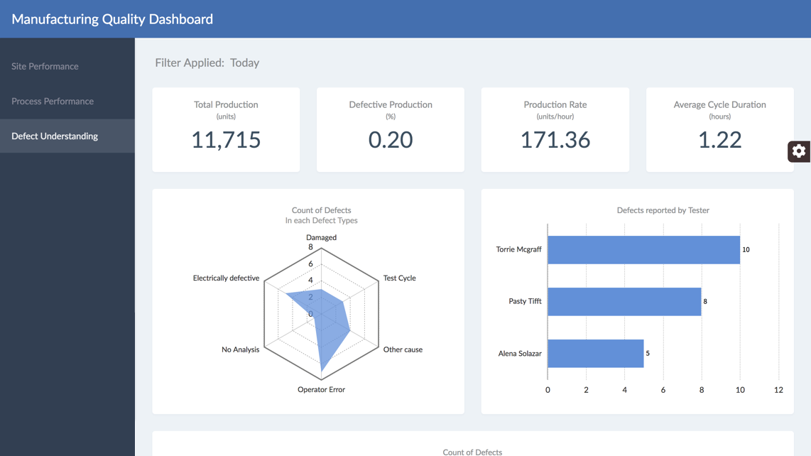 Manufacturing Quality Dashboard
Want to add interactive charts on your web or mobile app?
Fusionchart’s expansive library lets you build and use insightful & intuitive charts in minutes.