
Are you curious about bubble charts and how they can be used to visualize data? Look no further! In this complete guide to bubble charts, we’ll cover everything you need to know about this powerful tool for displaying information. Moreover, You’ll learn what a bubble chart is, how it’s constructed, and how to create your own using popular software tools.
We’ll also explore different types of bubble charts, best practices for creating effective visualizations, and real-world examples of bubble charts in action across various industries. By the end of this guide, you’ll have a comprehensive understanding of bubble charts and how to use them to make your data more accessible and informative.
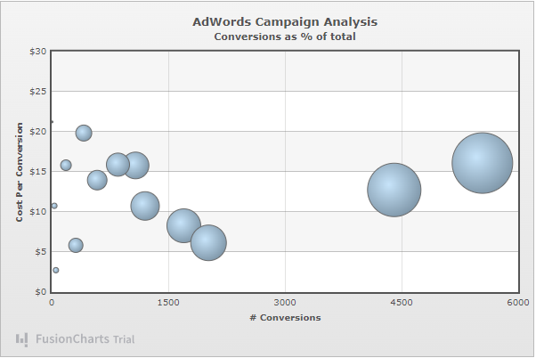
Table of Contents
What is a Bubble Chart?
If you’re unfamiliar with bubble charts, don’t worry – they’re easy to understand. Bubble charts are data visualization types that use circles (or bubbles) to represent data points. The bubble’s size indicates a third variable. You can use bubble charts to display complex data.
To create a bubble chart, you’ll need data with three variables. You can then use popular software tools like Excel, Tableau, or Google Sheets to create your chart. Choose the appropriate chart type, input your data, and customize your chart with colors and labels.
Bubble charts have various applications, from displaying financial data to visualizing social issues. Let’s check some of its popular examples.

What are the Variations of Bubble Charts?
Here are the most common variations found in bubble chart plots.
3D Bubble Chart
Adding a third dimension of depth to your chart can help make it more visually appealing and easier to understand.
Clustered Bubble Chart
This chart can help you compare data from multiple sources, providing a clear and concise view of your data.
Interactive Bubble Chart
Interactive bubble charts enable you to add interactivity to your chart, allowing you to zoom in, filter data, and highlight specific data points.
Multiple Variables
We can use bubble charts to represent data with multiple variables by adding colors or sizes to each data point. Moreover, it allows you to visualize complex data in a simple and accessible way.
By choosing the right type of bubble chart, you can create a visualization that best suits your needs and helps you make the most of your data.

What are the Best Practices for Using Bubble Charts?
Bubble charts are a powerful tool for visualizing complex data. Still, it’s important to use best practices to get the most out of them. Here are some tips to keep in mind when using bubble charts:
Choose the Right Variables
Bubble charts work best when you choose relevant variables for your audience and help you tell a compelling story.
Avoid Clutter
Make sure that your chart isn’t too cluttered or difficult to read. Use clear labels and avoid overlapping bubbles.
Use Color Wisely
Color can help you distinguish between different data points, but be careful not to use too many colors or make your chart too bright.
Consider Scale and Size
The size of the bubbles in your chart should accurately reflect the data you’re representing. Make sure the scale is appropriate, and the sizes are easily distinguished.
Highlight Key Data
Consider using a different color or making the bubble larger to draw attention if a particular data point is crucial.
Test Your Chart
Before you finalize your bubble chart, test it on a sample of your audience to ensure it’s easy to read and understand.

How to Create a Bubble Chart with FusionCharts?
To create a bubble plot with FusionCharts, you’ll need to follow these steps:
Choose the Right FusionCharts Product
FusionCharts offers a variety of products that can help you create bubble charts. Therefore, Choose the product that best suits your needs.
Prepare Your Data
To create a bubble plot, you’ll need to prepare your data in a format that FusionCharts can read. However, it typically involves creating a table that lists your data points and their associated values.
Select a Bubble Plot Template
FusionCharts offers a variety of bubble plot templates that you can use as a starting point. Moreover, you must choose the one that best matches your data and the desired style.
Customize Your Chart
Once you’ve selected a template, you can customize your chart by adjusting its colors, labels, and other settings. Moreover, you can add interactivity to your chart, such as tooltips and zooming.
Embed Your chart
After you’ve customized your chart, you can embed it in your website or application. FusionCharts offers several ways to embed your chart, including JavaScript, HTML, and other web technologies.
With FusionCharts, creating a bubble plot can be a simple process. By following these steps and customizing your chart to match your needs, you can create a visualization that effectively communicates your data and helps you make informed decisions.
FusionCharts also allows you to choose different frameworks for building a bubble chart. Moreover, It supports the following frameworks:
- JavaScript
- React
- Angular
- Vue
- Ember
- jQuery, and many others.

Conclusion
A bubble chart is a versatile tool for visualizing complex data. You can create an effective visualization by choosing the right variables, avoiding clutter, using color wisely, considering scale and size, highlighting key data, and testing your chart. Moreover, it can help you communicate your data and helps you make informed decisions. Businesses and large enterprises use effective charts in making important decisions. Moreover, they prefer tools like FusionCharts, AmCharts, and many others.
Whether you’re creating a simple 2D chart or a more complex 3D chart, a bubble plot can be helpful. It can help you present your data in a visually appealing and easy-to-understand way. However, make sure that your chosen option can fulfill your expectations. Finally, choosing FusionCharts can bring life into your data due to high-quality visualization. Moreover, it gives you various customization options to achieve the desired results.
FAQs
What is a Bubble Chart Used for?
A bubble chart is used for visualizing data that has three dimensions.
Why is It Called a Bubble Chart?
A bubble chart is called a “bubble” chart because it uses circles or bubbles to represent data points on a graph.
How Do You Do a Bubble Chart?
You must choose the right chart tools to build bubble charts. Moreover, it is important to follow the best practices given above.
What is Scatter Plot vs Bubble Chart?
Scatter charts and bubble charts are similar in plotting two sets of numerical data on a graph. However, the main difference between the two is that a scatter chart only uses points to represent the data. On the other hand, a bubble chart uses circles or bubbles.
Explore your data in a new way with Fusioncharts bubble charts – try it now!


