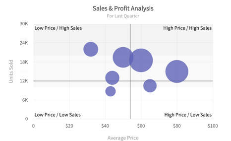
Bubble(XY) and Scatter Charts
The bubble chart is used to visualize data that is defined by three numeric variables. Two variables locate the point on the x- and y-axis and the third variable is indicated by the diameter of the bubble. Typically, this chart is used to compare and depict relationships between variables by means of positioning and proportions of the size of the bubbles/circles. It is also used to analyze patterns and trends in data.
The scatter chart shows the relationship between two variables by plotting them using cartesian coordinates. It displays a variable on each axis, marking the intersection of their values on the chart.When there are two numeric parameters, this chart type is the ideal one to determine how one variable impacts the other. For instance, this chart can be used to plot the relationship between income and expenditure or temperature and sales.


