
Do you have large data sets and want to pull valuable insights from them? Do you want to identify trends and patterns in your data sets? If you answered yes to these questions, you need to visualize your data using charts and graphs. When it comes to visualizing data, the two most common data visualization methods are bar graphs and pie charts. While both chart types have some common use cases, they differ from each other in many ways. However, many people are unsure about the difference between bar graph vs pie chart and when to use them.
Table of Contents
What Are Bar Graphs?
A bar graph or chart refers to a chart that plots data, quantities, or numeric values using bars. These are the best graph for categorical data and consist of two axes. One axis consists of bars representing different categories, while the other axis represents discrete values. The number of bars on a bar graph depends on the number of data categories. For example, if there are seven categories, the bar graph will have seven bars. The length of the bars demonstrates the numeric values of the category. Bar graphs are usually used to compare different variables or show changes in data over time.
If you’re looking for a tool to create bar graphs for your web apps, FusionCharts is the best choice. FusionCharts is a leading JavaScript charting library that allows you to create more than 100 different types of charts and graphs. It also comes with more than 2,000 choropleth maps (covering countries and cities).
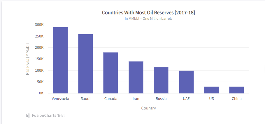
Below is a bar chart created using FusionCharts. The graph depicts different countries with the most oil reserves. The bars on the horizontal axis represent different countries, and their lengths correspond to the amount of oil reserves.
What Are Different Types of Bar Graphs?
The two most common types of bar graphs are vertical bar graphs and horizontal bar graphs. A vertical bar graph consists of bars along the x-axis, whereas in a horizontal bar graph, the y-axis consists of horizontal bars.
Two other types of bar charts are grouped bar charts and stacked bar charts. Grouped bar graphs consist of different sets of data categories, where each category has multiple items. In stacked bar graphs, each bar is divided into different parts to compare parts of a whole.
What Are Pie Charts?
A pie chart consists of a circular graph divided into different pieces/slices, where each slice represents a category. The size of each slice demonstrates the proportion of the whole each category signifies. These charts essentially depict how a total amount is divided between different variables or categories. Pie charts are a great choice when you want to plot data to show the graph with percentages of a whole.
When creating a pie chart, it’s essential to consider the order of the slices to ensure viewers can understand it quickly. It’s best to arrange slices from largest to smallest. However, if the variables have a specific ordering, you should follow that.
FusionCharts allows you to create interactive pie charts with captions, sub captions, data labels, legends, and more. It also lets you create pie charts using data contained in a database, such as MySQL.
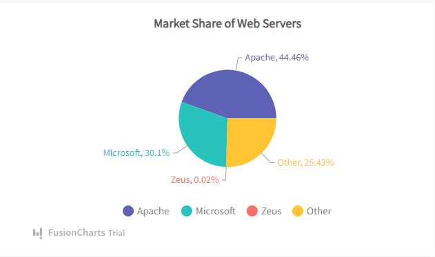
Below is a simple 2D pie chart created using FusionCharts. The chart shows how much market share different web servers have. We can easily interpret that Apache holds a little less than half of the web servers’ market share.
What Are Different Types of Pie Charts?
Pie charts are divided into two types based on the chart’s dimension. These two types are 2D pie charts and 3D pie charts. There are also nested pie charts that consist of multiple levels of the given data. FusionCharts lets you create all types of pie charts – be it 2D, 3D, or nested charts.
Pros and Cons – Bar Graphs Vs Pie Charts
Let’s have a look at the pros and cons of Bar Graph vs Pie Chart:
Bar Graphs
Pros
- Simple and easy to understand
- Help understand trends and patterns in a data set
- Make it easy to summarize large data sets in visual form
Cons
- Usually require additional details and explanations
- People can misunderstand or misinterpret bar graphs
- Don’t reveal key causes and effects
Pie Charts
Pros
- Simple and easy way of understanding how a total amount is divided between categories
- Display data to show a graph with percentages of the whole
- Give a clear idea of the relative proportion for each variable
Cons
- You cannot use a single pie chart for comparing multiple sets
- Pie charts become crowded when there are more than six categories
- Aren’t useful for representing time series data
Difference Between Pie Chart Vs Bar Graph-Comparison Table
The comparison table below shows bar graph vs pie chart differences
|
Bar Graph |
Pie Chart |
| Consists of rectangular bars representing different categories of a data set | Circular – Consists of slices representing different categories of a data set |
| Plots Absolute values | Plots relative values/frequencies of the measurements |
| Great for representing a data set with several categories | Becomes messy when there are more than six categories |
| Used for comparing categories to each other | Used for comparing the contribution of each category to the whole |
| Can represent multiple data sets | A single pie chart can only represent a single data set |
| Can be used to plot time series data |
Aren’t effective in representing time series data |
When to Use a Bar Graph vs Pie Chart?
The sections below will help you understand when to use a bar graph and pie chart.
When to Choose a Bar Graph?
A bar graph is great for representing the distribution of data points and comparing different variables/categories of your data. For example, you can use a bar graph to see which items in your data have the highest frequency or how a category compares against the others. A bar graph is also a good choice when you want to see changes in data over time.
When to Use a Pie Chart?
You should use a pie chart when you have a data set that consists of different distinct parts or categories that add up to a meaningful whole. In other words, it’s best to use a pie chart when you want to compare the contribution of each category to the whole.
How Do You Determine Which Is Better? Bar Graph Vs Pie Chart
Both bar graph and pie chart are the best graph for categorical data and have their own use cases. Determining which type of chart is best depends on the data type and the purpose of visualizing the data. When you want to compare different categories of data or track changes over time, bar graphs are the best choice. However, when you want to show the percentages of a whole, a pie chart is the right option.
Real life applications of Bar Graphs and Pie Charts
Nowadays, data visualization plays a very important role in analyzing trends across various industries and helps in making informed decisions. There are various real-life examples where we use bar graphs and pie charts to track performance. Here are some of the applications mentioned below:
How businesses use Bar Graphs and Pie Charts for decision making
Businesses use bar graphs to compare sales figures, track revenue, and analyze customer choices. On the other hand, to understand the market share distribution, budget allocation, and expense breakdowns, the company uses the pie chart. By taking the help of these data visualizations, companies can make informed strategic decisions.
Use cases in financial analysis
Financial analysts view stock market trends and analyze quarterly profits and investment returns by using stock charts or bar graphs. Information regarding portfolio distributions typically appears in pie charts to show how investment assets are divided across categories of stocks, bonds, and mutual funds.
How marketers leverage data visualization for insights
Bar graphs function as tools for marketing teams to both monitor campaign success levels and measure customer interactions, as well as evaluate survey findings. Pie charts function routinely to visually break down demographic segments, for example, age categories, together with male-female statistics and geographical penetration of markets. Marketers often use tools like a flipbook maker to present these data visualisations in an accessible and engaging way.
Using Charts in academic research and medical reports
The visual representation of experimental results through bar graphs assists researchers in result comparison, statistical data variation analysis, and survey result illustration. Doctors use pie charts to demonstrate, for example, the percentage of how a disease affects the population while showing patients’ profiles together.
What are the common mistakes to avoid when using Bar Graphs and Pie Charts
The common mistakes that one must avoid before creating bar graphs and pie charts are listed below:
Confusing your audience
When the number of categories exceeds a manageable range in a pie chart, the visualization becomes confusing because viewer distinction becomes challenging. The chart presents confusion when the total percentages fail to reach 100%. Maintain a minimum number of slices while having an accurate data representation to prevent this problem.
Scaling issues in Bar Graphs and how to fix them
The consistency of bar graph scales determines the accuracy of data representation. The scale, starting from a value other than zero, produces magnified differences between category intervals. A correct visual comparison needs both the y-axis origin at zero and proportional scaling to fix data misrepresentation.
Best practices for creating effective Bar Graphs and Pie Charts
There are various methods for creating effective Bar graphs and Pie charts. Here are some methods listed below:
How to design a clear and accurate Bar Graph
Bar graphs and pie charts require proper attention to design elements in addition to clear presentation for effective creation.
- A uniform color scheme enables category distinction while improving data visual attractiveness.
- Axis labels need to be presented with clarity because they enable viewers to understand the data properly.
- Bars used in bar graphs need proper width adjustment along with spacing adjustments to achieve an uncluttered presentation that supports readability.
- A logical sorting of categories through value-based or alphabetical organization improves audience understanding of patterns along with trends that become immediately visible.
The implementation of these guidelines enables users to produce data visualization products that look great while delivering meaningful information to their audience.
Tips for creating an informative Pie Chart
To create attractive yet straightforward pie charts, follow these recommendations.
- To create meaningful pie charts, position data slices in decreasing order to help both readability and ease of comparison.
- Avoid three-dimensional chart effects since they distort visual perceptions of data proportions.
- Each pie section should include clear percentage indications so users can immediately understand the importance of each segment.
- Try to restrict your pie chart to six slices or fewer for maximum clarity (group remaining slices in an “Other” category).
Choosing the right colors and labels for better data representation
The clarity of each segment in a pie chart depends on using color palette that contrast well with each other. Avoid bright colors and similar shades since they can blend together, which impairs interpretation. Use brief yet detailed label text so viewers can effortlessly understand the data groups.
Beyond Bar Graphs and Pie Charts: Other data visualization methods in 2025
The wide usage of bar graphs and pie charts does not hinder alternative visualization approaches from delivering quality results in specific data applications. For example:
- The line chart serves trends alongside time-series data, so it functions best when you need to track alterations during periods.
- Scatter plots enable users to determine the relationships between variables, making them suitable for pattern evaluation in data.
- Heatmaps efficiently display density differences because they reveal patterns through shifting colors.
- Tree maps function well for visualizing hierarchical structure and proportional data through their clear division of big data into smaller categories.
The selection of appropriate visual representation techniques relies on the dataset structure, together with the targeted insights for communication.
Conclusion
In conclusion, when deciding between a bar graph and a pie chart, consider the nature of your data and the insights you want to convey. Bar graphs are ideal for comparing categories or tracking changes over time, while pie charts are best for showing the proportions of a whole. Bar Graph vs Pie Chart select the chart type that better suits your data visualization needs to communicate your message effectively.While choosing between Bar Graph vs Pie Chart, select the type that best suits your data visualization needs to communicate your message effectively.
Frequently Asked Questions
1. Which is easier to understand at a glance: a pie chart or a bar graph?
When comparing a pie chart vs bar graph, a bar graph is generally easier to interpret at a glance, especially when dealing with many categories or values with small differences. Pie charts can become harder to read when there are too many slices or similar-sized segments.
2. Which is better for showing trends over time: bar graphs or pie charts?
A bar graph is a better choice for showing changes over time. While a pie chart shows proportions at a single point, bar graphs allow viewers to compare values across different time periods, making trends easier to see.
3. Can both pie charts and bar graphs be used for the same dataset?
Yes, but it depends on what you want to highlight. For instance, a single dataset showing sales by category could be displayed as either a pie chart or a bar graph. Use a pie chart if you want to emphasize percentage breakdowns, and a bar graph if you want to compare values more clearly.
Ready to Visualize Your Data More Effectively?
Choosing between a bar graph vs pie chart doesn’t have to be confusing. Now that you know their differences, strengths, and best practices, it’s time to put that knowledge into action. Start creating smarter, clearer, and more impactful charts today with FusionCharts.
table {
border-collapse: collapse; /* merge borders */
width: 100%;
border: 2px solid #333; /* dark border around table */
}
th, td {
border: 1px solid #333 !important; /* cell borders (force override) */
padding: 10px;
text-align: left;
}
th {
background-color: #f2f2f2;
}


