
We have all heard the saying “A picture speaks a thousand words.” It is true because visuals spark our curiosity and help us more effectively communicate our ideas. It is also why information presented in charts and graphs easier to understand than raw data in a table. As a result, business dashboards now play a key role in most company’s day-to-day operations, planning, and decision making.
Because of the importance of corporate dashboards, quality chart design, and presentation, as well as other data visualization techniques, are especially important skills. One method of effective communication is using Interactive charts and graphs. Simply put, interactive graphs play a pivotal role in conveying your message and effectively telling your data story.
If you are wondering why interactive charts and graphs are so much more effective than their static cousins. then you have come to the right place. We have compiled a list of answers to show you how FusionCharts interactive graphs and charts can add more value to your business dashboards.
Table of Contents
What is FusionCharts?
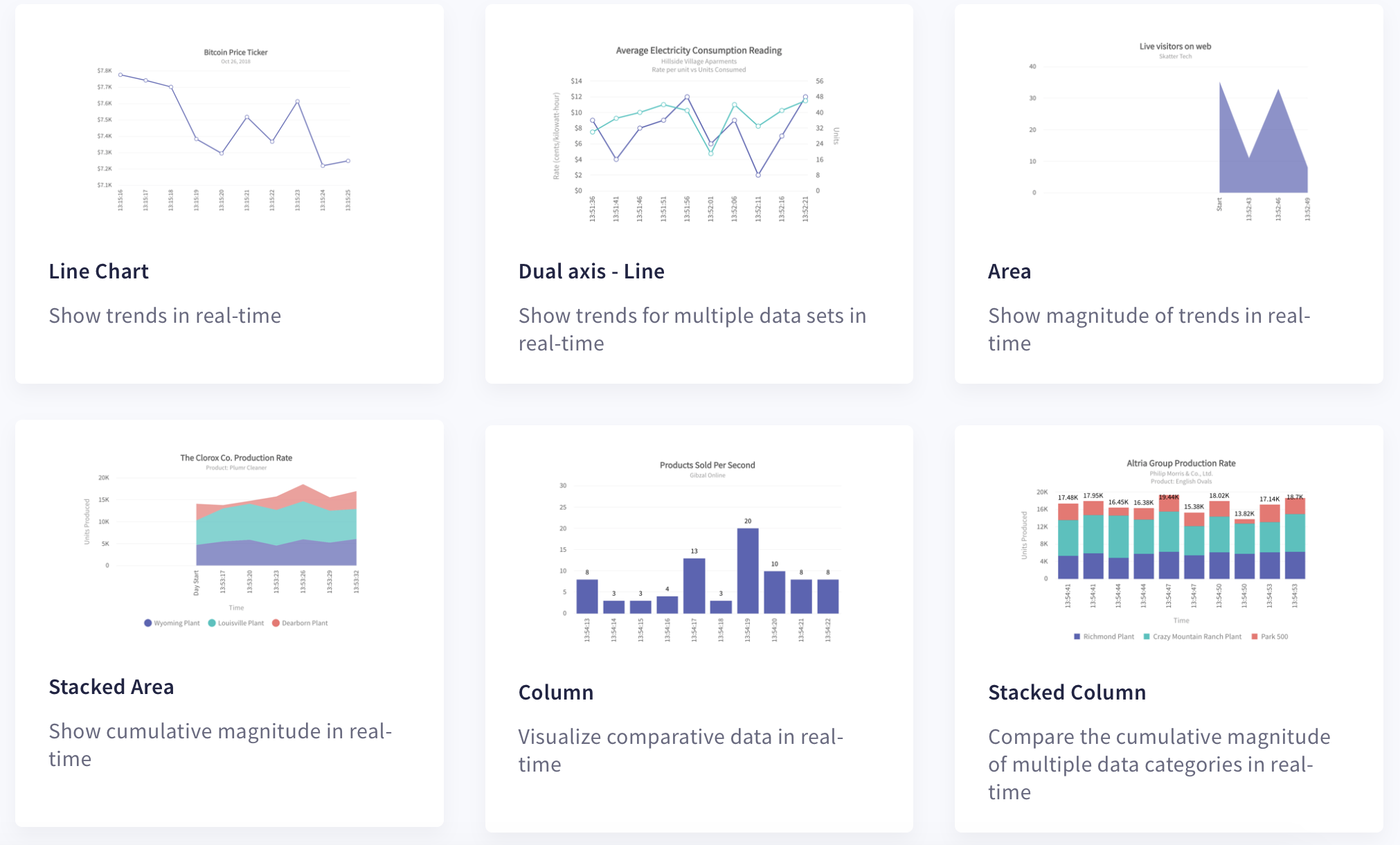
FusionCharts is a beautiful charting and graphing library to help you build interactive graphs, charts, and dashboards. There are more than 100+ charts, graphs, and gauges along with 2000+ choropleth maps to help you visualize all types of data. FusionCharts is a Javascript library that comes with consistent APIs and is compatible with all browsers running on all platforms and devices including iOS and Android. Developers can easily integrate responsive visuals in their software built using their choice of frameworks including Java, Django, React, Angular, Svelte, and more.
How Does FusionCharts Make Graphs Interactive?
FusionCharts comes with a complete set of options for handling user interactions during different phases of the lifecycle of a chart or graph. You can choose to stick with default behaviors or define your own customized action for different types of chart events. These behaviors and customizations make your charts live and responsive to different user actions and events. For example, you can define different handlers when your chart starts loading, completes rendering, or updates. You can easily customize all user events. These include the user clicking a data point, zooming or scrolling, and more.
Why is Zooming in or Out Important?
An interactive graph always usually has a zoom feature. One reason is that zooming into a data series helps pinpoint short-term fluctuations in data. It helps you observe the finer details. Zooming out, on the other hand, helps you look at the bigger picture and understand long-term trends. With FusionCharts, you can write listeners for events such as zoomReset, zoomedOut, zoomedin, and more for zoom-line charts and time-series charts. You can zoom in to look at a behavior over a few minutes or zoom out to see the trend over years.
What is the FusionCharts Panning and Scrolling Feature?
By scrolling and panning in time-series graphs, users can move your graph horizontally to study changes over time. With bar charts or column charts with many bars to plot, users can scroll right or left to look at variables that don’t fit a single screen. You can use the default FusionCharts event handler or write your own listeners for events including scrollstart and scrollend.
What is Time Navigator in Interactive Time-Series Plots?
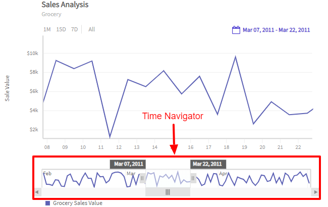
The time navigator is a built-in feature for viewing time-series data. In a FusionTime chart, the time navigator window appears below the time axis and shows the entire time series. The main window shows the smaller interval chosen by the user. This way, your users can observe your data over time ranges. They can also view your entire data and clearly grasp how the data changes over time.
How Do the FusionCharts Interactive Legends Help?
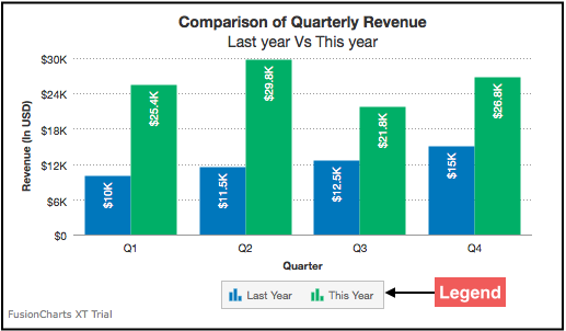
All FusionCharts legends are both interactive and customizable. Users can hide or display data series or data plots within a multivariate graph or a multi-series chart using the interactive legend. The interactive legend also lets them highlight a particular series of interest. This lets a focus on the finer details of one particular data series or study it relative to other series.
What are Drill-Downs in FusionCharts and How Do they Add More Value to Interactive Graphs?
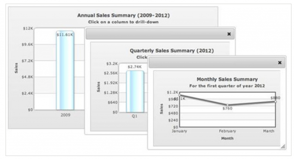
You can create easily create drill-down charts in FusionCharts. With drill-down interactivity, all data-points act as hot spots. You can open a new descendent chart in a new window or use popup windows or tooltips to display more information. Check out the various options for the FusionCharts drill-down feature and pick the one that’s right for you.
Can I Make Interactive Maps With FusionMaps XT?
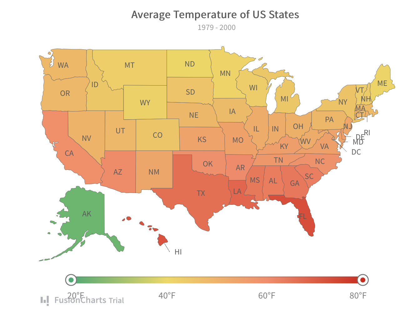
The FusionMaps component gives you the power to create interactive and responsive data-driven maps. You can make visualizations of your data to show metrics and parameters related to a certain region or area on your map. Maps can handle all types of user interactions. For example, you can add drill-down, custom tooltips, overlay icons, and more. These help you create effective data presentations that are responsive, interactive, and aesthetically appealing, in addition to informative. FusionMaps also comes with a default slider control so users can highlight regions of interest. Explore all of our maps and select the one that suits your needs.
Where Can I Learn More About FusionCharts Interactive Graphs, Charts and Maps?
FusionCharts is a complete Javascript data visualization library for building beautiful and interactive dashboards, graphs, charts, and maps. It is trusted by over 800,000 developers and 28,000 companies. This is due to its stunning visuals, extensive documentation, low learning curve, and customizable look and feel. FusionCharts also offers intelligent configurations and support for all modern browsers and devices.
Don’t wait any longer. Explore all of FusionCharts features and sign up for your free FusionCharts trial today. It is time to make the most of your data!


