Data visualization is undoubtedly the most important task in any data-driven business. It allows data to be better understood at a glance and can also help uncover hidden trends or patterns that might not be apparent. There are many different ways to visualize data; however, choosing the right approach can be tricky. In addition, many JavaScript data visualization libraries available to make it very hard to choose the right data visualization tool. So, in this post, we’ll look at some of the best JavaScript libraries for data visualization that you can use this year. Let’s get started!
Table of Contents
What Makes FusionCharts The Best JavaScript Data Visualization Library?

FusionCharts is perhaps one of the most popular data visualization libraries on the web, with an impressive range of features that makes it best for various types of data visualizations.
FusionCharts is a framework created by developers for developers, with respect to the importance of DV, making it arguably one of the best frameworks for creating charts. This platform provides not only different graph examples, but also all the source codes are updated frequently and are completely error-free. Additionally, it provides one-on-one support to quickly fix technical issues, as well as in-depth guides on different dashboards and charts to help you understand all the options.
Many people like it because of its high customizability and ease of use. Moreover, FusionCharts Suite allows you to customize your chart in any way you want, functional or visual. For example, you can customize the charts with attributes, add layers with annotations, or create complex visualizations with our events and API.
Overall, FusionMaps XT has over 2000+ geographical maps, including all countries, US states, and regions in Europe, for plotting business data like revenue by region, employment levels by state, and office locations.
Today, FusionCharts is being used extensively for building dashboards with different types of graphs and charts for web-based applications.
Why Is D3.js A Popular JavaScript Data Visualization Library?

D3.js is a popular JavaScript data visualization library, primarily used to edit documents using data. This is another framework that uses the latest web standards, regardless of whether you use React, Vue, or another JavaScript framework.
D3 uses jQuery-like selectors to choose DOM components, most of which are SVG but can also be canvas. It uses SVG, HTML, and CSS, three current web standards, to create data visualization. Standard visualization formats are not necessary when using D3. However, it enables users to create bar and pie charts, geospatial maps, graphs, and HTML tables.
Overall, D3.js is unique because it allows you to create custom visualizations using SVG, HTML, and CSS.
How Is Chart.js Different From Other Charting Libraries?
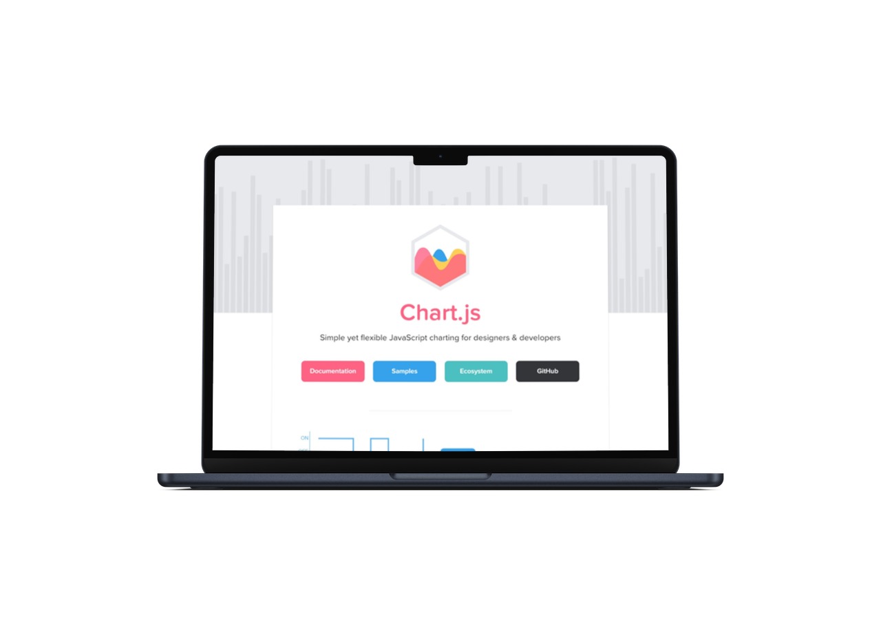
Chart.js is an open-source JavaScript library for data visualization available on GitHub that enables you to create various types of charts using the HTML5 canvas feature.
Because Char.js uses HTML5 canvas, you must use a polyfill to support older browsers. By default, it provides six major chart types, improves usability, and is simple enough for beginners to understand. In addition to pie charts, it has a bar, bubble, doughnut, line, polar area, radar, scatter, and many other responsive charts.
To incorporate different datasets, you can easily try combining different line and bar charts, which prove to be of exceptional quality. So, Chart.js is a simpler data visualization library that simplifies the creation of standard visualizations like line charts and bar graphs.
What Makes ApexCharts One Of The Best Charting Libraries?
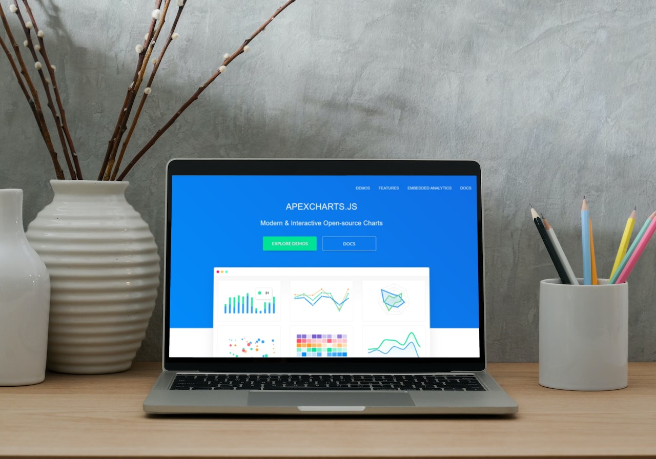
ApexCharts is an SVG chart library that comes with Vue.js and React wrappers. Its charts look great on various devices, and the library is customizable and has extensive documentation. However, it can be sluggish with larger datasets; therefore, you must ensure it’s exactly what you’re looking for.
The library was designed to make data zooming, panning, scrolling, and placing informative annotations on charts easier. However, the library itself is new, and there is still plenty of room for expansion.
Overall, ApexCharts is a data visualization library that aims to be user-friendly while also offering advanced customization options for more experienced developers.
How Does HighCharts Differ From Other Visualization Libraries?

Highcharts JS is a highly regarded JavaScript data visualization library, renowned for its adaptability and widespread acceptance. By leveraging SVG with VML and canvas fallbacks for older browsers, it offers a versatile solution for creating interactive and dynamic charts. Its popularity is underscored by its adoption by 72 of the world’s top 100 corporations, a testament to its dependability and ability to effectively convey complex data.
HighCharts JS supports a wide range of chart types, including all popular charts, such as error bars, waterfall, bar, pie, and many more. Non-commercial users, such as personal projects, university websites, and charitable and non-profit organizations, are not charged anything.
HighCharts allows you to create much more than just simple graphs. For example, creating Gantt charts, map-based charts, and stock charts is simple.
What Makes DataTables A Unique JavaScript Data Visualization Library?

DataTables is a jQuery library that allows developers to present data as HTML tables in their projects. In addition, tables can easily be enhanced with features such as sorting, pagination, and filtering.
Why Is DataVizJS An In-Demand Framework?

DataVizJS is a free and open-source data visualization web framework designed for modern browsers (desktop and mobile) that support HTML5 canvas. Its custom data-driven DOM elements can be used independently or in conjunction with existing frameworks.
What Makes jQuery Visualize A Favoured Plugin Among Developers?

jQuery Visualize is a data visualization plugin that generates charts with data from an existing page element or without HTML.
Why Is Recharts Considered A Solid JavaScript Data Visualization Library?
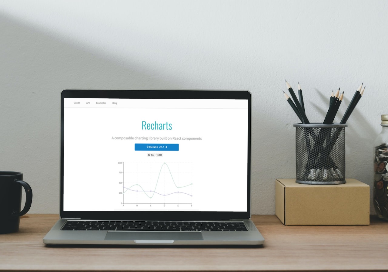
Recharts employs D3 and demonstrates declarative components. It’s lightweight and uses SVG elements to create stunning, interactive charts.
Charts can be customized, and you can see some examples provided by the library. In addition, it produces excellent static charts and includes built-in general chart resources, such as legend tooltips and labels.
It can become glitchy when dealing with multiple animated charts on the same page and large datasets, but it should still work for most use cases. It’s a little concerning that there are so many unanswered challenges on GitHub.
These issues may not be significant, but creators do not visit frequently enough to address them. Therefore, if you get stuck, make sure you know how to get out.
Recharts is a solid JavaScript data visualization library built with React and D3, making its functionality comparable to that of other data visualization frameworks.
What Makes Flexmonster A Versatile Framework?

Flexmonster is a set of browser-based data visualization tools. Data can be viewed or edited directly in the user interface, or data sets from external data sources can be loaded. In addition, it can connect to multiple data sources at the same time.
It supports Google Datastore, Amazon Redshift, PostgreSQL, and MySQL databases, and others. In addition, it includes more than 50 data visualization components, such as charts, tables, maps, and dashboards, that users can integrate into their web applications to work with data.
Why Is Google Charts Such A Well-Known Charting Tool?

Google Charts is a well-known charting tool that deserves to be mentioned in this article. It provides a variety of visual data representations, such as bar charts, pie charts, line graphs, and geographic maps, to name a few. Unfortunately, though it is open-source, it is not free. Furthermore, it is not responsive, although you could allow it to resize charts with some code.
Depending on the chart type, there are numerous customization options, but they may not be suitable for beginners. In addition, rather than using an NPM package, you must load it directly from a Google URL.
Google Charts offers customizable options and also has HTML/SVG properties. In addition, users enjoy that it allows modifying charts even after chart generation.
What Makes Dygraphs Very Adaptable?
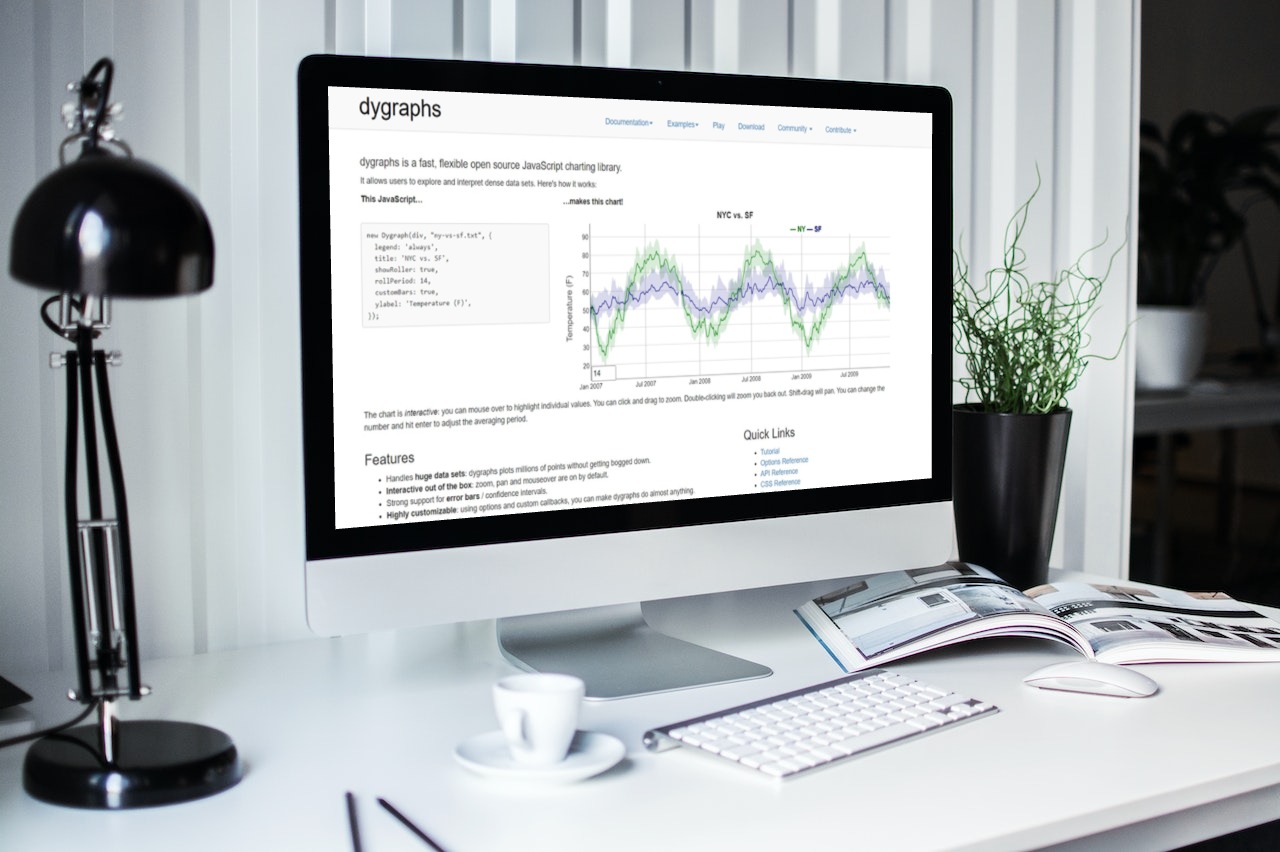
Dygraphs is one of the JavaScript data visualization libraries that provides a wide range of data display options for its data series. For example, data can be displayed as an inline graph or as a scatter plot, with trend lines added to identify patterns in the data.
Why Is Plotly.js Still Considered One Of The Best JavaScript Visualization Libraries?

Plotly is a free online data visualization platform that uses a JavaScript library. The library enables data to be submitted to the Plotly servers and displayed on a data-specific web interface. After that, data can be manipulated and exported as graphics files (PNG, SVG, or PDF) for use elsewhere.
How Is Vega-Lite Redefining The Visualization Framework Landscape?

Vega is a visualization grammar, which is a declarative format for designing, saving, and sharing interactive visualizations. Vega has been integrated into many other data visualization tools, including D3 and (to a lesser extent) Tensorboard. Vega-Lite, on the other hand, is specifically designed to function without using an external data processing library such as D3 or Protovis.
What Makes CanvasJS A Data-Driven Visualization Library?

CanvasJS is another popular tool that provides beautiful charts on various computers and browsers. It is a data visualization library that provides data-driven visualizations in HTML5 canvas elements in a lightweight environment with high performance.
Many charts, such as gauge and network charts, may be missing from this list.
CanvasJS boasts impressive scalability, effortlessly handling large datasets of up to 100k+ data points without any performance issues. While the library offers a wide range of chart types, some specific chart styles, such as gauge and network charts, may not be included in its standard offerings.
While the CanvasJS data visualization library may require some time to master, its efficiency and compatibility are notable advantages. The tool provides four pre-designed templates to cater to various environments, allowing users to select the most appropriate design for their applications.
What Makes amCharts A Hot JavaScript Data Visualization Library?

amCharts is one of the top-charting libraries out there. It includes a dynamically adjustable bar, line, pie charts, gauges, maps (world, USA, Europe), data tables, timelines, dashboards, and more.
For a set fee, you get all the charts you need, including geographical maps and excellent customer service. With response times averaging less than 3 hours, it appears to be a good solution for large corporations.
How Is ZoomCharts Different From Other Charting Libraries?

ZoomCharts data visualization tools are data-agnostic, which means they can visualize data from any source. ZoomCharts supports a wide range of data visualizations, such as basic charts (bar, line, and pie), geographical maps, data presentation widgets, data tables, and more. Users use zooming and scrolling gestures to interact with data plots.
What Makes NVD3 An Easy-to-Use Visualization Library?

The team behind datamodel.io has also created NVD3, which makes it easy for developers to incorporate high-quality data-driven charting components into their web applications. NVD3 aims to develop reusable charts and chart components that can be easily integrated into data visualizations and dashboards.
How Is Dc.js An All-Rounder Charting Library?

To work natively with cross filter, dimensional charting is built on top of D3, HighChair, and other JavaScript libraries. Also, dc.js powered by a cross filter that brings data manipulation to the browser for quick data crunching, exploration, and visualization.
Dc.js is a robust and intuitive JavaScript data visualization library that facilitates seamless data visualization and analysis across both desktop and mobile environments. With its streamlined yet sophisticated features, dc.js offers a comprehensive solution for individuals seeking to visualize and explore data within the browser or on mobile devices.
What Makes React-Vis A Specialized Visualization Framework?
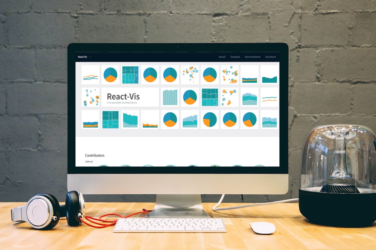
React-Vis is an interactive data visualization framework that is data-centric, declarative, and componentized. It enables you to generate data visualizations declaratively from an array of data sources. Uber created it for React visualization.
This library is extremely simple to install and use, and comes with excellent documentation that Uber supports. Popular charts such as line, area, bar charts, pie charts, treemaps, and many others can be quickly created.
The library requires no prior knowledge of D3 or any other data visualization library. It provides modular low-level building block elements like the X/Y axis. So, again, it is a good match and a very useful library to consider when working with Bit.
Are You Ready To Use The Best Tool For JavaScript Data Visualization?
In this article, we discussed the top 20 JavaScript data visualization libraries in 2024. All these tools offer some great features, but one library simply stands out, FusionCharts.
FusionCharts is perhaps one of the best open-source frameworks for making charts for web applications. It is an enterprise-level charting and graphics library that makes your graphs highly customizable. It also offers helpful tips about data visualization and is easy to learn and use.