
Charts and graphs are a quick way to visualize raw data, track key performance indicators, identify trends and gain actionable insights. Simply put, data visualizations help companies make critical strategic decisions. Many companies today use JS Charts to create interactive and attractive charts for the web. These charts allow businesses to display data on various platforms and web browsers. There are several types of charts and graphs for visualizing different types of data sets. For instance, a bar chart is perfect for representing categorical data, whereas a line chart is more suitable for depicting continuous data over time. Read on to learn about the best JS charts examples that you can use for your next project.
In this article, we’ll create different JS charts using FusionCharts.
Table of Contents
Line Chart
Line charts are great for representing continuous data over time. For example, a line chart can be used to visualize changes in stock prices over seven years. These charts also help identify overall trends.
Here is how you can create a JS line chart:
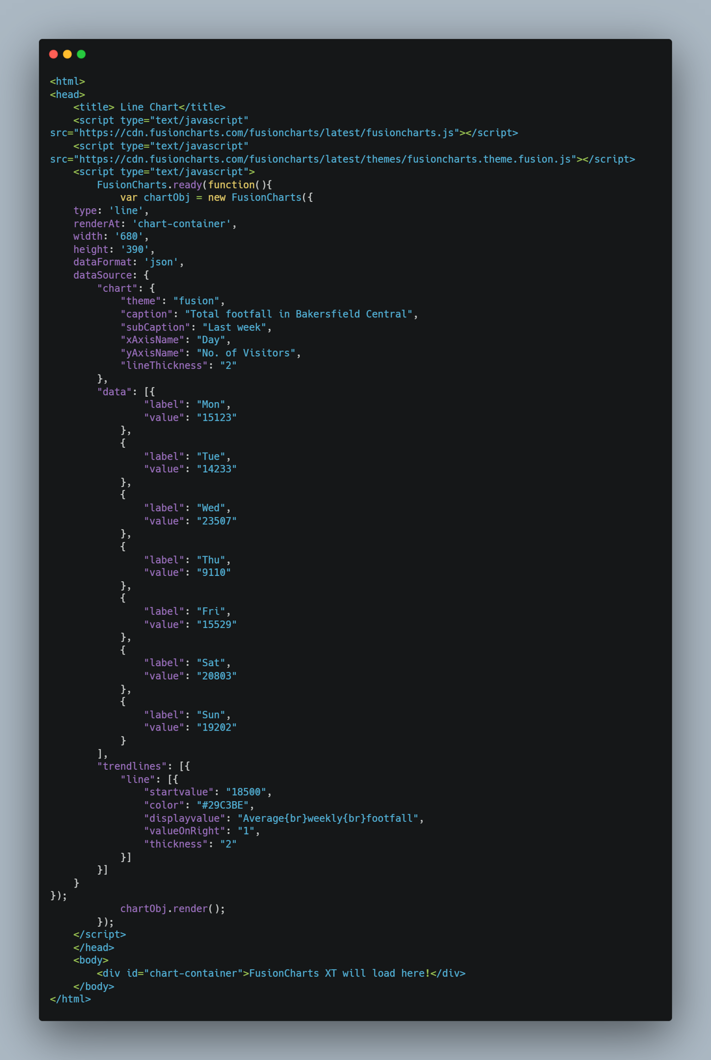
You can also find the code here.
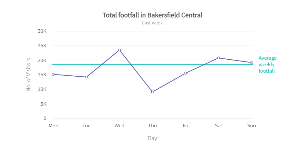
The code above will create the following line chart:
Bar Chart
Bar charts are perfect for representing data that can be divided into various categories. A bar chart consists of horizontal and vertical axes. One axis represents the bars for categories, whereas the other axis represents discrete values.
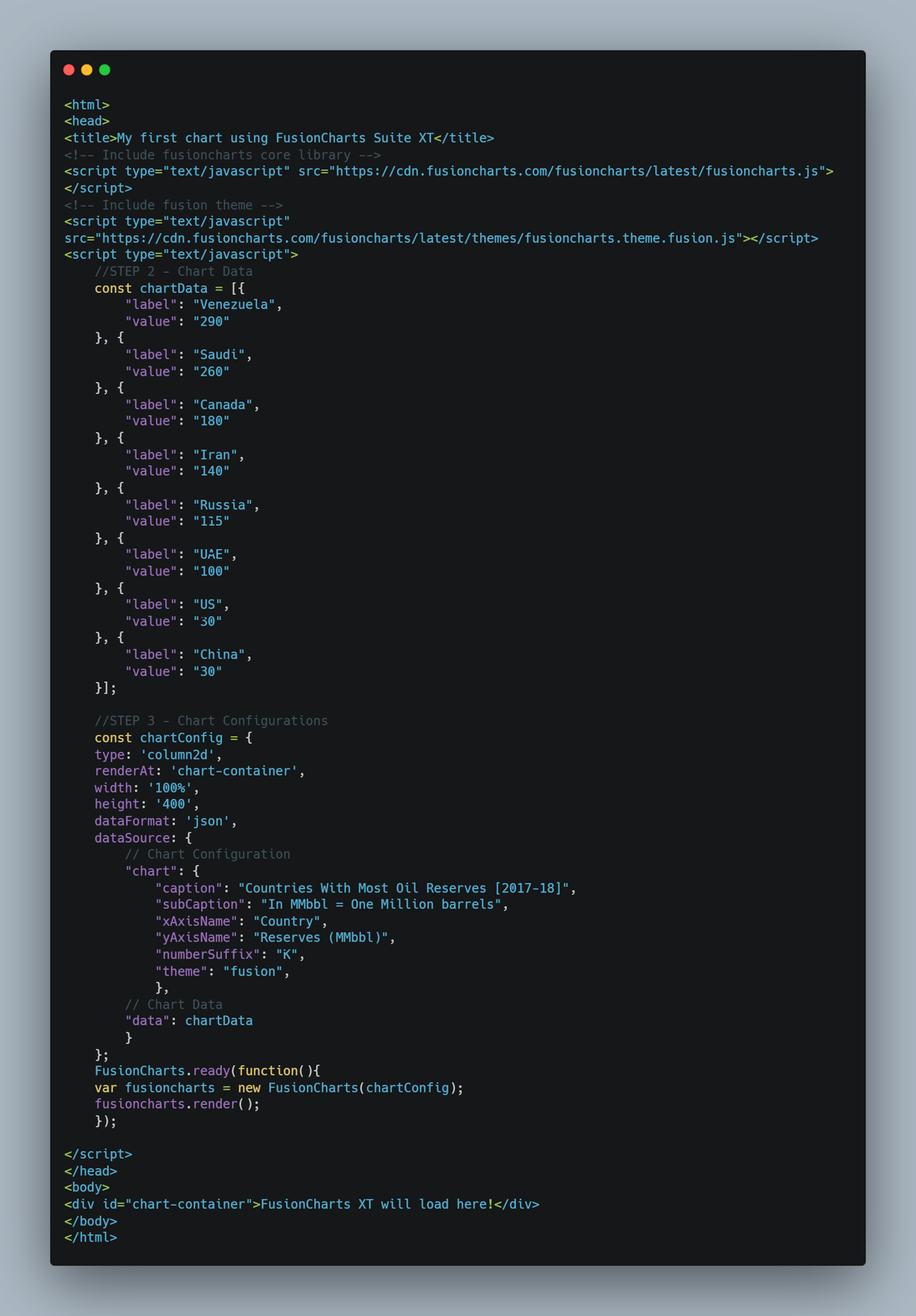
Here is an example code for creating a JavaScript bar chart:
You can also find the code here.
In the above code, we’ve set the data type to JSON and the chart type to column2D, which will create the bar chart. We’ve also added a caption, x-axis, and y-axis name.
The code above will create the following bar chart:

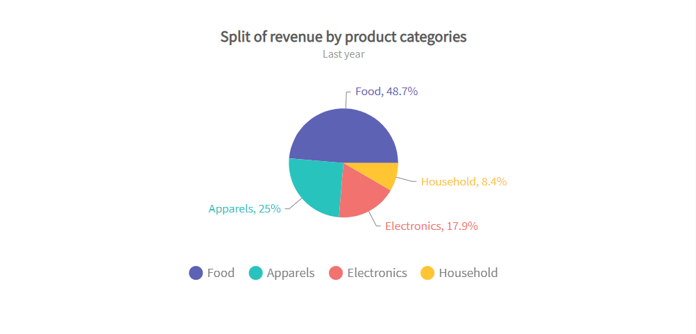
Pie Charts
Pie charts represent categorical data on a circular graph, and they help visualize the percentages of a whole. Pie charts are used to show how a total amount is divided between different variables or categories.
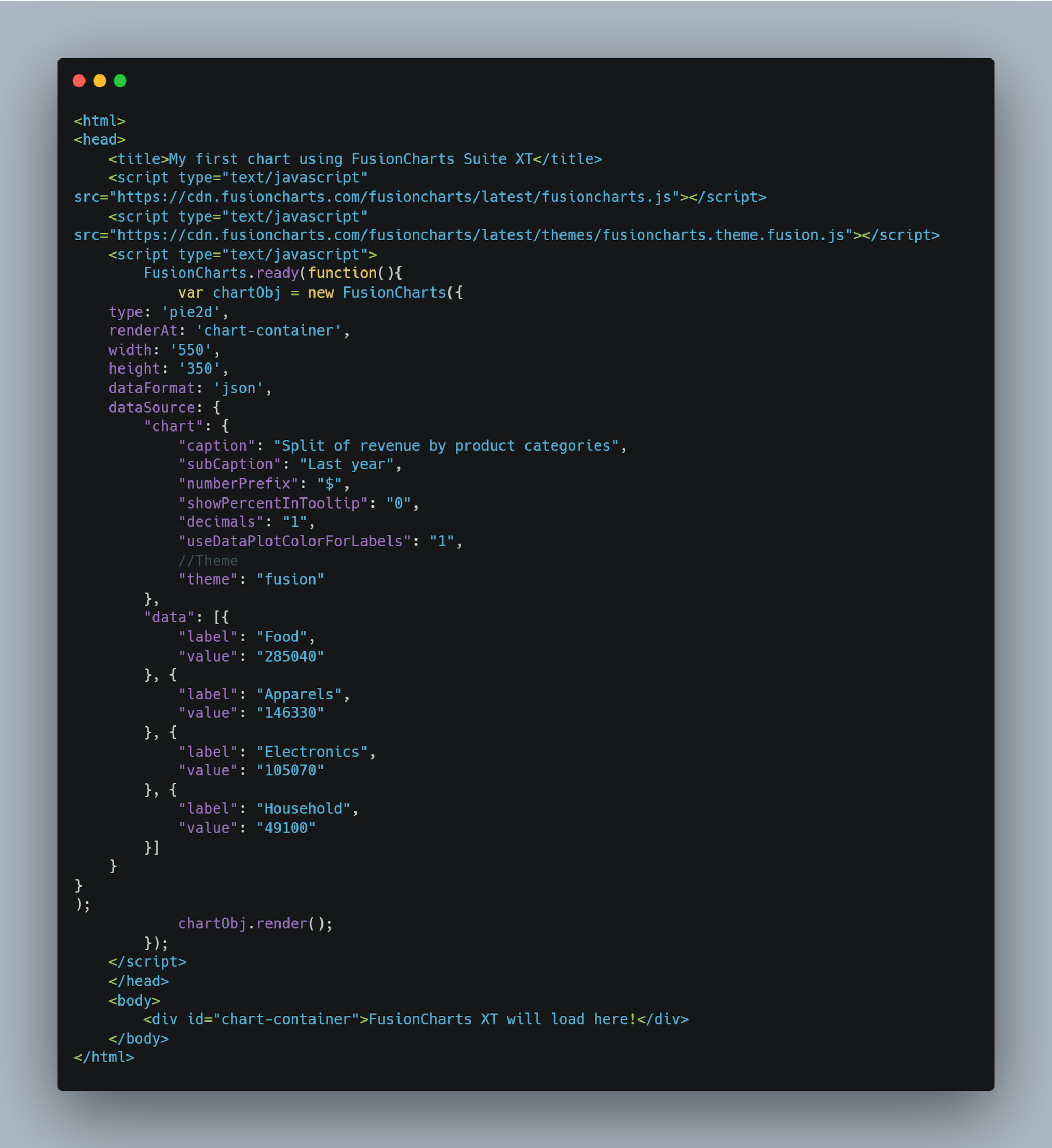
Here is the JS code for creating a pie chart:
You can also find the code here.
To make a pie chart, we need to choose the ‘pie2D’ type. These charts function with the same configurations as doughnut charts and are almost identical to them.
The code above will create the following data visualization:
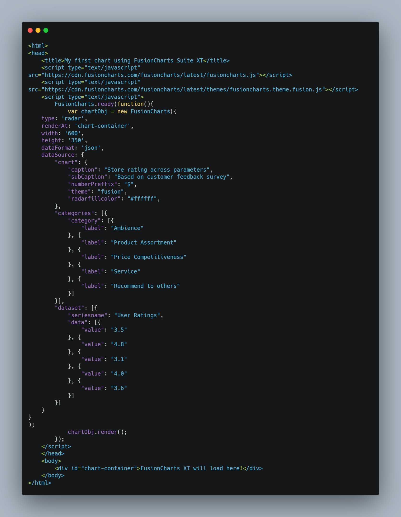
Radar Chart
Radar charts, also called spider charts, are great for representing multivariate and multidimensional data in a 2D visualization. These charts are also known as web charts or star charts.
Here is an example code for creating a JS Radar chart:
You can also find the code here.
We won’t specify the x-axis and y-axis here because we don’t need them for a radar chart.
The code above will make the following chart:

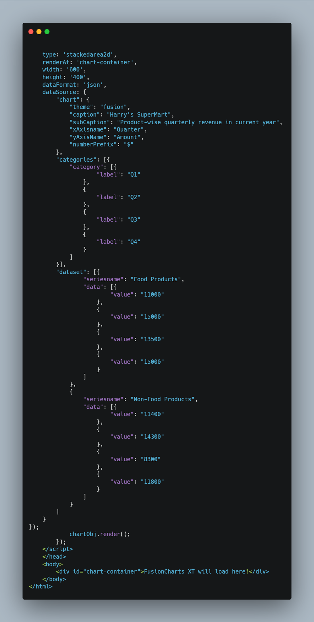
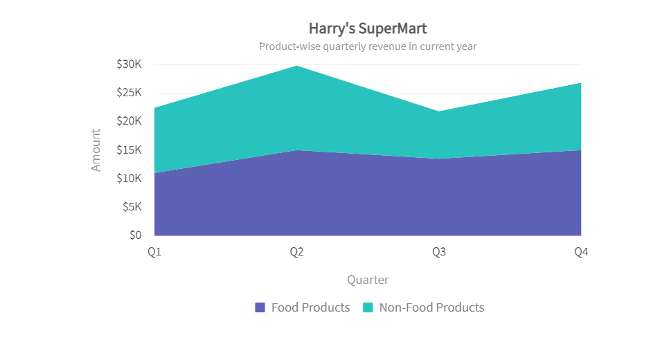
Stacked Area Chart
A stacked area chart is an extended version of a simple area chart, but it has several area series stacked on top of each other. These charts are helpful for comparing multiple variables changing over an interval of time.
Here is an example code for creating a stacked area chart:
You can also find the code here.
The code above will create the following chart:
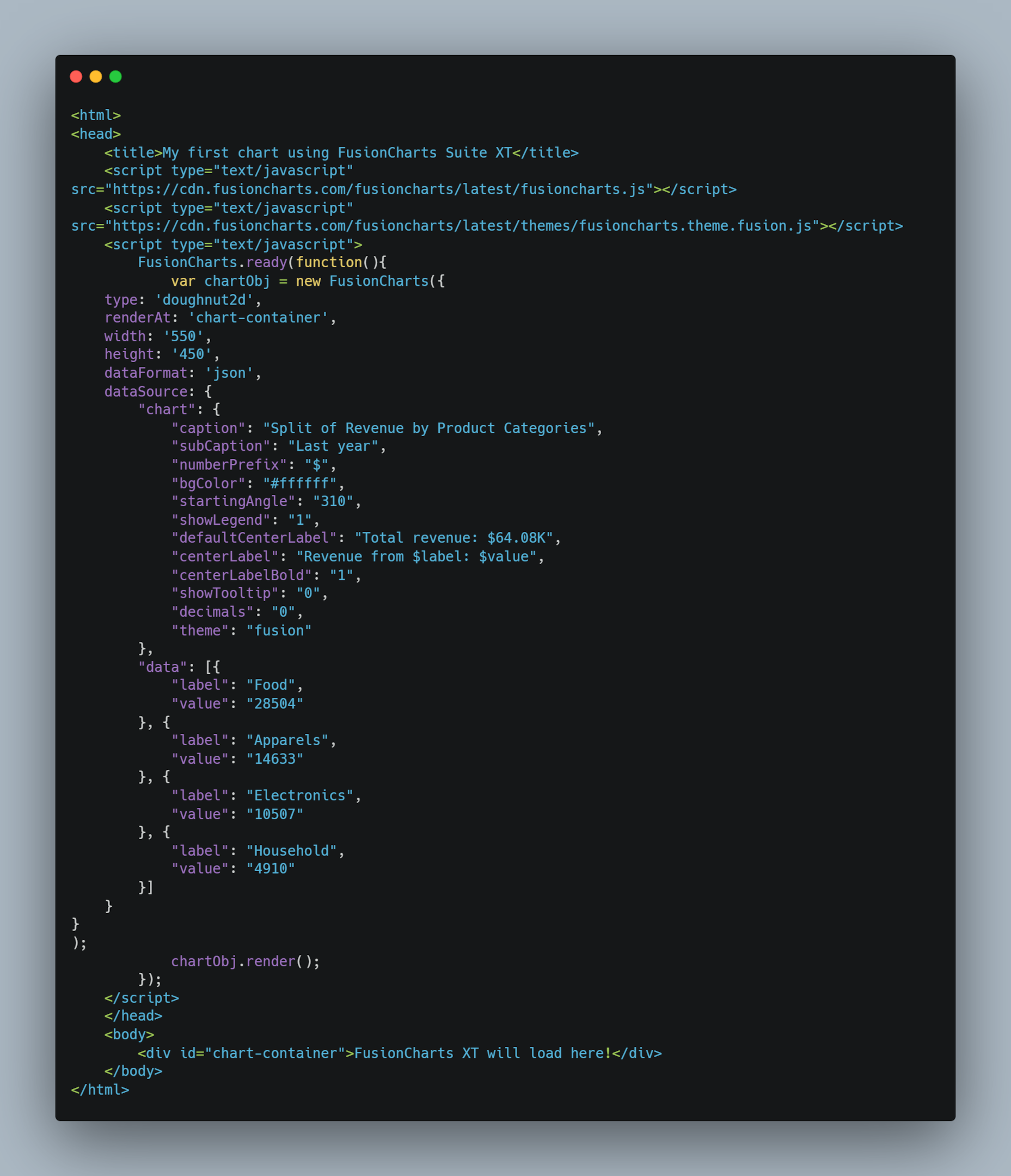
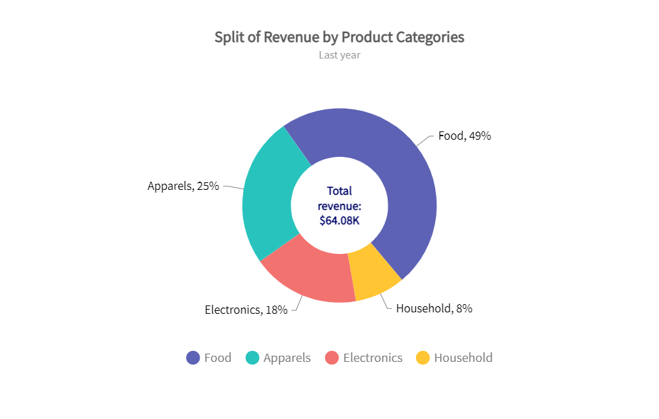
Doughnut Chart
Doughnut charts are like pie charts, and they can be created by setting the chart type to ‘doughnut2d.’ All the other configurations are similar to pie charts.
You can also find the code here.
The code above will create the following chart:
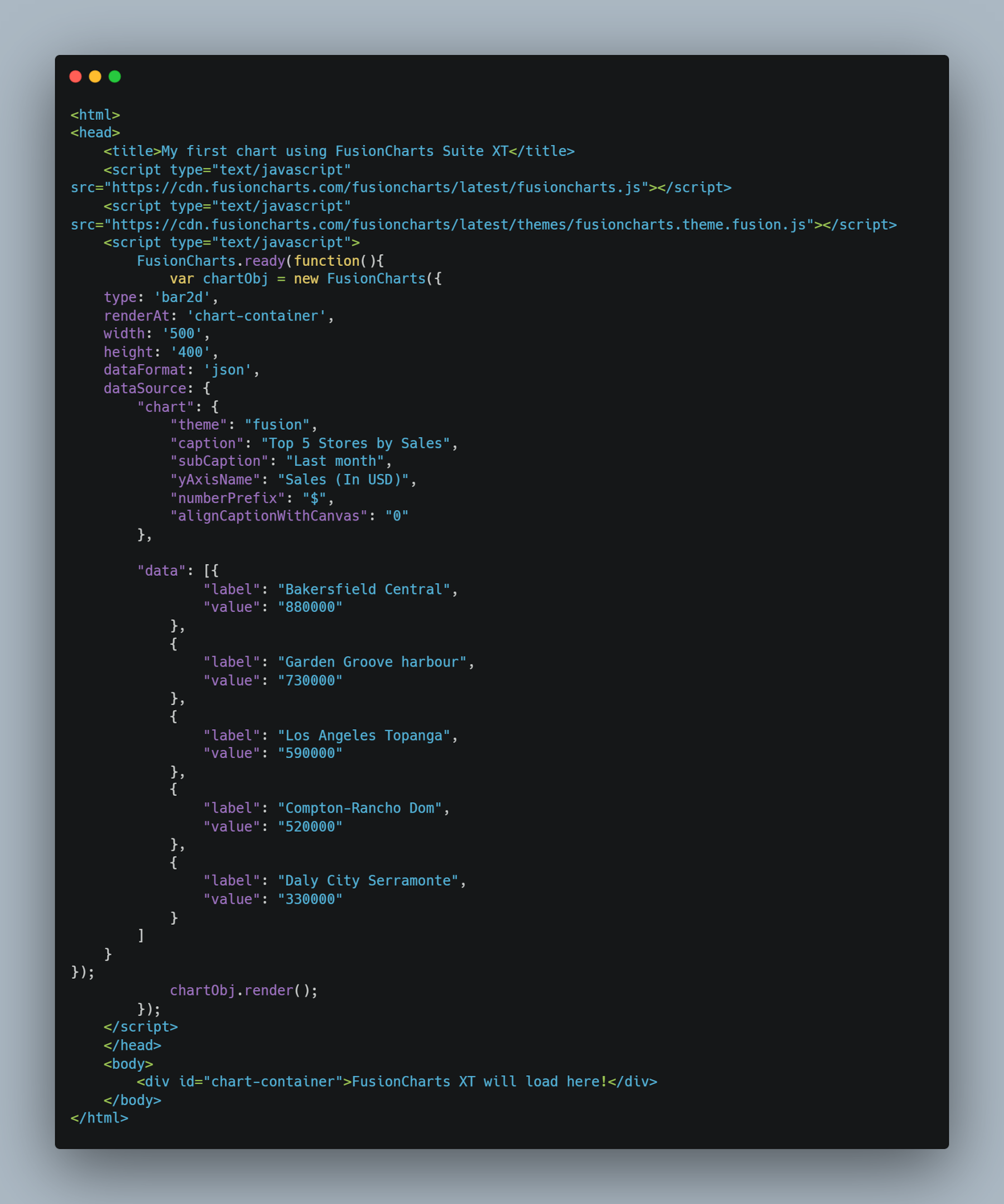
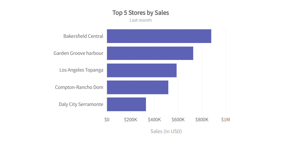
Horizontal Bar Chart
In a horizontal bar chart, the bars are drawn horizontally or along the y-axis. The vertical axis represents the data categories. We can make a horizontal bar chart by selecting ‘bar2D’ as the type.
You can also find the code here.
The code above will create the following chart:
Grouped Bar Chart
A grouped bar chart is also like a bar chart, but it does require a slightly different data configuration than standard bar charts. We need to set the type to ‘mscolumn2d.’ This will create a multi-series or grouped bar chart.
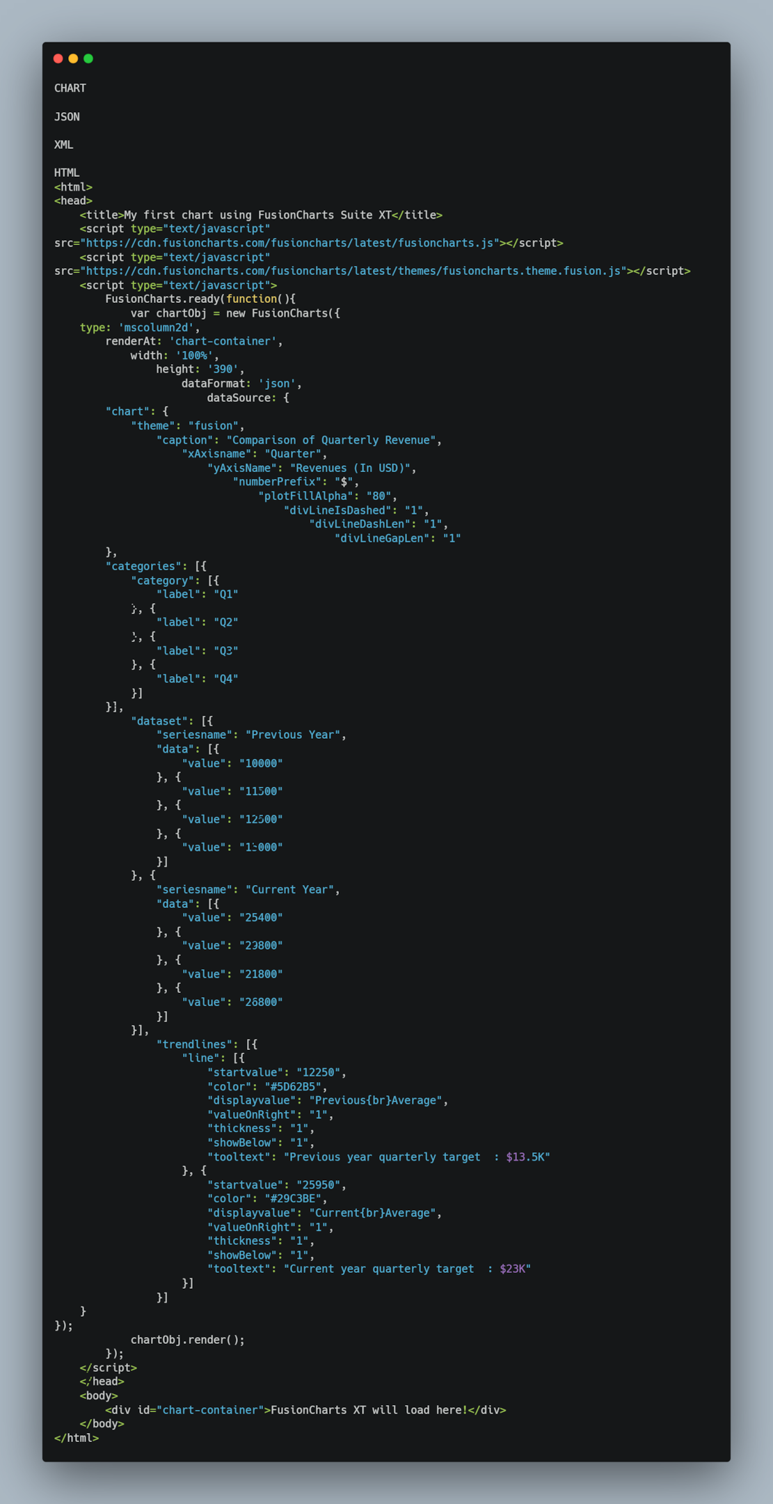
You can also find the code here.
The code above will create the following chart:
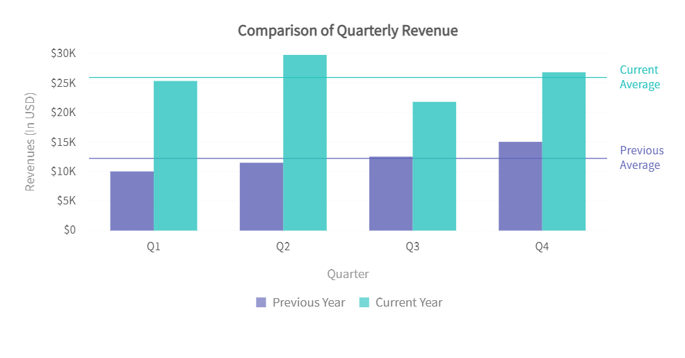
Bubble Chart
A bubble chart or a bubble plot shows the relation between three numeric variables. Each bubble in the chart represents only one data point.
You can find the code here.
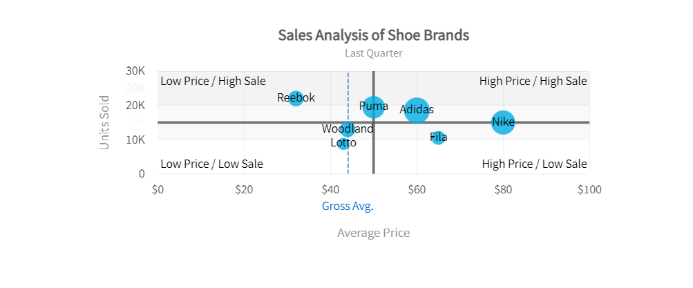
Scatter Chart
A scatter chart or scatter plot represents values for two different variables. It is mostly used to show the relationship between two numeric variables or compare two numeric variables.
You can find the code here.
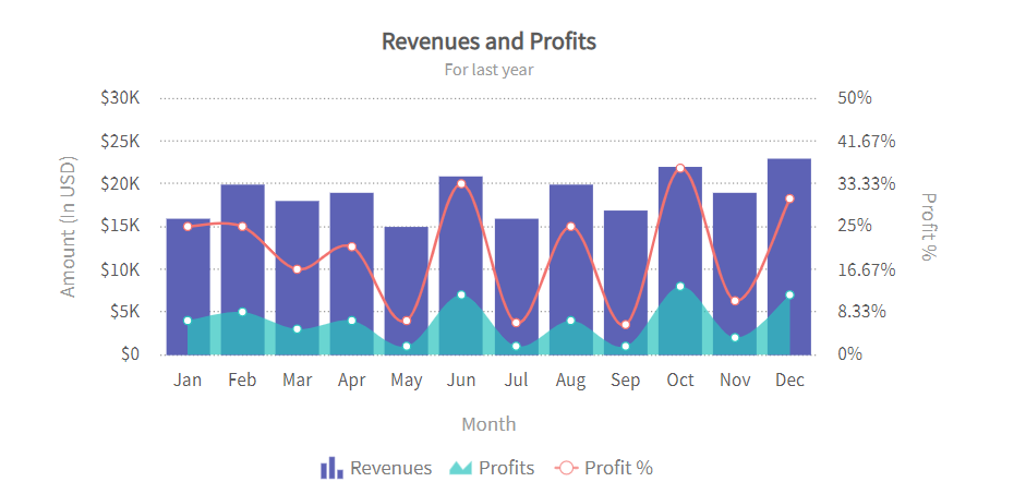
Mixed Chart
We can create a mixed chart by combining multiple charts and layering them on top of one another. However, we must set the type to ‘mscombidy2d.’
You can find the code here.
Which Tool Should You Use To Create JavaScript Charts?
If you’re looking for an easy-to-use charting library that offers all the features you need to create stunning yet functional charts for your web apps, FusionCharts is the right choice. It comes with over 100 different chart types, such as area, bar, line, pie, bubble, and scatter charts. Additionally, it provides a number of choropleth maps. FusionCharts also offers interactive features, such as panning, scrolling, zooming, and more. With FusionCharts, you can customize your charts by adding legends, titles, labels, axes information, and more.

Conclusion
Charts and graphs help businesses analyze data and make decisions accordingly. There are several chart types that you can use depending on your data set. In this article, we’ve discussed some of the most common JS charts examples that you can create for your next web project.
Frequently Asked Questions (FAQs)
How can you easily create JS charts?
If you want to create interactive JS charts for your web apps, you can use a JavaScript charting library, such as FusionCharts. FusionCharts offers more the 100 customizable and interactive charts and graphs.
What is a JavaScript charting library?
A JS charts library is a data visualization tool that lets you create charts for your web apps and websites quickly and easily. It has all the required functions, so you don’t have to start from scratch.
What is the best JS charting library?
Several JS chart libraries are available today, such as Google charts, Highcharts, FusionCharts, D3, Plotly, and more. However, FusionCharts is at the top of the list with its wide range of data visualizations, ease of use, extensive documentation, and customization options.
Ready to create interactive JS charts? Download FusionCharts today and make the most of your data!


