
Business dashboards are now a must-have for all businesses, large and small. This is due to the fact that they assist managers in tracking key performance indicators (KPIs) as well as the progress of various departments and employees within a company. They also allow users to track detailed metrics, research short and long-term trends, and make future plans and strategies.
While business dashboards may appear intricate and complex, they are simple to create and design with the right tools and technology. Continue reading to learn why creating a dashboard isn’t as difficult as you think.
In this post, you’ll learn more about business dashboards, why fusioncharts is the best for dashboard creation, how to create an awesome and amazing dashboard using the FusionCharts data visualization library, examples, and much more.
Table of Contents
What Is a Business Dashboard?
A business dashboard is an interactive and dynamic interface to visualize data, statistics, and various metrics using charts, graphs, and maps. A single dashboard generally comprises multiple graphs and illustrations of different parameters. It enables its users to track, monitor, and analyze key performance indicators as well as other metrics.
Why is FusionCharts the Best Platform for Dashboard Creation?
FusionCharts is a beautiful library for data visualization. It comes with a wide variety of 100+ charts and 2000+ choropleth maps to choose from. With FusionCharts, you can quickly and easily create stunning data presentations. Moreover, you don’t need advanced knowledge of programming or coding. In addition, you can easily integrate FusionCharts with the platform of your choice. This includes JavaScript, React, Django, PHP, Ruby, Svelte, ASP, and Angular. Simply put, FusionChart’s simple and consistent APIs help you build dashboards for complex data.
FusionCharts beats all other platforms in terms of efficiency, presentation, dashboard features, learning curve, functionality, cross-browser and cross-platform support, and technical documentation, as well as support.
What Steps Does Dashboard Creation Involve?
With FusionCharts, dashboard creation is really easy! Here is a brief outline of what you need to do.
- First, create a list of metrics you want to visualize and roughly figure out where they should be placed on the dashboard. For example, your key performance indicators should be above the fold and all related parameters should be next to each other.
- Then, choose the right chart for your data. You can consult the detailed white paper on Choosing the Right Charting Component for Your Product.
- Next, place the data for each chart in a separate XML/JSON file or string.
- Finally, on your HTML page, each chart should be in a separate container.
You can consult building a dashboard for more details.
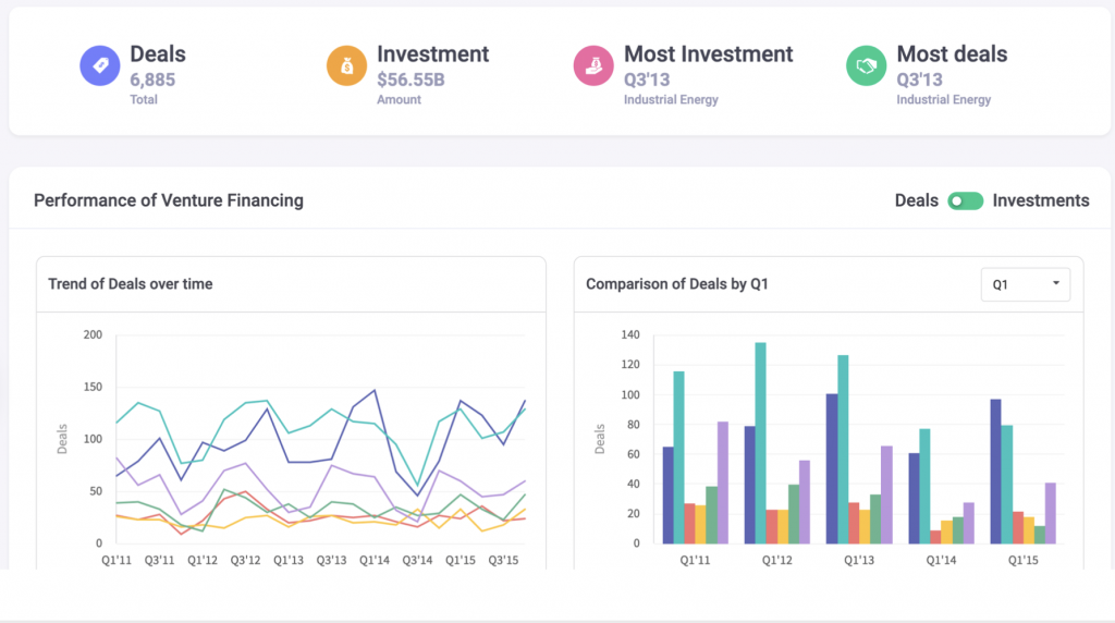
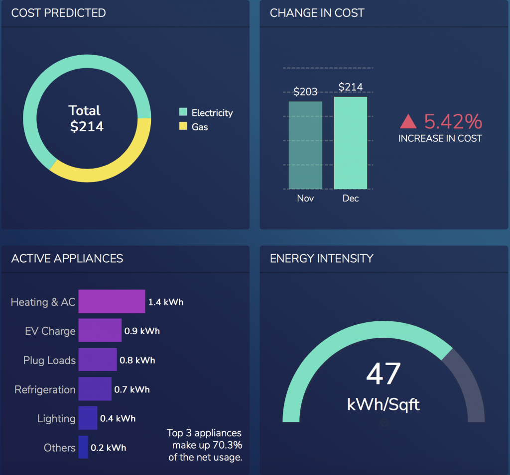
Are there Examples of Dashboards Created Via FusionCharts?
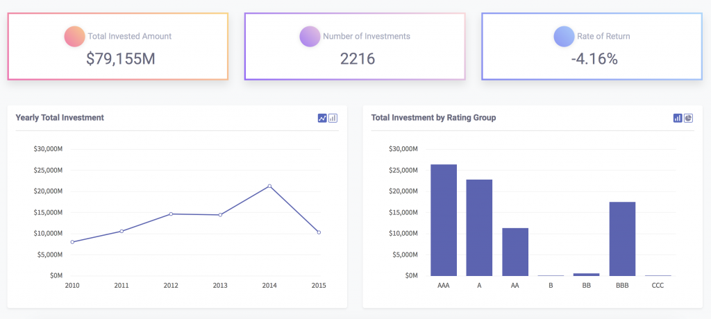
You can also browse through an immense variety of dashboards built using FusionCharts. Some examples include but are not limited to:
- SaaS dashboard
- Wealth management dashboard
- Sales management dashboard
- Pediatrics Center Dashboard
- Covid-19 tracker
- Real-time Twitter hashtag tracker
Can I Create My Own Dashboard From an Existing Template

Creating your own customized dashboards is really easy. This is because all the sample FusionCharts dashboards come with full source code. You can choose the dashboard that is right for you, download its source code, and customize it according to your requirements.
Can I Illustrate My Data Story Via Dashboard Creation?
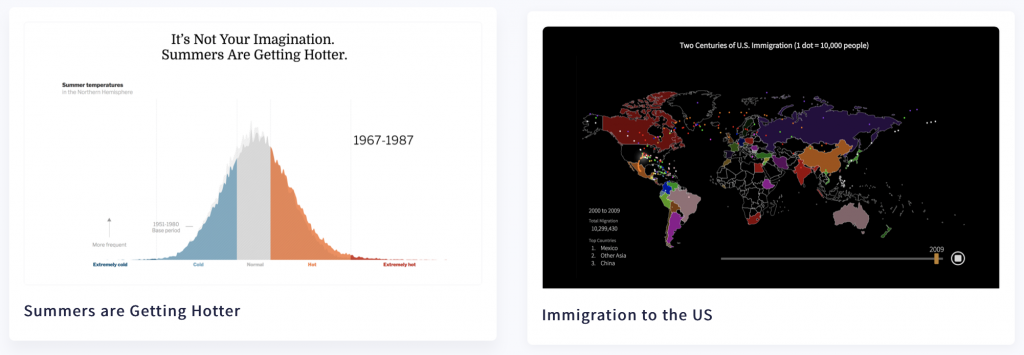
FusionCharts is also an ideal platform for building dashboards that narrate an entire data story. For example, data stories include animations and interactive visualizations to present the variations in data over time. Here are a few samples from different domains. These include financial, environmental, political, and demographic subjects.
- Gasoline prices around the world
- What is really warming the world
- Clean water access around the world
- Performance of tech IPOs
- Ratios of inequality
Click here for more sample stories. Would you like to build your own data story? Schedule a call with us today and we’ll build an interactive visualization that narrates your story.
What are the Special Features of FusionCharts Dashboards?

With FusionCharts you can build responsive and interactive dashboards that are effective and engaging. A few special features include:
- Real-time updates without the need for page refreshes
- Drill-downs, where each data point acts as a hot spot
- Event handling for all types of keyboard and mouse events
- Zooming, panning, and scaling
- Options to present very fine variations and details, as well as long term trends and summaries
How Do I Sign up For FusionCharts?
FusionCharts is the best library for creating effective and engaging dashboards. With a simple and clean design, wide variety of charts and graphs, event handling capabilities, interactive and responsive interfaces, extensive documentation, and cross-browser support, FusionCharts is now the first choice of over 28,000 individuals, organizations, and businesses across 118 countries.
If you have not already signed up, start exploring FusionCharts today and sign up for your free trial!


