Ratios of Inequity
Data Story by FusionCharts
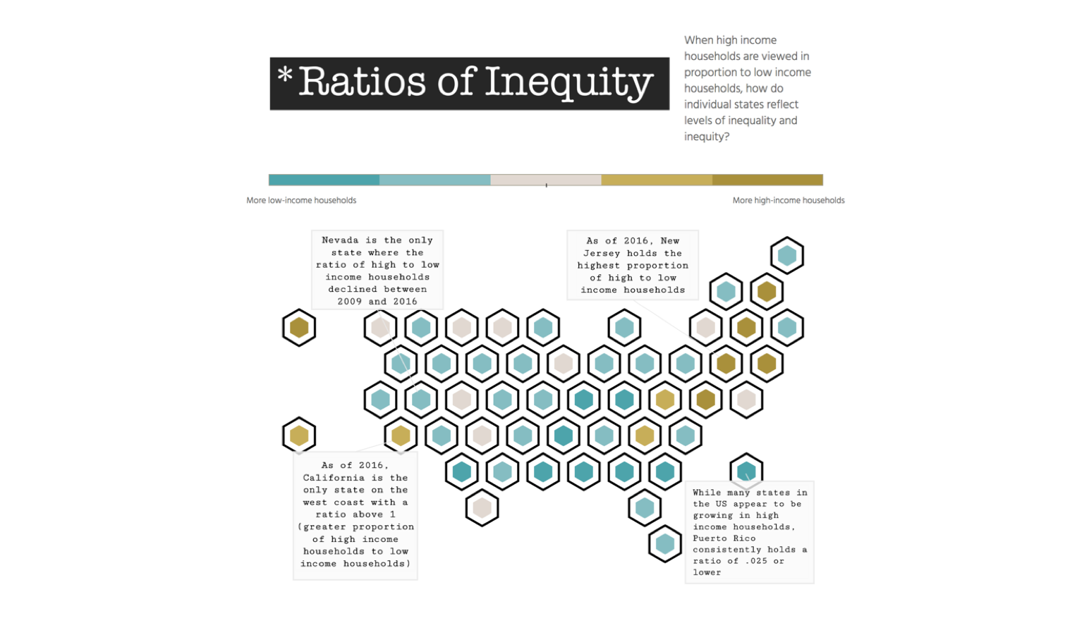
The ratio of the number of high-income households to the number of low-income households is represented in this visualization. To explore a particular state in detail, hover on the state to see the trend of this ratio. This ratio gives an accurate understanding of the levels of inequity in each state, and how it’s changed over the years. It can be a good measure of how effective each state government has been in curtailing the rise of inequity.
This sample dashboard is built using FusionCharts Suite XT, which needs a license for commercial use.
Want to use this Data Story in your projects?
We can plug in your data into our data story templates, or customize the template for your needs, or even build a completely new one. We would love to talk to you!