
Table of Contents
Key takeaways
- Histograms show how continuous data spreads across groups of similar values by creating specific intervals.
- Bar charts specifically show data points from discrete or categorical categories, so they work well for comparisons.
- Histograms function best when you need to study trends and patterns along with frequency distributions in numerical data sets.
- Bar charts are the proper visualization for value comparison between established categories or groups.
In a data-driven world, businesses must make good use of the data they produce to remain competitive in any market. This involves predicting trends and making data-driven decisions. Stakeholders and decision-makers must analyze and interpret complex data quickly. This is where data visualization tools play a crucial role.
A chart comparison (histogram vs. bar chart) is a great tool for visualizing data. Although they may have some similarities — in fact, the histogram is a subclass of the bar chart — they’re quite different. In this article, you’ll learn the differences between the histogram and bar chart, and when to use them. You will also learn different bar graphing methods that help create more transparent and impactful data displays.
What Is A Histogram?
A histogram is a type of bar chart with connected bars that show the frequency and distribution of continuous data, using bins or intervals on the x-axis and values on the y-axis. Examples include average Instagram followers by age, website visit duration, or hotel counts by price range. Histograms are used to analyze data distributions, identify patterns, and simplify large datasets for statistical insights.
When should you use a histogram?
You should use a histogram to analyze continuous numerical data and detect changes in distribution. It shows particular patterns when analyzing distributions through central tendency measurements, as well as skewness and variability evaluation, if you have an analysis of test scores, website visit durations, and income brackets. The benefits of a histogram are that it shows the frequency distribution of values. This makes it ideal for understanding histogram data distribution across various datasets.
What are the features of histograms
Here are a few histogram features mentioned below:
- Data Grouping through Bins within Histograms uses bins or intervals on the x-axis to present how continuous data is distributed across the range.
- The vertical bars in Frequency Representation measure data frequency across intervals so analysts can quickly detect distribution patterns as well as data shapes and trends.
Advantages and disadvantages of histograms
Advantages
- A histogram helps in visualizing the distribution of continuous data.
- Helps detect patterns and trends.
- One of the primary histogram chart uses is identifying how data behaves within specific intervals, making it easier to analyze frequency distributions.
Disadvantages
- Doesn’t show exact data points.
- A misinterpretation of data can result when choosing inappropriate bin sizes.
- This tool operates exclusively with numerical data because it fails to handle categorial information.
Examples
Let’s explore some comparison examples to highlight how histograms and bar charts can be applied to different kinds of data
Example of a histogram
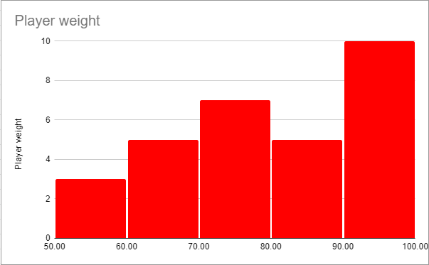
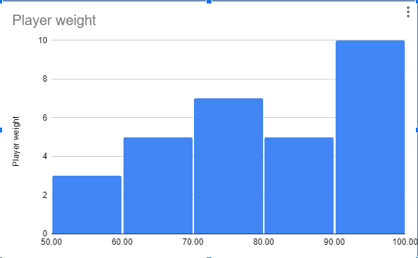
A high school coach wants to evaluate players’ weights using bins like 50–60, 60–70, etc. The x-axis shows weight ranges, and the y-axis shows the number of players in each range. For example, if ten players weigh 90–100 lbs, the corresponding bar reaches 10 on the y-axis. A histogram in statistics displays how continuous data spreads across intervals.
Below is an example data set you can visualize using a histogram. A high school football coach wants to evaluate his players’ weight. Using a high school grading system, the coach is able to group the weight of his players. For example, the x-axis could include bins for players weights between 50-60, 60-70, and so forth. The y-axis will display the number of players with weights in the predefined range. If ten players’ weights fall between, the 90 – 100 bin bar will stop at the point marked “10” on the y-axis, as seen below.
What Is A Bar Chart?
A bar chart visualizes categorized data, making it easy to compare categories. Double bar charts compare two related data sets. Examples include students per course, properties per state, and yearly sales. Bar charts clearly show value differences, trends, and patterns across categories.
What are the different types of bar charts/graphs?
The following kinds of bar graphs exist for different data visualization requirements:
- Vertical bar chart: It manages data presentation through the use of bars running vertically. It also enables viewers to examine different categories when placed next to each other.
- Horizontal bar chart: It functions as the main feature of this type of graph since it replaces the conventional vertical bars, thus enabling a clear visual representation of extensive category names and vast datasets.
- Grouped (clustered) bar chart: It combines various bars into comprehensive groupings that examine different sub-category transformations.
- Stacked bar chart: It represents various sub-groups through bundled sections of one bar to reveal complete components in addition to vertical divisions.
- Segmented bar chart: This graph contains visible color codes that help identify the components within a complete system. Similar to stacked bar graphs it shows parts of whole elements.
Users can tailor their data through a dynamic and interactive bar chart because FusionCharts supports every chart variation, offering flexibility when comparing histogram vs bar chart visualizations.
When should you use a bar chart?
When different categories need comparison of their corresponding values, you should use a bar chart. This chart type serves to display survey results, product sales, and region-based population data. The use of bar graphing enables users to view which categories achieve better performance results.
What are the features of a bar chart?
Here are some of the bar chart characteristics listed below:
- The bar chart displays categorical divisions through bars that reflect the extent of their relative values.
- The orientation of bar chart elements can be set either vertically or horizontally to adapt data display according to category name or value formats.
Advantages and disadvantages of bar chart
Advantages
- Users can easily interpret and read bar charts.
- Supports comparison between multiple categories.
- Users have control through the ability to sort, group, and stack the elements.
Disadvantages
- This method fails to identify patterns within the distribution of the data values.
- The display becomes difficult to read with numerous categories.
- Not suitable for continuous or interval data.
Knowledge about bar chart uses enables better assessment of situations that suit this data representation method despite its known limitations.
Read In-depth: Bar Charts: An easy guide for beginners
Example of a bar chart
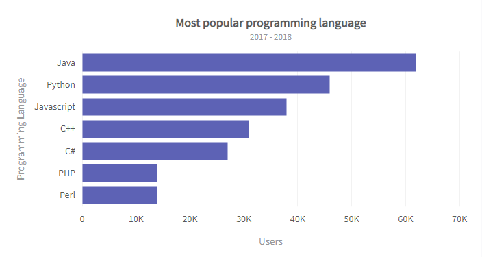
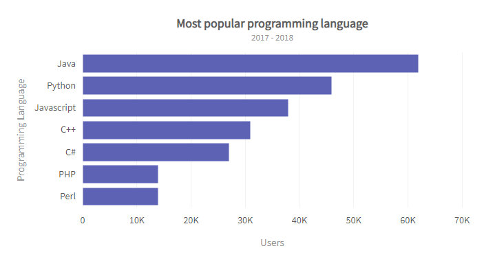
A developer community wants to compare users across programming languages. The x-axis shows the number of users, and the y-axis lists the languages. For instance, if Java has 60k+ users, its bar reaches the 60–70k mark. Bar charts compare distinct categories rather than continuous ranges.
Here’s a guide on preparing bar charts in Excel
<!–
Examples
Example of a Histogram
Below’s an example data set you can visualize using a histogram.
A high school football coach wants to evaluate his players’ weight. Using a high school grading system, the coach is able to group the weight of his players. For example, the x-axis could include bins for players weights between 50-60, 60-70, and so forth. The y-axis will display the number of players with weights in the predefined range. If ten players’ weights fall between, the 90 – 100 bin bar will stop at the point marked “10” on the y-axis, as seen below.

Example of a Bar Chart
Here’s an example data type that requires a bar chart:
A global developer community wants to compare the number of users for various programming languages. Unlike the histogram example above, the x-axis would include the number of users of the various programming languages, with each language serving as a category. The y-axis will display the programming languages. If Java has around 60k+ users, the bar will stop between 60k – 70k, as seen in the chart below.
Here’s a guide on preparing bar charts. –>
What Is The Difference Between A Histogram vs. Bar Chart?
Histograms and bar charts are both effective tools for representing large data sets. While they may share similarities, such as the number of axes and the use of bars, they display different data types and tell different stories. Below is a histogram vs. bar chart table describing their differences.
Histogram |
Bar Chart |
| Histogram represents quantitative data by grouping them into bins. Bins can sometimes be referred to as intervals, classes, or buckets. | The bar chart plots datasets with data values divided into different non-numerical categories. |
| Histograms organize data in increasing order. The bins from left to right must be plotted from lowest to highest. | Bar charts have no strict organizational rules. What category comes first is at your discretion. However, some experts recommend using an alphabetical order of organization. Others recommend organization by size, for example, from smallest to largest or vice versa. |
| Histograms can determine the distribution or frequency of data values — for example, average income per age group. | A bar chart can determine the relationships between predefined categories — for example, product sales in different store locations. |
| There are no gaps between bins; therefore, no spaces between the bars of a histogram. However, if bins have zero value, they’re left empty and may appear as spaces between bars. | Bar charts have spaces between each category. |
| The bar widths of a histogram depend on the data it represents. It must be proportional to the data. Most importantly, the bar widths must equal the percentages used. | While the height of the columns of a bar chart is proportional to the data value of the y-axis, the bars’ widths are mostly similar. |
Data Representation
When selecting the best way to represent your data accurately, it’s essential to understand the difference between a bar graph and a histogram. Although both look similar, each serves a unique purpose based on the data type and structure.
| The x-axis of a histogram plots bins, numerical values, or range categories. The y-axis plots the data value of the bins or ranges. | The x-axis of a bar chart plots the various categories in the data set. The y-axis plots values representing the bars’ size in each category. |
| The variables plotted on a histogram are non-discrete variables. These are continuous variables whose values are determined through measurement. | The variables plotted on a bar chart are discrete variables. These are variables whose values are determined through counting. |
| Histograms group different x-axis elements or data values into bins or ranges. | Bar charts recognize each element, data value, or item as an individual entity. |
| Histograms can be used to identify trends and patterns. Its design and data type representation allows users to identify trends and predict future behavior or occurrences. | While bar charts allow you to determine which category performs best, it doesn’t display the details of why such category performs best or which element in a category is responsible for the high performance. Therefore, you can’t identify trends and patterns with a simple bar chart. However, there are classes of bar charts that display trends and patterns. providing more data visualization examples for comprehensive analysis. |
| Histograms do not display exact values; rather, they plot data in bins and ranges. | Bar charts display actual data values. |
| Since the columns of a histogram cannot be rearranged, skewness (i.e., data asymmetry or distribution) applies to histograms. | Bar charts allow for fluid column arrangement; therefore, skewness does not apply to bar charts. |
Read: Know the difference between bar charts and pie charts
Bar Chart vs Histogram: which should you use?
Histograms and bar charts serve different purposes based on your data. Use histograms for frequency or distribution of continuous values, and bar charts for categorized data. If unsure, plot both to see which best represents your data. FusionCharts makes it easy to create and visualize your insights effectively. You can download a trial to see for yourself.
What are the use cases of both
These are some of the use cases that show the difference between the histogram and bar chart. Knowing how histograms and bar charts differ from one another enables users to make proper decisions about their selection.
- The analysis of data distributions benefits from histogram visualization because it shows both website visit frequencies and demonstrates skewness and gaps in continuous variables such as regional income distributions.
- A bar chart functions better for class performance comparison and also works for displaying survey results, including preferred social media choices.
The histogram vs bar chart comparison is made easier with FusionCharts, which lets you make both charts at once to identify which visualization best communicates your data story.
What are the common mistakes when using histograms and bar charts?
Here are some of the common mistakes that appear when using these charts:
- Using a bar chart for continuous data: A bar chart misrepresents data when used with continuous information.
- Incorrect bin sizes in histograms: Using an inappropriate number of bins in histograms causes data interpretations to become inaccurate.
- Overloading bar charts with categories: Bar charts become too cluttered when they contain numerous categories.
- Ignoring labels or axis titles: When readers overlook label text or axis title information, the data becomes harder to understand.
- Failing to use color or spacing correctly: The improper use of colors or spacing causes significant effects in bar chart analytics because gaps hold critical meaning when comparing the bar chart vs histogram visualizations.
Conclusion
Histograms and bar charts are essential visualization tools for different data types. Use histograms for continuous data distributions and bar charts for category comparisons. Both kinds of visualizing examples can be easily created on platforms like FusionCharts, making data insights clear and actionable. Download a trial today to get started.
FAQs
How are histograms and bar graphs similar?
Both use bars along two axes, but bar charts show categories while histograms display continuous data.
How do you choose the right type of chart for your data?
Use histograms for continuous data distribution and bar charts for comparing distinct categories.
Which of the two is the best choice for representing data?
Choose histograms for trends and distributions, and bar charts for category comparisons; FusionCharts allows testing both.
/* Base table */
.table {
width: 100%;
border-collapse: collapse; /* makes borders merge */
font-family: system-ui, Arial, sans-serif;
font-size: 14px;
color: #222;
background: #fff;
}
/* Table cells */
.table th,
.table td {
padding: 10px 12px;
border: 1px solid #ccc; /* <– border here */
text-align: left;
}
/* Header */
.table thead th {
background: #f5f5f5;
font-weight: bold;
}
/* Row hover */
.table tbody tr:hover {
background: #f9f9f9;
}
/* Responsive wrapper */
.table-responsive {
overflow-x: auto;
}


