
Trendlines are added to scatter plots to enable easier analysis and understanding of data, including trends and outliers. More specifically, the slope of the trendline defines the rate of change of the independent variable relative to the dependent variable. That said, Google Sheets would not automatically add the equation of trendlines to your graph. But that doesn’t mean you have to unearth your pen and paper to calculate it yourself. You can maneuver the Google Sheets graph maker settings to add basically anything to your chart. In this article, you’ll learn how to add an equation to a graph or line of best fit equation in Google Sheets.
However, before we dive into adding equations using the Google Sheets graph maker, let’s define a trendline equation.
Table of Contents
What Is A Trendline Equation?
There are different types of trendlines depending on the chart type and purpose of the trendline. However, this article focuses on the linear trendline. The linear trendline equation is a linear relationship that describes the line that best fits a set of numerical data points. Depending on the nature of a scatter plot, this line should have the shortest distance between each data point and the line itself. The trendline equation is used to define this line.
The equation of a linear relationship is y = mx + b. Where x is the independent variable, y is the dependent variable, m is the slope of the line, and b is the y-intercept. Using this equation, you can identify whether or not a trend is present in your data points. But if you are looking to visualize the trend in your data, you can add a line of best fit formula to your chart. The line of best fit, also known as the trendline, is a straight line that best represents the relationship between the variables in your dataset. Let’s look at how to add this equation to your chart.
Purpose of Best Fit Line
The whole purpose of adding a best fit line in Google Sheets is to showcase and identify the data patterns. With the help of this straight line, the distance between itself and the data points is minimized. Additionally, one’s understanding of the data trends is enhanced.
Interpretation of Best Fit Line
The interpretation of the best-fit line involves the slope and y-intercept. The slope indicates the relationship that is between the variables. The positive line shows a direct connection, and the negative one shows inverse connections. Y-intercept denotes the dependent variable when the independent ones are zero.
How To Add Best Fit Lines In Google Sheets?
To add trendline equations to your chart, you must first have a chart with trendlines. The steps to create one are below:
Step: 1 Setting Up Google Sheet
While setting up the Google Sheet for adding line of fit equation, there are a few steps you need to consider. Let’s check them out one by one:
- Firstly, choose the data range and the column headers.
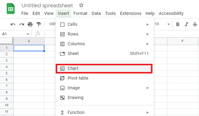
- Go to the Insert option in the menu bar.
- Select the Chart Options.
- There, you will find a chart with a Chart Editor sidebar on the window’s right side.
- Based on your data, Google Sheets will recommend a chart. If it is not the scatter chart, move ahead to the next step.
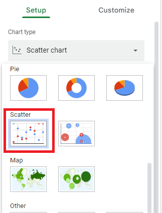
- To get a scatter chart, click the Setup tab and find the Chart Editor option. You will find a drop-down menu with all the chart-type options.
- There, choose the Scatter Chart option.
Step: 2 Go To Chart
In Google Sheets, you must first select the columns comprising the chart you wish to use for creating the Google Sheets best-fit line, followed by navigating to the “Insert” menu and selecting “Chart” to generate the desired visualization.
Step: 3 Data Interpretation
At this point, Google Sheets will create a chart that best suits the data points you’ve provided. In this case, it should automatically create a scatter plot. But if it creates a different chart, simply navigate to Chart Editor > Setup > Scatter plot to create a scatter plot.
Step: 4 Spreadsheet Floaters
At this stage, you should have a raw scatter plot equation visualization without any trendlines. The data points will be represented as floating over individual spreadsheet cells, providing a clear and unobstructed view of the data.
Step: 5 Chart Editor Customization
To access the Chart Editor, navigate to the “Chart Editor” tab within the platform. Once there, proceed to the “Customize” section and select “Series.” From this point, enable the “Trendline” option to add a trendline to your chart.
Step: 6 Trendline Verification
If you want to customize the thickness, opacity, color, and more, go to the “Series” section. There, you will find a trendline checkbox. Click on it and find the varied options.
Step: 7 Trendline Visual
Depending on your data points, Google Sheets will display a line (trendline) with the shortest distance between your data points and the line itself. This feature is especially useful when creating a reporting dashboard, as it helps visualize trends and make data-driven decisions.
Step: 8 Select Use Equation
Proceed to Chart Editor > Customize > Series > Label. Within the ‘Label’ dropdown menu, select ‘Use Equation.’ This will enable you to input and apply a mathematical formula to the plot, visually representing the trendline.
Results
In Google Sheets, the trendline equation is prominently displayed at the top of your scatter plot chart, providing a clear visual representation of the data. To enhance your chart’s visualization, you can add additional labels, such as a chart title, for easy identification and analysis of the data.
How to Use Excel to Graph an Equation or Function
Excel can be a Google Chart alternative, depending on your project needs. Adding a trend line or Google Sheets best fit line to a scatter plot in Excel is similar to the Google Sheets steps discussed above. However, there are a few differences. But basically, you simply have to create your scatter plot and add the equation.
The equation of the line in Excel follows the standard format y = mx + b, where m is the slope and b is the y-intercept. Once added, Excel allows you to display this equation directly on the chart for easy reference.
Here’s how you can do so in Excel.
Creating A Scatterplot
Like in Google Sheets, you need to prepare your data.
- List your x-axis and y-axis values in different columns. You can do this using the function you want to graph. For example, using the equation, y = 3x + 5 to get the y-axis values.
- Select the columns containing your data.
- Navigate to Insert > Chart.
- Choose the scatter plot from the chart dropdown.
Adding Equation
This is where the difference between using Google Sheets and Excel lies.
- Highlight your scatter plot chart.
- Navigate to Chart Design > Add Chart Element.
- Scroll down to ‘Trendline’ and click on it to open the trend line options dropdown.
- Select Linear.
- Click ‘More Trendline Options’ and check the ‘Display Equation On Chart’ checkbox.
Final Scatterplot With Equation
- Excel will display the equation at the top of your chart. Note that your final scatter plot equation would match the function used for your y-axis values.
Final Thoughts
The trend line equation enables users to identify trends and outliers. You can go a bit deeper to determine whether or not a trend exists and in what direction.
- If your equation shows a positive slope, i.e., the value of m is positive, there’s a positive relationship between the independent and dependent variables.
- If the value of m is negative, i.e., a negative slope, it represents a negative relationship between variables.


