
In today’s fast-paced economy, organizations must continuously make informed business decisions and develop data-driven strategies. To do this, you must leverage existing data to predict possible future trends. This is where trend lines, a charting tool used to represent prevailing data trends, play a crucial role. Additionally, you can use trend lines to draw viewers’ attention to a particular section of your chart. In this article, we’ll discuss the main types of trend lines and how you can add them to your charts.
Table of Contents
What is a Trend Line?
Trend lines are straight lines connecting multiple price points on a chart, aiding in the recognition and validation of trends.
According to technical analysis, trend lines stand as a cornerstone tool for traders and analysts, facilitating the identification and prediction of general price movement patterns in various markets. These lines visually illustrate support and resistance levels across different time frames.
The significance of trend lines in technical analysis lies in their capacity to represent market trends and potential reversal points concisely. This clarity empowers traders with valuable insights for making well-informed decisions. Trend lines present a straightforward yet powerful method for discerning and anticipating market dynamics.
What are the different types of Trend Lines?
Various types of trendlines exist, with the most prevalent being categorized as linear, logarithmic, polynomial, power, exponential, and moving average. So, let’s explore each of them in brief.
What Are Linear Trend Lines?
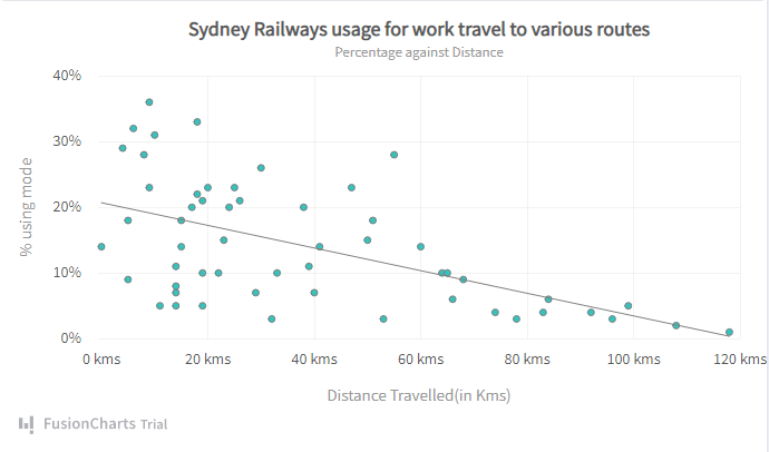
Linear trend lines, also known as best-fit lines, are straight lines used to represent the patterns in simple linear data sets. Your data is linear if most data points fall on or very close to the line of best fit. You’ll typically use a linear trend line to determine if something is trending steadily in a positive or negative direction. For example, the chart below plots the percentage of passengers on board (Y-axis) against the distance traveled (X-axis). The linear trendline here illustrates that the number of passengers on board the train reduces with distance.
What Are Logarithmic Trend Lines?
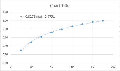
The logarithmic trend line is basically a linear trend line with a curve. It is also known as the best-fit curved line. Typically, the curve represents quick increases or decreases in the data’s rate of change. In other words, logarithmic trend lines are great for analyzing plots where data values increase or decrease rapidly before flattening out.
The following example uses a logarithmic trend line where the rate of change increases before flattening out.
What Are Polynomial Trend Lines?
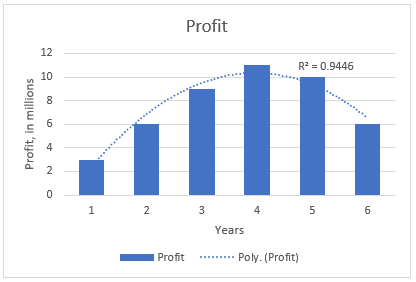
These types of trend lines are best suited for representing or analyzing fluctuating data sets: For example, gains and losses over a particular trading window. These trend lines are often represented by parabolic curves or curved lines, depending on your data sets. Polynomial trendlines are categorized based on their orders, which you can deduce from the number of hills and valleys (fluctuations) in the plot. For example, Order 2, Order 3, and Order 4 polynomial trend lines generally have only one hill or valley, two hills or valleys, and three hills or valleys, respectively.
The example below uses an Order 2 polynomial trend line to illustrate the profit fluctuations for each year.
What Is A Power Trend Line?
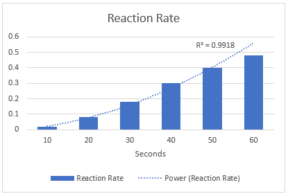
These types of trend lines are curved lines used to plot data sets that increase at a constant rate. For example, a chemical reaction plot that represents changes in state or composition every n seconds.
The example below shows a power trend line on a chart that illustrates a chemical reaction that changes every 10 seconds.
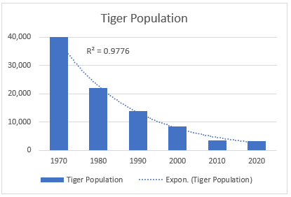
What Is An Exponential Trend Line?
The exponential trendline is similar to the power trend line. It is a curved line that illustrates the rise and fall of data points at an increasing rate.
The following example shows the use of an exponential trend line on a tiger population that falls with time.
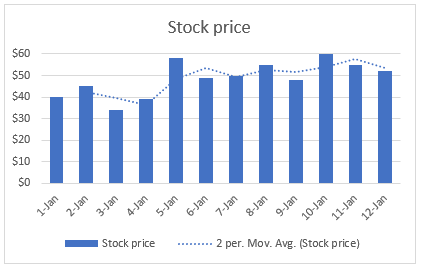
What Are Moving Average Trend Lines?
A moving average trend line smooths out the nearest possible pattern amidst numerous fluctuating data values. Each point in a moving average trend line is the average value of specific data points, set by the period option. For example, a “period 3” means the average of the first 3 data values would be the first point.
The example below uses the moving average trend line to illustrate a clear pattern in fluctuating stock prices.
How Can You Add Trendlines To Your Chart?
You need the right charting library to add trend lines to your charts — one with limitless possibilities when it comes to trend lines. FusionCharts is a JavaScript chart library that offers numerous ways of customizing trend lines into your chart. Regardless of your chart type, FusionCharts provides easy-to-implement methods for adding trend lines to your charts.
Check out the best JavaScript chart libraries for more information on what’s right for your project.
To show you how you can add trend lines to your chart using FusionCharts, let’s look at the example below:
Suppose you intend to add a trend line to a plot of yearly revenues earned by a company over the last 10 years — the years on the X-axis and the revenues on the Y-axis. You want the trend line to attract your viewers to a specific section of the chart, for example, the average of the yearly revenues. With FusionCharts, you can calculate the average and add a trend line to the Y-axis as follows:
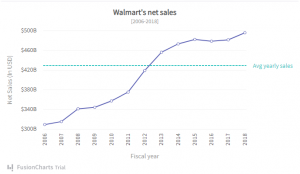
“trendlines”: [ { “line”: [ { “startvalue”: “428.61”, “endvalue”: “”, “color”: “#29C3BE”, “displayvalue”: “Avg yearly sales”, “valueonright”: “1”,
“dashed”: “1”, “thickness”: “2”
} ] } ] }; FusionCharts.ready(function() {
const myChart = new FusionCharts({
type: “line”,
renderAt: “chart-container”,
width: “100%”,
height: “500”,
dataFormat: “json”,
dataSource }).render();
}
The code above adds the trend line to the chart above. You can get the complete code for the chart here.
What are the advantages of Trend Lines?
With the above content, we understood all about the 6 types of trend lines. Now, it’s time to look into the advantages of trend lines:
Identification of the support and resistance levels
Traders use these lines to establish the stock’s support and resistance levels. The support levels are the price levels that signify when the buyer will enter the market. Meanwhile, resistance levels are the price levels that tell when the seller will enter the market.
Exit and entry timing
In trading, trend lines are used to determine the entry and exit points. When a trader sees a stock bouncing back from a trend line and keeps going up in an uptrend, they might buy and hold onto it for a while. Conversely, if the stock rebounds from the trend line and keeps falling during a downtrend, a trader might choose to sell it short, expecting its price to drop further
Identification of Trends
With the assistance of trend lines, traders can identify a stock’s price movement. By taking a look at the linking highs and lows of a company’s price with a line, traders can quickly determine whether the stock is following an uptrend or a downtrend.
What are the disadvantages of Trend Lines
Like everything else, the trend lines have a few downsides, too. Let’s check them out:
Effective Only for Short-Term Price Swings
Trend lines can predict only short-term price swings. These are not effective when it comes to long-term forecasting.
False Signals
There have been incidents where the predictions drafted by Trendline have been proven to be false. Even the slightest of breaks might indicate a trend reversal, which might not be true. So, make sure to verify the signals precisely with other indicators.
Conclusion
While trend lines offer valuable insights for analyzing data and identifying trends, they’re not without limitations. If you want to make the right and informed decision, you must understand the types of trend lines. On the plus side, trend lines help pinpoint support and resistance levels, indicating potential buying and selling points.
However, their effectiveness is limited to short-term price swings, making them less reliable for long-term forecasts. By acknowledging both the strengths and weaknesses of trend lines, you can harness them effectively for informed data analysis and decision-making.


