
Ever wanted to add a trendline to your data in Google Sheets? Do you find it difficult to do so?
Trendlines are a great way to visually depict the changes in a data set. They can show whether a trend is increasing, decreasing, or staying the same. But how to add trendline in Google Sheets?
Your graphs can easily add trendlines in Google Sheets with the help of a few simple steps. All you need is a data set, a line graph, and a trendline tool.
While trendlines are easy to add in Google Sheets, there can be a bit of a learning curve. Today, we’ll show you how to add a trendline in Google Sheets.
Table of Contents
What is a Trendline?
You might have known that visualization is an important part of data analysis. For a visually inclined person, it’s hard to understand data without charts and graphs. And for those who want to analyze data more effectively, trendlines can be a very helpful tool.
When using visualizations in Google Sheets, you can add trendlines to illustrate the direction of a data series. Trendlines are a helpful tool for completing the picture for that data series and simplifying chart analysis. Adding multiple trendlines can help identify patterns in your data.
‘Line of best fit’ or ‘trendlines’ are superimposed on a chart to show the trend of the data. They are also used to identify turning points and to identify possible market bottoms and tops. Not only can trendlines be used to understand charts, but they can also make predictions about future market movements and identify the relationships between data points.
As a charting tool, your charts will look better and be more informative if you add trendlines. This is because trendlines help visually identify patterns in the data and can help to highlight important turning points.
How To Add Trendlines To A Chart In Google Sheets?
Before I show you how to add a line of best fit, let us first quickly go over how you can create a chart for the data shown below:
Creating A Scatter Chart In Google Sheets
To create a scatter chart, simply select the data you want to plot, and then use the scatter function in Google Sheets. Pick the data range, the chart type, and the data point type.
Click Insert and then click Chart. Select the type of chart you want to create, and then click OK.
Usually, Google Sheets will create a chart based on the data you selected. However, if you want to create a scatter chart, you will need to specify the chart type in the Chart Editor. Then, in the Chart Editor, select Scatter Chart and then click OK.
Now that we have created the chart, you can customize it in the Chart Editor as you see fit. You can add labels, titles, and other features. Your data should be displayed in the chart as well.
Find The Line Of Best Fit On Google Sheets
No equation is needed to add a trendline to a chart in Google Sheets. You can simply customize the chart and then add the line of best fit.
There are Setup and Customize tabs on the menu. You need to click on the Customize tab, and then under Customize tools, you will find the Series option. Here, there are three check boxes that will allow you to add a trendline. Click on the Trend Line check box and you will see the trendlines on the chart.
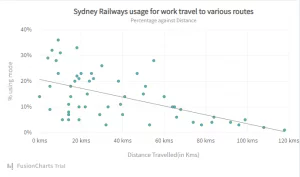
The trendline is drawn on the chart based on the data you have selected. If it shows an upward or downward trend, the line will be drawn at the peak or trough of the trend, respectively.
Making Changes To The Trend Line
If you want to change the trendline, you can do so by customizing the options under the trendline and then make your changes. You can change the type of line, the color, and the weight.
One can pick linear, exponential, or a logarithmic function. You can also show the R2 value, which is a measure of the correlation between the data points and the trendline.
The key is just to experiment with the different options to see what looks best on your data. This is an excellent way to see how the different options impact the overall look and feel of the chart.
Changing The Type Of The Trendline
You can use 6 different types of trendlines in Google Sheets. Each has its own usage and benefits. Here we will briefly introduce each type and when to use it.
Linear Trendline
This type of trendline is used to show a constant trend. It is usually used when there is an increasing or decreasing trend pattern in the data. The slope of the straight line is constant and indicates how much the data has changed for each unit of time.
Exponential
For positive data, an exponential trendline will show an upward slope. For negative data, an exponential trendline will show a downward slope. This trendline is used when there is a significant change in the data over a short period.
Polynomial
Fluctuations in data will be reflected in a polynomial trendline. The trendline will have a slope that changes over time, showing the intensity of the fluctuations.
Logarithmic
For a quick fall and then a quick rise in data, a logarithmic trendline will be appropriate. The trendline will have a slope that slowly changes over time, indicating a slow change in the data. This trendline is used when there is a change in the data that is not significant enough to warrant a linear or exponential trendline.
Power Series
Sometimes data is increasing at a certain rate. Here, a power series trendline would be appropriate. The trendline will have a slope that is increasing over time.
Moving Average
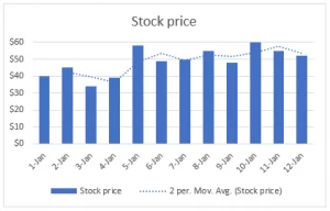
If your data has extreme values that move around a lot, a moving average trendline may be a better option. The trendline will smooth out fluctuations in the data.
Adding Multiple Trendlines In Google Sheets
Suppose you have more than one series of data in your chart. You can add multiple trendlines to the chart to show the different trends. You can add a trendline to each series of data by going to the Chart Editor, Customize, then Series. On the drop-down menu, make sure the series you want to add a trendline to is selected. To add a trendline, check the box next to the trendline type you want to use.
Using The TREND Function To Make A Trendline
This function calculates a trendline based on the data. You can forecast future market movements by using this function to create a trendline.
Under the following syntax, the TREND function operates on a data series and returns a trendline.
=TREND(known_data_y, [known_data_x], [new_data_x])
Visualize The Trend
Trendlines help visualize the trend of data. When plotted on a graph, a line of best fit shows the trend of the data. The trendline can make predictions about future data points.
Analysts and investors often use trendlines to help make predictions about future events. They compare values over time to see if there is a trend, and then make predictions about what will happen next.
Visualization is key when using trendlines in Google Sheets. If the trendline is not well-drawn, it’s difficult to understand the data.
FusionCharts make it easy to create graphs, trendlines, and more. Download FusionCharts today and see for yourself!