By being an expert in dashboard creation, you can help businesses achieve their growth in a big way. You can enable them to track critical data easily. As a result, they can efficiently monitor their companies and make data-driven business decisions. However, to become an expert, you need to know and follow highly effective tips and tricks. It will help you create an intuitive dashboard and present important business data to the users. In this post, you will find all the details.
Table of Contents
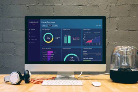
What is a dashboard?
A dashboard is an information management tool. It enables you to easily track, analyze, and display key performance indicators, metrics, and data points. As a result, you can monitor key insights and make effective business decisions.
Why do I need to use a dashboard?
- Measure multiple KPIs and metrics
- Make data-driven business decisions
- Know your business goals and keep everyone on the same page
- Save a lot of time by simplifying data analysis
- Gain control of your business processes and performance
How can I become an expert in creating effective dashboards?
To become an expert, you need to have a clear idea about the dashboard design essentials. Also, you need to know and implement tips and tricks. It will make your dashboard intuitive, effective, and visually appealing.
Here, you will find 5 important tips and tricks that you need to follow to become an expert in dashboard creation. Let’s dive in.
1. Do I need to have a clear idea about the users?
To be an expert in dashboard creation, you need to have a solid understanding of your users. It would be best if you had a clear idea about what is important to them, what data means to them, and how it will shape their business decisions. It will help you to gain important context.
Before starting to design the dashboard, you need to ask these questions:
- What’s the purpose of the dashboard?
- What information do you need to display to the users?
- What are the pain points of users?
- How can you make their lives a lot easier?
Once you figure out the answers to the questions, you will get key insights into making a highly successful dashboard. It will enable you to create a massive impact by solving real-world issues.
2. Should I include all the details in the dashboard?
Adding too much information can make your dashboard significantly cluttered, making everything a lot harder to find. Also, the users will struggle to understand the critical information. It would be best to focus on adding only the most essential data to solve this issue, and it will make the lives of users a lot easier.
Not every piece of information needs to appear on the dashboard. It would help if you critically thought about the most critical data to the users. For example, you should exclude the metrics that don’t vary significantly over time. You don’t want to stare at numbers that never change; instead, you should include the metrics that change reasonably often.
Make sure not to shove too much information on a single dashboard. If you have a lot of data, you should consider creating a separate dashboard.
3. Does grouping similar metrics make my dashboard more attractive?
Grouping similar metrics helps the users to find the data quickly. Also, it makes your dashboard more attractive. It would be best to focus on logically placing information on your dashboard. It can take the overall look to a whole new level.
You should give the groups a title. It will enable the user to spot them quickly—group information on different factors, including campaign, product, brand, region, and team. Also, you can group metrics logically for a group of users, like executives and managers. It will allow you to display the necessary data effectively. Also, it will make the dashboard look nice and clean.
For example, the metrics for a CMO would include conversion rates. On the other hand, CFO will need the gross profit margin percentage.
4. Is it very important to use the right layout?
Using a suitable layout helps you to organize the dashboard efficiently. It enables the users to find the information they need quickly. You don’t want to force them to think more with a poor layout. It would help if you made users’ lives easier by presenting the information in the right layout.
The general rule is to display all the key information in the upper-left-hand corner of the screen. Most people in the world read texts from left to the right and from top to bottom. It’s natural for the users to look at the upper-left-hand corner as soon as they get into the dashboard. By presenting important data there, you can enable them to find the critical KPIs easily.
Make sure to make the primary trend easily visible to the users. They should be able to see it instantly. After displaying the overview, you can present the users with more detailed charts, and you should group the charts based on a theme. By placing comparable metrics next to each other, you can help the viewer quickly understand key information. It can significantly enhance the user experience.
5. Should I use the best charting library for quickly creating beautiful data visualizations?
The best charting library that you can find right now is FusionCharts. It is the most comprehensive JavaScript library for conveniently creating data visualization. It offers a massive collection of charts, and you have plenty of options to visualize data. But more importantly, FusionCharts enable you to create impressive charts with significantly less code. As a result, you can quickly create beautiful data visualizations, and it can significantly boost your dashboard development workflow.
Here is an example of a chart created with FusionCharts:
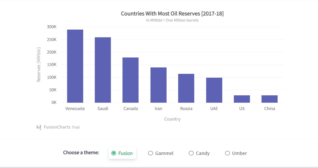
This simple column chart shows the countries with the most oil reserves. To create this chart in React using FusionCharts, you have to follow these steps:
1. First, you need to import all the necessary libraries, including FusionCharts, charts, and ReactFusionCharts.
import FusionCharts from "fusioncharts";
import charts from "fusioncharts/fusioncharts.charts";
import ReactFusioncharts from "react-fusioncharts";
2. Then you have to resolve the chart dependency.
charts(FusionCharts);
3. Next, you have to add the data source.
const dataSource = {
  chart: {
    caption: "Countries With Most Oil Reserves [2017-18]",
    subcaption: "In MMbbl = One Million barrels",
    xaxisname: "Country",
    yaxisname: "Reserves (MMbbl)",
    numbersuffix: "K",
    theme: "fusion"
  },
  data: [
    {
      label: "Venezuela",
      value: "290"
    },
    {
      label: "Saudi",
      value: "260"
    },
    {
      label: "Canada",
      value: "180"
    },
    {
      label: "Iran",
      value: "140"
    },
    {
      label: "Russia",
      value: "115"
    },
    {
      label: "UAE",
      value: "100"
    },
    {
      label: "US",
      value: "30"
    },
    {
      label: "China",
      value: "30"
    }
  ]
};
4. Finally, you can render the chart.
class MyComponent extends React.Component {
  render() {
    return (
      <ReactFusioncharts
        type="column2d"
        width="100%"
        height="100%"
        dataFormat="JSON"
        dataSource={dataSource}
      />
    );
  }
}
Source Code:
You can find the source code right here.
As you can see, FusionCharts has made it very easy to build charts. It allows you to create beautiful data visualization with significantly less code. As a result, you can become faster and more efficient in dashboard creation.
Read: The Anatomy Of A Great Graph Maker
Should I use FusionCharts for dashboard creation?
FusionCharts is a powerful JavaScript charting library. It allows you to create beautiful charts for your dashboard effortlessly. But more importantly, it enables you to visualize the data effectively. As a result, the dashboard user can easily understand the critical information. Also, using FusionCharts is very easy, and you need to write a few lines of code. It would be best to consider using FusionCharts for effective dashboard creation for all these reasons.


