
Charts are stunning visual components that significantly improve the appearance and feel of your mobile app. By using charts as a design tool, you can improve the aesthetics of your React Native app while simultaneously improving the user experience. Charts are simple to read and convey data stories effectively.
React Native Charts components make your app’s narrative more powerful than tables of data. So what kinds of app concepts can fully utilize the React Native Charts library? As it turns out, in a wide range of app categories, adding stunning charts can significantly improve the user experience. Business dashboard applications, financial apps, mobile banking apps, analytics apps, e-commerce apps, health apps, and fitness apps are just some of those categories.
However, charts might also be useful in mobile environments such as social networks or utilities for particular functionalities. Instagram, too, has a few charts, such as the time spent graph. React Native Charts express many stories in limited real estate, making them ideal for phone apps ranging from business KPIs to health activities.
Without further ado, let’s get started on how we can use React Native Charts to create better mobile apps.
Table of Contents
How to create a chart in React Native using FusionCharts
FusionCharts enables you to create interactive charts, gauges, maps, and dashboards in JavaScript. The ‘react-native-fusioncharts’ component allows you to easily add rich and interactive charts to any React-Native project. Let’s see how to install FusionCharts and render a chart using the ‘react-native-fusioncharts’ component.
Prerequisite (expo cli / react-native cli)
We are assuming that you have a ‘react-native’ project up and running. If not, follow the steps here to get started with your React-Native project setup.
IMPORTANT NOTE: Install react-native-web if not present already.
Create an application using FusionCharts – with Expo
Using FusionCharts with Expo, you can create your application. First, ensure you have ‘Node.js’ and ‘Git’ installed in your environment. For more details, you can check the official Expo documentation.
To get started, open the Command Prompt and run the following command to create a new application:
expo init My-test-app try
Installation and including dependencies
To complete the installation, including the dependencies, run the following code:
npm i @unimodules/react-native-adapter
npm i react-native-fusioncharts –force
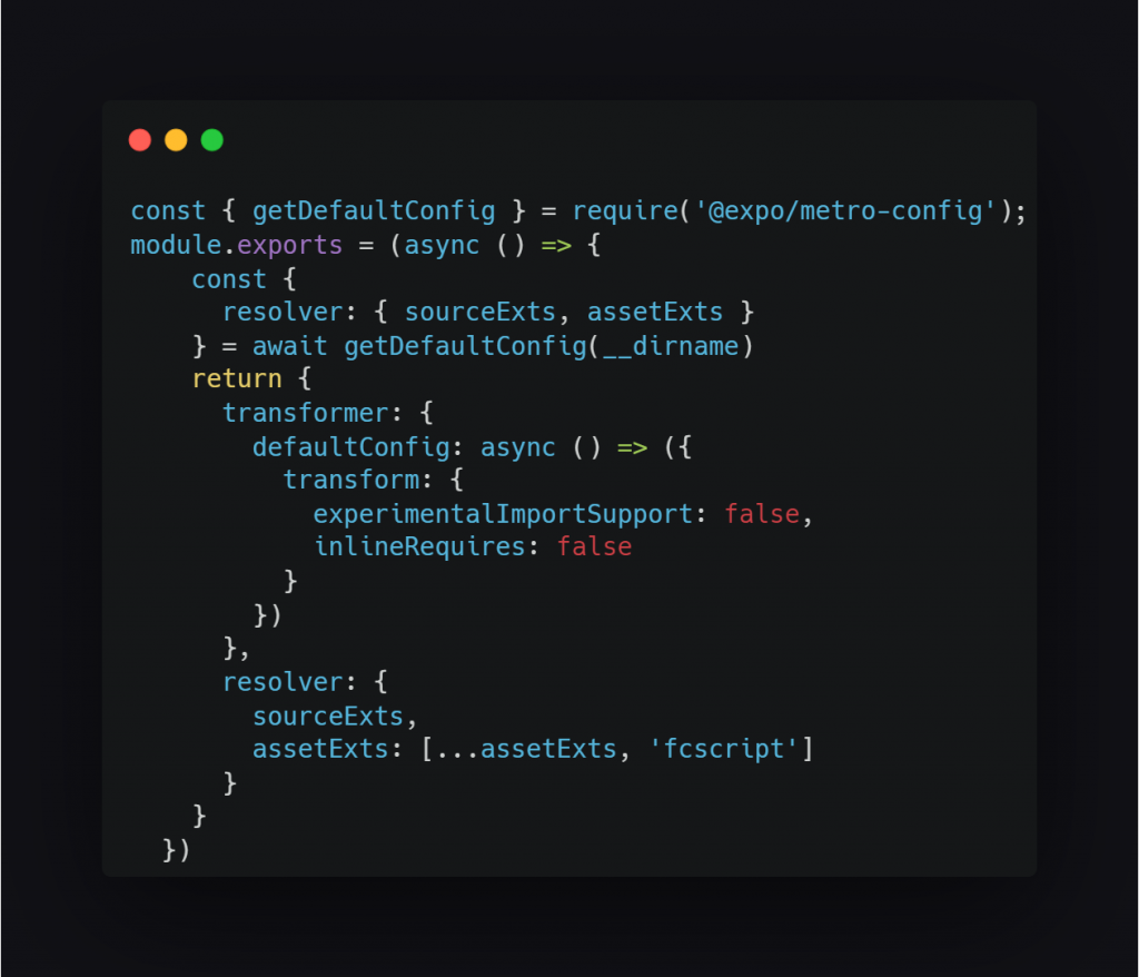
Now, in the root folder of the application, create the ‘metro.config.js’ file and include the following code:
Preparing the Data
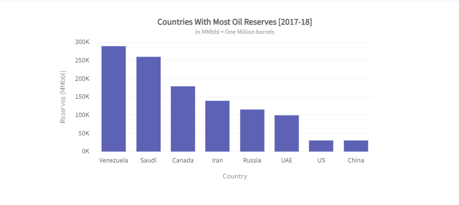
Let’s create a chart showing the “Countries with Most Oil Reserves. The oil reserves data for various countries is shown in tabular form below.
| Country | No. of Oil Reserves |
|---|---|
| Venezuela | 290K |
| Saudi | 260K |
| Canada | 180K |
| Iran | 140K |
| Russia | 115K |
| UAE | 100K |
| US | 30K |
| China | 30K |
Since we are plotting a single data set, we’re creating a 2D column chart with ‘countries’ as data labels along the x-axis and ‘No. of oil reserves’ as the data values along the y-axis. Then, let us prepare the data for a single-series chart.
Note: FusionCharts accepts the data in JSON format.
Render the Chart
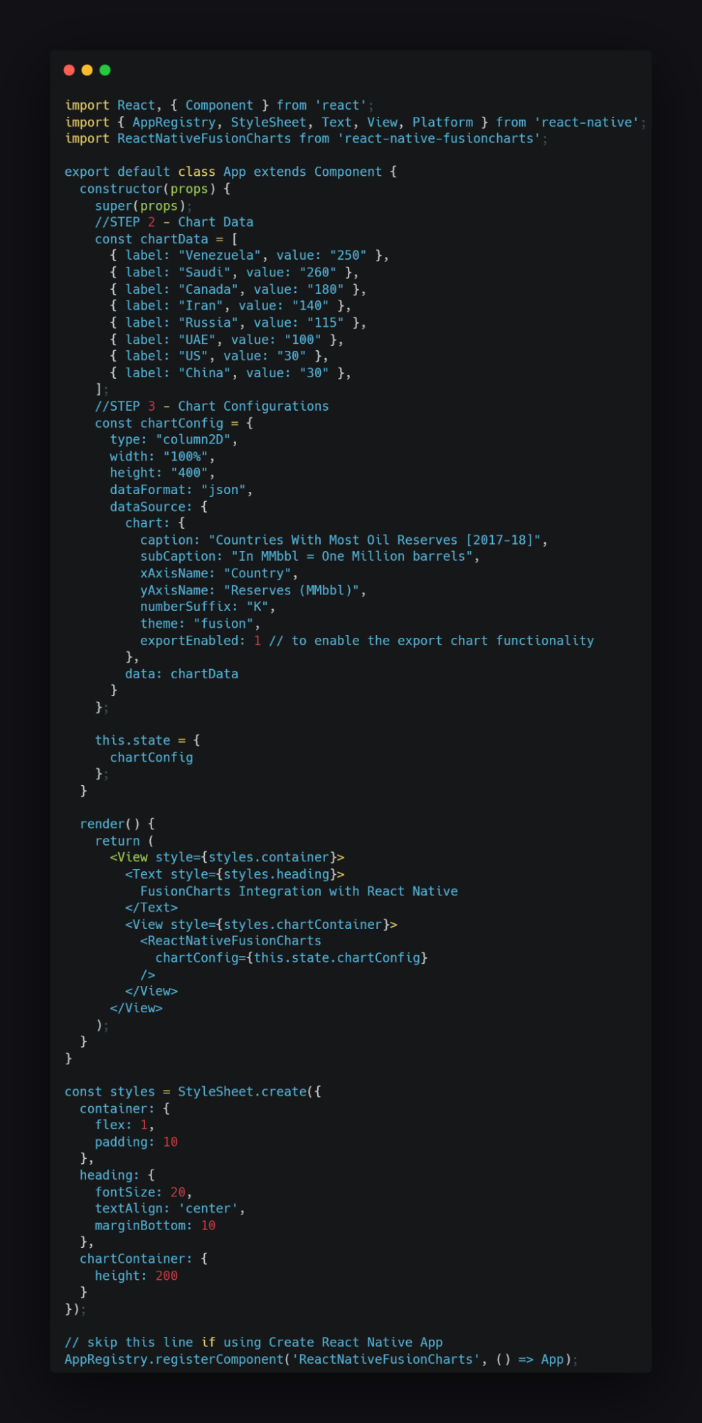
Finally, get ready to render your first chart using the react-native-fusioncharts component. In your “App.js” file, replace your entire code with the code sample below,
You should be able to see the chart as shown below.
Rendering different complex charts with React Native and FusionCharts
We discussed above how to build a single series chart using FusionCharts Suite XT. In this section, we will explore further how to create different charts and maps using FusionCharts and React Native.
Gauges
Gauges are powerful tools that can showcase information using a radial or linear scale to display data. FusionCharts XT provides you with seven different gauges — Angular Gauge, Bulb Gauge, Cylinder Gauge, LED Gauge, Linear Gauge, Thermometer Gauge, and Vertical LED Gauge.
An angular gauge is used to show a specific value over a radial scale. The gauge is rendered with a radial scale that displays the data range. This scale can be color-coded to indicate divisions within the range. A dial is used to indicate the data value, and the gauge can also be rendered with multiple dials. It is often used to simulate a speedometer and on dashboards.
To start with, we’ll build a simple angular gauge showing Nordstrom’s customer satisfaction score as shown below.
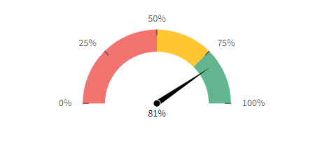
Any score less than 50 is bad and is shown in red. Any score between 50 and 75 is average and is shown in yellow, and any score above 75 is good and is shown in green.
To build the gauge shown above, we will use the data presented in the table below:
| Range | Color | Hex Code |
|---|---|---|
| 0-50 | Red | #F2726F |
| 50-75 | Yellow | #FFC533 |
| 75-100 | Green | #62B58F |
Click here to get the consolidated code for gauges.
Multi-series charts
A multi-series chart is used to plot data for many series of data values. It is also used to evaluate and compare data points organized into subcategories. For example, you can use a multi-series chart to depict the income collected each month over the previous two years. Multiseries charts can also help you plot the highs and lows of several data sets so that you can readily compare them.
In a multi-series chart, we have two or more data sets plotted against the same x-axis (or y-axis) value. Let us build a 2D multi-series column chart.
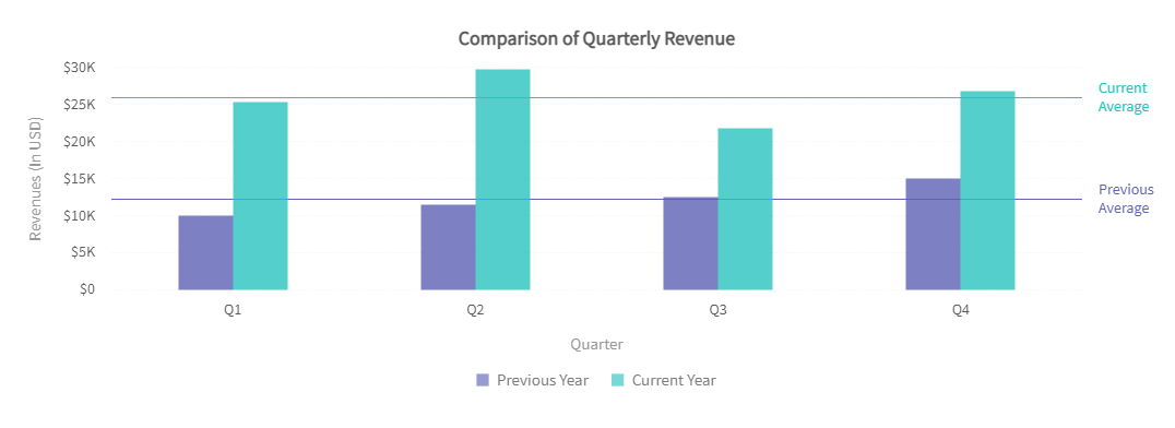
As you can see, a Multi-series Column 2D Chart has vertically aligned rectangular bars on one axis with discrete values shown on the other. The length of a column is proportionate to the value it represents.
To build the chart shown above, we will use the data presented in the following table:
| Quarter | Previous Year | Current Year |
|---|---|---|
| Q1 | 12000 | 24400 |
| Q2 | 10500 | 29800 |
| Q3 | 23500 | 20800 |
| Q4 | 16000 | 26000 |
Click here to check the consolidated code for multi-series charts.
Combination charts
Similar to multi-series charts, combination charts also allow you to plot multiple data sets on the same chart. However, while you need to use the same plot type for all data sets in multi-series charts, in a combination chart you can use a different plot type for each data set. For instance, you can show a column, a line, and an area plot on the same chart canvas.
Let us build a 2D single y-axis combination chart.
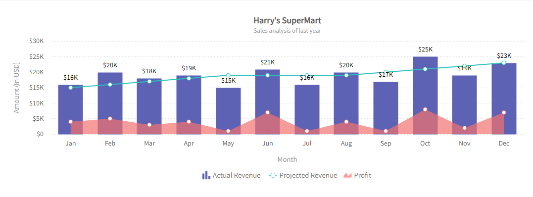
As you can see in the 2D single y-axis combination chart above, a line, a column, and an area-type plot share the same set of x- and y-axis. The line plot displays the projected monthly revenue of Harry’s SuperMart, while the column plot displays the actual revenue earned and the area plot shows the monthly profit. To build the chart, we will use the data provided in the following table:
| Month | Actual Revenue | Projected Revenu | Profit |
|---|---|---|---|
| January | 16000 | 15000 | 4000 |
| February | 20000 | 16000 | 5000 |
| March | 18000 | 17000 | 3000 |
| April | 19000 | 18000 | 4000 |
| May | 15000 | 19000 | 1000 |
| June | 21000 | 19000 | 7000 |
| July | 16000 | 19000 | 1000 |
| August | 20000 | 19000 | 4000 |
| September | 17000 | 20000 | 1000 |
| October | 25000 | 21000 | 8000 |
| November | 19000 | 22000 | 2000 |
| December | 23000 | 23000 | 7000 |
Click here to check the consolidated code of combination charts.
Heat Map
A heat map chart utilizes different colors to represent data values within a table. It comes in handy the most when you have to plot large and complex data sets. FusionCharts Suite XT supports two types of heat map charts: a numeric heat map to plot numeric values and a category-based heat map to plot non-numeric data.
TreeMaps are another similar chart type with hierarchical data. Treemaps are ideal for displaying large amounts of hierarchically structured (tree-structured) data. The space in the visualization is split up into rectangles that are sized and ordered by a quantitative variable. The levels in the hierarchy of the tree map are visualized as rectangles containing other rectangles. Find more about treemaps here.
In the section below, we will see how to build a heat map chart.
As you can see in the heat map above, the data plot indicates the ratings of four different smartphones based on five common components, with the help of different colors.
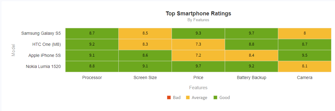
| State | Processor | Screen Size | Price | Battery Backup | Camera |
|---|---|---|---|---|---|
| Samsung Galaxy H5 | 8.7 | 8.5 | 9.3 | 9.7 | 8 |
| HTC One (M8) | 9.2 | 8.3 | 7.3 | 8.8 | 8.7 |
| Apple iPhone 5S | 9.1 | 8.6 | 7.2 | 8.4 | 9.5 |
| Nokia Lumia 1520 | 8.8 | 9.1 | 9.7 | 9.2 | 8.1 |
Click here to check the consolidated code of heat maps.
Conclusion
Adding React Native Charts in a mobile app is simple if you use the open-source react-native-chart kit. It’s usually a great idea to thrill your app users with stunning, rich graphs, and it doesn’t take much developmental effort.
Charts improve the user experience and help your app stand out from the crowd. We strongly advise you to experiment with the react-native-chart kit library. Build beautiful experiences with matching colors, and keep in mind that wonderful users are the number-one focus of every React Native developer. We can’t wait to see what you build with this tutorial. If you find this post insightful, then please share so that other developers can also take advantage and learn how to create charts in their React Native apps. Happy coding!


