
You’re about to begin understanding the power of interactive dashboards and the different types available to meet your data visualization needs. Interactive dashboards are the perfect tool to bring data to life and communicate insights clearly and concisely. With the ability to create custom graphics, display real-time information, and interact with the data, you’ll find it easier to make data-driven decisions.
This blog will explore the different types of dashboards, including operational, strategic, and analytical dashboards, to help you choose the right one for your business needs. Get ready to be amazed by the endless possibilities of interactive dashboards.

Table of Contents
What is an Interactive Dashboard?
You may have heard the term “interactive dashboard” before, but what exactly is it? Simply put, an interactive dashboard is a visual representation of data that allows you to easily digest and understand complex information. With the ability to display real-time information and offer customization options, interactive dashboards make it easier for you to make informed decisions based on your data.
Not only are interactive dashboards visually appealing, but they also provide a user-friendly interface that allows you to easily interact with the data and uncover new insights. Whether a business owner, marketer or data analyst, an interactive dashboard can help you stay on top of important metrics and confidently make data-driven decisions.

What Makes a Dashboard Interactive?
A dashboard can only be considered interactive if it offers features that allow you to interact with the displayed data. The ability to manipulate and explore the data sets an interactive dashboard apart from a static one. Some of the key elements that make an interactive dashboard include:
Customizable visualizations:
Interactive dashboards allow you to choose the best way to display your data, whether it be through graphs, charts, or tables.
Real-time updates:
Interactive dashboards often connect to live data sources, providing real-time updates to ensure that you always have the latest information.
User interaction:
The ability to drill down into the data, filter it, or manipulate it in some way makes a dashboard truly interactive. This allows you to explore the data and uncover insights that may have been hidden before.
By incorporating these elements, an interactive dashboard becomes a powerful tool for data analysis and decision-making. So, consider an interactive dashboard if you want to take your data visualization to the next level.

What Are the Benefits of Interactive Dashboards?
Some amazing benefits of interactive dashboards are listed below:
Insight to Action
With an interactive dashboard, you can turn data insights into actionable steps. The ability to easily interact with your data and uncover new insights means you can confidently make informed decisions.
Flexible & Customizable
Interactive dashboards allow you to choose the best way to display your data and create custom visualizations that meet your specific needs. This level of customization means you can quickly identify and analyze the data that is most important to you.
Real-Time & Mobile Friendly
Interactive dashboards often connect to live data sources, providing real-time updates to ensure that you always have the latest information. Additionally, many dashboards are designed to be mobile-friendly, allowing you to access your data on the go.
Accountability & Alignment
Interactive dashboards promote accountability and alignment across your organization by providing a centralized view of your data. Everyone can stay on top of the same metrics, ensuring everyone is working towards the same goals.
Reporting & Drill-downs
Interactive dashboards offer robust reporting capabilities, allowing you to easily generate reports and drill down into your data for a deeper understanding. Whether you’re creating a report for stakeholders or exploring the data yourself, an interactive dashboard makes it easy to understand and communicate your data.
What Are the Types of Interactive Dashboards?
You may have heard of interactive dashboards, but do you know what kind of dashboards exist and what they can do for you? Here’s a brief rundown of some of the most popular dashboards:
Executive Dashboards
As a busy executive, you need to be able to see the big picture at a glance. That’s where executive dashboards come in. They provide high-level, real-time information on key performance indicators (KPIs) that are important to your business. You can customize your executive dashboard to show exactly what you need to see and access it anywhere.
Operational Dashboards
As an operational manager, you need to know what’s happening in your business. Operational dashboards give you a real-time, comprehensive view of all the key metrics and KPIs related to your operations. This allows you to quickly identify any issues and take action to resolve them before they become bigger problems.
Analytical Dashboards
Analytical dashboards are your go-to tool if you’re responsible for making data-driven decisions. They allow you to analyze large amounts of data and turn it into insights that drive better decision-making. Analytical dashboards make it easy to find what you need to know, whether you’re looking for trends, patterns, or outliers.
Financial Interactive Dashboards
As a financial manager, you need to see your business’s financial health at a glance. Financial dashboards provide real-time financial data, including income statements, balance sheets, and cash flow statements. With this information at your fingertips, you can make informed decisions about spending, investments, and other financial matters.
Sales Dashboards
To drive sales, you need to know how your sales team performs. Sales dashboards provide real-time data on key sales metrics, such as the number of deals closed, the value of deals, and the conversion rate. This information helps you identify trends or patterns in your sales data and make changes to improve your results.
Marketing Dashboards
As a marketer, you need to know how your campaigns perform. Marketing dashboards provide real-time data on key metrics, such as click-through rates, conversion rates, and return on investment. With this information, you can quickly see what’s working and what’s not and make adjustments to your campaigns to improve their results.
Project Management Interactive Dashboards
As a project manager, you need to see your projects’ status at a glance. Project management dashboards provide real-time information on key project metrics, such as project progress, budget, and timeline. With this information, you can quickly identify any issues and resolve them, helping you keep your projects on track and within budget.
What Are Some Top Interactive Dashboards In The Market?
Let’s take a closer look at some of the most popular dashboards on the market:
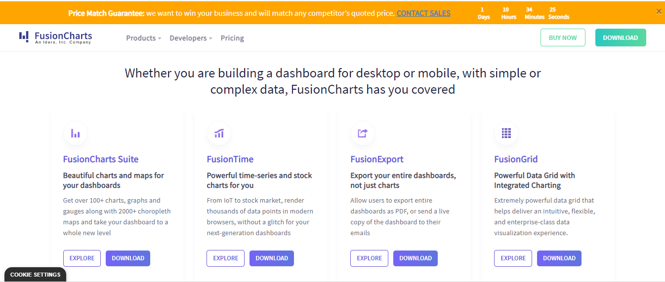
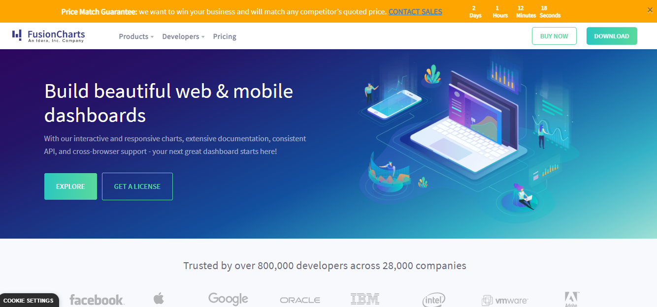
FusionCharts Interactive Dashboards
FusionCharts is a robust and feature-rich dashboard tool that allows you to create interactive and visually appealing charts and graphs. Whether you’re looking to display real-time data or analyze data from multiple sources, FusionCharts has everything you need to get the job done. Its drag-and-drop interface and extensive documentation make creating charts easier and faster.
Tableau
Tableau is a popular data visualization tool allowing users to create interactive dashboards and reports. With its intuitive interface and wide range of data sources, Tableau makes it easy to connect, analyze, and visualize your data. Whether you’re working with a large dataset or need to create a simple chart, Tableau has you covered.

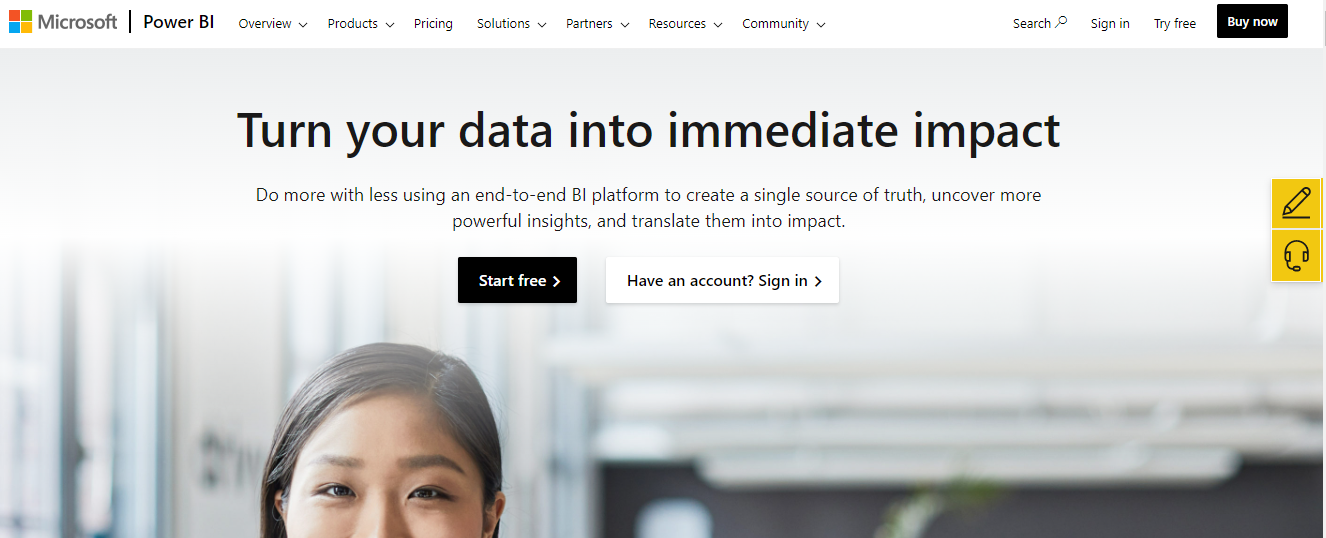
Microsoft Power BI
Microsoft Power BI is a cloud-based business intelligence platform that provides users with the tools they need to turn data into actionable insights. With its interactive dashboards, reports, and data visualization tools, Power BI makes it easy for users to get the information they need to make better decisions.
Whether you’re working with data from Excel, SharePoint, or other sources, Power BI provides a comprehensive solution for your data analysis needs.
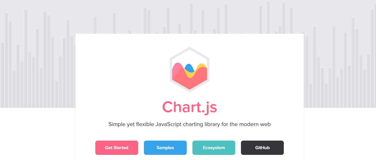
Charts.js Interactive Dashboards
Charts.js is a free and open-source charting library that allows adding charts and graphs to your web applications easy. Whether you’re looking to create bar charts, line charts, or pie charts, Charts.js provides you with the tools you need to create stunning and interactive visualizations.
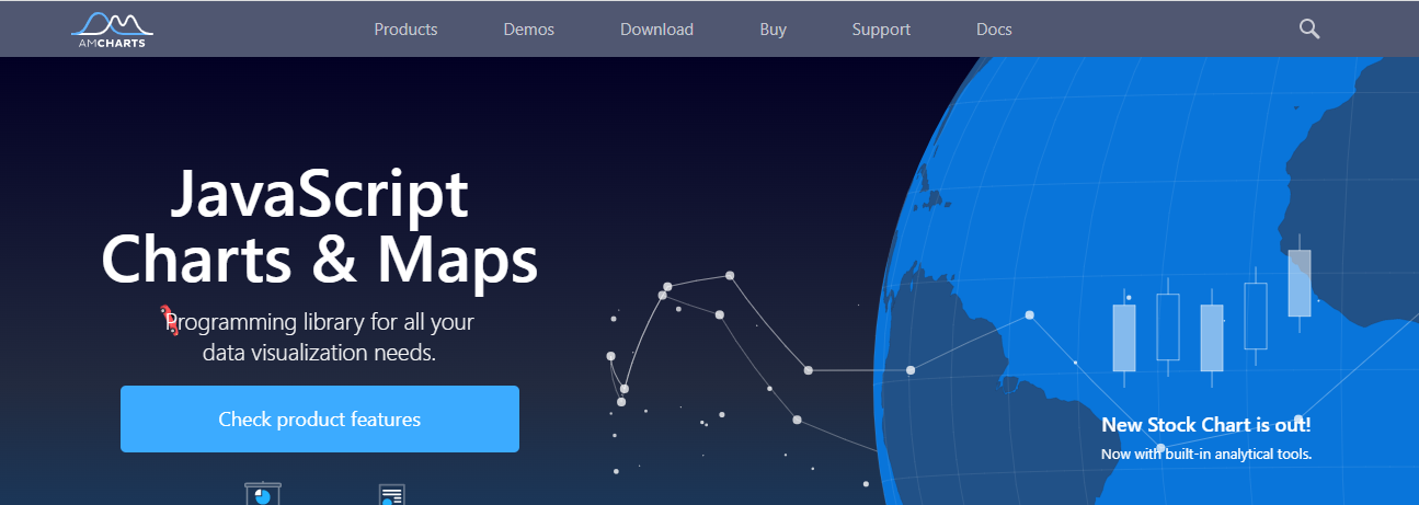
AmCharts
AmCharts is a powerful and flexible charting library that allows you to create various interactive and visually appealing charts. Whether you’re looking to create line charts, bar charts, or pie charts, AmCharts provides the tools you need to get the job done.
Why FusionCharts Is A Good Option For Interactive Dashboards?
FusionCharts is a good option for several reasons:
Customization
FusionCharts offers a wide range of customization options, allowing you to create charts and dashboards that match your specific needs and requirements. You can choose from various interactive chart types, customize the look and feel of your charts, and even add interactive elements like tooltips, drill-downs, and hover effects.
User-friendly interface
FusionCharts provides an intuitive and user-friendly interface that makes it easy to create charts and dashboards to visualize data. With its drag-and-drop interface and extensive documentation, anyone can quickly create stunning and interactive visualizations.
Integration with multiple data sources
FusionCharts allows you to integrate data from various sources, including spreadsheets, databases, and APIs. This makes it easy to connect to your data, regardless of where it’s stored, and analyze it to gain insights.
Wide range of chart types
FusionCharts offers a wide range of chart types, including line charts, bar charts, pie charts, scatter charts, and more. This makes it easy to choose the best chart type for your data and create visualizations that effectively communicate your insights.
Robust and reliable
FusionCharts is a robust and reliable tool that thousands of organizations have trusted for over 15 years. With its extensive documentation, active community, and reliable support, you can be confident that FusionCharts will provide the tools you need to succeed.
FusionCharts is a great option for creating interactive and visually appealing charts and dashboards. With its wide range of features and customization options, it’s easy to see why FusionCharts has become one of the most popular dashboard tools on the market.
Interactive Dashboards: FAQs
What Are the Three Types of Dashboards?
- Executive dashboards
- Operational dashboards
- Analytical dashboards
What Makes a Good Interactive Dashboard?
Clarity and conciseness make a good interactive dashboard.
What Are Interactive Dashboards in Excel?
An interactive dashboard in Excel is a data visualization tool that allows users to explore and analyze data interactively and dynamically.
Can Tableau Dashboard Be Interactive?
Yes. It is also an interactive dashboard.
Transform Your Data into Actionable Insights with FusionCharts: Start Your Free Trial Today!


