
Before the Western world created the bar and point-and-figure charts, candlestick charts were created in Japan more than 100 years ago. A Japanese man named Homma noticed that, although there was a correlation between rice price and supply and demand, trader emotions significantly impacted the markets. Traders use candlestick charts to guide their trades. The choices are based on recurring patterns that assist in predicting the short-term movement of the price. People in business should understand how to read candlestick charts due to their significance.
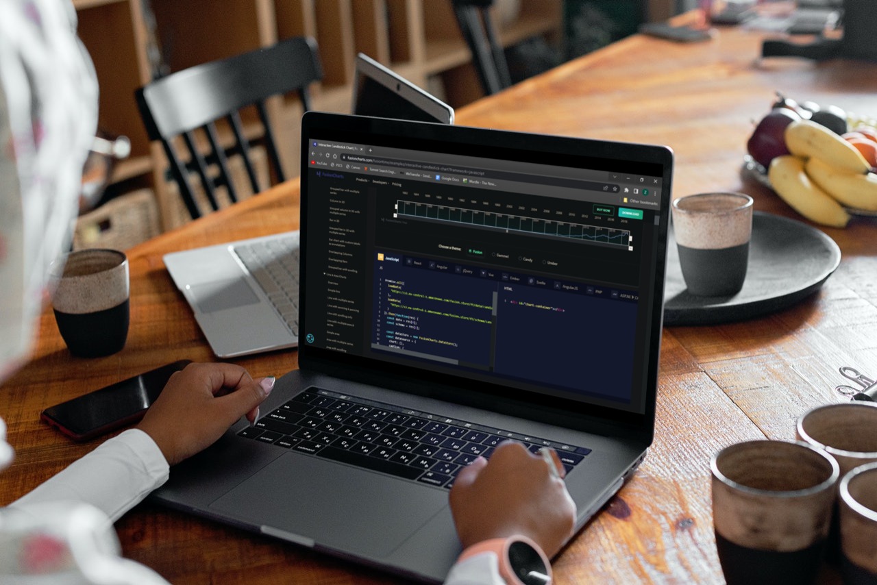
The candlestick chart in FusionCharts Suite XT provides a robust and interactive interface for visualizing your stock data. This post will teach candlestick charts and show a few JavaScript chart examples.
Table of Contents
What Are The Components Of A Candlestick Chart?
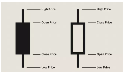
A data set including Open, Close, High, and Low values for each time period you want to plot is used to create the Candlestick chart. The Body is the solid/hollow section. Upper and Lower Shadow, respectively, refer to the lines that are above and below the Body. The top of the Upper Shadow designates the Highest Trading Price, while the bottom of the Lower Shadow designates the Lowest Trading Price. The Opening Price is more than the Closing Price, and you get a strong body when selling pressure (bareish tendencies). The Closing Price is more than the Opening Price when purchasing under pressure (bullish tendencies), but you get a hollow body otherwise.
The only difference between bar charts and candlestick charts is how they present the same data. Due to the color coding of the price bars and thicker actual bodies, which are better at displaying the difference between the open and the close, candlestick charts are more illustrative.
How To Start Making A Candlestick Chart?
To generate a Candlestick Chart, data collection containing the open, high, low, and close values for each time period you choose to display is required. The candlestick’s “body” (sometimes referred to as “the genuine body”) is the hollow or filled component of the candlestick. The shadows, also known as “wicks” and “tails,” are the long, thin lines above and below the body that depicts the high/low range. The top of the higher shadow and the bottom of the lower shadow serve as markers for the high and low, respectively. A hollow candlestick shows that the closing stock is higher than its opening price, with the bottom of the body indicating the opening price and the top of the body reflecting the closing price. A full candlestick is drawn, with the top of the body indicating the opening price and the bottom of the body representing the closing price. This is if the stock closes lower than its initial price.
Learn more on how to create a Candlestick Chart.
How Are Candlestick Charts To Be Read?

Each candlestick, as we previously saw, displays the stock’s opening price, closing price, highest trading price, and the lowest trading price for that specific day. Candlesticks may create several patterns, including the engulfing, hammer, shooting star, doji, and many more, based on these four values. In part after, we go over a few of these patterns. Below is an example of a candlestick chart in JavaScript. The stock prices are of the company Apple Inc., and the data is between the time frame January 1980 – November 2011.
Promise.all([
loadData(
"https://s3.eu-central-1.amazonaws.com/fusion.store/ft/data/candlestick-chart-data.json"
),
loadData(
"https://s3.eu-central-1.amazonaws.com/fusion.store/ft/schema/candlestick-chart-schema.json"
)
]).then(function(res) {
const data = res[0];
const schema = res[1];
const dataStore = new FusionCharts.DataStore();
const dataSource = {
chart: {},
caption: {
text: "Apple Inc. Stock Price"
},
subcaption: {
text: "Stock prices from January 1980 - November 2011"
},
yaxis: [
{
plot: {
value: {
open: "Open",
high: "High",
low: "Low",
close: "Close"
},
type: "candlestick"
},
format: {
prefix: "$"
},
title: "Stock Value"
}
]
};
dataSource.data = dataStore.createDataTable(data, schema);
new FusionCharts({
type: "timeseries",
renderAt: "chart-container",
width: "100%",
height: "500",
dataSource: dataSource
}).render();
});
What Patterns Can Candlesticks Form?
Discussed below are some basic chart patterns formed by Candlesticks.
Bearish Engulfing Pattern
A Bearish Engulfing pattern is when a giant solid candlestick follows a smaller, hollow candlestick and completely “engulfs” the smaller candlestick. It means that purchasers no longer have any influence over how much a stock will fluctuate in price.
Bullish Engulfing Pattern
When a giant hollow candlestick follows a tiny solid candlestick that totally engulfs the smaller candlestick, a pattern known as a Bullish Engulfing form. It means the sellers no longer have any influence on the price movement of a stock.
Bullish Hammer
A hammer candlestick forms when a stock goes noticeably lower than the beginning price and then rises later in the day to end above or close to the opening price.
Bullish Shooting Star
A shooting star candlestick is created when a stock trades much higher than the beginning price and then rebounds later in the day to end below or close to the opening price. It is an upside-down hammer.
Doji
When the open and close of stocks are almost equal, Doji candlesticks result. The candlestick that results from varying the duration of the top and lower shadows resemble a cross, an inverted cross, or a plus sign. When there is a Doji, both buyers and sellers appear uncertain.
Candlestick Chart Example
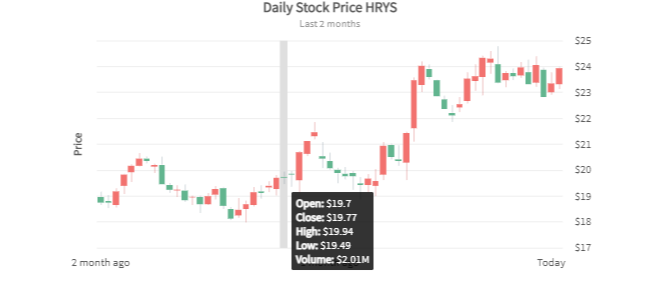
The price chart is in the first half of the candlestick chart. The volume chart is in the second half.
A candlestick chart is frequently utilized for applications that call for an examination of equities and commodity prices. For example, on a single chart, you may display the opening price, closing price, highest trading price, lowest trading price, and trade volume.
Both the x-axis and y-axis on a candlestick chart are numerical. Dates are not accepted directly for this graphic’s data and category labels. Instead, each data point is an x-value. This chart offers more versatility as you may use it to depict days, hours, weeks, etc. The chart can be customized by changing its appearance and its properties.
It’s easy to translate your dates into x-values. Choose the first date in your chart to use your server-side script as the base date. Then, to obtain the x-values for each date, apply the date difference function with regard to this base date. Thus, you may use “day” as the date difference option if you wish to display daily quotations on the chart. Similarly, you may use “weeks” as the date difference option if you wish to display weekly quotations.
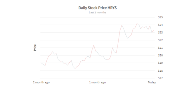
How To Set Chart Type For The Price Chart?
A candle chart, a bar chart, or a line chart can all display the price chart. Set the plotPriceAs property to a candlestick, bar, or line to show the price chart as needed.
{
"chart": {
"plotPriceAs" : "line"
}
}
This is an example of a candlestick chart with a line chart for the price:
Why Is FusionCharts The Best For Creating Candlestick Charts?

A candlestick chart is frequently utilized for applications that call for an examination of equities and commodity prices. You may plot your stock data using the robust and interactive interface of the FusionCharts Suite XT candlestick chart. It provides the following attributes:
- Integrated pricing and volume plot with an on/off switch for the volume plot.
- Price charting choices include candlestick, bar, and line charts.
- Both the hover bar and the tooltip are interactive.
- Draw zones and trend lines.
- Possibility to display any number of individual trend sets on a chart that may be altered to display technical indicators.
- The ability to provide the lacking info.
- The ability to spotlight particular candles.
- There is an option to draw vertical indicator lines on the x-axis at any position.


