Table of Contents
Key takeaways
- Use column charts for time-based trends and bar charts for comparing categories with long labels.
- Bar charts handle long labels and more categories better than column charts.
- They clearly highlight growth, decline, and patterns over a timeline.
- Proper chart selection enhances engagement and improves data interpretation.
Choosing the right chart impacts how clearly data is conveyed. For categorical data, bar charts compare categories, while column charts show trends over time. Our guide on Bar Chart vs Column Chart explores their features, strengths, and ideal use cases. By understanding these differences, you can make data-driven decisions and present insights more effectively. Using tools like FusionCharts’ graph maker simplifies creating accurate and visually appealing charts for any dataset.
The difference between bar chart vs column chart
Both the Bar charts and the Column charts display data using rectangular bars where the length of the bar is proportional to the data value. Both charts compare two or more values. However, the difference lies in their orientation. A bar chart is oriented horizontally, whereas a column chart is oriented vertically. Although alike, they cannot always be used interchangeably because of the difference in their orientation.

Figure: Bar chart

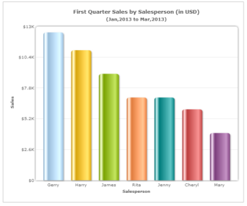
Figure: Column chart
What is a bar graph?
Bar graphs (bar charts) use rectangular bars to represent categorical data. The length or height of each bar is proportional to the data value it represents. These bars are drawn horizontally, so it is simple to see at a glance the differences between categories with long labels. One of the advantages of using a bar chart is its ability to clearly display differences among categories, making it ideal for data in surveys, reports, and dashboards.
What does a bar graph look like?
A bar graph displays categories on the horizontal axis (x-axis) and values on the vertical axis (y-axis) using horizontal rectangular bars. All bars have equal width, and their length reflects the value they represent. Spacing between bars ensures clarity, while digital versions often include data labels and interactive tooltips for better understanding.
What is a column chart/graph?
A column graph, similar in structure to a bar graph, represents data using rectangular bars as well. However, the key distinction lies in the orientation of the bars, column charts display bars vertically. This format makes them particularly effective for illustrating trends over time or comparing values across a limited number of categories.
The advantages of column chart design are time-series analyses, monthly sales comparisons, and departmental performance metrics, offering a clear and concise way to communicate data insights at a glance.
Components of column graph
A typical column graph includes:
- X-axis (horizontal): Categories such as months, regions, or departments
- Y-axis (vertical): Numerical values
- Columns/bars: Vertical bars proportional to the data values
- Gridlines and labels: Enhance readability and precision
- Data series: For comparing multiple sets, like “this year vs last year”
These elements together form a structured and intuitive way to analyze data visually.
When to use column graph vs bar graph
Bar charts are suitable for displaying long data labels.
Column charts have limited space in the category axis. So, when your data labels are long, the category axis may look cluttered.

You can reduce clutter by either slanting or rotating the labels.

However, using the bar diagram will significantly improve the readability of your chart.

Bar charts are good for displaying a large number of data sets on the category axis.
The column chart is a good fit for a maximum of 10-12 data sets. However, using a column chart is not the best way forward when large numbers of data sets are needed.

A bar chart with the data sets placed one below the other would be a better choice in this case as it makes optimum use of space.

When should you use a bar chart/graph
Bar charts are ideal for displaying long category names, comparing values across multiple groups, or when horizontal space is limited. They emphasize differences between discrete data sets. Some of the common uses of bar chart visuals include comparing survey results, visualizing report data, and enhancing dashboard clarity.
Real-time example: Bar graph for 2 data values between different categories
Consider a scenario where you’re evaluating customer service performance across five regions. If you need to compare resolved vs. unresolved support tickets, a bar graph works well. This is one of the practical bar chart examples that displays each region with two horizontal bars side by side — one for resolved tickets and one for unresolved. This setup allows for easy visual comparison within and across regions.
What about column charts?
Column charts are suitable for displaying data sets with negative values.
In a bar graph, negative values are displayed as bars on the left.

However, we associate negative values with the downward direction (as used by the column chart) than leftward (as used by the bar chart).

Example of column graph/chart
Let’s say you’re analyzing monthly revenue for a retail business. Each month (January to December) is plotted on the x-axis, while revenue is plotted on the y-axis. This column graph example clearly shows how each column represents revenue in a particular month. You can easily spot which months performed best, worst, or showed consistent growth.
Column graph as a subclass of bar graph
Technically, column graphs are a vertical subtype of bar graphs, and together they are often referred to as column bar charts. Both chart types use bars to convey values and help in comparison. The only real distinction lies in orientation, vertical (column) vs horizontal (bar).
While both fall under the same family, choosing the right one depends on data label length, screen space, and intended message clarity.
Categorical data representation in column graphs
Column graphs excel at showcasing categorical data, where each column represents a distinct, separate category (e.g., countries, departments, or products). When used with single or multiple series, column graphs:
- Make comparisons between categories obvious
- Show how values change between time periods or groups
- They are ideal for dashboard visualizations in BI tools like FusionCharts
Best practices for making bar and column charts
To make your visualizations clear, effective, and impactful, it’s essential to follow proven design principles. Column chart and bar chart best practices will help you present data in the most meaningful way:
- Limit the number of bars/columns: Stick to 5–10 categories for readability
- Use consistent colors: Especially when showing comparisons across time
- Label clearly: Add category names and data values
- Keep axes clean: Don’t overcrowd with unnecessary gridlines
- Choose the right orientation: Horizontal for longer labels, vertical for timelines
- Use spacing wisely: Avoid overlapping bars and maintain uniform spacing
Avoiding common charting mistakes
Even the most well-designed chart can fail if basic visualization principles are overlooked. Ensuring clarity and accuracy is essential for making your data impactful and easy to interpret. Here are some common mistakes to avoid when using bar and column charts:
- Overloading with data: Too many bars confuse viewers
- Inconsistent scaling: Skewed Y-axes can misrepresent values
- Neglecting labels: Data without context reduces clarity
- Mixing chart types unnecessarily: Avoid adding line plots to bar charts unless absolutely necessary
- Color overuse: Stick to a logical color scheme – reserve highlights for specific emphasis.
Conclusion
Column and bar charts are very flexible tools for visualizing data. Although both have a similar structure, which chart to use should depend on how your data is organized and the types of categories present.
A bar chart vs column chart comparison shows that a bar chart is good for reviewing how many groups or categories are different or for displaying very long labels, but a column chart works well for tracking how values change over a duration. Picking the correct chart type can greatly help your data become clearer, more comprehensible, and more engaging for your audience.


John Lynch
December 28, 2016, 2:11 amThe bar chart with the negative values are more effective
swarnam
February 24, 2017, 12:37 pmHi John,
As mentioned in the post, column charts would have better visualization when compared to bar charts and for comparison based analysis. Do share your thoughts on why bar chars seems to be more effective.
RANGASWAMY SARLA
January 18, 2017, 11:56 amHi
here i am using the basic version of fusion chart
and is this posible to set a legends in pie chart with out comparison
and in attribute the legends options are workimg or not
swarnam
February 24, 2017, 12:24 pmHi,
Yes, its possible to add legends for Pie charts. Do set the attribute “showLegend” as 1 in the chart element. Check out this fiddle.
Walid Gamal
April 13, 2017, 1:14 pmi use column chart design for ax report in visual studio 2010
i put many question in visual studio and ax Forms
but nothing help me to when i have one column it be very large
i want to control the width of columns
this problem take a lot of time
any help please
anonymous
December 27, 2017, 5:40 amColumn charts are good for displaying data sets with negative values
Noreen Breen
December 29, 2017, 11:15 amThe column chart is definitely a better option for showing negative information, he looks much clearer to the audience. I do like the bar chart when there is a lot of data to communicate its easier to read. Both have pros and cons
Cleta
May 5, 2018, 10:42 amNormally I do not learn article on blogs, however I wish to say that this write-up very forced me to try and do
so! Your writing taste has been surprised me.
Thank you, very great article.
Jonathan
May 7, 2018, 1:08 pmThanks Cleta!
Your kind words will help us push our initiatives to create awareness around data visualization.
Jatin Arora
July 8, 2018, 10:07 amExcellent ExplainAtion?