Candlestick charts were developed in Japan more than a century before the Western world constructed the bar and point-and-figure charts. Although the cost of rice and demand and supply were correlated, a Japanese man named Homma discovered that trader emotions considerably impacted the markets. Therefore, trading charts are used by traders as trading references. The decisions are based on recurrent patterns that help forecast the price’s short-term movement. Due to their importance, free candlestick charts should be understood by everyone in business.
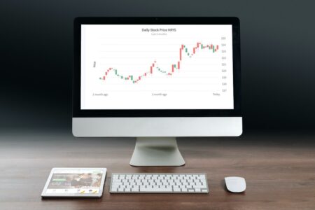
For displaying your stock data visually, FusionCharts Suite XT’s candlestick chart offers a powerful and interactive interface. This article will explain candlestick charts and provide some examples of JavaScript charts.
Table of Contents
What Are Candlestick Charts?

A candlestick chart is a type of financial graph that displays changes in the cost of commodities, equities, or derivatives. It resembles a candlestick with a vertical rectangle and wicks at the top and bottom. The candlestick’s top and bottom display the opening and closing prices.
A specialized technique known as a candlestick or a trading chart condenses data from multiple time frames into a single price bar. As a result, they are more valuable than conventional open-high, low-close bars or straight lines connecting closing prices. Candlesticks create patterns that predict cost movement. This colorful technical tool, which dates back to Japanese rice traders in the 18th century, is made more interesting by color coding.
How To Create Candlestick Charts?

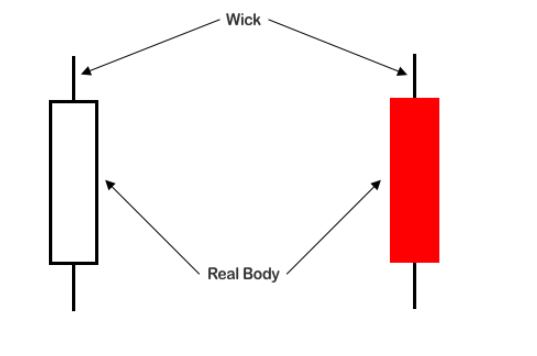
Data collection with open, high, low, and close values for each time frame you wish to display is necessary to create a Candlestick Chart. The hollow or filled portion of the candlestick is referred to as the body (or actual body) of the candlestick. The long, narrow threads above and below the body that represent the high/low range are called wicks and tails and are also referred to as shadows. The high and low are indicated by the higher shadow’s tip and the lower shadow’s bottom, respectively. A hollow candlestick, with the opening cost at the bottom and the closing cost at the top, indicates that the closing stock price was higher than the opening cost. The top of the body represents the opening price, while the bottom of the body represents the closing price, creating a full candlestick.
Learn more on how to create a Candlestick Chart.
What Are The Different Types Of Candlestick Charts?
The hues and fills of the candlesticks reveal to chartists the events of the business day. The four parts of colored candlesticks are divided into two sections. A red candlestick is displayed for a close that is lower than the previous close, and a black candlestick for a close that is higher. Second, a candlestick is hollow and filled when the close is higher than the open and lower than the open.
Hollow
A hollow bar is always produced when the close is greater than the open. Because the price was allowed to increase over the period, this type of candle shows purchasers were in command of the security, but this does not give enough information to anticipate what would happen next.
Filled
Each candlestick displays the price movement for the day. The empty candlesticks, in particular, let us know that security rose after the market opened. A filled candlestick signifies a security’s decline following the open.
Green/White
Long white/green candlesticks show intense purchasing pressure, which often denotes a bullish price trend.
Red/Black
A red candlestick on a price chart represents a security whose closing price is lower than its opening and prior closing prices. If the close is lower than the previous but higher than the open, a candlestick may also be red; in this scenario, it will typically appear hollow.
How To Read Candlestick Charts?
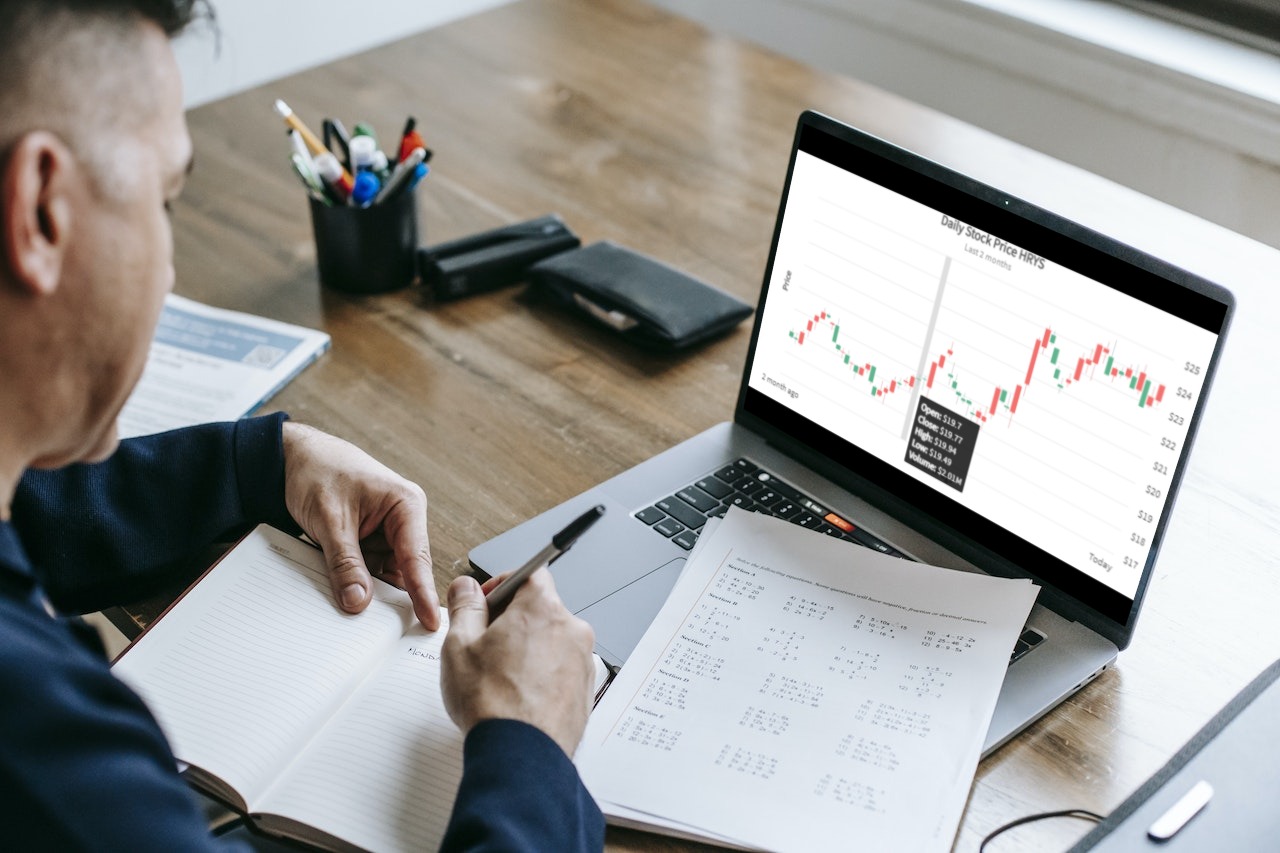
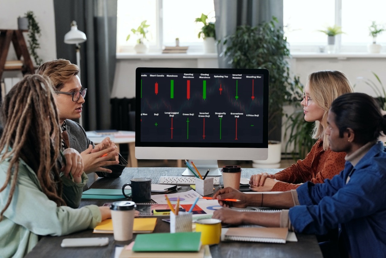
As we previously observed, each candlestick shows the stock’s opening, closing, maximum, and lowest trading prices on that particular day. Based on these four values, candlesticks can produce a variety of patterns, such as the hammer, engulfing, doji, shooting star, and many others. We discuss a couple of these patterns in the section that follows. First, here is a JavaScript example of the chart. The data is from January 1980 to November 2011 and pertains to the stock prices of Apple Inc.
Promise.all([
  loadData(
    "https://s3.eu-central-1.amazonaws.com/fusion.store/ft/data/candlestick-chart-data.json"
  ),
  loadData(
    "https://s3.eu-central-1.amazonaws.com/fusion.store/ft/schema/candlestick-chart-schema.json"
  )
]).then(function(res) {
  const data = res[0];
  const schema = res[1];
  const dataStore = new FusionCharts.DataStore();
  const dataSource = {
    chart: {},
    caption: {
      text: "Apple Inc. Stock Price"
    },
    subcaption: {
      text: "Stock prices from January 1980 - November 2011"
    },
    yaxis: [
      {
        plot: {
          value: {
            open: "Open",
            high: "High",
            low: "Low",
            close: "Close"
          },
          type: "candlestick"
        },
        format: {
          prefix: "$"
        },
        title: "Stock Value"
      }
    ]
  };

  dataSource.data = dataStore.createDataTable(data, schema);

  new FusionCharts({
    type: "timeseries",
    renderAt: "chart-container",
    width: "100%",
    height: "500",
    dataSource: dataSource
  }).render();
});
Candlestick or trading charts show a wide range of data, including:
- Open price
- Close price
- Highest price
- Lowest buy price
- Patterns and trends in share prices
- Emotions of trades
The rectangular candlestick, which displays the open and close price of the stocks and equities, is referred to as the true body (or rice). The wick, also known as the shadow, which extends from the real body’s top and bottom, displays the day’s high and low price points. The close price was lower than the open price if the true body was black or filled in. The close price is greater than the starting price if the genuine body is open.
Additionally, the wicks reveal important data. For example, when a candle is down, a short upper wick indicates that the open price was close to the high price, and when a candle is up, a short upper wick indicates that the closing price was near to the high price.
You can learn more about how to read candlestick charts.
Are There Different Candlestick Chart Patterns?
Here are a few of the most popular candlestick patterns that predict price movement and momentum.
Hammer Candlestick
The Hammer candlestick, which can be seen at the bottom of a downtrend, denotes a potential market reversal (in the direction of the bulls). For example, when a stock market opens, goes significantly lower throughout the day, then rallies back to close to the opening price, it forms the candlestick pattern known as a hammer.
Shooting Star Candlestick
A Shooting Star candlestick is formed when a stock trades significantly higher than the opening price and then recovers later in the day to conclude the day below or very near the opening price. It is an inverted Hammer.
Doji Candlestick
Doji candlesticks appear when the open and close of equities are nearly equal. A cross or a plus sign can be seen in the shape of the candlestick that is created by altering the length of the upper and lower shadows. A Doji indicates uncertainty for both buyers and sellers.
Bullish Engulfing Candlestick
A Bullish Engulfing form occurs when a huge hollow candlestick follows a small solid candlestick and completely “engulfs” the smaller candlestick. It denotes that sellers can no longer affect how much a stock’s price changes.
Bearish Engulfing Candlestick
A larger solid candlestick that follows a smaller hollow candlestick and totally “engulfs” the small candlestick is known as a Bearish Engulfing pattern. It implies that the buyers no longer control how much a stock’s price will move.
Bullish Harami Candlestick
A candlestick chart indication used to identify bear trend reversals is called a Bullish Harami. Typically, a tiny price increase (shown by a white candle) that can be handled within the equity’s recent downward price movement (represented by a black candle) signals it.
Bearish Harami Candlestick
A Japanese candlestick pattern with two bars is known as a Bearish Harami, which indicates that prices may shortly shift downward. A lengthy white candle precedes a small black candle in the motif.
Hanging Man Candlestick
During an upswing, a Hanging Man candlestick appears and signals the possibility of a price decline. The candle consists of a short higher shadow, a lengthy lower shadow, and a small genuine body. The dangling man demonstrates that consumer interest in buying is beginning to rise.
Dark Cloud Cover Candlestick
A down candle (usually black or red) begins above the close of the preceding up candle (often white or green). Subsequently, it closes below the middle of the up candle, forming the bearish reversal candlestick pattern known as Dark Cloud Cover.
The pattern is notable because it demonstrates a change in momentum from upward to downward. An up and down candle combines to form the design. Traders anticipate the price will drop even more on the third candle. It is known as confirmation.
Applications that require an analysis of the stock market and commodities prices commonly use candlestick charts. The FusionCharts Suite XT candlestick chart’s powerful and interactive interface can be used to visualize your stock data. It offers the following qualities:
- Pricing and volume plot are combined, and the volume plot has an on/off button.
- There are three price charts: candlestick charts, bar charts, and line charts.
- In addition, the tooltip and the hover bar can be interacted with.
- On the chart, zones and trend lines can be drawn.
- The ability to show any distinct trend sets on a chart can be changed to show technical indicators.
- Ability to supply missing information.
- The capacity to highlight specific candles.
- On the x-axis, you can choose to draw vertical indication lines at any location.
You can get more information about candlestick charts in the blog.


