Modern Angular applications often rely on data visualization to help users understand trends, compare metrics, and make decisions quickly. Whether you’re building analytics dashboards, financial platforms, SaaS products, or internal reporting tools, charts help transform complex data into clear and actionable insights.
Angular provides a powerful framework for building dynamic user interfaces while FusionCharts offers more than 100 chart types and dashboard components that integrate seamlessly with Angular.
In this guide, you’ll learn how to create interactive Angular charts using FusionCharts, including installation, configuration, data binding, and best practices for production applications.
Table of Contents
Key Takeaways
- Learn how to create interactive Angular charts using FusionCharts.
- Install and configure FusionCharts in an Angular application.
- Convert tabular data into the JSON format required for chart rendering.
- Build and render a Column 2D Chart with custom configuration options.
- Apply Angular charting best practices for performance, responsiveness, and usability.
What Are Angular Charts?
Angular charts are data visualizations built inside Angular applications using charting libraries. They transform raw data into interactive visual representations such as:
- Bar charts
- Line charts
- Pie charts
- Area charts
- Scatter plots
- Gantt charts
- Real-time charts
Developers use Angular charts to improve usability and help users understand complex datasets faster.
Why Use Charts in Angular Applications?
Angular charts are commonly used in:
- Analytics Dashboards to track KPIs and business performance.
- SaaS Platforms to visualize user activity and product usage.
- Financial Applications to display revenue, forecasts, and market trends.
- Operational Monitoring to track real-time events and system metrics.
- Business Intelligence Tools to support data exploration and reporting.
Why Choose FusionCharts for Angular Charts?
Building charts from scratch can be time-consuming, especially when you need advanced functionality, responsiveness, and production-ready visualizations. FusionCharts simplifies the process by providing a comprehensive charting library that helps developers create interactive and scalable data visualizations faster.
What Are the Benefits of Using FusionCharts JavaScript Charting Library?
Whether you’re building dashboards, analytics platforms, or business applications, FusionCharts includes the tools needed to deliver engaging user experiences with minimal development effort.
- 100+ chart types
- Interactive tooltips
- Drill-down functionality
- Real-time updates
- Exporting and printing support
- Responsive layouts
- Dashboard components
- Enterprise-ready support
Prerequisites
Before getting started, ensure you have:
- Node.js installed
- Angular CLI installed
- Angular 17+ project
- Basic knowledge of Angular and TypeScript
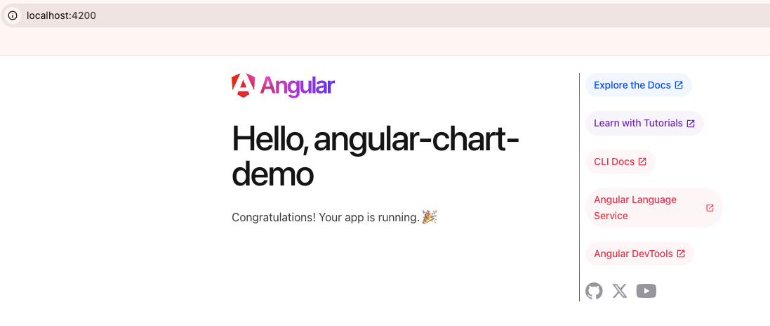
If you don’t already have an Angular project, create one using the Angular CLI:
ng new angular-chart-demo
cd angular-chart-demo
ng serve --open
The Angular development server will start automatically and open your application in the browser. You should see the default Angular welcome page at:
https://localhost:4200/
Install FusionCharts and Configure Angular
FusionCharts provides an Angular wrapper that makes it easy to integrate interactive charts into Angular applications.
Install FusionCharts and the Angular integration package using npm:
npm install fusioncharts angular-fusioncharts --save
Angular 17 and above versions use standalone components by default, so there is no app.module.ts file. Instead, FusionCharts can be configured directly inside the application component.
Open the src/app/app.component.ts file and import the required FusionCharts modules.
import { Component } from '@angular/core';
import { FusionChartsModule } from 'angular-fusioncharts';

import * as FusionCharts from 'fusioncharts';
import * as Charts from 'fusioncharts/fusioncharts.charts';
import * as FusionTheme from 'fusioncharts/themes/fusioncharts.theme.fusion';

// Register FusionCharts modules
FusionChartsModule.fcRoot(
  FusionCharts,
  Charts,
  FusionTheme
);

@Component({
  selector: 'app-root',
  standalone: true,
  imports: [FusionChartsModule],
  templateUrl: './app.component.html',
  styleUrl: './app.component.css'
})
export class AppComponent {
}
Prepare the Chart Data
Let’s create a chart that visualizes monthly website traffic.
The following dataset shows monthly website traffic from January to June, categorized by traffic source.
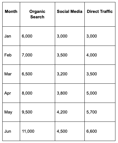
Since we’re working with multiple datasets, a Stacked Column Chart is a suitable choice. The months will be displayed along the x-axis, while visitor counts from different traffic sources will be stacked on the y-axis, making it easy to compare both total traffic and source contributions across months.
FusionCharts accepts data in JSON format, so we’ll convert the table into the following structure:
// Preparing the chart data
const dataSource = {
    categories: [
    {
      category: [
        { label: "Jan" },
        { label: "Feb" },
        { label: "Mar" },
        { label: "Apr" },
        { label: "May" },
        { label: "Jun" }
      ]
    }
  ],
  dataset: [
    {
      seriesname: "Organic Search",
      data: [
        { value: "6000" },
        { value: "7000" },
        { value: "6500" },
        { value: "8000" },
        { value: "9500" },
        { value: "11000" }
      ]
    },
    {
      seriesname: "Social Media",
      data: [
        { value: "3000" },
        { value: "3500" },
        { value: "3200" },
        { value: "3800" },
        { value: "4200" },
        { value: "4500" }
      ]
    },
    {
      seriesname: "Direct Traffic",
      data: [
        { value: "3000" },
        { value: "4000" },
        { value: "3500" },
        { value: "5000" },
        { value: "5700" },
        { value: "6600" }
      ]
    }
  ]
};
The category labels represent the months, while each dataset contains visitor counts for a specific traffic source. FusionCharts uses this structured JSON format to generate the stacked column chart.
Configure the Chart
Now that the data is ready, the next step is to configure the chart. This includes defining the chart title, axis labels, theme, and other settings that help users understand the data being displayed.
const dataSource = {
  chart: {
caption: "Monthly Website Traffic by Source",
subCaption: "January - June 2026",
xAxisName: "Month",
yAxisName: "Visitors",
theme: "fusion"
},
  data: chartData
};
In this configuration:
- caption defines the main chart title.
- subCaption provides additional context about the displayed data.
- xAxisName labels the horizontal axis.
- yAxisName labels the vertical axis.
- theme applies the FusionCharts visual theme.
- categories define the labels displayed along the x-axis.
- dataset contains the individual data series that will be stacked in the chart.
- seriesname identifies each traffic source in the chart legend.
- dataSource combines the chart settings and data into a single object that FusionCharts uses to render the visualization.
Add the Chart to Your Angular Component
Next, add the chart configuration and data source to src/app/app.component.ts. FusionCharts uses the dataSource object to combine chart settings, category labels, and datasets into a single configuration that the chart component can render.
export class AppComponent {

  dataSource = {
    chart: {
      caption: "Monthly Website Traffic by Source",
      subCaption: "January - June 2026",
      xAxisName: "Month",
      yAxisName: "Visitors",
      theme: "fusion"
    },
    categories: [
      {
        category: [
          { label: "Jan" },
          { label: "Feb" },
          { label: "Mar" },
          { label: "Apr" },
          { label: "May" },
          { label: "Jun" }
        ]
      }
    ],
    dataset: [
      {
        seriesname: "Organic Search",
        data: [
          { value: "6000" },
          { value: "7000" },
          { value: "6500" },
          { value: "8000" },
          { value: "9500" },
          { value: "11000" }
        ]
      },
      {
        seriesname: "Social Media",
        data: [
          { value: "3000" },
          { value: "3500" },
          { value: "3200" },
          { value: "3800" },
          { value: "4200" },
          { value: "4500" }
        ]
      },
      {
        seriesname: "Direct Traffic",
        data: [
          { value: "3000" },
          { value: "4000" },
          { value: "3500" },
          { value: "5000" },
          { value: "5700" },
          { value: "6600" }
        ]
      }
    ]
  };
}
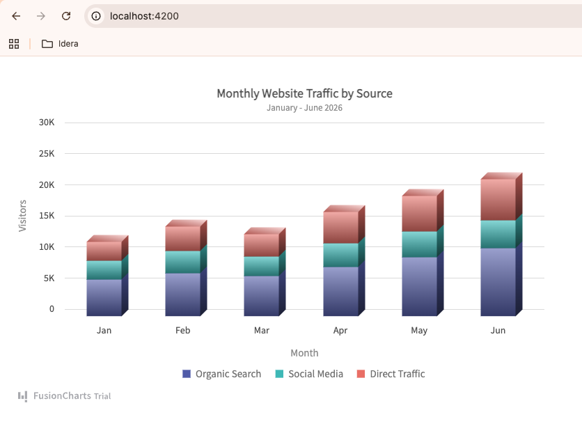
This configuration creates a stacked column chart that displays monthly website traffic and shows how Organic Search, Social Media, and Direct Traffic contribute to the overall visitor count each month.
Render the Chart
Finally, open src/app/app.component.html and add the FusionCharts component:
<fusioncharts
  width="50%"
  height="500"
  type="stackedcolumn3d"
  dataFormat="json"
  [dataSource]="dataSource">
</fusioncharts>
The type attribute determines which chart type FusionCharts renders. In this example, we’re using a Stacked Column 3D Chart (stackedcolumn3d) to visualize monthly website traffic by source.
A stacked column chart allows you to compare both the total monthly traffic and the contribution of individual traffic sources. Each column represents the total number of visitors for a month, while the stacked segments show how Organic Search, Social Media, and Direct Traffic contribute to that total.
FusionCharts supports more than 100 chart types, including line charts, bar charts, pie charts, area charts, scatter charts, Gantt charts, maps, gauges, and real-time charts, making it easy to choose the visualization that best fits your data and use case.
Result
Save your files and return to your browser. Angular will automatically reload the application and render the chart.
You should now see an interactive column chart displaying monthly website traffic from January through June, complete with tooltips, responsive behavior, and FusionCharts styling.
Get the complete source code and working example from GitHub.
Discover more charting capabilities in the FusionCharts documentation.
Angular Charts Best Practices
Following a few best practices can improve both the usability and performance of your Angular charts. They also help create a consistent experience across different devices and screen sizes.
Keep Visualizations Simple: Avoid overcrowding your charts with too many data points, labels, or visual elements. A clean and focused chart helps users quickly understand the information without distractions.
Use Responsive Layouts: Ensure your charts adapt seamlessly to different screen sizes and devices. Responsive charts provide a consistent user experience across desktops, tablets, and mobile phones.
Optimize Large Datasets: Large datasets can impact chart performance and readability. Consider aggregating data, limiting the displayed range, or using pagination and drill-down features to improve both speed and usability.
Use Consistent Colors: Maintain a consistent color scheme throughout your application or dashboard. Consistent colors help users recognize data categories more easily and improve overall readability.
Choose the Right Chart Type: Select a chart type that best represents your data and the story you want to tell. For example, use line charts for trends over time, bar charts for comparisons, and pie charts for showing proportions.
Angular Charts with a Charting Library vs Building from Scratch
Developers can either use a charting library or build charts from scratch. Each approach has its own advantages, depending on the project’s requirements, customization needs, and development resources.
| Feature | Charting Library | Building from Scratch |
|---|---|---|
| Development Time | Faster implementation | More development effort |
| Interactive Features | Often built in | Must be developed manually |
| Responsive Support | Usually included | Requires custom implementation |
| Exporting & Printing | Available in many libraries | Requires additional development |
| Customization | Extensive configuration options | Complete control over implementation |
| Maintenance | Managed through library updates | Fully maintained by the development team |
Conclusion
Angular makes it easy to build modern web applications, but presenting data effectively requires powerful visualization tools. FusionCharts simplifies the process by providing interactive, responsive, and enterprise-ready Angular charts that help developers create dashboards, reports, and analytics applications faster.
Whether you’re building a SaaS dashboard, financial platform, or business intelligence solution, Angular and FusionCharts provide a scalable foundation for delivering engaging data experiences.
In this tutorial, we used Angular’s modern standalone component architecture to build and render an interactive chart with FusionCharts.
Still evaluating your options? Explore our guide to the best Angular chart libraries to compare popular solutions, features, and use cases before choosing the right library for your project.
Ready to build Angular charts faster? Start your free trial of FusionCharts and create interactive, data-rich visualizations with ease.
FAQs
What are Angular charts?
Angular charts are data visualizations integrated into Angular applications to display information through interactive graphical components.
Which chart library works best with Angular?
Several libraries support Angular, including FusionCharts, Chart.js, Apache ECharts, Highcharts, and D3.js. The best choice depends on your project requirements.
Can Angular charts display real-time data?
Yes. Angular charts can consume live API data and update dynamically.
Are Angular charts mobile responsive?
Most modern charting libraries, including FusionCharts, support responsive layouts.
Which chart type should I use in Angular?
Line charts work well for trends, bar charts for comparisons, pie charts for proportions, and scatter charts for correlations.


Robert
September 25, 2017, 1:25 pm“AngularJS (version 1.x) when launched by Google a few years back”… Not true…
They took over the team and essentially taking over the project. They did not launch it…
Jonathan
September 25, 2017, 7:52 pmHey Robert, it would be more apt to say that AngularJS was developed at Google. As a by-product of the Google Feedback Tool. Misko Hevery and Adam Abrons (the inventors of Angular), were part of this team when they developed Angular to simplify the development process. The framework has ever-since been maintained by Google.