
Revenue is critical for growth in any organization, and the sales team is in charge of it. It is critical for the sales team to understand how many leads came from marketing efforts and organic sources and how many of these opportunities received pricing quotes. This results in a pipeline of these deals and their associated revenue. This pipeline also represents the revenue that the sales department can expect in a month or quarter. Furthermore, some of the deals in the pipeline become lost opportunities for a variety of reasons (competitors, pricing too high, or certain features not available in the product). Finally, a subset of these pipeline deals converts to actual customers.
To ensure revenue predictability, sales managers and revenue stakeholders in a company must understand different patterns of opportunities, pipeline, and closed deals.
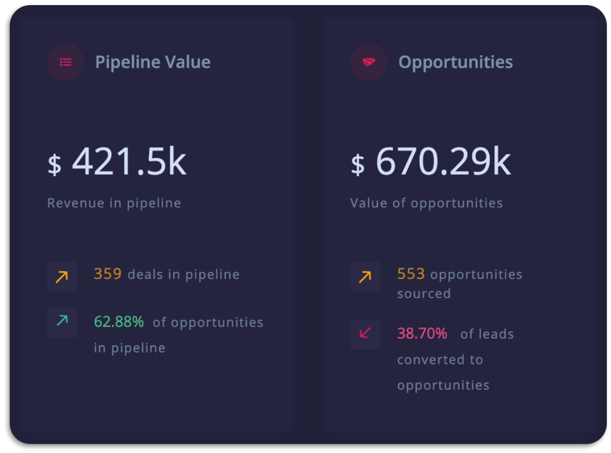
This Sales Dashboard enables the sales team to understand trends, identify unprofitable months/quarters, determine which parts of the sales cycle require more bandwidth, and optimize or reconsider the selling strategy.
To create this dashboard, we will be using React, a JavaScript library for building user interfaces; FusionCharts, a JavaScript-based charting library, and Google Sheets API. Using FusionCharts’ React component, you will be able to create responsive React Charts, APIs, animations, drill-downs, real-time updates, and even full exporting of charts & dashboards without any hassle.
In this tutorial, we’ll create a Sales dashboard by fetching data using Google Sheets API. Before we get started, let’s take a look at the Sales dashboard you’ll be able to create at the end of this tutorial.
Check Sales Dashboardhttps://sowmyaraj92.github.io/sales-dashboard-gsheetsapi-react/
Table of Contents
Include Dependencies
Step 1: Include React
Using Create React-App is one of the best ways to set up the development environment. This setting provides the latest JavaScript features, enhances the developer experience, and optimizes the app for production.
Open the terminal, go ahead and enter:
npx create-react-app my-sales
cd my-sales
my-sales is the working directory where the React Boilerplate will be installed along with all the utilities and dependencies.
- Note: The working directory should contain a package.json. If the package is not present, then you can create it with the command: npm init -y
Step 2: Include Bootstrap
We will use Bootstrap to create the layout and user interface for our app. So, in the terminal, go ahead and enter:
npm install bootstrap --saveStep 3: Including the FusionCharts Core Package and Its React Component
We will use FusionCharts to render the charts in our dashboard. To install FusionCharts, open the terminal and enter:
npm install fusioncharts --saveThe React-component provided by FusionCharts can be used to add JS charts in our app without any difficulty. To check them out, click here.
npm install react-fusioncharts --saveStep 4: Including FusionMaps Package
To render maps, install the fusionmaps package, which contains all the map definition files as shown below:
npm install fusionmapsImporting the Charts Using React Component
The dashboard comprises three charts: Multi-Series Column 2D, Maps, and Multi-Series Line charts. Let’s explore each of them below:
Multi-Series Column 2D
The multi-series column 2D chart plots data for multiple datasets. This chart also helps with the analysis and comparison of data points grouped in sub-categories. It has vertically aligned rectangular bars on one axis with discrete values shown on the other. There is a legend for each of the bars plotted. Hovering over the rectangular bar displays the coordinate value of the attribute.
Furthermore, the length of a column is proportional to the values it represents. This chart visualizes revenue for a year/quarter, sales transactions involving opportunities, pipelines, etc. Click here to read more about Multi-Series Column 2D.
Multi-Series Line Charts
The multi-series line chart visualizes trends and relationships in multiple datasets. It consists of various data points connected using line segments, where each point represents a single value. It is often used to show continuous data like opportunities in the pipeline, closed opportunities, etc. Take a detailed look at Multi-Series Line Charts here.
Maps
FusionCharts offers more than 1400+ maps to plot geographical data like revenue by regions, population by state, and survey effectively. To render the maps, you need to download the map definition files from here and copy-paste the maps folder within your FusionCharts directory.
There are multiple ways to install them; you can check out this developer documentation page for more details.
For any map visualization, it is essential to provide the correct value for the id keys. The table on the right displays the region with its corresponding entity name.
Take, for example, to plot a world map; the type attribute is set to world.
For a detailed explanation of maps, visit this link.
To import the charts and react-component, follow the code below:
import React from 'react';

import FusionCharts from 'fusioncharts';

import Charts from 'fusioncharts/fusioncharts.charts';

import Maps from 'fusioncharts/fusioncharts.maps';

import World from 'fusionmaps/maps/es/fusioncharts.world';

import PowerCharts from 'fusioncharts/fusioncharts.powercharts';

import ReactFC from 'react-fusioncharts';

import FusionTheme from 'fusioncharts/themes/fusioncharts.theme.fusion';

ReactFC.fcRoot(FusionCharts, Charts, PowerCharts, Maps, World, FusionTheme);
We have added all the dependencies for our dashboard app, so let’s set up the Google Sheets API.
Google Sheets API Setup
We will be creating a new project for the dashboard app on Google Developer API Console to procure the data from Google Sheets. Let’s call it gsheets-salesdashboard. You can create a new project using the link → Create New Project.
Once you create the project, you’ll be redirected to the Google Developer API dashboard. Now, we will enable Google Sheets API for our app. For this in the APIs box, click “Go to APIs overview.” Once you click “Enable APIs and Services,” you’ll get the API Library, and we’ll go ahead and search for “Google Sheets API.”
Once you find it, click “Enable.” The API is now enabled, and you will be able to read and write into Google Sheets.
From the sidebar, navigate to “Credentials,” and click on the “Create credentials” button, and select “API Key.” Also, click on the “Restrict Key” and set a name for the same. (We’ve set it to SalesDashboardAPIKey).
Note: Save the key generated (mine is AIzaSyCn_qxApnW1By0E3DZmIOJeXkT_RtYuYHo) since we will need this key to pull the data from our Google Sheets later.
From the “API Restrictions,” select the “Google Sheets API” and save it. Now, let’s connect Google Sheets API and fetch the data.
Connecting Google Sheets API and Fetching Data
We will now take a look at the Google Sheets that we will be using for our dashboard. Here’s a snapshot of how it looks, basis some of the key performance indicators of sales – like opportunities created, deals in the pipeline, and value of closed deals. The data also focuses on revenue, leads, sales cycle, and other growth indicators.
The Google sheet for KPI data:
The Google sheet for the Map Data(Year – 2016):
The componentDidMount() is invoked immediately after a component is mounted. This is exactly where AJAX requests and DOM or state updates should occur.
Below is the code to fetch the response from the JSON data:
const url = `https://sheets.googleapis.com/v4/spreadsheets/${config.spreadsheetId}/
             values:batchGet?ranges=SalesDataFinal&majorDimension=ROWS&key=${config.apiKey}`;

componentDidMount() {

fetch(url).then(response => response.json()).then(data => {

let batchRowValues = data.valueRanges[0].values;

const rows = [];

for (let i = 1; i < batchRowValues.length; i++) {

let rowObject = {};

for (let j = 0; j < batchRowValues[i].length; j++) { rowObject[batchRowValues[0][j]] = batchRowValues[i][j]; } rows.push(rowObject); } this.setState({ items: rows}, () => this.getData('All','2016'));

});

}
Building the Sales Dashboard
We’ll be using Bootstrap 4 to build the dashboard structure. With new components, responsive designs, and styles, it is a consistent framework that supports all browsers.
Now let’s divide our dashboard into three parts:
- Navigation Section
- KPI Section
- Charts Section
Creating the Navigation Section
To create the navigation bar, we will be using the navbar component of Bootstrap. Just below the navigation bar holds a component with a drop-down for Year and Quarter. Below is the HTML snippet for the same:
<nav className ="navbar navbar-expand-sm text-sm-center text-md-left fixed-top">
 <div className="navbar-brand"><span className="logo">S</span>ales Dashboard</div>
 <ul className="navbar-nav flex-row ml-sm-auto">
 <li className="nav-item">
 <div className="profile">
 <img alt="" className="mr-3 rounded-circle border" width="42" src="./Image-Tim.png" />
 <span className="name d-none d-sm-inline-flex">Hey, Tim </span>
 </div>
 </li>
 </ul>
 <div className="row mb-5">
 <div className="col-2">
 </div>
 <div className="col text-right time-selector">
 <ul className="list-inline">
 <li className="list-inline-item">
 <div className="dropdown active-item">
 <button className="btn btn-secondary dropdown-toggl
 type="button" id="dropdownMenuButton" data-toggle="dropdown" aria-haspopup="true" aria-expanded="false">
 {this.state.value}
 </button>
 <div className="dropdown-menu" aria-labelledby="dropdownMenuButton">
 <div className="dropdown-item" value ="2018" id="btn-2018" onClick ={this.updateDashboard} >2018</div>
 <div className="dropdown-item" value ="2017" id="btn-2017" onClick ={this.updateDashboard} >2017</div>
 <div className="dropdown-item" value ="2016" id="btn-2016"onClick ={this.updateDashboard} >2016</div>
 </div>
 </div>
 </li>
 <li className="list-inline-item">
 <div className="dropdown">
 <button className="btn btn-secondary dropdown-toggl
 type="button" id="dropdownMenuButton" data-toggle="dropdown" aria-haspopup="true" aria-expanded="false">
 {this.state.quarterValue}
 </button>
 <div className="dropdown-menu" for="navbarDropdown" aria-labelledby="navbarDropdown">
 <div className="dropdown-item" disabled>--Select Quarter--</div>
 <div id ="btn-q1" className="dropdown-item" onClick ={this.updateDashboardQuarter}>Quarter 1</div>
 <div id ="btn-q2" className="dropdown-item" onClick ={this.updateDashboardQuarter}>Quarter 2</div>
 <div id ="btn-q3" className="dropdown-item" onClick ={this.updateDashboardQuarter}>Quarter 3</div>
 <div id ="btn-q4" className="dropdown-item" onClick ={this.updateDashboardQuarter}>Quarter 4</div>
 <div id ="btn-q5" className="dropdown-item" onClick ={this.updateDashboardQuarter}>Quarter 1</div>
 <div id ="btn-q6" className="dropdown-item" onClick ={this.updateDashboardQuarter}>Quarter 2</div>
 <div id ="btn-q7" className="dropdown-item" onClick ={this.updateDashboardQuarter}>Quarter 3</div>
 <div id ="btn-q8" className="dropdown-item" onClick ={this.updateDashboardQuarter}>Quarter 4</div>
 <div id ="btn-q9" className="dropdown-item" onClick ={this.updateDashboardQuarter}>Quarter 1</div>
 <div id ="btn-q10" className="dropdown-item" onClick ={this.updateDashboardQuarter}>Quarter 2</div>
 <div id ="btn-q11" className="dropdown-item" onClick ={this.updateDashboardQuarter}>Quarter 3</div>
 <div id ="btn-q12" className="dropdown-item" onClick ={this.updateDashboardQuarter}>Quarter 4</div>
 </div>
 </div>
 </li>
 </ul>
 </div>
 </div></nav>
We will now create a container to house both the KPI and Chart sections of the dashboard. Take a look at the HTML snippet below:
Creating the KPI Section:
To create this, we will use the Card component of Bootstrap to create the layout for our KPI section. Below is the HTML snippet for the same:
<div className="card c-portlet c-portlet--height-fluid-half d-flex align-items-start flex-column">
<div className="d-flex">
<span className="oval d-flex justify-content-center ">
<img src={'./revenuetarget.svg'} alt="fireSpot" className= "img-responsive rounded-circle"
width="20"/>
</span>
<p className="c-portlet-title">Revenue Target</p>
</div>
<div className="kpi-block mt-3">
<div className="c-portlet-value">
<span className="h1">$</span> {this.state.targetRevenue}
</div>
<div id="added-meta-target" className="targetRevenue">
<span className="h5 poa meta-value-text1">Target in
<span className="defaultQtr_value">
{this.state.quarterValue}</span>, {this.state.value}</span>
</div>
</div>
<div className="d-flex align-items-center kpi-block mt-4 mb-2">
<span className="rectangle d-flex justify-content-center ">
</span>
<div id ="kpi-target" data-up=" more" data-down=" less"></div>
<span className ="h5 mb-0"> of target achieved</span>
</div>
</div>Now that our layout is ready, we will define functionality for elements and feed data to them from Google Sheets. For this, we will define a function called getData in our component which will take the year and quarter as arguments to de-structure google sheets data present in the app’s state.
getData = (arg,arg2) => {
 // google sheet data
const arr = this.state.items;
 const arrLen = arr.length;
 let chartDataArr = [];
 let targetRevenueVal =0;
 let targetRevenueFlag =false;

 //KPI 1 - Target achieved

 const targetElem = document.getElementById('kpi-target');
 targetElem.classList.remove('has-up-val');
 targetElem.classList.remove('has-down-val');

 //Annual Data
 for (let i = 0; i < arrLen; i++) {
 let monthStr = (arr[i])['year'];
 if (monthStr.includes(arg2)) {
 chartDataArr.push(arr[i]);
 if(targetRevenueFlag===false) {
 targetRevenueVal=parseInt(arr[i].revenueTarget_Annual);
 targetRevenueFlag = true;
 }

 }
 }
 //Quarterly Data
 if(arg !== "All") {
 chartDataArr = [];
 targetRevenueFlag =false;

 for (let i = 0; i < arrLen; i++) {
 let quarterStr = (arr[i])['quarter'];

 if (quarterStr.includes(arg)) {
 if(targetRevenueFlag===false) {
 targetRevenueVal=parseInt(arr[i].revenueTarget);
 targetRevenueFlag = true;
 }
 chartDataArr.push(arr[i]);
 }
 }
 }

//Percent of targets achieved
 let target = (oppClosedVal/targetRevenueVal)*100;
 const targetPercent =(target).toFixed(2);
 if(target < 100 ) { target = 100-target; targetElem.innerHTML = Math.abs(target) + '%'; targetElem.classList.add('has-down-val'); } else if(target >= 100 ) {
 target = target -100;
 targetElem.innerHTML = Math.abs(target) +'%';
 targetElem.classList.add('has-up-val');

 }

 document.getElementById("kpi-target").innerHTML = (target.toFixed(2))+'%';
}
The above code snippet will create one KPI for Revenue Target. Likewise, we will make cards for all four KPIs for the Sales Dashboard.
Creating the Charts Section
We will use col and card components of Bootstrap to create the Chart Layout. containerBackgroundOpacity is an attribute that is used to manipulate the background opacity of the charts.
/*Multi-series line chart*/

<div className="col-md-6 col-xl-9 order-2 order-md-1 order-xl-1 ">
  <div className="card c-portlet c-portlet--height-fluid pipeline-card full-height">
  </div>
</div>

/*Multi-series column 2D Chart*/

<div className="col-md-6 col-xl-8 order-2 order-md-1 order-xl-1 ">
  <div className="card c-portlet c-portlet--height-fluid full-height pipelineClosing-card">
  </div>
</div>

/*Map Chart*/

<div className="col-md-12 col-xl-6 order-2 order-md-1 order-xl-1 ">
  <div className="card c-portlet c-portlet--height-fluid full-height map-card">
  </div>
</div></pre>
The above code snippet will create one chart card each for Multi-series Charts, StackedLine, and Map. Follow the steps to build the chart cards and you will have the chart layout. And to make sure you are getting it right, take a look at the code files in my Github repository.
Now, we will form the JSON data array for each chart and consume the cosmetic options defined and add it to the apps’ state.
//Multi-series column 2D chart
 type: 'mscolumn2d',
 width: '100%',
 height: '100%',
 dataFormat: 'json',
 dataSource: {datasource }
}
 this.setState({stackData: chartConfigs1});

//World Map
const chartConfigs2 = {
 type : "world",
 width : '100%',
 height : '95%',
 dataFormat : "JSON",
 dataSource :{datasource}
}
 this.setState({mapData: chartConfigs2});

//Multi-series line chart
const chartConfigs3 = {
 type: 'msline',
 width: '100%',
 height: '150%',
 dataFormat: 'json',
 dataSource: {datasource}
 }
 this.setState({mslineData: chartConfigs3});
We will now pass the JSON data to the FusionCharts’ React component under the element which we have created for each chart.
<div className="card c-portlet c-portlet--height-fluid pipeline-card full-height">

<div className="card c-portlet c-portlet--height-fluid pipeline-card full-height">

<reactfc {...this.state.mslineData} containerBackgroundOpacity ="0"></reactfc>

</div>

 <div className="card c-portlet c-portlet--height-fluid pipeline-card full-height">

<reactfc {...this.state.stackData} containerBackgroundOpacity ="0"></reactfc>

</div>  <div className="card c-portlet c-portlet--height-fluid full-height map-card">

<reactfc {...this.state.mapData} containerBackgroundOpacity ="0"></reactfc>

</div></div>
If you’ve followed these steps till now, then you should have a functional dashboard as in the image below:
We hope the tutorial helped you create this Sales Dashboard using Google Sheets. Now, you can go ahead and add UI elements, styles, more charts, and a lot more features.
You can download FusionCharts Package for React stack from here: Sign up for FusionCharts.
A sales dashboard plays a crucial role in giving the peeps at sales an up-to-date view of their organization’s sales health to make desired revenue predictions, visualize successfully closed deals, and identify critical areas for optimization.
You can look at the other dashboards on React built by our developers, such as Retail Dashboard and SaaS Dashboard.
For any references, you can check out the source code from this Github Repository.


swapna
May 2, 2019, 11:30 amAmazing post !