
Charts help you to visualize data while telling stories. They allow you to reveal important patterns and illustrate key trends effectively. They help businesses to make informed data-driven decisions. So, it’s very important to create charts without any flaws. However, there are some common mistakes that people make frequently. But how can you fix them? In this post, you will find all the details.
Table of Contents
What is a chart?
Data charts are a graphical representation of data. It enables you to visualize information to uncover valuable insights, trends, and relationships. Besides, it helps you to tell a story while exploring the data effectively.
Why are charts important?
- Enables you to present key information concisely
- Allows people to understand complex information easily and quickly
- Helps businesses to make informed business decisions effectively
What are the most common mistakes people make with charts?
Poor Use of 3D Graphics
3D graphics help you to visualize data and captivate the audience. However, if you don’t use it appropriately, you will face big problems. For example, improper use of 3D graphics can lead to occlusion. It occurs when one graphic partially blocks another one. It can obscure important information and create false hierarchies.
Let’s take a look at this chart, which visualizes Amazon’s net revenue by segment. Do you think that it represents the data correctly?
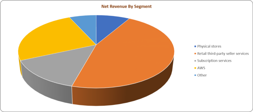
Looking at the chart, can you confidently say that the AWS segment generated more revenue than subscription services? It looks to be a bit confusing. Both of the segments seem to generate identical revenues.
To solve this issue, you can try using the bar chart. After removing all the unnecessary color codes and reordering the data, you will get the correct representation of the data.
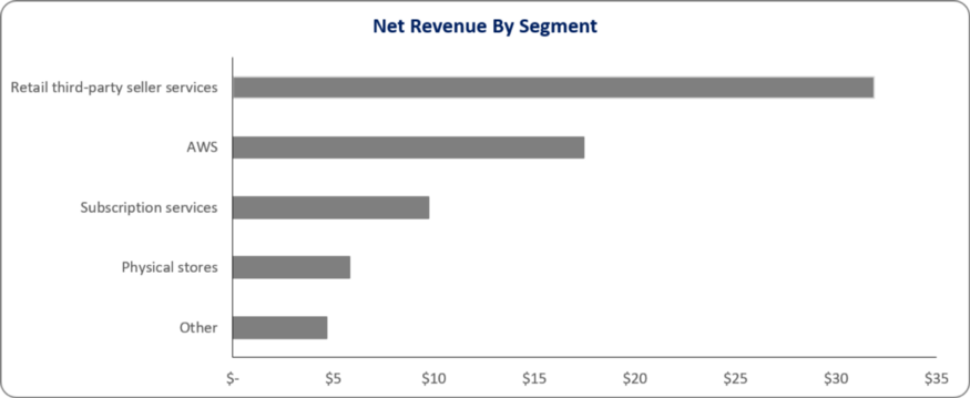
As you can see, the bar chart has revealed a major difference in revenue generation between AWS and subscription-based services. You would not have identified it with the 3D pie chart.
That’s why you should use 3D graphics only when it is absolutely necessary. Otherwise, you should visualize the data in 2D.
Choosing the Wrong Chart Type
Choosing the wrong chart type can make it very difficult for the audience to understand key information. You don’t want to see the people scrunching their eyebrows with confusion.
Let’s take a look at an example to get an idea of what you might get with the wrong chart type.
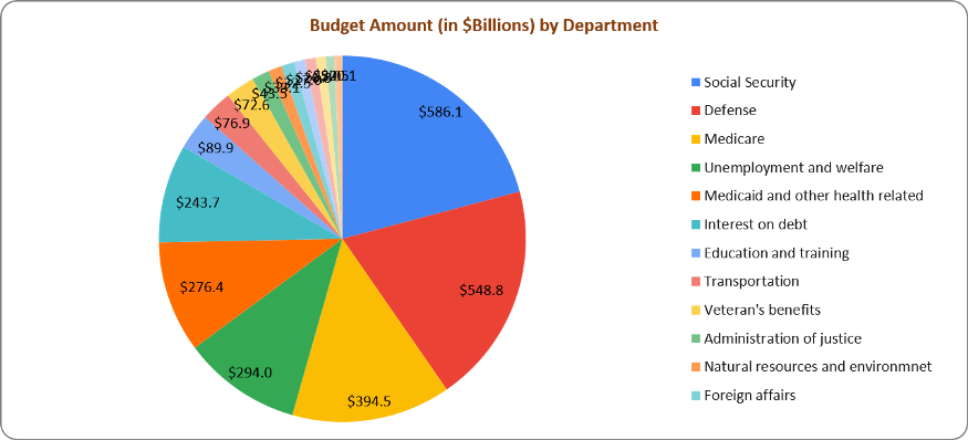
The pie chart shows the 2007 United States federal budget by department. There are too many slices, which makes it very difficult to comprehend. Also, they have various colors and size combinations. Besides, there are a whopping 12 legends. As a result, the pie chart fails to present the information effectively.
To improve the chart, you need to change its type. How about changing it to the bar chart? It can represent multiple date categories efficiently.
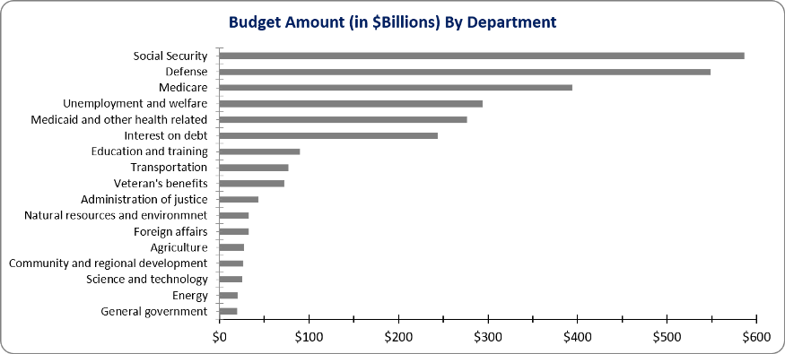
As you can see, the bar chart has delivered a major improvement. The viewers can understand all the information quickly by simply looking at the chart. All the confusion is gone.
Presenting Misleading Data
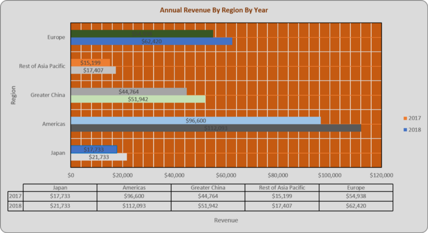
Charts help you to present data in an easily comprehendible way. But sometimes, the findings can be misleading. Here’s a chart of Apple’s year-over-year (YoY) revenue by region in 2018 versus 2017.
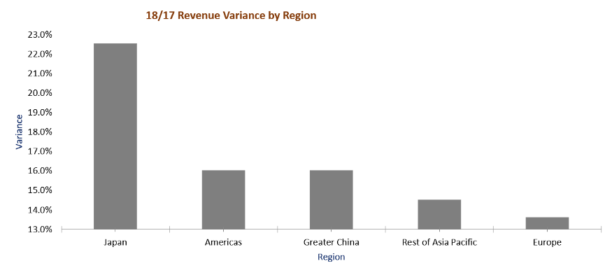
Looking at the chart, you may think that Japan has massively outperformed both the Americas and Europe. But is it really true? Yes, the Japanese market is massive. But can it really outperform major regions like the Americas and Europe by such a huge margin?
If you take a closer look at the chart, you will find that the X-axis doesn’t start at zero. As a result, the data comparison has been distorted significantly. Let’s fix the issue by making the X-axis start at zero. Also, let’s change the axis options to show values in a 5% increment, rather than 1%.
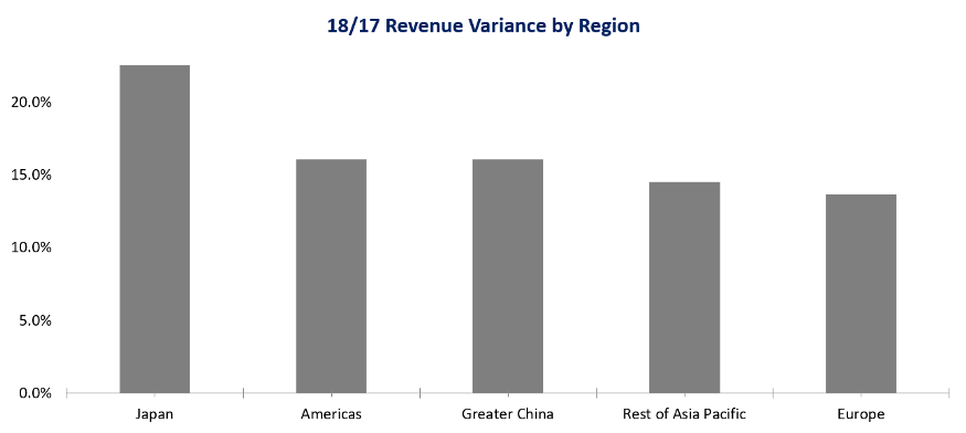
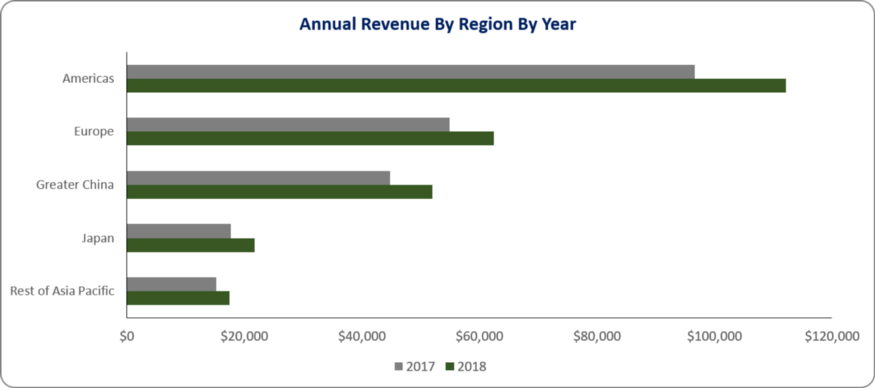
As you can see, the difference between the markets of Japan and the Americas is not as big as shown by the previous chart. The same thing goes for Europe.
Showing Too Much Data
The role of a chart is to help people comprehend key information easily from a large amount of data. If you include too many data points, the audience will not be able to grasp the insights quickly.
Let’s take a look at this chart of 2013 MLS salaries.
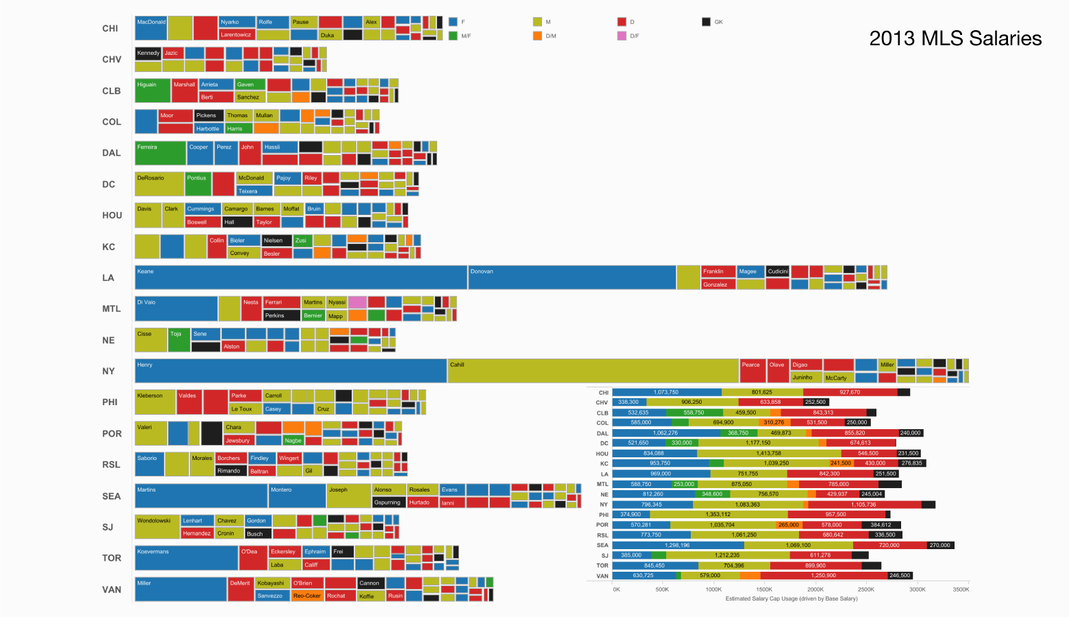
As you can see, the chart shows an excessive amount of data. It is very difficult to comprehend. It leads to analysis paralysis, which is a situation where the viewers cannot make any decision due to the chart being overloaded with information.
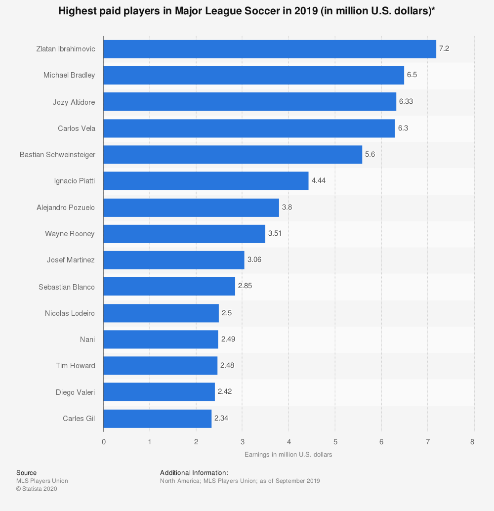
To solve this issue, avoid including too much information in the chart. Keep it simple and clean, just like this:
Inconsistent Scale
Some people put more emphasis on making charts colorful than maintaining consistent scaling. As a result, the visualization fails to convey the right message to the audience effectively. Let’s take a look at this chart that visualizes the percentage of people using banks in the US:
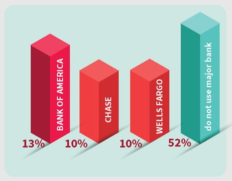
Looking at the chart closely, you will find that the visualization has a scaling issue. 13% of the people in the US use Bank of America. But you will not find a major difference while comparing it with the visualization of 52% of people who do not use any bank in the country. Shouldn’t the visualization of 13% be a lot smaller? The same thing goes for the other visualizations. The scaling is not appropriate.
To avoid this situation, always try to maintain consistency in your chart. Make sure that the visualizations are scaled appropriately.
Using Excessive Color
Using too much colors in your chart can cause major distractions. It can take the viewers away from the main point of your chart. You don’t want to make it harder for the people to understand the key information. Here is an example of a chart that uses excessive color:
As you can see, the chart is very confusing. It’s really difficult to comprehend. Also, you cannot read some of the numbers at the first glance. You have to spend more time figuring them out. Overall, the chart is not professional.
Now, let’s make this chart better by excluding extra colors.
Now, the chart looks clean and simple. It has managed to reveal all the information effectively. You can understand everything quickly. There is no confusion.
Zooming in Data that Favors Your View
Displaying the right data at the right timeframe is very important. It allows the companies to make major business decisions effectively. However, zooming in on the timeframe can lead to displaying information that reflects your own view, rather than the real insights. Let’s take a look at this example:
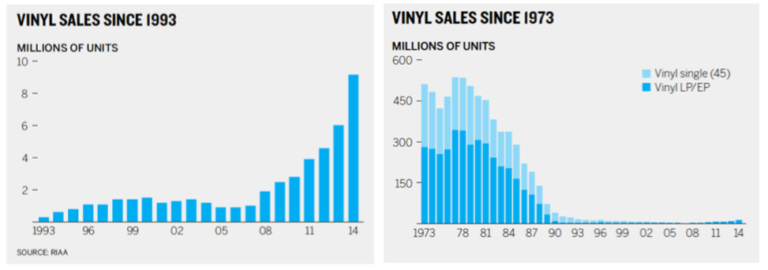
The chart on the left size is zoomed in. Looking at it, you might feel that vinyl sales have seen major growth since 1993. However, when you zoom it out, you will see the chart on the right side, which tells a completely different story. The number of sales seems to have gone down significantly since 1990.
That’s why you should never zoom in to reflect your favorable view. Make sure to reveal the data that displays all the information accurately.
How can I avoid making common mistakes with charts?
It’s quite common for people to make mistakes with charts. However, it’s not hard to fix them. By following the tips mentioned in this blog post, you can avoid making common mistakes and help the audience to uncover valuable insights easily.